Working with Color: Create a Monotone Design Scheme
Creating a dark color scheme can result in a beautiful, elegant design.
There are a variety of ways to do it, from creating pop with sharp contrast or working with a more monotone color palette, which we will focus on here.
Export Figma Designs to Live Website – No-Code
The No. 1 thing to keep in mind when working with a palette of dark colors is readability. Dark color schemes can sometimes overwhelm the rest of the page, making content difficult for the user to understand. When working with dark colors, keep in mind that contrast is vital – even when working with a monotone palette.
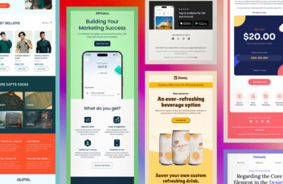
With Postcards Email Builder you can create and edit email templates online without any coding skills! Includes more than 100 components to help you create custom emails templates faster than ever before.
Free Email BuilderFree Email TemplatesMonotone Color Palettes

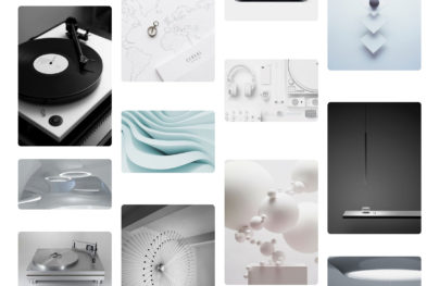
The first step to creating a great monotone design schemes is to understand the basics of color. A monotone or monochromatic color palette is one that is made up of different tints or shades of a single color.
The color wheel is a great starting point for developing any color palette.
Think about the color that best works with your message – you can learn more about the specific associations with red, blue, green, yellow, orange and purple in a series of previous articles. Then develop a scheme using various hues of that color.
The addition of white will make a specific hue lighter.
With Pulsetic you’ll be instantly notified the moment your website, API, or server becomes unavailable. Monitor uptime from multiple global locations and respond to incidents before your users are affected.
Create beautiful status pages in minutes to keep customers informed during outages and build trust with transparent communication.
Start Monitoring for FreeTo create a dark monotone scheme, you would add black to a base color to darken it enough to fit you needs.
Dark Monotone Schemes
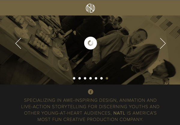
Developing a scheme that contains dark hues can be a challenge and limiting the total number of shades can make it easier to develop. Consider using just three tints or shades to create this style of color palette.
But where do you start? Play with adding black in 10 percent increments to your base color to get the desired result. By adding black in constant increments, you will develop a set of colors that have a consistent feel.
Consider the amount of variance you want between tones in your dark color scheme. Would you like hues to vary more or less? What other elements are going to appear on the page? Think about how these will also affect the perception of the color in the final design.
Contrast

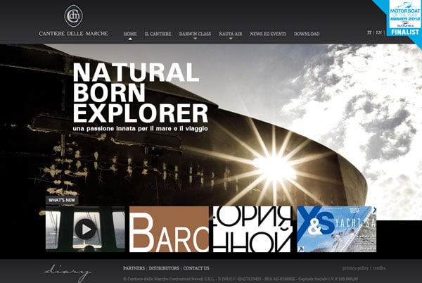
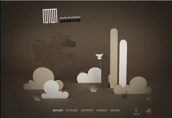
One of the most important elements of developing a dark color scheme – maybe even as important as choosing the colors – is to include an element of contrast. It is important to make sure you can tell the difference between colors and other design elements.
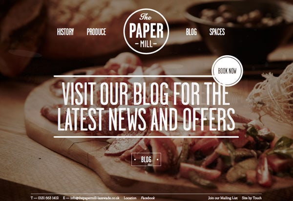
When working with a dark color scheme, consider using white (or light colored) text so that it “lifts” off the dark background. Black text on a dark screen can be very difficult to read.
Think about increasing the point size and leading of text when working with dark backgrounds to increase readability as well. With a larger font and more space between lines, the eye will be able to easily move across the screen.
The style of text is also important. Avoid typefaces with super-thin strokes when using a dark background color palette. It can be hard for users to read thin lettering against a dark color.
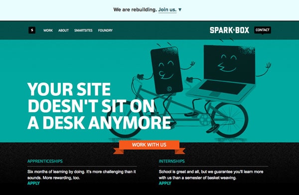
Use a contrasting color to add visual interest to your color scheme. By using a color that is on the opposite end of the color spectrum as an accent, you can add extra emphasis to a monotone color scheme. Consider this pop of color for important buttons, as the main color in photos or for big text.
Tools to Get Started
You can use a variety of color building tools to help develop a dark color palette or consider a user interface pack with ready-made items with a prepackaged (and wonderfully matched) color scheme. Here are a five great tools to get your started.
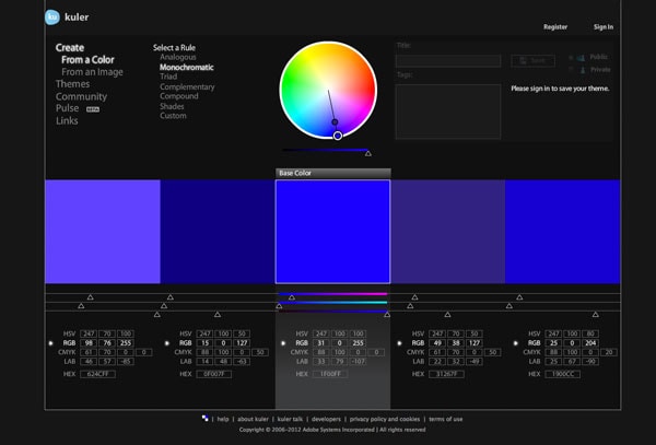
Kuler: Adobe’s Kuer is a quick and easy way to generate a five-color palette in minutes. It includes an option to generate a monochromatic scheme and is fully customizable. Plus it shows color values as you work, making it a breeze to use.
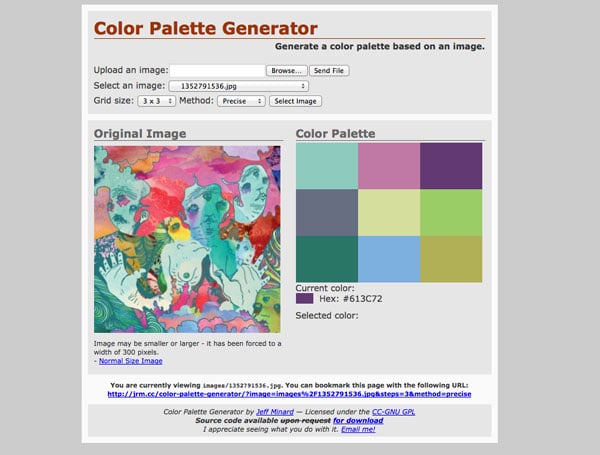
Color Palette Generator: This is a great tool for developing a color scheme based on a specific element. If, for example, you have an image that has colors that appeal to you, Color Palette Generator allows for the upload of a photo and it will pull a color scheme from it. Some designers may not like the lack of control over the results, but it can be a great starting point.
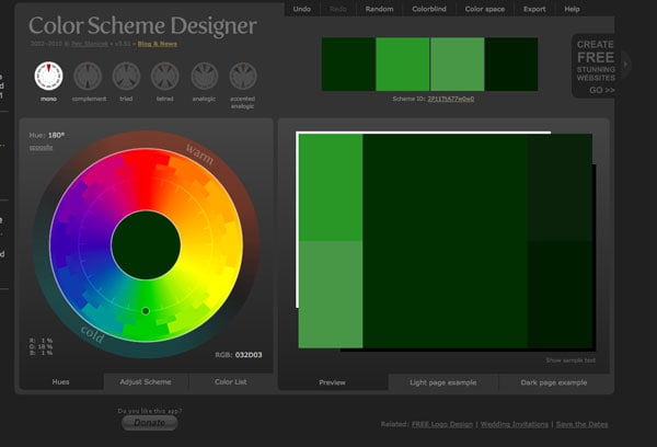
Color Scheme Designer: Not only does Color Scheme Designer employ a dark, monotone color scheme, it is a great tool. Select the type of palette you want (yes, there is a mono option) and use the color wheel to generate palette ideas. You can manually adjust the scheme and get a quick preview of how it will look with pop up examples (make sure to use the dark example).
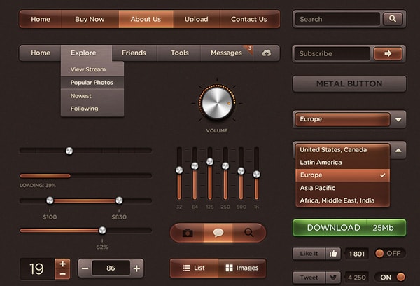
Dark Amber UI: A user interface kit is another great way to get started. With the kit you get a set of components that include a pre-designed color scheme.Dark Amber UI is a great dark set that uses brown tones. The pack includes an expansive set of components for web and mobile design and is the perfect kit to develop a framework for any site. The added benefit of a kit is that you save time because the color scheme and basic user interface elements are prepackaged and ready to go right “out of the box.”
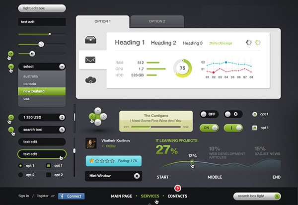
Futurico UI: This user interface kit embodies the ideal dark, monotone color scheme. Futurico UI is created with black and uses elements with pops of color to really grab the user’s attention. Like Dark Amber UI, this kit is professionally designed and is a great (and easy) way to get a project moving quickly. The colors are sharp and appealing and work in a variety of applications. Plus this kit offers two different accent color sets – green or blue – making it even more versatile.
Check this out: Futurico UI Free – User Interface Elements Pack


![The Short History of Web Design [Infographic]](https://designmodo.com/wp-content/uploads/2018/11/The-History-of-Website-Building-404x263.png)