How to Use Pastel Colors in Web Design Projects
The use of pastel colors in web design is more than a recent trend, it is a technique designers have used for years to create impactful visuals.
When you hear “pastel”, pale pinks, blues and yellows might come to mind, but there is so much more to this type of color palette. Pastels don’t have to have the newborn baby feel to them. These hues can be quite bold when paired with other elements in the proper way.
Here we will look at 10 ways to use pastel colors in web design, based on sites that are doing it well.
Pastel Photography
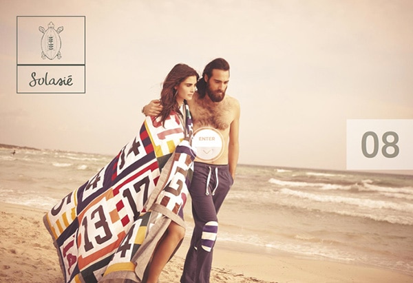
Pastel overlays on photos or photos taken in the right lighting conditions can create a subtle and great canvas for a website. With more muted tones in a photograph, the designer has more available area for placement of other elements.
Using pastel photography can also help create contrast with other elements, such as a logo or buttons. Also note how beautifully the Solasie logo fits into the pastel-toned photo. This same concept would make a great ghost button as well.
With Postcards Email Builder you can create and edit email templates online without any coding skills! Includes more than 100 components to help you create custom emails templates faster than ever before.
Free Email BuilderFree Email TemplatesPastel Backgrounds
A pastel background can be a great way to use a lot of color without overwhelming users. Because of the more subdued tone of pastels, they can be used to cover more of the canvas without feeling too strong.
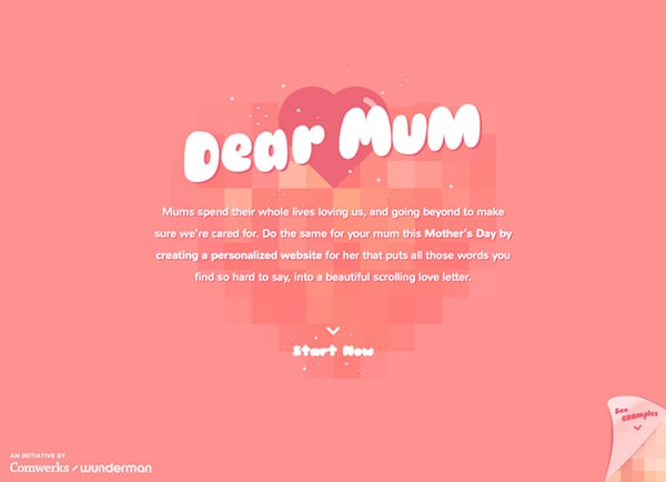
A common trend when working with pastel backgrounds is to use variations of a single hue for a monochromatic color scheme such as Dear Mum. The single color creates a strong visual and contrasts beautifully with white text elements. Paired with just the right typography, this technique also creates a modern mood with a hipster feel.
Bold Pastels
While you don’t often think of “bold” and “pastel” in the same sentence, this type of color palette can help you create bold designs. Because pastels tend to fall back, they are a great choice if you want to do something around them.
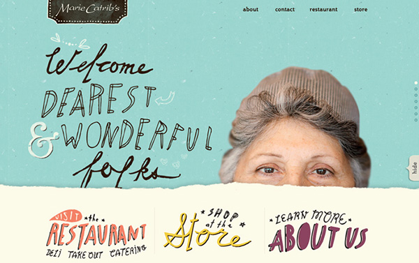
Marie Catrib’s does a great job of this. The pastel hues are pretty bold but still seem to get out of the way so you can see the woman peeking out of the layers of color. The boldness of the pastels helps you see and focus on the image, a totally muted backdrop would create less impact.
Pastels for Mood
How do you want visitors to feel on your website? Pastels are great to create a sense of calmness, relaxation or ease. If those emotions are words that describe your site or business, a pastel color palette might be the right option.
With Startup App and Slides App you can build unlimited websites using the online website editor which includes ready-made designed and coded elements, templates and themes.
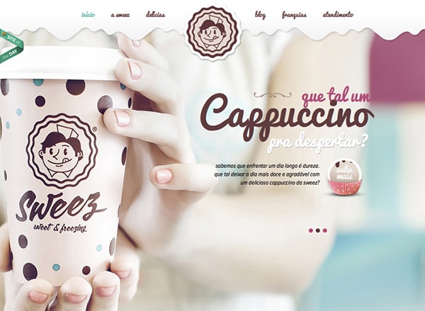
Try Startup App Try Slides AppOther ProductsSweez does a great job of creating this emotional connection with color. Everything about the image is in a muted, pastel hue. And it makes you think about sitting in a quiet, calm place and enjoying a nice, warm cappuccino. See how effective the simple color is?
Pastels in Illustrations
Pastel colors make a great choice for illustrations as well. Use this color concept to create something that makes users look.
A pastel illustration pulls together both the idea of what was drawn with a certain calmness from color. Pastel illustrations allow the use of drawings where you might not expect them.
Contrast with Pastels
Pastel colors do not have to be used in a vacuum. Pastel colors are a great tool for creating contrast with other design elements.
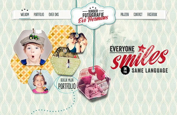
Kinder Fotografie does an excellent job of using pastels and bright photos and text. There are a lot of small details in the pastel portions of the design, but what you see first are the images of children and the word “smiles.” Then users start to notice some of the fine detailing.
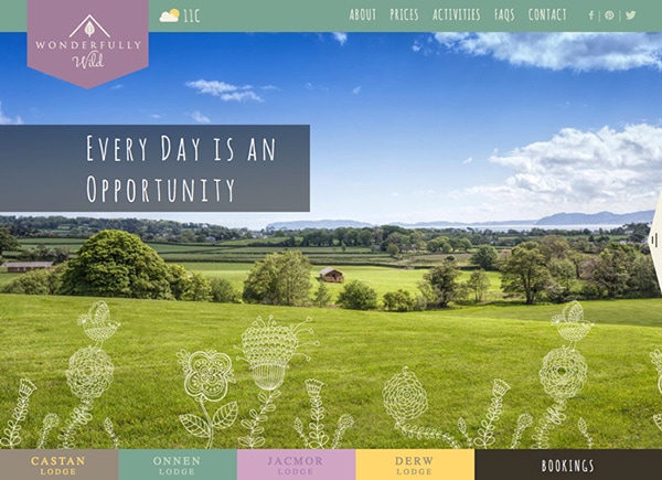
Pastels can also help make great navigation tools. Commonly, designers will frame websites with black or white borders or bars for navigation but color can work in this space as well.
The reason pastels can work as navigational tools is because they get out of the way of other parts of the design. In Wonderfully Wild, for example, the photo is what users will look at first and react to. The navigation elements blend well with the main content area, but don’t get in the way of the primary visual thanks to color choice.
Pastels in Flat Design
Much of what we are seeing with today’s pastel color trend was born out of flat design. Many of the bright pastels designers favor are scaled back versions of some of the super-bright hues that were popular at the start of flat design’s emergence.
What’s nice about using pastels in flat design projects is that the colors still have the same feel and overall look, but don’t quite scream at the user for attention in the same way. A pastel and flat color outline makes it a little easier to use color to direct users to certain parts of the screen or highlight important text elements.
Pastel Typography
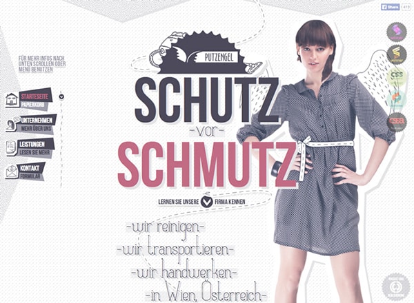
Designers are not limited to using pastels for images or backgrounds alone. This color style can also be applied to typography. (Although it can be tricky.)
Pastels are best use with large, bold typography against a more stark background to create plenty of contrast. By using a typeface with thick stokes at a larger size, you ensure that the more muted color will show on the screen. This concept should be reserved for a small grouping of letters or words and should not be used for body copy.
Pastels for User Interface Elements
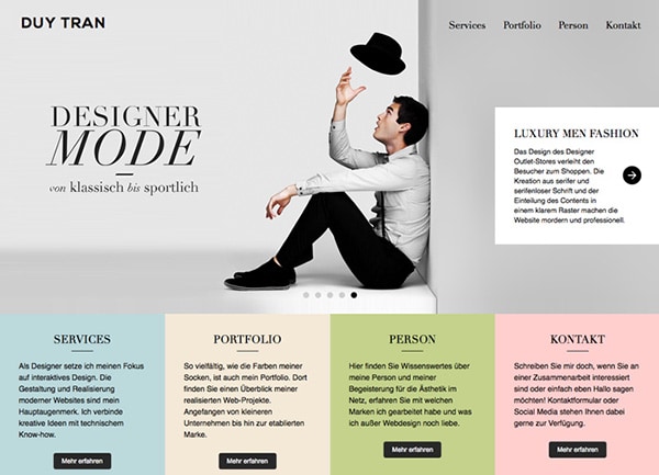
Using pastels as part of the scheme for user interface elements is a fun concept. Another “trick” born out of flat design concepts, buttons and other elements can use pastel colors.
In Duy Tran’s site, every pastel box is actually an oversized button. The pastel colors tell users which box is which and makes each easy to click (or tap). The hues also stand out because the contrast greatly with the more minimal main image area. (Every image in the slider stands apart from the pastel buttons.)
Conclusion
The key to using pastel colors in a color palette is to create something that looks fresh, and not washed out. By pairing pastels with deeper saturations that you might expect and bright images or white contrasting elements, you can help create a muted color palette with impact.
Pastel colors, by nature, have a relaxing and calming idea surrounding them. Use that to your advantage when creating website designs with this type of color scheme. Remember to keep in mind how the colors will interact with other parts of the overall design.


