Winners and Trends from the Apple Design Awards 2017
Apple recently released it’s winners of the 2017 Design Awards. The annual event showcases some of the most outstanding design and innovation in the digital space.
The awards are in their 20th year and “recognize excellence in design, innovation and technology in apps and games across iPhone, iPad, Mac, Apple Watch and Apple TV.” The 2017 slate of represent eight countries — Austria, Canada, Germany, Israel, Italy, Singapore, Slovenia and the United States.
Many of the winning designs can be a precursor of trends and feature a few apps you might know as well as some others that are new.
Here’s a look at our favorite projects from the 12 winners (you can find full biographies from Apple) and what you can learn and apply to your design projects from some of the best design in the world.
Blackbox
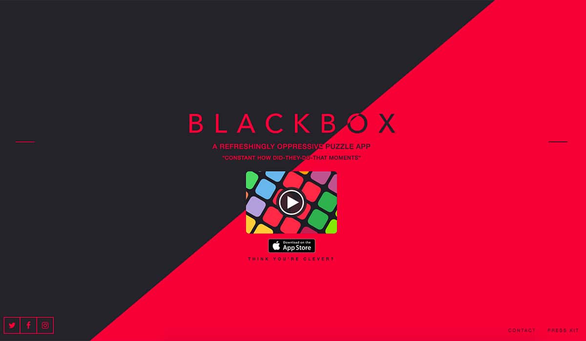
Word of caution before you download Blackbox: It is a rather addictive game. The beautifully designed interface is full of color, streamlined typography and seamless interactions.
With Postcards Email Builder you can create and edit email templates online without any coding skills! Includes more than 100 components to help you create custom emails templates faster than ever before.
Free Email BuilderFree Email TemplatesWhy it won: “Exclusive to iPhone, and with more than 77,000 5-star ratings, Blackbox is a refreshingly stimulating, engrossing, and clever puzzle game that breaks through the “fourth wall” of iPhone to take you beyond the screen and make your world a part of each solution. Designed and developed by one person, Blackbox was chosen as an Apple Design Award winner for being fully accessible, and offering unique and ingenious gameplay, deep iOS integration and clever innovations.”
Design trend: Here’s the takeaway for designers thinking about game and app design: Blackbox uses an interface that doesn’t require touch. The game works by having users move their device, activate elements with voice cues and think about merging the digital and physical worlds.
Lake
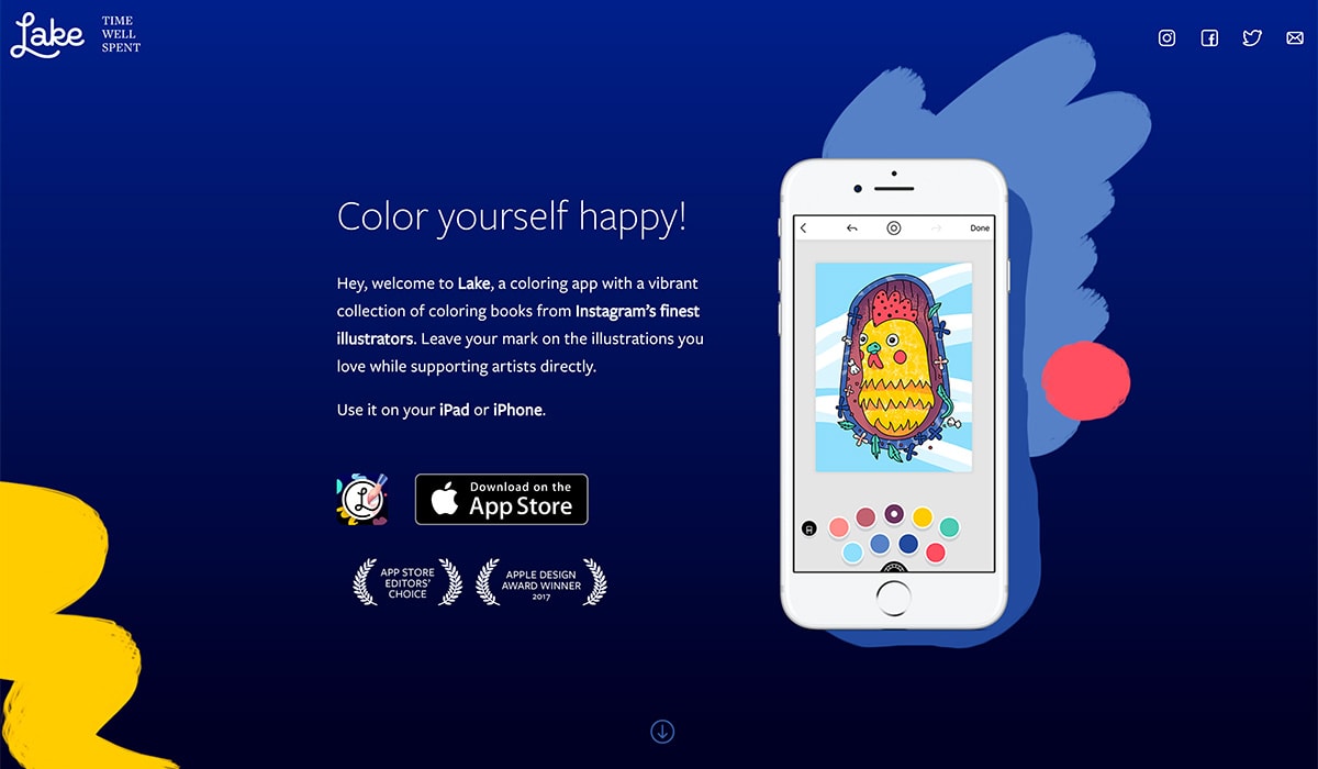
Not only is Lake a beautiful app, it can help you de-stress as well. The touch and haptic integrations are so seamless, the user doesn’t even think about how to use the app. It looks and feels so much like a real coloring book, but you never have to worry about forgetting pencils or markers since the app is just a couple taps away on an Apple device.
Why it won: “It offers high quality curated illustrations from local and renowned artists that bring them together with their fans and ensures a rewarding and relaxing coloring book experience for all ages. Lake’s deep system integration is also impressive. Written in Swift, Lake is optimized for Apple Pencil and takes full advantage of powerful iOS and macOS technologies such as Dynamic Type, 3D Touch, Quick actions, On-Demand Resources, CloudKit Sync, Handoff, Haptic Feedback, QuickLook and Spotlight search.”
Design trend: Designing with touch is an integral part of the mobile user experience. And it is gaining popularity on other devices as well – even more laptops and desktops are using touch-based screen interactions. Lake does this so well. The coloring “pencils” respond to pressure as you draw on the screen, the colored areas look and feel like using actual pencils for brushes with thick and thin lines and edges.
Then Lake adds an extra component to the usability of the design by letting users save their artwork in a gallery. Visual cues, sleek animations and microcopy throughout the app help guide the user experience. It’s a great showcase into what a simple interface can do to help show users how to use an app and make the most of its functionality.
Bear
With Startup App and Slides App you can build unlimited websites using the online website editor which includes ready-made designed and coded elements, templates and themes.
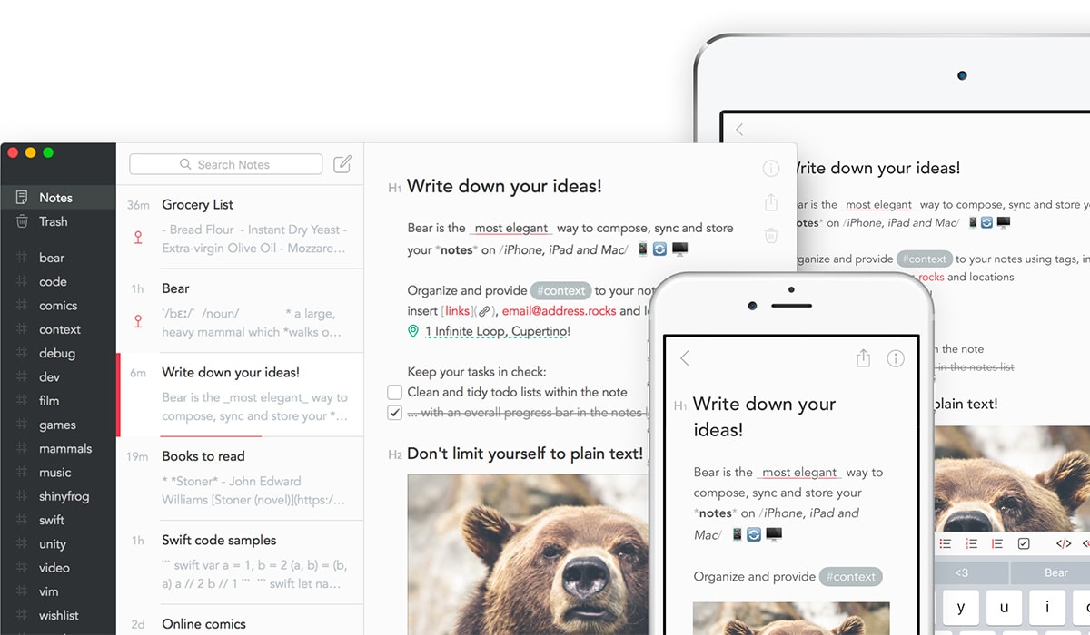
Try Startup App Try Slides AppOther ProductsBear is a minimal-style writing app that is for making notes or even crafting more longform writing. Users can link notes to each other to build a body of work and use hashtags to organize for the way you think. All notes are stored in portable plain text>.
Why it won: “With a simple and clean design, beautiful typography, and a consistently fast experience on any device, Bear helps writers focus on their content and produce great looking results whenever and wherever inspiration strikes.”
Design trend: Design does not have to be complicated or overly “designed” to work well. This app is so simple in look, but big in functionality. The light background with dark text is ideal for writing. The sidebar uses a reverse color scheme for contrast. The visual composition of the app is organized and a great example of how to stack and layer content.
Kitchen Stories

Kitchen Stories is more than just a recipe app, it is a cooking experience. The app is packed with recipes and video to help anyone figure out how to prepare almost any meal in the database. Some of the best features include the ability to watch video on a large screen (such as Apple TV) and recipe shopping lists that are generated from the app to make meal prep a breeze.
Why it won: “Founded by two young women and developed with the goal of enabling anyone to cook a delicious meal, Kitchen Stories is a simple and beautiful cooking app, available in 12 languages, for iPhone, iPad, Apple Watch, and Apple TV. Kitchen Stories includes a rich variety of recipes, dazzling photos, helpful videos, handy tips, and informative articles, all focused on inspiration, convenience and execution.”
Design trend: Kitchen Stories is a full multi-media experience for users with video, text, notifications, lists and more. The design takeaway is that users want to have more immersive interactions with apps; you have to design elements that encourage engagement. Just popping a video on the screen isn’t enough to keep today’s user base interested for extended periods of time.
Things 3
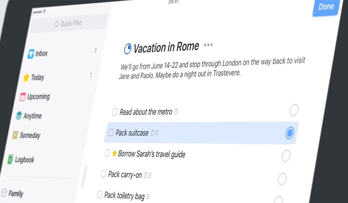
Things 3 will make you want to add things to your to-do list just so you can check them off. The app does a lot of things that other lists don’t, including the ability to move a shape lists in a bunch of ways across devices.
Why it won: “This app is the quintessential personal task manager, exclusive to iPhone, iPad, Apple Watch, and Mac. A joy to use and beautiful to look at, Things 3 has been completely re-imagined to improve efficiency. Its thoughtful design and powerful features help you get organized and make the most out of every day.”
Design trend: The differentiating factor for Things 3 is usability. The app acts like you would expect. Every tap and microinteraction has purpose. There’s not a lot of “junk” in the design. The aesthetic is also extremely clean, so that the actions and interactions are the focus of the interface. The key to app design in this manner is usability that users don’t have to think about, and that’s just what Things 3 does.
Elk
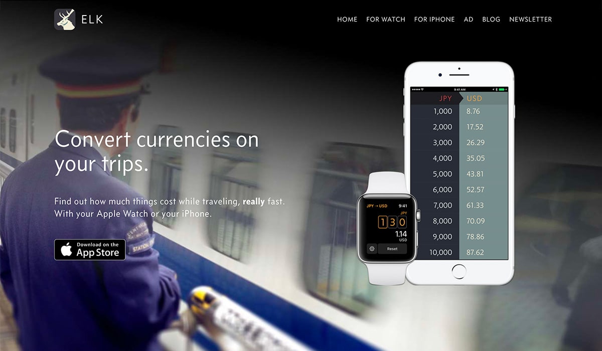
Elk is a simple tool that makes life easier for world travelers. The app converts currency using real time, geolocation data and time zones. Plus, the app works on multiple devices, including the Apple Watch. The design is simple and sleek with nice typography and font sizing that makes every conversion easy to see at a glance.
Why it won: “An innovative currency conversion app, Elk is perfectly suited for Apple Watch and enables quickly converting between 150+ currencies worldwide. Elk provides a thoughtfully designed and efficient experience on watchOS that makes currency conversion fast, easy and convenient.”
Design trend: Complicated tasks don’t have to look or feel complicated. They should be easy for users. That’s what Elk does. It streamlines something that could be hard for users to figure out into a simple interface. The use of geolocation and time zones is something that all app developers and designers should consider when working with projects that have any element of time or space distance. These are features that are becoming more important to users all the time and contribute to ease of use.
Conclusion
The other app winners were equally impressive, and you should go look at the projects. Even better, make a point to download the apps and play around with them. You are sure to be inspired.
Do you see other trends emerging from some of these design winners? We’d love to know what you think in the comments.
