Designing for Apple Watch: Getting Started
The highly anticipated Apple Watch will hit stores later this month with thousands of watch apps competing for your attention. With a smaller screen size, always on the wrist and different ways to interact, creating a beautiful, delightful experience on the Apple Watch will require new design approaches. This primer will help get you started.
In this article you will start to learn how to design an application for the Apple Watch with basic theory and principles to get started in design for wearables.
App Structure
There are three parts to an Apple Watch app: the WatchKit App, a Glance screen, and Notifications. Each has different purposes and their own design challenges.
WatchKit App
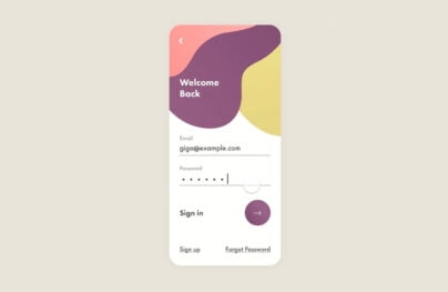
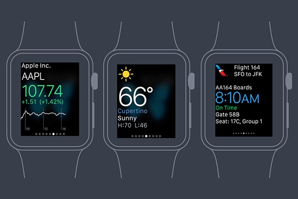
The WatchKit App is the main way of viewing and interacting with app data. This is typically opened from the watch home screen but can also be accessed through a Glance or Notification.
It’s important to understand that there are only two types of navigation for the WatchKit App — hierarchical and page-based. Whereas custom navigation can be programmed for iOS apps, WatchKit Apps are very limited and don’t support customization as of yet.
With Postcards Email Builder you can create and edit email templates online without any coding skills! Includes more than 100 components to help you create custom emails templates faster than ever before.
Free Email BuilderFree Email Templates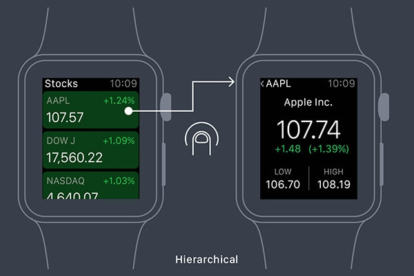
A hierarchical style is best suited for more complex apps and resembles a lot of existing iPhone apps with the user having to make a series of choices until reaching the final screen. Keep in mind that Apple expects people to use their watch in 10-second bursts so don’t design your watch app to be a replacement of your existing app but rather compliment it.
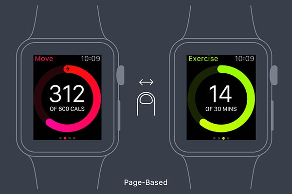
A page-based interface lets the user navigate between pages by swiping horizontally. This navigation is best if the data between pages isn’t tied to data on other pages.
When starting your design, figure out what data is most important to the user, how they relate and then the navigation structure that best compliments accessing that data.
Glance
Glances are a browse-able collection of timely and contextually relevant moments from the wearer’s favorite apps. Glances are accessed by swiping up on the Apple Watch and then can be swiped through horizontally. A glance is optional so not all apps will have or even need one.
A glance is limited to one non-scrollable screen so you’ll want to only put the most useful, essential information on your screen and use color, different font sizes and imagery to visually distinguish your glance. Tapping anywhere on your glance will open your watch app so avoid including controllers like buttons, sliders, and menus.
With Pulsetic you’ll be instantly notified the moment your website, API, or server becomes unavailable. Monitor uptime from multiple global locations and respond to incidents before your users are affected.
Create beautiful status pages in minutes to keep customers informed during outages and build trust with transparent communication.
Start Monitoring for Free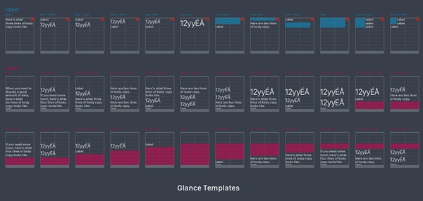
Finally, glances are based off templates, so your design should fit into the one that makes the most sense for your data. Apple provides a variety of templates for both the upper and lower part of the screen.
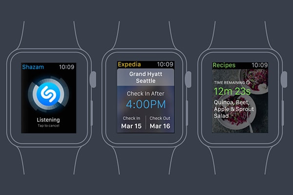
Notifications
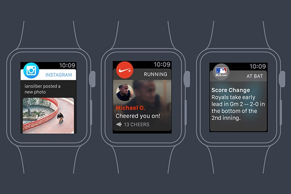
Apple Watch apps have two stages of notifications called short-look and long-look interfaces. When a user first receives a notification, the short-look notification appears and it’s visible for a brief time. The user can lower their wrist for the notification to dismiss or they can see more detailed information and functionality through the long-look notification by raising their wrist or tapping on the short-look notification.
Since the watch is always being worn, you’ll want to limit notifications to only what’s most useful. It would be quite annoying if you were constantly being interrupted with something unimportant. The best notifications use the context of the user — for example location, time, or activity — to provide a timely, relevant piece of information.
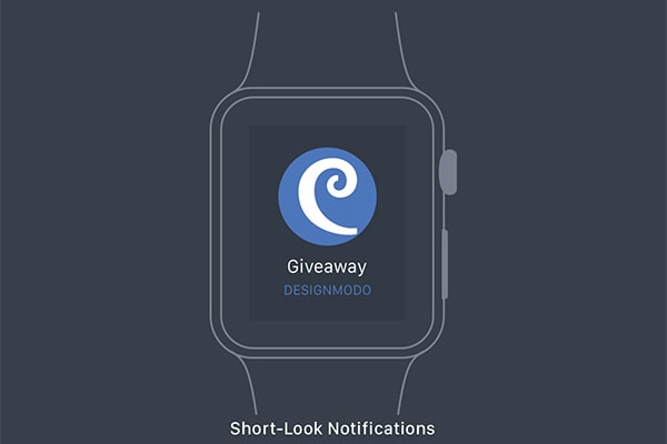
The short-look interface contains the app icon, app name, and title from the notification. Since the title is the only thing you have control over, it should provide a brief hint as to the contents of the notification.
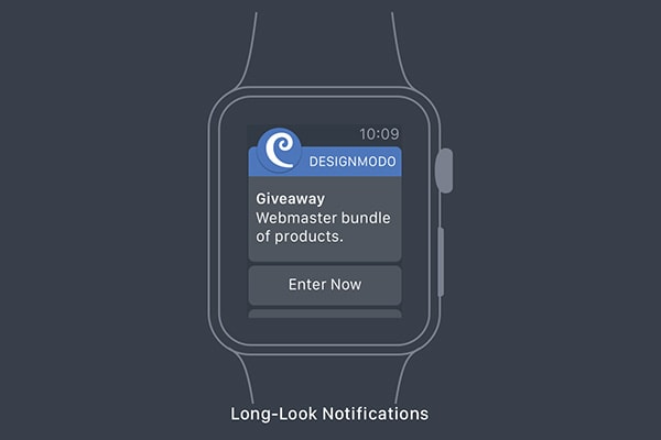
The structure of the long-look interface is the same for all apps. The top displays the app icon and name (you also can specify the bar color) and the bottom is a dismiss button. In between is your custom content and up to four custom action buttons.
Ways to Interact
Besides the familiar tapping and swipe gestures we use every day on our phones, the Apple Watch provides two new methods to interact: the Digital Crown and Force Touch.
Digital Crown
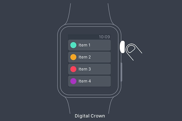
Apps use the crown to scroll without obstructing the display, as you would when swiping with your finger. The crown is especially good for scrolling through longer pages.
Force Touch
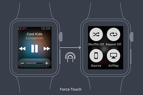
The Apple Watch display is able to distinguish between a tap and a press. Similar to a right-click on the mouse, pressing down can display a context menu of up to four items relevant to the current screen.
Multi-touch gestures like pinch to zoom are not available on the watch.
Layout
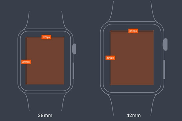
The Apple Watch comes in two sizes — 38mm and 42mm. The smaller screen is 340 pixels by 272 pixels and the larger one is 390 x 312. The watch features a retina display and just like for the iPhone, you’ll need to provide images at double the resolution.
You won’t need to provide different sized images (although you can) or design two different layouts as Apple uses relative sizing and spacing options so images and objects resize to fill the available space.
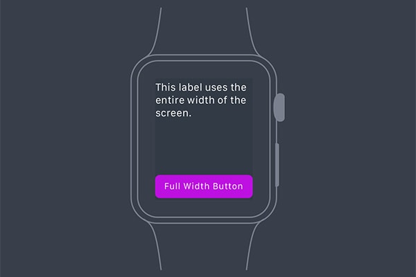
When designing your app, Apple recommends a black background to match the bezel. The dark background also works better in light compared to bright colors. Because the bezel adds visual padding, it’s important to maximize the available space and design for the full width of the screen.
For buttons, Apple also recommends full-width buttons but if you do have side by side buttons, use icons instead of text. Having three or more buttons in one row is not advised because of the small screen size. Buttons on the same screen should be the same height for visual consistency.
Color
Because you’re designing against a dark background, you’ll want to use bright, high contrast colors for your app. Color can also be used as part of the branding of your app.
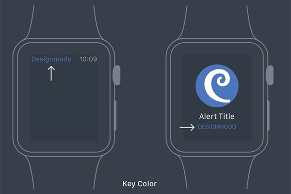
Each app will also have a “key color” you define, which shows up in the title string in the status bar and the app name in notifications. You can also customize the bar color in the long-look notification.
Animation
Beautiful, subtle animation can enhance the user experience and make apps more engaging, dynamic, and memorable. When designing animation on a watch, you’ll want to make sure it’s fast and has a purpose. If your animation is slowing the user down from getting the information they want, it could hurt the experience.
When creating animations on the Apple Watch, you can’t just give your developer a GIF and tell him to dynamically create it. You’ll need to provide separate static images of each frame to create canned animations that appear quicker and smoother. The best way to do this is to import your animation file into After Effects or Photoshop and extract individual frames.
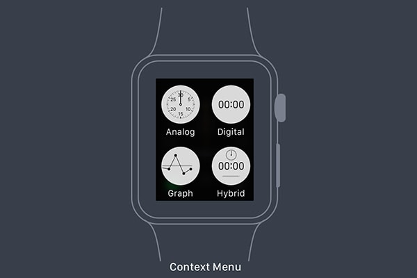
The context menu can display up to four actions and displays as a circular image with a label. The menu is dismissed after tapping an action item or anywhere else on the screen. When designing context menu items, you don’t need to worry about color. Similar to the tab icons in an iOS app, context menu icons are template images and the color only defines the icon shape.
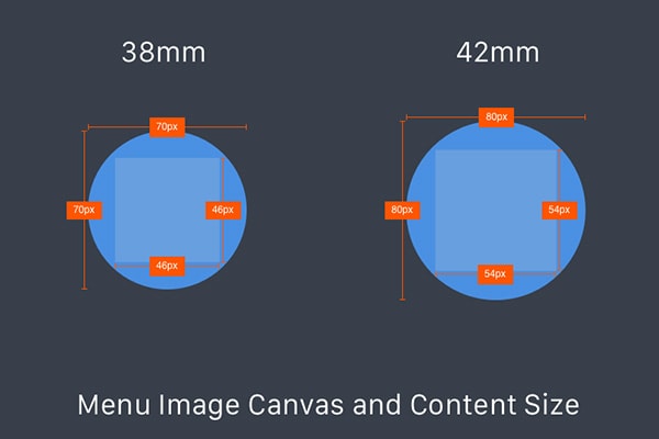
In the case of context menu icons, you’ll need to provide two image sizes for each icon. The line weight should generally be 1 pixel more on the 42mm watch than the 38mm version.
Typography
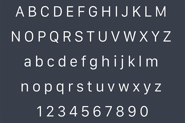
Apple developed a sans-serif typeface, named San Francisco, specific for legibility on the Apple Watch, that comes in 23 variations. While you can use a custom font for your app, Apple recommends using built-in text styles since they were designed for the small screen.
Another benefit for using the default Apple system font is the text will automatically resize if the label is too long. As the font size increases, font tracking decreases. If you decide to specify a font size, the San Francisco Text font is recommended for text that is 19 points or smaller and the San Francisco Display font should be used for text that is 20 points or larger.
App Icon
Just like iOS app home screen icons, the Apple Watch will need an app icon as well. Unlike an iPhone, which shows the icon and app name and is in a square shape, Apple Watch app icons are round and not include labels. This makes it imperative that your icon is recognizable and familiar to your iOS app icon while still conveying what it does.
When designing an app icon for such a small screen size, aim for simplicity first. In the sea of other app icons competing for your attention, the app icon is the first thing the user sees before launching your app so you’ll want to make a good first impression with a beautifully designed icon.
Create your app icon in different sizes to support both watch sizes and the various screens the icon could appear. The system will automatically put a circular mask on your icon so create your icons as a square image using the guides provided by Apple.
You can download this handy Apple Watch icon template to generate icons.
Beyond the Basics
The Apple Watch provides users with an unobtrusive way to get data that is important to them. By understanding the structure of an app, ways to interact, and best design principles, we can create more beautiful, delightful experiences on the Apple Watch.
To learn more and get started, check out the Apple Watch Human Interface Guidelines and download the Apple Watch Design Resources for a set of bezels, guides, templates, and fonts.
For more details, tips and resources on designing delightful wearable experiences, check out Design for Wearables, a free course that goes step-by-step through the design of an Apple Watch app.