Peculiar Balance Asymmetrical Website Designs
Developing website designs with a lopsided feel is a rather common approach nowadays. Majority of designers resorts to off-center landing pages in order to initially concentrate users’ attention on the most important things, recreating strong visual paths.
An inability to draw a line of symmetry helps to naturally separate navigation or sidebar from the rest of the content, providing more room for informative part. Asymmetrical tension helps to convey various feelings and sense of motion. Although asymmetry is associated with a dissonance such website designs don’t yield to others in the balance, since, lack of two identical halves or mirror effect usually brings more benefits then disadvantages, opening up a number of possibilities.
In a collection below we have listed demonstrative examples of website designs that ably eschew leveraging a full equality between the 2 website halves.
Asymmetrical Website Design Examples
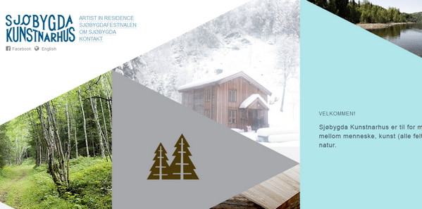
Sjobygda. Designer skillfully makes use of background to create an asymmetrical design. Here the background acts as a functional part of a site, providing users with a spectacular visual content that is perfectly paired with a logo.
The Enterprise Foundation also leverages jagged lines and uneven shapes represented in a garish solid coloring to achieve an asymmetrical feeling. Thanks to complementary color palette and rather clean surface design looks well balanced and neat.
With Postcards Email Builder you can create and edit email templates online without any coding skills! Includes more than 100 components to help you create custom emails templates faster than ever before.
Free Email BuilderFree Email Templates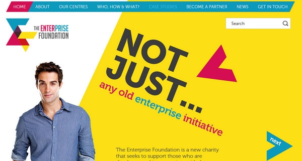
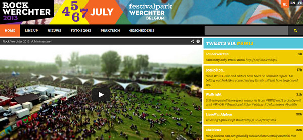
Rock Werchter ably embraces the prevalent idea where website is based on a traditional column layout, setting different widths for each column. In this case, designer has divided page not only into columns but also into several lines, each of which includes various functional blocks.
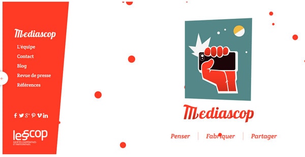
Mediascop looks clean and neat. Designer adopts minimal approach, pleasantly improves website design by adding flat style aesthetics, and ably provides a sharp contrast. The wry sidebar with a small navigation well matches with a main content area.
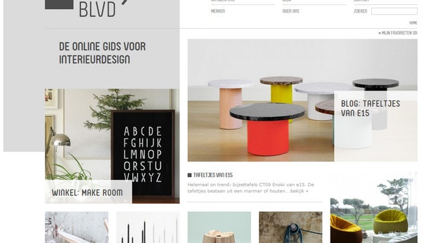
DesignBlvd includes a lovely content-heavy front page that harmoniously demonstrates both contextual and visual data. Its layout looks asymmetrical and surprisingly well balanced, even despite the obvious difference of sizes between post thumbnails. A light color scheme along with soft subdued images establishes a restrained, businesslike atmosphere.
Artegence gets the feel of an off-center design mainly from its grid-based layout. Designer wisely employs simple rectangular shaped blocks in order to avoid sense of confusion and chaos that inherent to information overloaded websites.
With Pulsetic you’ll be instantly notified the moment your website, API, or server becomes unavailable. Monitor uptime from multiple global locations and respond to incidents before your users are affected.
Create beautiful status pages in minutes to keep customers informed during outages and build trust with transparent communication.
Start Monitoring for Free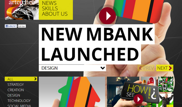
Timberline Tours features a unique offbeat image-based menu that neatly breaks the mold of picturesque main page. The navigation has a triangle form that perfectly fits into design, recreating quite balanced look even without symmetry, and in cooperation with dynamic background clearly sharpens a sense of motion.

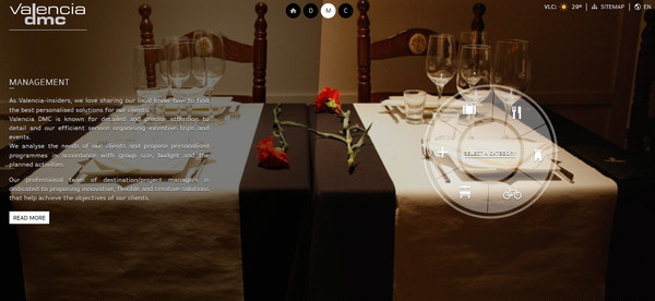
Valencia DMC capably exudes an image of luxury with its set of extravagant photos. Designer utilizes semitransparent content block that unevenly divides front page into 2 functional parts. Text wonderfully collaborates with an elegant circular navigation.
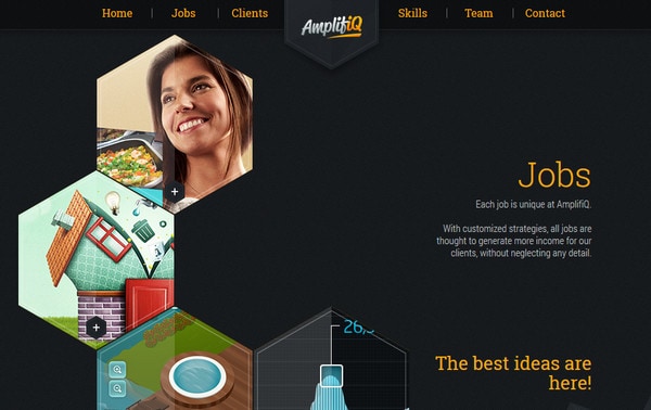
AmplifiQ has a strong geometric vibe that is achieved by means of dark low-poly background and honeycomb-like structure for image representation. Designer ably matches images and text in order to create a distinct eye track and off balance feel.
Sarasota Web Design immediately draws users’ attention to mind-blowing photo manipulation. The flat polygonal background separates layout into several parts. Designer uses graphical instruments in order to add to website an overall balance appeal with an absence of symmetry.
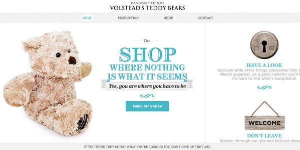
Senador Volstead harmoniously balances huge content section with a couple of small text widgets. Here, asymmetry is used to emphasize a focal point on the website slogan and call-to-action button.
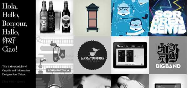
Jose Guizar. Designer employs conventional grid layout that affords efficient and well-arranged mockup. Separating page into odd amount of columns is the easiest and the quickest way to make website look asymmetrical, recreating a sense of compositional harmony.
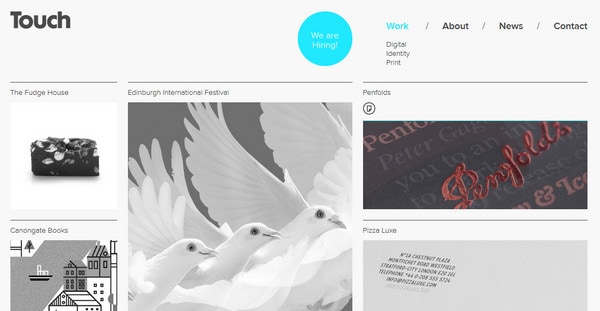
The Touch Agency is another great example of well-organized website. Despite of having a content-heavy front page, website manages to supply users with all necessary information in non-intrusive manner. Designer resorts to traditional 3-column format, where columns don’t have constant width, and, as a consequence, such modification gives the website a quite unbalancing appearance.
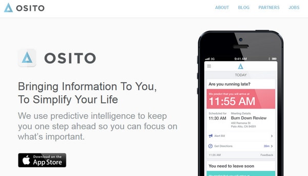
Osito has a polished and sleek landing page. Here, asymmetry is achieved by means of contrast between image and text, where the latter occupies most of the page, distinctly going over the middle of the screen. In this way designer makes people to notice a slogan at first.
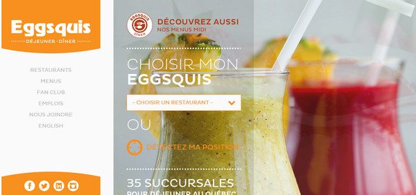
Eggsquis has a typically off-center home page that showcases data by means of 2 basic columns. First one – rather narrow and simply clean – stands for navigation, and second one, which occupies two-thirds of a screen, is reserved for a huge image slider.
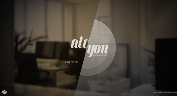
Alcyon Communication brings about an effect of asymmetrical design with a help of translucent layer that breaks main page into 2 equal but trapezoidal halves.
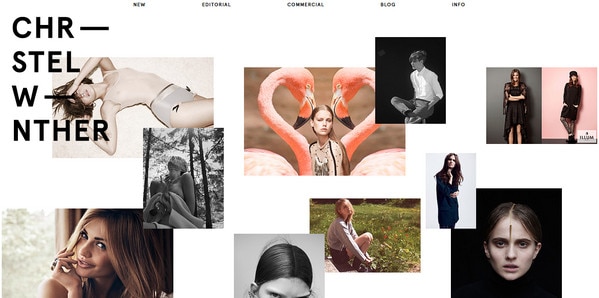
Stylist Christel Winther. This website is a good example of design without symmetry at all, but that looks attention-grabbing with rather tricky balance. An alternative approach of creating digital collage works well here, delivering a strong impression. Mix of various fashion photos naturally forces you to explore a page.
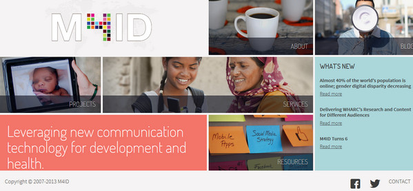
M4ID is a compactly-arranged portfolio website that has a neat tile vibe. Cells of various widths are used to establish a focal point on the most important things such as “Services Section” or bright box with a slogan.
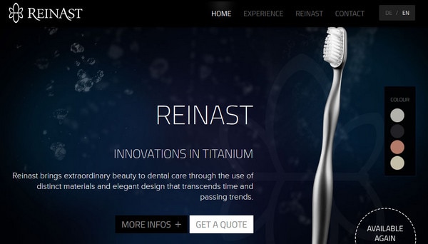
Reinast is another good example of a website where you can’t draw a line of symmetry. Although the home page can be easily divided into 2 parts, yet they won’t be the two congruent parts simply because of the difference of sizes and contents.
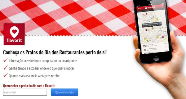
Flavorit uses a power of an asymmetrical tension that helps to separate text, and guides the users’ eye directly to advantages of an app.
Kinetik. A huge image on the left accurately destroys the symmetry of the front page, leaving a small space for logotype. Geometric pattern on a background in conjunction with a diagonal line enhances the overall effect.
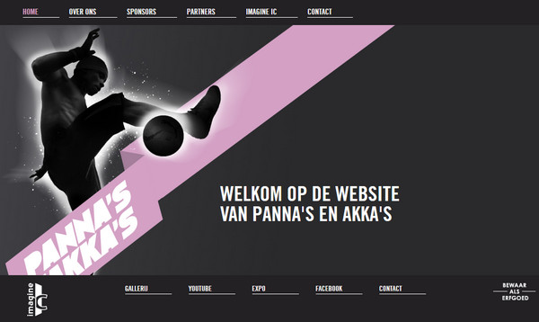
Panna’s en Akka’s. One of the main features of this website is a wide pink stripe that pleasantly breaks the symmetry of a design, both giving extra room for integral elements and playing a decorative role.
Reflection
There are different ways to create asymmetrical design. You can pair images with texts or blank space with text, set background against foreground elements or large element against densely packed items, use geometric patterns and decorations, divide layout into an odd number of columns and much more. The main point is to achieve a right balance, making a website look harmonious and consistent.


