Form and Function: Websites That Combine Beauty with Usability
One of the most essential aspects of designing a website is finding a balance between form and function, to ensure that the viewer can easily navigate through each page. We have all seen websites that work well but are poorly designed. Conversely, there are plenty of sites out there that look attractive but do not operate smoothly. Every so often, though, both of these elements can be found living together in harmony.
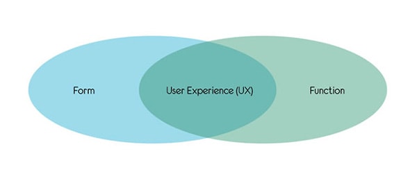
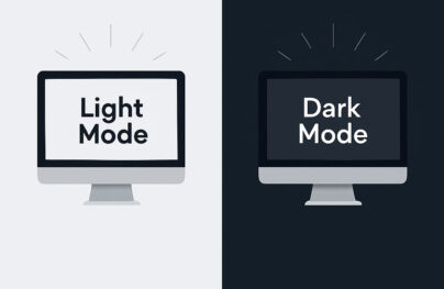
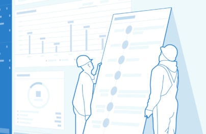
The overall visual appeal of a site in combination with its usability is known as “user experience” or “UX”. The graphic above helps us understand visually the relationship between these two crucial elements. Think of it as a mathematical equation; the key is finding symmetry between the two components so that one does not overwhelm the other. Today I am going to share a few of my favorite sites that exhibit equal parts beauty and usability, and I will delve into the reasons behind their success.
Beautiful Examples
Acko
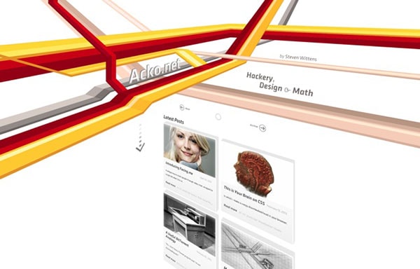
Steven Wittens, pushing the boundaries of commonplace web design, uses CSS3 3D transforms to make the initial view of his site a three-dimensional experience. The animated arrow encourages us to scroll down; when we do so, the view transitions back to the two dimensions to which we’re accustomed.
Ready-Made Designs
With Postcards Email Builder you can create and edit email templates online without any coding skills! Includes more than 100 components to help you create custom emails templates faster than ever before.
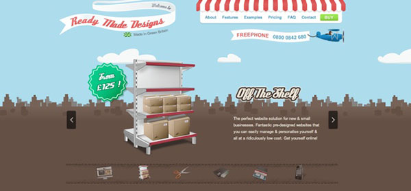
Free Email BuilderFree Email TemplatesReady Made Designs effectively uses illustration to communicate their mission of “off the shelf” websites. For navigation, the red and white stripes on the awning at the top grab your eye, helping you instantly orient yourself. The subtle movement of the clouds and skyline behind the main slider help to provide a sense of a three-dimensional experience. By using sky as the background for the header, a more fluid transition is achieved between header and body.
Sand & Starfish
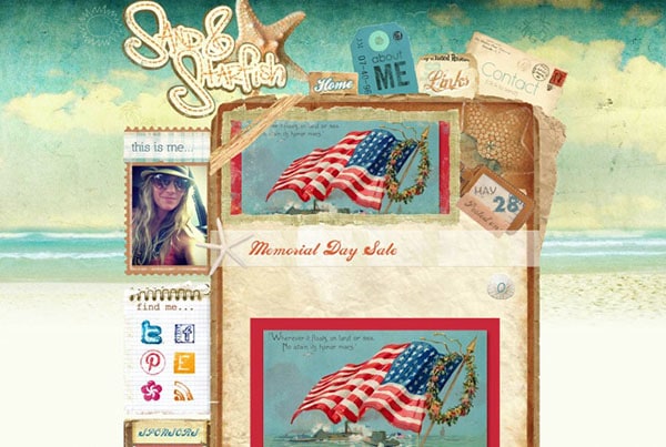
Lavish artwork on Sand & Starfish converts an otherwise-average blog into a noteworthy visual experience. The standard visual elements expected for a blog are present; but the unique presentation encourages us to stop, take notice and interact. An old envelope on the top-right provides a skeuomorphic cue for the contact form. The hand-drawn social media icons “sketched” on the notebook contrast the canned social media icons we’re used to seeing.
Michael Levin
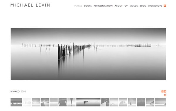
Photographer Michael Levin finds common objects and transforms them into compelling images. Interestingly, this same description could be applied to the design of his website. He uses a very plain, basic layout that complements his stunning body of work. Simplicity is key here, but the genius of the site lies in the details.
A photograph fades to bright orange on the landing page, giving the site a small dose of animation. Tiny pops of color juxtapose the primarily colorless content of the rest of the page, while an attention to typographical detail lends more interest to the layout.
FeedStitch
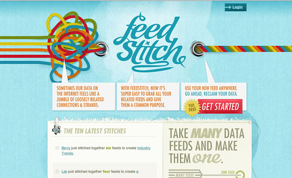
Next up is feedstitch.com, a service that merges multiple content sources into one manageable feed. The most impressive attribute here is the colorful rope graphic at the top of the page. Without reading a single word, you begin to form an idea in your mind about the site’s purpose.
With Pulsetic you’ll be instantly notified the moment your website, API, or server becomes unavailable. Monitor uptime from multiple global locations and respond to incidents before your users are affected.
Create beautiful status pages in minutes to keep customers informed during outages and build trust with transparent communication.
Start Monitoring for FreeThere are not many places to click, so once you have read about the service, you simply click on the “get started” button at the top of the page. The site’s reliance on visual elements gives the viewer a break from the usual verbal clutter that plagues much of the World Wide Web.
TH= SUM
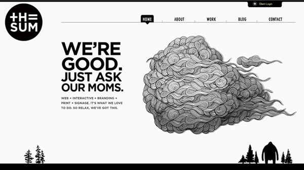
The Sum, a design studio in Vancouver, utilizes white space to its advantage throughout the composition of each section. There is a fine line between elegant and boring when creating a design that’s heavy on white space. But the addition of a few artistic images provides enough visual interest to satiate the viewer’s need for creativity. And when a page is selected in the navigation bar, an unusual shape highlights the page name.
The triangular form points the eye downward toward the content of the page. The movement of the logo on the left also adds excitement to the design.
4pinesbeer
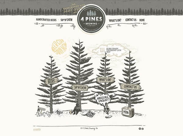
4 Pines Brewing Company uses illustration to impart a playful quality; the homepage is set up in such a way that the viewer is given the option to click on the more traditional navigation bar along the top of the page, or they can choose to use the illustration below.
This method makes the site appealing to different types of minds; those of us who are visual thinkers will most likely click on the picture, while those who are more logic-driven might click on the bar along the top. This deliberate design decision shows a distinct awareness of user experience.
Rocket Club
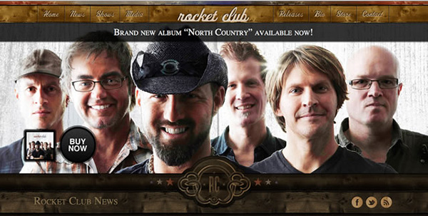
Lastly, Rocket Club employs an abrasive-looking but unexpectedly straightforward approach to their website that mirrors the sound of their music. Rocket Club uses center justification to their benefit; designers sometimes consider center justification to be a mundane practice, but because websites are often left-justified, it gives the site an air of originality.
The stationary nature of the navigation bar is another important design element. As the viewer scrolls down the page, the navigation bar remains motionless and always visible. This eliminates the need to scroll back up to move from page to page, and also creates a pleasing visual resting place.
Conclusion
As you can see, user experience depends upon many different criteria; but the most important characteristic of a successful website is always a clear balance between beauty and usability. An attractive site often displays a keen attention to detail and a strong sense of uniqueness. As you browse the Internet, see if you can pinpoint the reasons behind the success or failure of each site’s user experience. Hopefully, these observations will encourage you to view the Internet with a more discerning eye.
Have you found any websites that are easy to use and pleasing to the eye? Tell us about it in the comments section below.
