20 Most Rockin’ Behance Web Design & UI Case Studies
Behance: As designers we love it; it’s become entrenched in my daily online routine just as much, if not more than, Facebook, Twitter or Instagram. I’ve been a member since 2011 and recently gained over 1,000 appreciations, which meant more to me than follows/likes on any other network.
Individual pieces of work (case studies) have come a long way since the humble beginnings of Behance. No longer are a few individual browser shots and an introductory piece of copy acceptable if you want to get serious admiration from your fellow professionals. In the last few years we’ve seen some extraordinarily good case studies; where the case studies themselves can even be see as works of art in there own right.
I’ve listed my favorite 20 from my area of expertise — web design/UI design.
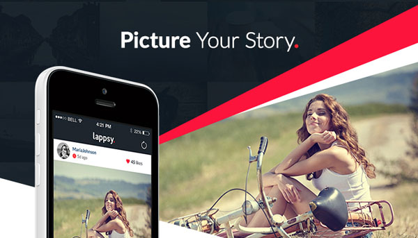
Lappsy by Arkadiusz Płatek is beautifully presented, multi-layered and colorful. Arkadiusz has used multiple layers and angles to create a UX case study with real depth.
With Postcards Email Builder you can create and edit email templates online without any coding skills! Includes more than 100 components to help you create custom emails templates faster than ever before.
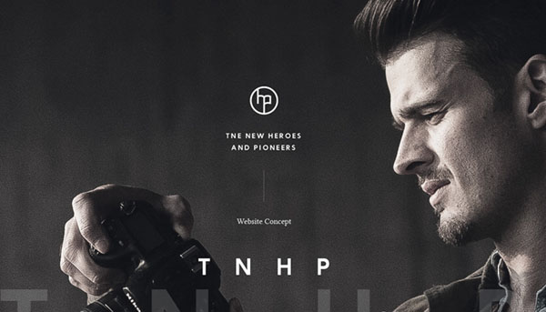
Free Email BuilderFree Email TemplatesThe New Heroes & Pioneers by Alexey Masalov is a lovely piece of imagery with a minimalist look and feel that enables this piece to stand out. Beautifully understated. All the work on Alexey’s portfolio is worth taking time to appreciate.
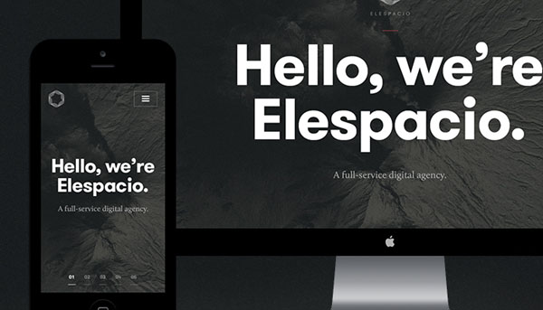
Elespacio by Filip Slováček is so nice that it’s hard to even describe how much I love this piece of work – everything about this presentation works well, from typography to photography treatment. A strong and consistent brand are hugely important for any digital agency website.
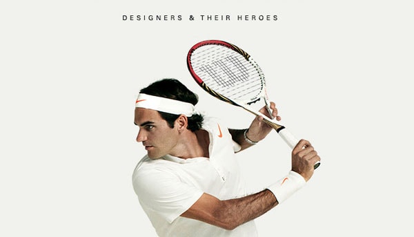
Influencers Designers their heroes by Nguyen Le includes stunning imagery, amazing photography and a gorgeous color palette. This has to be one of my favorite web design case studies in recent times. Nguyen only has the one piece of work on his portfolio – I’d love to see some more!
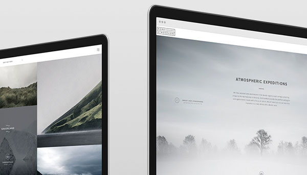
Noma Atmosphere by Jacob Mattesen Hansen & Ozair Nazir is moody, atmospheric and stylish. This piece of work lives up to its title. It almost captures the feeling of being in an art gallery as you scroll down the page.
With Pulsetic you’ll be instantly notified the moment your website, API, or server becomes unavailable. Monitor uptime from multiple global locations and respond to incidents before your users are affected.
Create beautiful status pages in minutes to keep customers informed during outages and build trust with transparent communication.
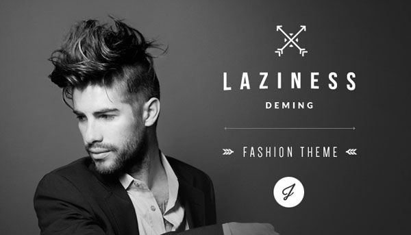
Start Monitoring for FreeLaziness PSD theme by Julián Pascual is simply stated while everything about this presentation has been beautifully crafted – the typography is especially pleasing and compliments the imagery very well.
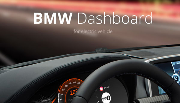
BMW Car Dashboard Design by Denys Nevozhai beautifully conveys the feeling of sitting behind the dash of a new luxury car. An absorbing presentation from start to finish.
Rucea Website-design-part-1 by Mike is an amazing presentation from a talented designer. It’s easy to see why Mike’s portfolio has so many followers and appreciations.
Sochi Gear Up For Gold by Erik Herrström & Rasmus Wangelin includes slick, strong imagery and excellent use of animation add real depth to an already stunning presentation.
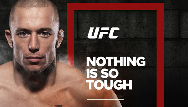
UFC New Visual Concept by João Paulo Teixeira features a confident, strong and outstanding design that reflects the subject matter and photography perfectly. A great cohesive presentation.
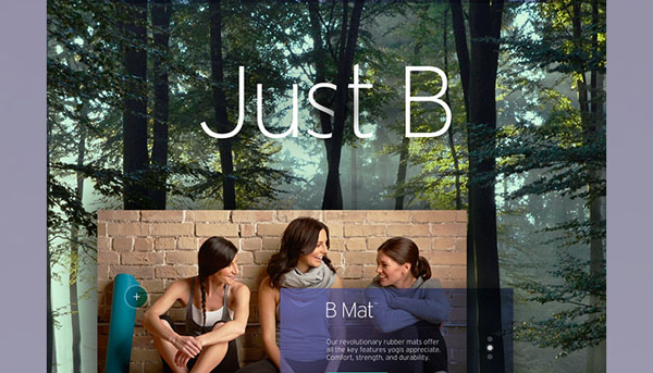
B Yoga Website by Agency Dominion is multi-layered, bold, different and gorgeous. Another example of amazing attention to delivering a presentation that does justice to the original design. The colors work together especially well.
Betit Mobile App Football by Karol Kos is dark, moody and slick. The concept and UI are detailed so clearly and sharply it makes me you want to download the app just to see a bit more.
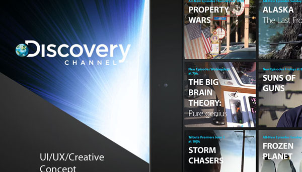
Discovery Channel Ipad by Serge Mistyukevych includes a clever use of browser and device shots layered over a de-focused dark background create a slick and sumptuous presentation.
Rosbri Decoration Studio by Vadim Sherbakov features an amazing pastel color palette and font selection to create a nice ambiance to this work. All of Vadim’s work in his portfolio page has a beautifully crafted look and feel.
Badoo concept by Jakub Antalík has a great boldness and simplicity to it, but it’s the animated sequences in the presentation that push this beyond being just good work.
Socialpuzzle Tool and Website Presentation by Degordian, Mario Šestak, Marko Cvijetić & Hrvoje Grubisic is simply an incredibly detailed and well thought out presentation; there isn’t much that isn’t covered – this truly raises the bar for what’s possible on Behance.
Spleat iPhone App by Dima Shvedun is clean, precise and elegant. This is one of the best uses of multi-angled device shots I’ve seen. All of Dima’s work is bold, clean and clear.
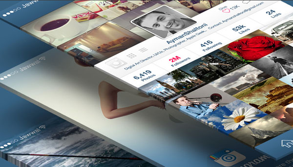
Instagram Redesign Concept by Ayman Shaltoni is great for fans of Instagram and I love what Ayman has done with the interface. It’s all about the images and this presentation highlights them beautifully.
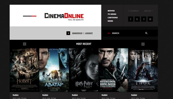
Cinema Online by Ruslan Aliev is a phenomenal example of applying the golden ratio grid to a design. The animated diagram highlighting the various parts of the structure lifts this into the “great” category.
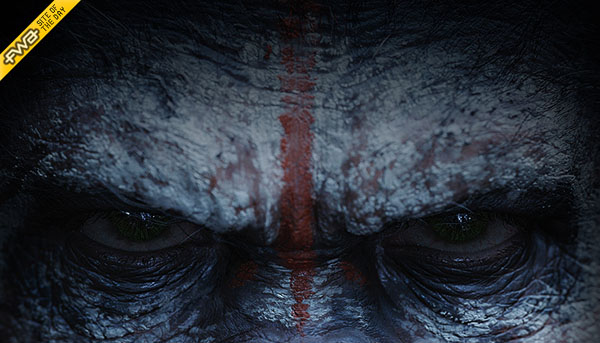
Dawn of the Planet of the Apes Website by Garth Sykes & Matt Weston could be an example of saving the best piece for last! This piece includes an unbelievable amount of detail, great imagery and clever use of animation make this an engrossing and engaging presentation. The case study itself takes a little time to load because of all the embedded animation, but it’s worth the wait.


