Loud and Magnetic: Big Typography Amplifies Messages
This year has been rich in web design and user experience trends. There have been animations of different kinds, experimentation with layouts, several delightful comebacks and extravagant mainstream concepts.
Maybe surprisingly, typography has been in the spotlight. How you present slogans, taglines and messages in the hero area have been of particular interest:
- Dynamic displays involving Three.js library
- Artistic displays with illustrations
- Static displays involving masking techniques
- Creative displays with manipulations of positioning, symmetry, orientation and more
Today we want to draw your attention to a trend that can’t be called brand new. Loud and magnetic – big typography is our topic of discussion.
Massive letters are used to amplify messages and enliven first impressions. The time-tested solutions in 2017-2018 are incredibly matured and elegant, and big typography is no exception. The key to its advancement lies in well thought out whitespace. Websites with the huge taglines are incredibly airy and spacious. Persia Studio is a typical example of that. Just take a look.
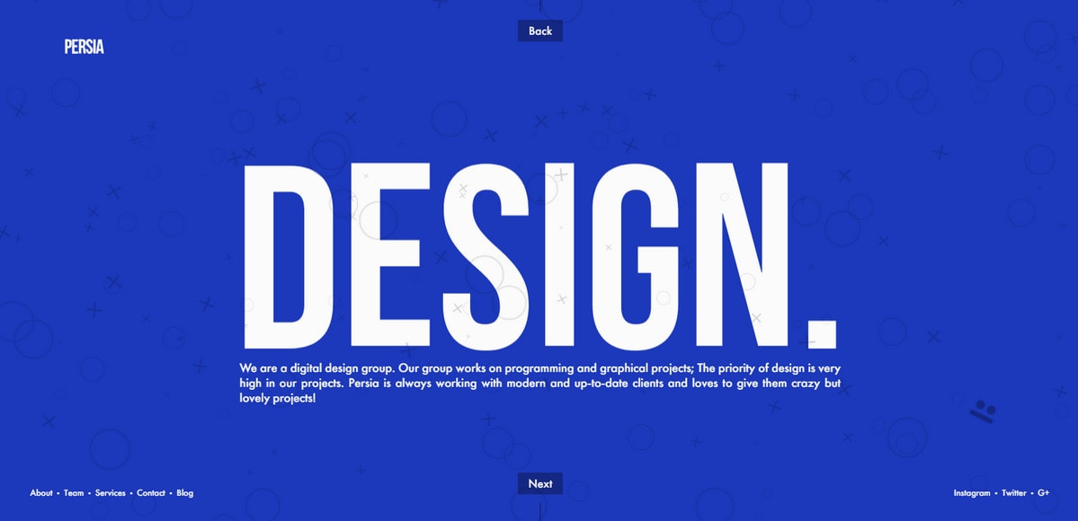
Thanks to tiny menu links, CTAs, and subheading, and a generous amount of space, the tagline feels enormous. The typeface is plain yet in this case that is exactly what the doctor ordered. “Design” is a keyword and we do not doubt that whatsoever.
Rainfall is a similar example. Although the background is not a pure solid blue canvas, the picture is so muffled and seamless that the slogan at the heart of the page catches the eye from the get-go. 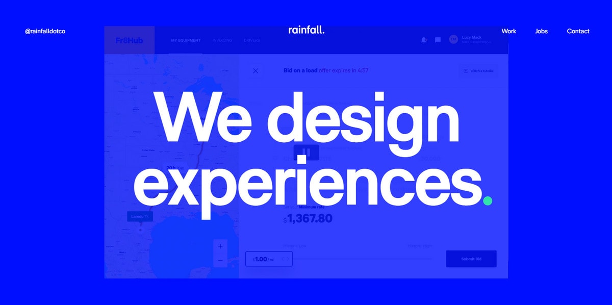
With Postcards Email Builder you can create and edit email templates online without any coding skills! Includes more than 100 components to help you create custom emails templates faster than ever before.
Free Email BuilderFree Email TemplatesOf course, not all web designs can stick to these principles; there are always those that require showing brand identity or placing focus on a button. Even in these cases, big typography is hard to beat. Consider Domov.
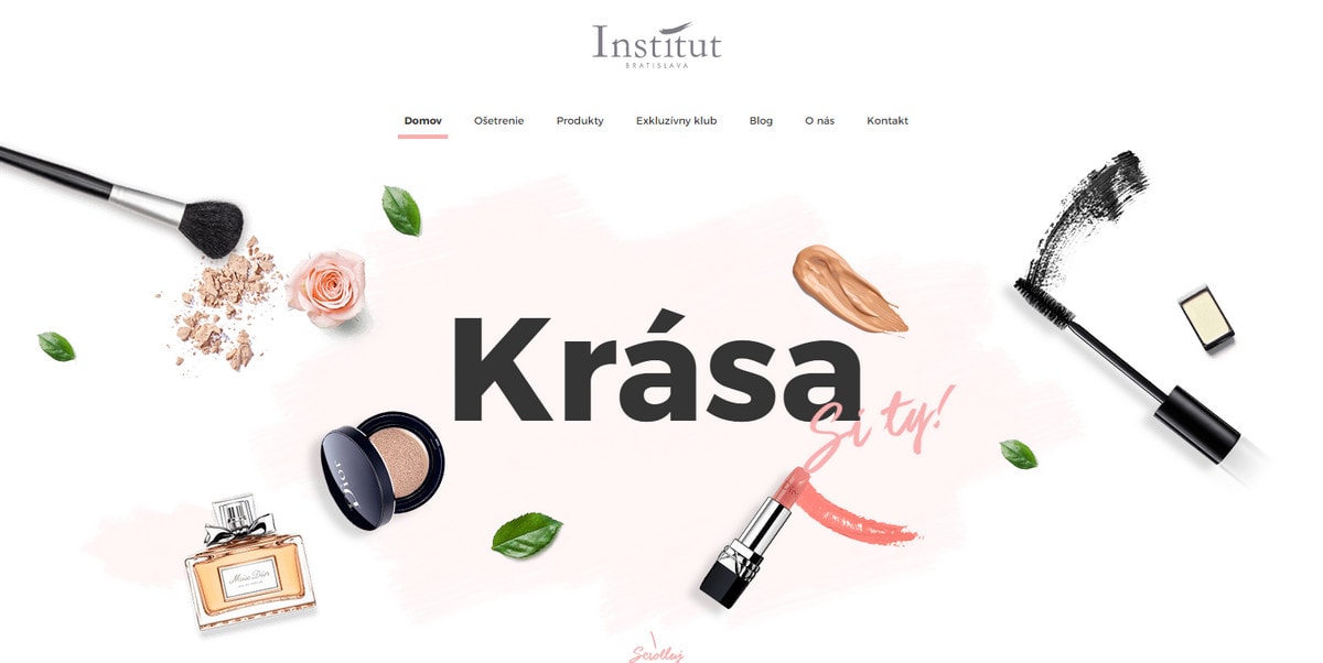
While the “welcome” area is visually heavy, with realistic mockups scattered throughout the screen, the word “Krasa” nicely stands out.
The previous website proves that a ton of whitespace is not the only way to enhance big typography; contrast is also a powerful instrument and Gravity is a great example of that.
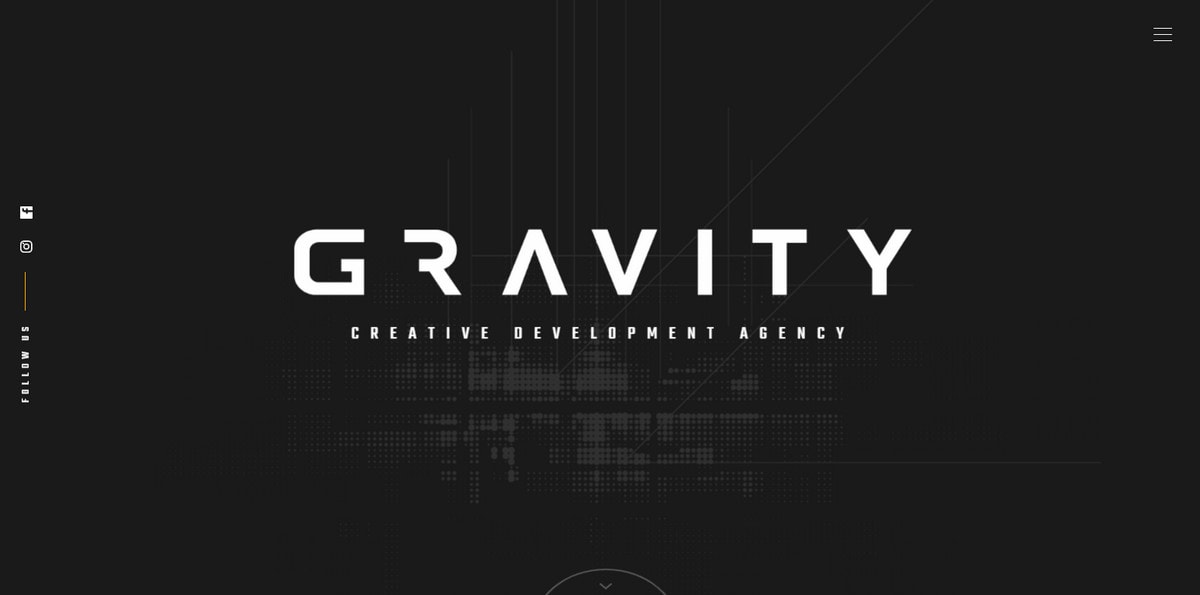
Although the company’s nameplate is in a font size smaller than the first two examples, the striking contrast between black and white does its job perfectly well, accentuating one word.
If contrast is not an option, go for a trendy overlay technique. Bold lettering will blossom as well with this “created” contrast. Consider Community Hubs.
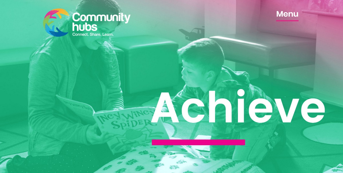
There are several things that boost the big typography here. The first is a semi-transparent gradient-styled layer above the image backdrop. It does not create a perfect foundation for the content, but it is enough to give the catchy word solid ground. The second is a short underscoring that adds extra visual weight. Last but not least, the amount of whitespace is enormous.
Modern Takes on Big Typography
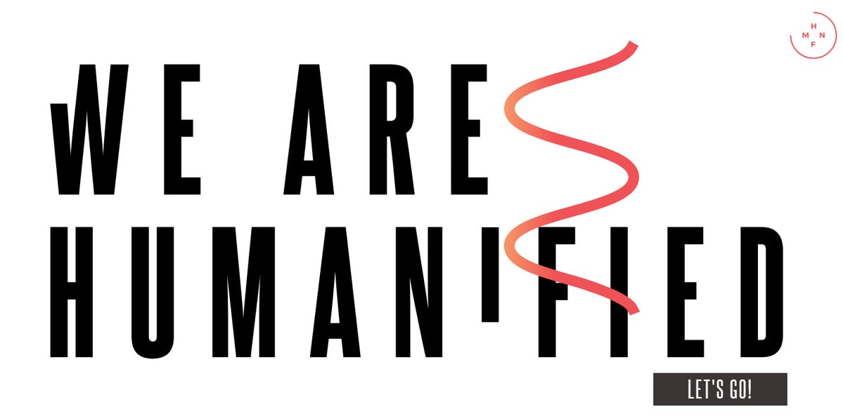
Let’s turn our heads to websites that feature modern implementations of the trend. Humanified is an example. There are several things to keep an eye on:
- Elegant typography; subtle letterforms that a bit elongated
- A ton of white space around
- Perfect contrast
- Nothing redundant; only important stuff for users to move forward
- One or two complementary details, that can be static or like Humanifie set in motion, provide emphasis on lettering as well as keep the page from feeling dull
Powerful Tandem
Big typography greatly benefits from interaction with other elements. As you know, there is a huge trend in typography that involves a masking technique – cut letters have been populating interfaces for a year already. Together, it makes an incredible effect. Consider 7811 Wines, City of Danbury and Push.
With Startup App and Slides App you can build unlimited websites using the online website editor which includes ready-made designed and coded elements, templates and themes.
Try Startup App Try Slides AppOther ProductsAll three examples get the most out of this powerful alliance; however, there are some differences that hint the possibilities of the technique.
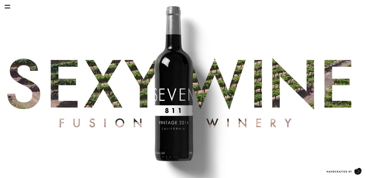
The team behind the 7811 Wines benefits from a basic realization. Here, relatively big letters serve as a background. They complement the photo of the wine bottle as well as help to establish a connection to nature that’s inherent to the industry.
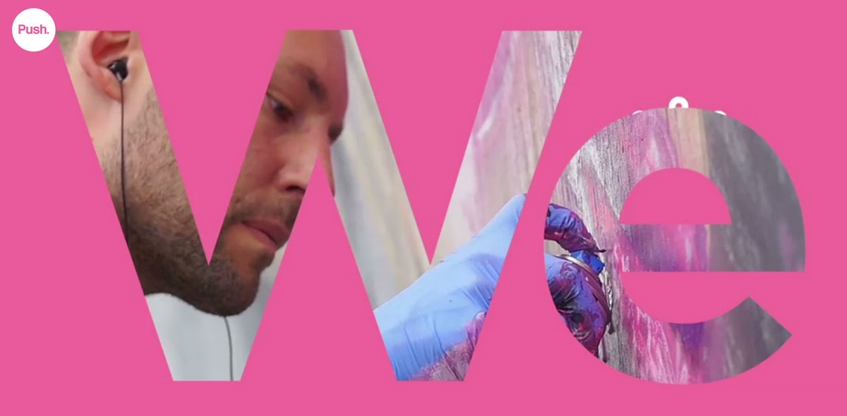
The team behind Push uses big letters to display a tagline through the slides in the front-page carousel. The trick contributes to the aesthetics, to say nothing about skillfully drawing the attention to the headline.
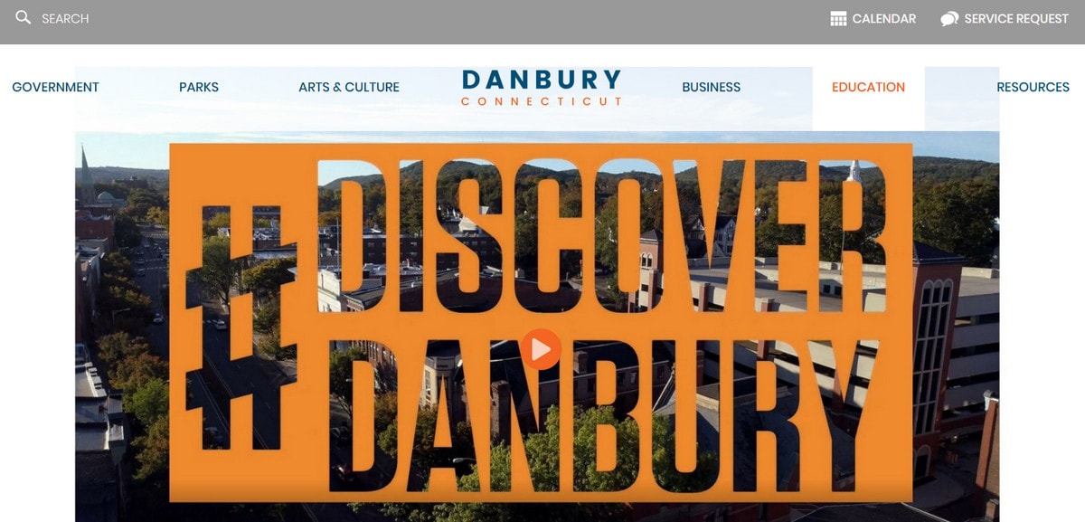
The city of Danbury uses cut letters as a preamble for the homepage video. Thanks to hollow representation, lettering feels airy and does not add heaviness to the page.
A Sprinkle of Dynamics
The more advanced and modern solution can be found in A Foreigner’s Guide to the Polish Alphabet. Not only does the project feature huge full-screen height letters but they are meticulously constructed from other small characters, which have a dynamic behavior. This is a playful and engaging trick. Also, thanks to clever manipulations with the color scheme and geometric patterns in the back, the block of regular text on the right has its own place.
Another way to adjust big typography is to use Three.js or similar libraries to generate a message rather than operate with a static one. Affilicy shows this in practice.
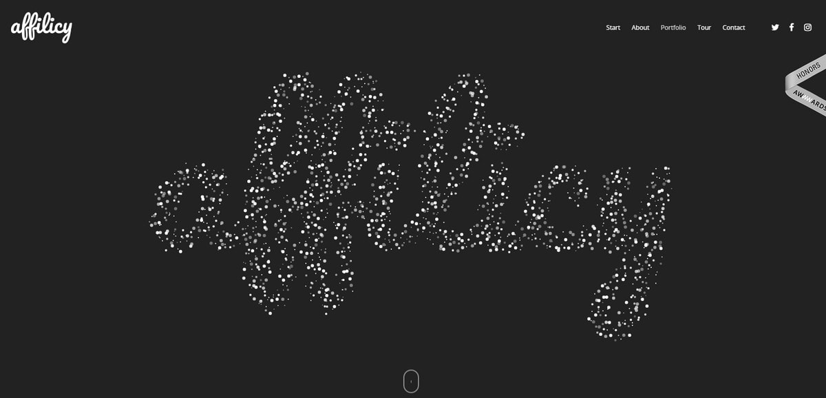
The company’s nameplate takes up almost the entire screen yet it does not feel overwhelming. All of the characters are constructed from tiny particles that are in constant flux. They are not densely packed so that the feeling of lightness is preserved. It is engaging and enjoyable with a lovely high-tech vibe.
Conclusion
Big letters can be intimidating. However, with some clever manipulations and thorough appliance of current trends, it can easily bring benefits not only in terms of conveying a message but also for producing a great impression. Keep in mind that whitespace, contrast and several complementary details are your friends in the pursuit of a successful design trend implementation.
Do you prefer big or small letters in your front pages?
