Bootstrap 4 CSS Tutorial
In today’s article we’re going to continue with some more CSS and the JavaScript options that are essential for every Bootstrap-based website.
Looking for a Bootstrap online builder?
- 👉 Try our Bootstrap Builder and create unlimited projects for unlimited clients.
- 👉 Start to build a website using our Bootstrap Templates.

We’re going to discuss the following topics:
- Bootstrap Navbar
- Navs
- Forms
- Media Objects
- Progress bar
- Carousel
- Tooltips and Popovers
- Modals
- Buttons
- Columns
Video Tutorial
Getting Started
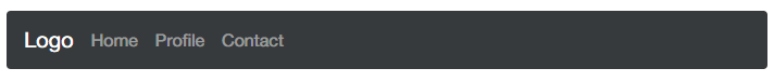
The navbar is one of the prominent features of every Bootstrap-based website. The core code includes styling for a site logo and basic navigation links.
To create a navbar, follow these steps:
With Postcards Email Builder you can create and edit email templates online without any coding skills! Includes more than 100 components to help you create custom emails templates faster than ever before.
Free Email BuilderFree Email Templates- Create a <nav> tag with a class of .navbar along with a .navbar-dark bg-inverse class (this will be the color scheme of the navbar).
- Inside the <nav> tag put an anchor tag with a class .navbar-brand. This will be the logo of the navbar.
- Add an unordered lists with a class .nav along with a .navbar-nav class.
- For each list item add a class .nav-item and a class .nav-link for each link inside.
You can check the sample code and results below.
<nav class="navbar navbar-dark bg-inverse">
    <!-- Brand -->
    <a class="navbar-brand" href="#">Logo</a>

    <!-- Links -->
    <ul class="nav navbar-nav">
        <li class="nav-item">
            <a class="nav-link" href="#">Home</a>
        </li>
        <li class="nav-item">
            <a class="nav-link" href="#">Profile</a>
        </li>
        <li class="nav-item">
            <a class="nav-link" href="#">Contact</a>
        </li>
    </ul>
</nav>
Putting these codes together will give you exactly the same result as the image.
Note: You can use the class .active to specify a link as the current page and add a <span> with .sr-only class for screen readers.
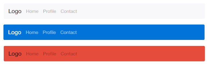
If you want to add a different background color to your navbar you can use the combination of a simple link color modifier class and background-color utilities (such .bg-primary, .bg-warning).
Here are some examples:
<nav class="navbar navbar-light bg-faded">
  <!-- Navbar content -->
</nav>

<nav class="navbar navbar-dark bg-primary">
  <!-- Navbar content -->
</nav>

<nav class="navbar navbar-light" style="background-color: #e74c3c;">
  <!-- Navbar content -->
</nav>
Using the following classes and styles with our previous code, you’ll get the following result.
With Pulsetic you’ll be instantly notified the moment your website, API, or server becomes unavailable. Monitor uptime from multiple global locations and respond to incidents before your users are affected.
Create beautiful status pages in minutes to keep customers informed during outages and build trust with transparent communication.
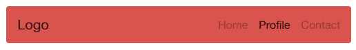
Start Monitoring for FreeIf you want to align the elements of your navbar you can use the .pull-left or .pull-right class to achieve this.
Check out the code below.
<nav class="navbar navbar-light bg-danger">
    <!-- Brand -->
    <a class="navbar-brand" href="#">Logo</a>

    <!-- Links -->
    <ul class="nav navbar-nav ml-auto">
        <li class="nav-item">
            <a class="nav-link" href="#">Home</a>
        </li>
        <li class="nav-item active">
            <a class="nav-link" href="#">Profile <span class="sr-only">(current)</span></a>
        </li>
        <li class="nav-item">
            <a class="nav-link" href="#">Contact</a>
        </li>
    </ul>
</nav>
The code above will display the image below.
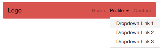
Dropdowns menus are another important component of any navigation bar. You can add a dropdown to one of the li elements of the navbar-nav list by adding the .dropdown class. You also need to add the data attribute data-toggle=”dropdown” along with the aria-haspopup=”true” to indicate whether this element may display a pop-up window as well as the aria-expanded=”false” to indicate the state of a collapsible element. For each item of the dropdown link you must add the class .dropdown-item to add styles on it.
See the example code below.
<nav class="navbar navbar-light bg-danger">
    <!-- Brand -->
    <a class="navbar-brand" href="#">Logo</a>

    <!-- Links -->
    <ul class="nav navbar-nav ml-auto">
        <li class="nav-item">
            <a class="nav-link" href="#">Home</a>
        </li>
        <li class="nav-item dropdown">
            <a class="nav-link dropdown-toggle" data-toggle="dropdown" href="#" role="button" aria-haspopup="true" aria-expanded="false">
                Profile
            </a>
            <div class="dropdown-menu">
                <a class="dropdown-item" href="#">Dropdown Link 1</a>
                <a class="dropdown-item" href="#">Dropdown Link 2</a>
                <a class="dropdown-item" href="#">Dropdown Link 3</a>
            </div>
        </li>
        <li class="nav-item">
            <a class="nav-link" href="#">Contact</a>
        </li>
    </ul>
</nav>
Check out the image output below.
You can also position your navbar in fix position either to the top or bottom of the screen upon mouse scroll by using the .navbar-fixed-top or .navbar-fixed-bottom. Check out the structure code below.
<nav class="navbar navbar-fixed-top navbar-dark bg-primary">
    <!-- Content Here! -->
</nav>

<nav class="navbar navbar-fixed-bottom navbar-dark bg-danger">
    <!-- Content Here! -->
</nav>
To create a responsive navbar, you can use the .navbar-toggler class on the button along with the data attribute data-toggle=”collapse” and data-target with the id of the navbar. You can then add one of the .navbar-toggleable-* classes. This navbar will collapse at a given viewport width depending on the screen size you set on .navbar-toggleable-* class. You can use one of the following classes:
- navbar-toggleable-xs
- navbar-toggleable-sm
- navbar-toggleable-md
- navbar-toggleable-lg
- navbar-toggleable-xl
Let’s see this in action.
<nav class="navbar navbar-light bg-primary navbar-expand-lg">
    <!-- Toggle Button -->
    <button class="navbar-toggler" type="button" data-toggle="collapse" data-target="#nav-content">
        ☰
    </button>

    <!-- Nav Content -->
    <div class="collapse navbar-collapse" id="nav-content">
        <a class="navbar-brand" href="#">Logo</a>
        <ul class="navbar-nav">
            <li class="nav-item">
                <a class="nav-link" href="#">Home</a>
            </li>
            <li class="nav-item">
                <a class="nav-link" href="#">Profile</a>
            </li>
            <li class="nav-item">
                <a class="nav-link" href="#">Contact</a>
            </li>
        </ul>
    </div>
</nav>
See image result below.

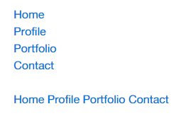
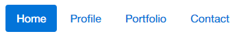
Bootstrap 4 provides a variety of options for styling navigation elements. All of them share the same markup and base .nav class either within the <ul> or <nav> tag. You also need to add the class .nav-item for each list items and the .nav-link class for each anchor tags.
Bootstrap also provides a helper class, .active to specify the active page. Let’s try this on both <ul> and <nav> tag.
<!-- Using <ul> -->
<ul class="nav">
    <li class="nav-item">
        <a class="nav-link active" href="#">Home</a>
    </li>
    <li class="nav-item">
        <a class="nav-link" href="#">Profile</a>
    </li>
    <li class="nav-item">
        <a class="nav-link" href="#">Portfolio</a>
    </li>
    <li class="nav-item">
        <a class="nav-link" href="#">Contact</a>
    </li>
</ul>

<br/>

<!-- Using <nav> -->
<nav class="nav">
    <a class="nav-link active" href="#">Home</a>
    <a class="nav-link" href="#">Profile</a>
    <a class="nav-link" href="#">Portfolio</a>
    <a class="nav-link" href="#">Contact</a>
</nav>
Putting this code together will display the image below.
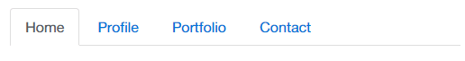
To create a tabbed navigation menu, you need to start with a basic unordered list with the class of .nav along with the .nav-tabs class. You also need to add the class .nav-item for each list items and the .nav-link class for each links. In addition, you can then add the class .active to specify the active page.
<ul class="nav nav-tabs">
    <li class="nav-item">
        <a class="nav-link active" href="#">Home</a>
    </li>
    <li class="nav-item">
        <a class="nav-link" href="#">Profile</a>
    </li>
    <li class="nav-item">
        <a class="nav-link" href="#">Portfolio</a>
    </li>
    <li class="nav-item">
        <a class="nav-link" href="#">Contact</a>
    </li>
</ul>
See image result below.
To create a pill navigation use .nav-pills instead of .nav-tabs.
<ul class="nav nav-pills">
    <li class="nav-item">
        <a class="nav-link active" href="#">Home</a>
    </li>
    <li class="nav-item">
        <a class="nav-link" href="#">Profile</a>
    </li>
    <li class="nav-item">
        <a class="nav-link" href="#">Portfolio</a>
    </li>
    <li class="nav-item">
        <a class="nav-link" href="#">Contact</a>
    </li>
</ul>
See image result below.
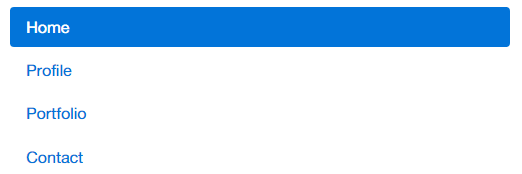
Vertical Pills
To stack pills vertically you just need to add .nav-stacked to the class .nav-pills.
<ul class="nav nav-pills flex-column">
    <li class="nav-item">
        <a class="nav-link active" href="#">Home</a>
    </li>
    <li class="nav-item">
        <a class="nav-link" href="#">Profile</a>
    </li>
    <li class="nav-item">
        <a class="nav-link" href="#">Portfolio</a>
    </li>
    <li class="nav-item">
        <a class="nav-link" href="#">Contact</a>
    </li>
</ul>
With the code above you’ll get the image result below.
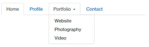
Dropdowns
Navigation menus can also have a similar syntax with dropdown menus. Just add .dropdown class to an <li> element followed by its classes and data-attributes. See the code below.
<ul class="nav nav-tabs">
    <li class="nav-item">
        <a class="nav-link active" href="#">Home</a>
    </li>
    <li class="nav-item">
        <a class="nav-link" href="#">Profile</a>
    </li>
    <li class="nav-item dropdown">
        <a class="nav-link dropdown-toggle" data-toggle="dropdown" href="#" role="button" aria-haspopup="true" aria-expanded="false">
            Portfolio
        </a>
        <div class="dropdown-menu">
            <a class="dropdown-item" href="#">Website</a>
            <a class="dropdown-item" href="#">Photography</a>
            <a class="dropdown-item" href="#">Video</a>
        </div>
    </li>
    <li class="nav-item">
        <a class="nav-link" href="#">Contact</a>
    </li>
</ul>
See the image result below.
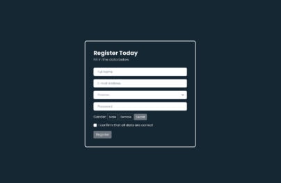
Forms
One of the Bootstrap 4’s great feature is the ability to create forms with ease. Bootstrap makes it easy by just using simple HTML markup and extended classes for different styles of forms.
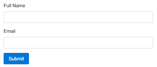
To use Bootstrap forms, simply add the class .form-control class to any of the form components such as <input>, <textarea>, and <select> tag.
You also need to wrap each form component to a <fieldset> tag along with class .form-group.
Here’s the sample code.
<form>
    <fieldset class="form-group">
        <label for="full_name">Full Name</label>
        <input type="text" class="form-control" id="full_name" name="full_name">
    </fieldset>

    <fieldset class="form-group">
        <label for="email">Email</label>
        <input type="email" class="form-control" id="email" name="email">
    </fieldset>

    <button type="submit" class="btn btn-primary">Submit</button>
</form>
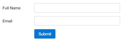
Basic Form Output:
Optional Form Styles
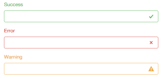
You can also add a color for each fieldset. There are three classes that you can use.
- has-success
- has-warning
- has-error
These classes can be use inside a <fieldset>, <div>, any tag element. In addition you can also add icons by using .form-control-* class. Check the list here.
Let’s see it in action.
<fieldset class="form-group has-success">
    <label class="control-label" for="username">Success</label>
    <input type="text" class="form-control form-control-success">
</fieldset>

<fieldset class="form-group has-error">
    <label class="control-label" for="phone">Error</label>
    <input type="text" class="form-control form-control-error">
</fieldset>

<fieldset class="form-group has-warning">
    <label class="control-label" for="password">Warning</label>
    <input type="email" class="form-control form-control-warning">
</fieldset>
Horizontal Form
Bootstrap comes with predefined horizontal form formats. This one stands apart from the others not only on its markup, but also in the display of the form.
To use Bootstrap horizontal form, use .form-horizontal class inside the <form> tag. You also need to add .form-control-label class to the <label> tag for it to appear vertically center.
Note: Don’t forget to specify how many columns each form component should span via .col-*-*.
See the example below.
<form action="" class="form-horizontal">
    <div class="container">
        <div class="form-group row">
            <label for="full_name" class="col-xs-3 form-control-label">Full Name</label>
            <div class="col-xs-9">
                <input type="text" class="form-control" id="full_name" name="full_name">
            </div>
        </div>
        <div class="form-group row">
            <label for="email" class="col-xs-3 form-control-label">Email</label>
            <div class="col-xs-9">
                <input type="email" class="form-control" id="email" name="email">
            </div>
        </div>
        <div class="form-group row">
            <div class="col-xs-offset-3 col-xs-9">
                <button type="submit" class="btn btn-primary">Submit</button>
            </div>
        </div>
    </div>
</form>
The code above will have a result like this:
Inline Form
To create a form where all of the elements are inline and labels are left-aligned, simply add a class .form-inline to the <form> tag and use the .form-group class within a <div> or <fieldset> tag to organize each field set. See the code example below.
<form action="" class="form-inline">
    <div class="form-group">
        <label for="full_name">Full Name</label>
        <input type="text" class="form-control" id="full_name" name="full_name">
    </div>

    <div class="form-group">
        <label for="email">Email</label>
        <input type="email" class="form-control" id="email" name="email">
    </div>

    <button type="submit" class="btn btn-primary">Submit</button>
</form>
The codes above will have a result like this:

Media Objects
Social media websites such as Facebook and Twitter use the media object. The goal of the media object is to make the code for developing these blocks of information shorter.
Bootstrap Media Object align text and media objects next to each other. This gives the user the option to quickly float the object either to the right or to the left.
You can create a Media Object in three steps.
- Create a <div> with a class .media.
- Insert .media-object class to any element you want to float such as <img> and <video> For the alignment of the media element you can add one of the following class to the parent element to control the position of media objects (.media-middle, .media-bottom, .media-left, .media-right). By default the media-objects are set to top-aligned position.
- Create another <div> inside the class .media and then insert .media-body class In addition, you need to add the .media-heading to any heading tag inside the .media-body <div>.
Let’s try an example:
<div class="media">
  <a class="media-left" href="#">
    <img class="media-object" src="https://goo.gl/sLxT6P" width="100" alt="">
  </a>
  <div class="media-body">
    <h4 class="media-heading">Media Heading</h4>
    <p>
      Bootstrap is the most popular HTML, CSS, and JS framework in the world for building responsive, mobile-first projects on the web.
    </p>
  </div>
</div>
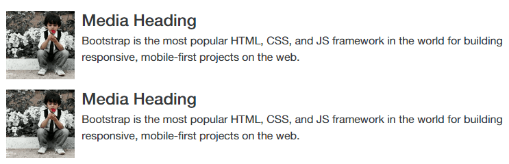
With codes above, you’ll get exactly the same result like the image below.
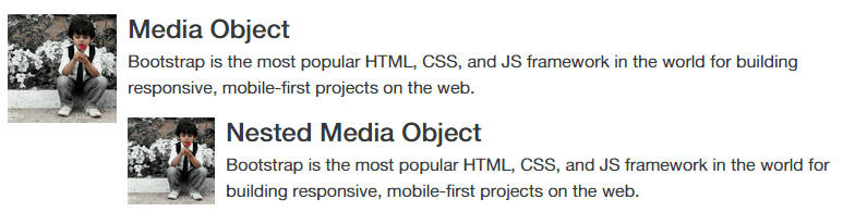
Nested Media Objects
You can also nest media objects by simply adding another media object structure inside the <div> with a .media-body class. See the code below.
<div class="media">
  <a class="media-left" href="#">
    <img class="media-object" src="https://goo.gl/sLxT6P" width="100" alt="">
  </a>
  <div class="media-body">
    <h4 class="media-heading">Media Object</h4>
    <p>
      Bootstrap is the most popular HTML, CSS, and JS framework in the world for building responsive, mobile-first projects on the web.
    </p>

    <!-- Nested Media Object -->
    <div class="media">
      <a class="media-left" href="#">
        <img class="media-object" src="https://goo.gl/sLxT6P" width="80" alt="">
      </a>
      <div class="media-body">
        <h4 class="media-heading">Nested Media Object</h4>
        <p>
          Bootstrap is the most popular HTML, CSS, and JS framework in the world for building responsive, mobile-first projects on the web.
        </p>
      </div>
    </div>
    <!-- Nested Media Object -->
  </div>
</div>
Putting it all together, you’ll get a result like the image below.
Progress Bar
The progress bar displays the assets that are loading, in progress, or that there is an action taking place within the page. The Bootstrap default progress bar has a light gray background and a blue progress bar.
To create a progress bar, use the html5 <progress> tag with a class of .progress. Inside, insert a value attribute from 0 to 100 to indicate where progress bar was at. See the code below.
<progress class=”progress” value=”75″ max=”100″>75%</progress>
See the image below.
Color Variation
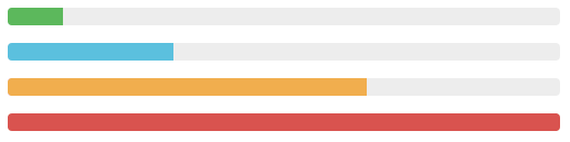
Bootstrap 4 Progress bars can use a variety of color classes which are the identical with button and alert classes for consistent styles using the .progress-* class. See the examples below.
<progress class="progress progress-success" value="10" max="100">10%</progress>
<progress class="progress progress-info" value="30" max="100">30%</progress>
<progress class="progress progress-warning" value="65" max="100">65%</progress>
<progress class="progress progress-danger" value="100" max="100">100%</progress>
Striped and Animated Progress bar
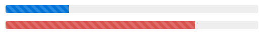
To create a striped progress bar just add an extra .progress-striped class to the <progress> tag. You can also create an animation using the .progress-animated to the same tag. See code example below.
<progress class="progress progress-striped progress-animated" value="25" max="100">25%</progress>
<progress class="progress progress-striped progress-animated progress-danger" value="75" max="100">75%</progress>
The code above will output the image below.
Bootstrap JavaScript Plugins
JavaScript adds interactivity to every website on the web. Tooltips, image slideshows, drop-down menus and popovers are just some examples of popular website features that can be created by combining JavaScript with CSS.
In this part, we’ll learn how to use JavaScript plugins via Bootstrap 4 to create advanced website features.
There are two ways to include Bootstrap’s JavaScript plugins. The first is by downloading the boostrap.js or bootstrap.min.js file here. The second is by using the CDN and link to your HTML file. Let’s see both in action. Please take note that you need to add first the jQuery library link along with bootstrap.js file.
Use Bootstrap Source File
<script src="https://ajax.googleapis.com/ajax/libs/jquery/2.1.4/jquery.min.js"></script>
<script src="js/bootstrap.js"></script>
Use Bootstrap CDN Link
<script src="https://ajax.googleapis.com/ajax/libs/jquery/2.1.4/jquery.min.js"></script>
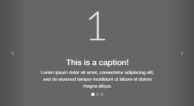
Carousel
Bootstrap 4 carousel is a flexible and responsive way to add a slider to your website. Aside from being responsive, it allows you to add images, videos or just about any type of content.
To create a carousel, follow these steps:
- Create a wrapper <div> and add the .carousel and .slide with its own ID. You also need to data-ride=”carousel” attribute to start the carouse’s animation immediately when the page loads.
- Create an ordered list for our indicator controls (the little circles at the bottom center) and add the carousel-indicators class on the <ol> Then we also need to add the data-target=”#id” along with the data-slide-to=”#” to specify which slide to go to when clicking a specific dot. Don’t forget to add class .active on the first element; this will be the starting item of the carousel.
- Now create another <div> container for the scrollable contents (this where you will put your contents), add the .carousel-inner inside it and give each item a .carousel-item You can also add a new <div> element inside right after adding the images and give it a class .carousel-caption.
- For Previous and Next buttons, we will use an anchor class with the class .left and carousel-control for the “Previous” button, and class .right and .carousel-control for the “Next” button.
The following code creates the Bootstrap carousel:
<div id="carousel-generic" class="carousel slide" data-ride="carousel">
  <ol class="carousel-indicators">
    <li data-target="#carousel-generic" data-slide-to="0" class="active"></li>
    <li data-target="#carousel-generic" data-slide-to="1"></li>
    <li data-target="#carousel-generic" data-slide-to="2"></li>
  </ol>
  <div class="carousel-inner" role="listbox">
    <div class="carousel-item active">
      <img src="https://goo.gl/RKA5bV" alt="First slide">
      <div class="carousel-caption">
        <h3>This is a caption!</h3>
        <p>Lorem ipsum dolor sit amet, consectetur adipiscing elit, sed do eiusmod tempor incididunt ut labore et dolore magna aliqua.</p>
      </div>
    </div>
    <div class="carousel-item">
      <img src="https://goo.gl/cLZ8gN" alt="Second slide">
      <div class="carousel-caption">
        <h3>This is a caption!</h3>
        <p>Lorem ipsum dolor sit amet, consectetur adipiscing elit, sed do eiusmod tempor incididunt ut labore et dolore magna aliqua.</p>
      </div>
    </div>
    <div class="carousel-item">
      <img src="https://goo.gl/ZbqeTw" alt="Third slide">
      <div class="carousel-caption">
        <h3>This is a caption!</h3>
        <p>Lorem ipsum dolor sit amet, consectetur adipiscing elit, sed do eiusmod tempor incididunt ut labore et dolore magna aliqua.</p>
      </div>
    </div>
  </div>
  <a class="left carousel-control" href="#carousel-generic" role="button" data-slide="prev">
    <span class="icon-prev" aria-hidden="true"></span>
    <span class="sr-only">Previous</span>
  </a>
  <a class="right carousel-control" href="#carousel-generic" role="button" data-slide="next">
    <span class="icon-next" aria-hidden="true"></span>
    <span class="sr-only">Next</span>
  </a>
</div>
You can manually call the carousel with JavaScript, using the following code:
$('.carousel').carousel()
Methods
The following methods are useful carousel code.
Options
Initializes the carousel with an optional options object and starts cycling through items:
$('.carousel').carousel({
 interval: 2000
})
Cycle
Cycles through the carousel items from left to right:
.carousel('cycle')
Pause
Stops the carousel from cycling through items:
.carousel('pause')
Number
Cycles the carousel to a particular frame (0-based, similar to an array):
.carousel('number')
Prev
Cycles to the previous item:
.carousel('prev')
Next
Cycles to the next item:
.carousel('next')
Tooltips and Popovers
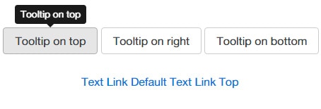
Tooltips are used to describe a link or provide certain information about a word or of an abbreviation. The plugin was originally based on the jQuery.tipsy a plugin was written by Jason Frame. However, in Bootstrap 4, it moves to Tether, a third-party plugin. If you want to use this you can simply include tether.min.js just before the bootstrap.js.
To add a tooltip, add data-toggle=”tooltip” and title=”Some tooltip text!” to an anchor tag or button. The title of the anchor will be the text of a tooltip.
You also need to add the following JavaScript code inside a <script> to trigger tether.js:
$(function () {
$('[data-toggle=&amp;amp;amp;amp;amp;quot;tooltip&amp;amp;amp;amp;amp;quot;]').tooltip()
})
The following examples show how to do this in the Bootstrap and tether.js.
<button type="button" class="btn btn-secondary" data-toggle="tooltip" data-placement="top" title="Tooltip on top">
  Tooltip on top
</button>

<button type="button" class="btn btn-secondary" data-toggle="tooltip" data-placement="right" title="Tooltip on right">
  Tooltip on right
</button>

<button type="button" class="btn btn-secondary" data-toggle="tooltip" data-placement="bottom" title="Tooltip on bottom">
  Tooltip on bottom
</button>

<a href="#" data-toggle="tooltip" title="Some tooltip text!">Text Link Default</a>
<a href="#" data-toggle="tooltip" title="Some tooltip text!" data-placement="top">Text Link Top</a>
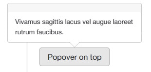
For pop-over, you can simply add the following data-attributes to your button:
- data-container=”body”
- data-toggle=”popover”
- data-placement=”top” – either top, bottom, left or right
- data-content=”Your content here”
See example code:
<button type="button" class="btn btn-secondary" data-container="body" data-toggle="popover" data-placement="top" data-content="Vivamus sagittis lacus vel augue laoreet rutrum faucibus.">
  Popover on top
</button>
Modals
A modal is a pop-out window that is layered over its parent. The purpose is to display content from a separate source that can have some interaction or action without leaving the parent window.
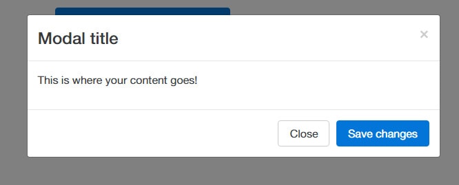
To create a static modal window, check this code:
<!-- Button trigger modal -->
<button type="button" class="btn btn-primary btn-lg" data-toggle="modal" data-target="#myModal">
Click here to see the demo!
</button>
<!-- Modal -->
<div class="modal fade" id="myModal" tabindex="-1" role="dialog" aria-labelledby="myModalLabel" aria-hidden="true">
<div class="modal-dialog" role="document">
<div class="modal-content">
<div class="modal-header">
<button type="button" class="close" data-dismiss="modal" aria-label="Close">
<span aria-hidden="true">×</span>
<span class="sr-only">Close</span>
</button>
<h4 class="modal-title" id="myModalLabel">Modal title</h4>
</div>
<div class="modal-body">
<!-- Your Content here! -->
<p>This is where your content goes!</p>
</div>
<div class="modal-footer">
<button type="button" class="btn btn-secondary" data-dismiss="modal">Close</button>
<button type="button" class="btn btn-primary">Save changes</button>
</div>
</div>
</div>
</div>
There are two data attributes that can trigger the modal via link or buttons.
- data-toggle=”modal” – opens the modal window directly
- data-target=”#myModal” – access to the id of the modal
Inside the modal part, we have a <div> which has an ID that is the same as the value of the data-target attribute used to trigger the modal, in this case its .myModal class.
Here are some more classes/attributes that were used:
- .modal class – specify the content of the <div>
- role=”dialog” attribute is for accessibility for people using screen readers
- .modal-dialog class – creates the width and margin of the modal
- .modal-header class – for modal header styles
- .close class – styles the close button
- .modal-body class – handles the style for the body of the modal
- .modal-footer class – handles the style for the footer of the modal; this area is right aligned by default
Having all the code here, you’ll get a result like the image below.
Please take note that you can also control the size of the modal by adding either .modal-sm class for small modals or .modal-lg class for large modals inside the <div> that has the .modal-dialog class.
Using JavaScript
You can also use Bootstrap modal window via JavaScript by calling the modal() Bootstrap method with the modal “id” or “class” selector. See the code below.
<script type="text/javascript">
$(document).ready(function(){
    $(".btn").click(function(){
        $("#myModal").modal('show');
    });
});
</script>
You can always refer to the documentation here if you want more options for modals.
Conclusion
Like other CSS frameworks, the power of Bootstrap comes not just from the creators but also from other external plugins that support it.
In this article, you’ve learned about the extra features that Bootstrap 4 offers including JavaScript. You can also customize the default CSS styles of every component here. However, it is recommended that you add an additional custom CSS or JavaScript file if you want to make changes instead of editing core files.
Please take note that at the time of this writing, Bootstrap 4 CSS is in alpha release; therefore, it is highly recommended to not use it in production yet. I hope you learned from this tutorial and let me know your thoughts in the comment section.