Bright Colors Make an Elegant Return to Web Design
Color is a traditional design tool. Can you imagine a website without color? Despite its significance and importance in an era of animation, WebGL experiments and VR, it obediently stays in the shadow most of the time.
Pantone picks a color of the year and it is often a popular design choice. Undoubtedly, it is a big deal for the world of fashion, not always as popular in web design. Obviously, such an influential detail of the design as this could not help but burst out with interesting ideas.
The duotone color effect was incredibly popular in web design several years ago. Numerous websites were marked by outstanding bi-tone schemes. The trend was bold and powerful. This year, there’s the comeback of bright coloring. But, this time it differentiates itself with elegance and subtlety in solutions. While the last time it affected mainly welcome sections and homepages, this time it enhances all the details of the interface to varying degrees.
Geometry, Splashes and Spots
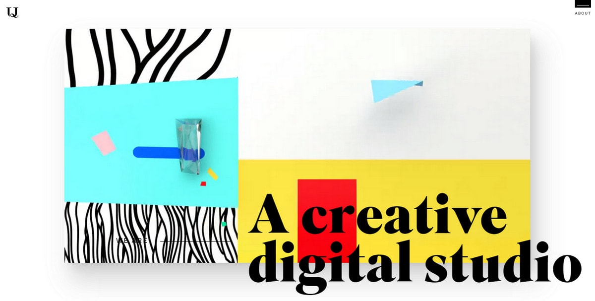
Generally when it comes to trends in color, we talk about tones that monopolize the web, however, this year the situation is slightly different. Not only is the gamut of various shades and tones skillfully combined but also the way you apply color matters. With an overwhelming obsession with geometry, the trend has got an interesting twist in application. Consider the Upperquad.
With Postcards Email Builder you can create and edit email templates online without any coding skills! Includes more than 100 components to help you create custom emails templates faster than ever before.
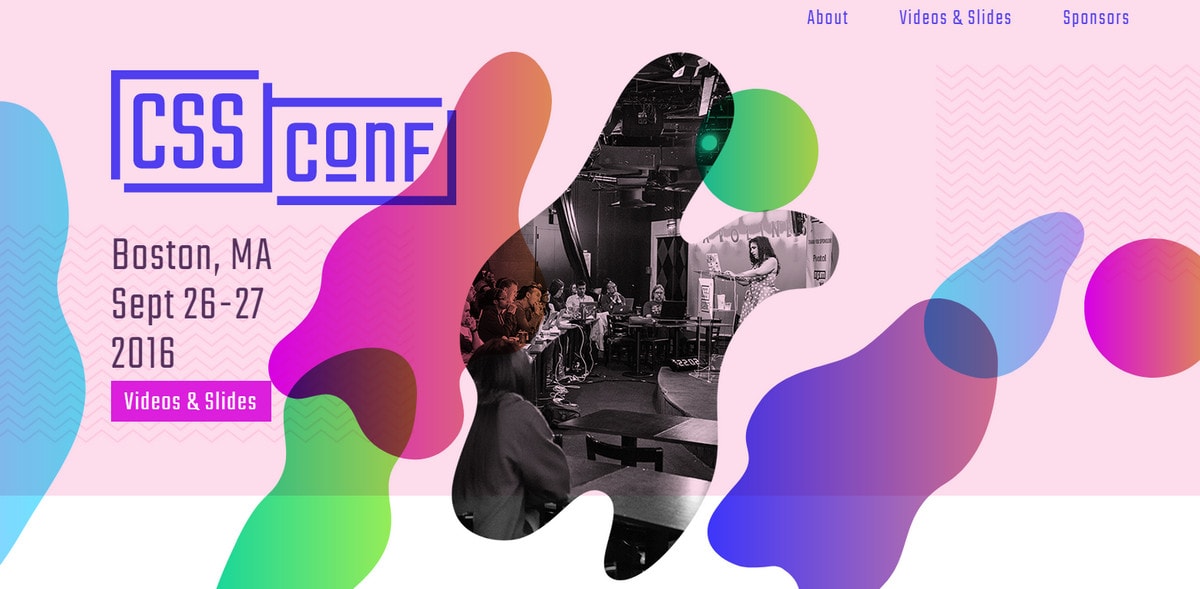
Free Email BuilderFree Email TemplatesNotice how the garish color palette is broken into blocks of various sizes and shapes. With a subtle flair of Kandinsky art, it looks so refreshing and invigorating that it is difficult to take your eyes off of it. The same goes for the website of CSS Conf 2016. Although there are neither strict rectangles nor squares here, smooth liquid-like gradient-styled splashes set in motion create a sophisticated feeling and enrich the visual experience.
While the previous example goes for flat realization, the team behind the Republic’s design adopts the same technique but amps up the volume. It is applied to dynamic 3D animation. The fluid paintbrush-like spots move across the screen. The colors are drastically bright but thanks to a pure white background, everything looks nice and lovely.
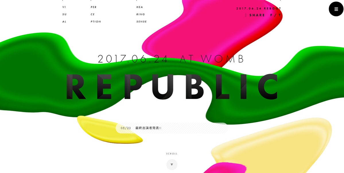
Republic
Gradients
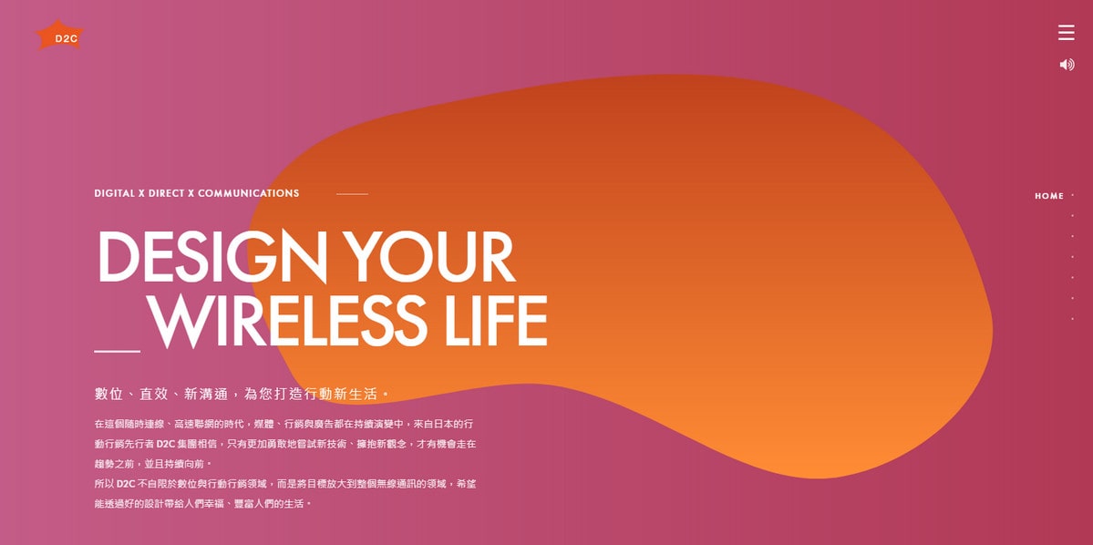
If you find yourself like missing gradients, cheer up! Bright color choices encourage applying color transitions without looking annoying. D2C Taiwan shows how to do it the right way.
With Startup App and Slides App you can build unlimited websites using the online website editor which includes ready-made designed and coded elements, templates and themes.
Try Startup App Try Slides AppOther ProductsIt leverages smooth, beautiful mono gradients that feel fresh and elegant. Orange and maroon are not the tones that usually work together; however, they hit the harmony and produce a fantastic outcome. White is a primary color and thanks to its neutrality, it works with the palette and provides an optimal level of readability.
Gradients not only play a role of decorative element, but also serve as a tool for adorning various things.
- Typography like in case of Talkd where the gorgeous warm gradient puts the focus on the nameplate as well as separates it from the background beautifully.
- Main illustrations like in case of an official website of Kikk Festival that draws you into from the get-go and promises to roll out a unique storytelling experience thanks to the stunning illustrated environment.
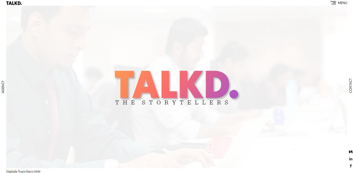
Talkd
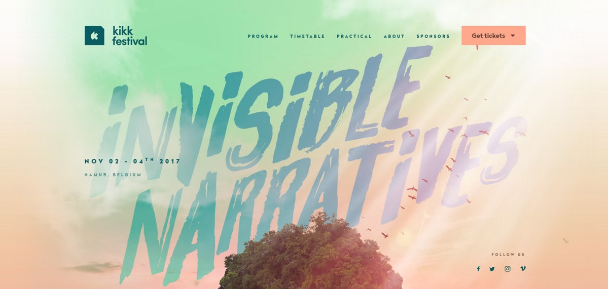
Kikk Festival
Unconventional Use
What’s more, the trend does not restrict itself only to the common usage that we are accustomed to seeing; it can be found in unconventional places as well.
Let’s consider some real implementations: Digital Volcano, Jony Guedj and New from Bose.
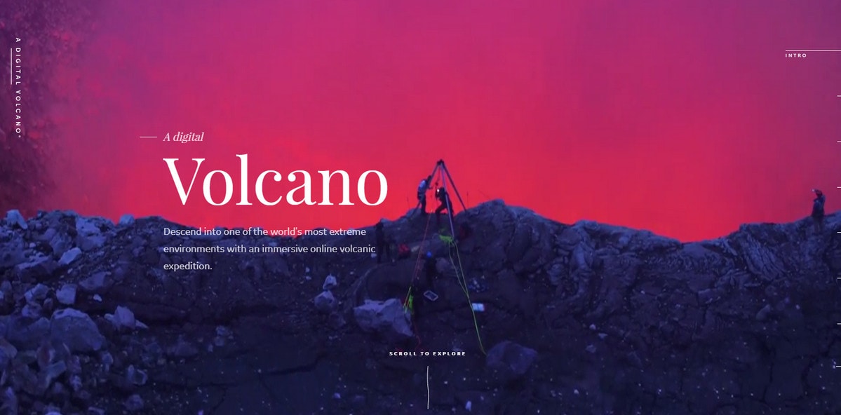
Digital Volcano
The team behind the Digital Volcano uses a gorgeous color palette to enhance the video background. It corresponds to the theme of the website and conveys the majestic atmosphere of an active volcano. The first impression is simply outstanding.
Jony Guedj’s website uses a rainbow of colors for pagination. The idea is interesting. It transforms standard pagination into an intriguing piece, finishing off an exceptional design aesthetic.
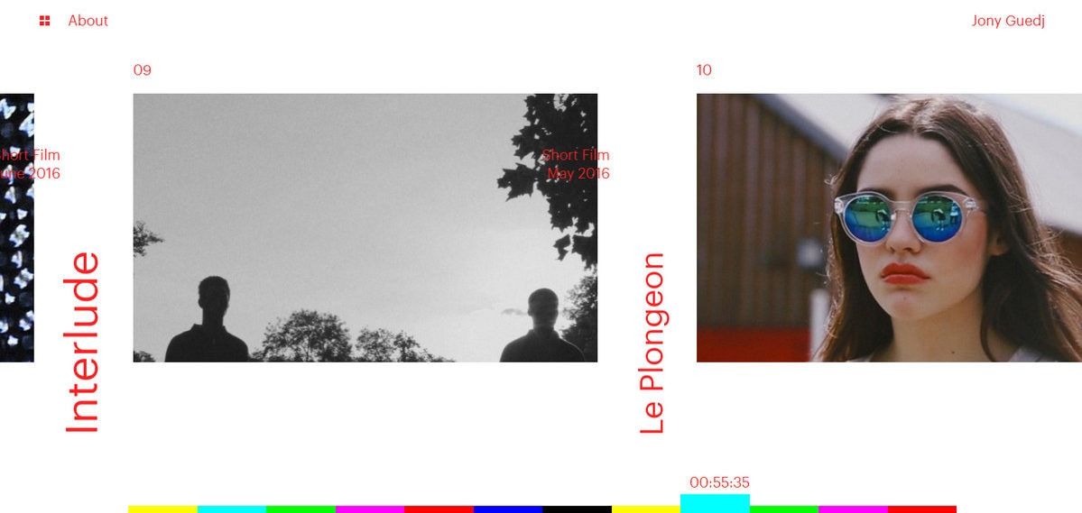
Jony Guedj
However, regarding user experience, the navigation is a bit bold. It seems that we, as regular visitors, require more information rather than just a tiny block with a distinctive shade to understand how to engage.
New from Bose uses bright coloring to distinguish goods from each other. We can all agree that the idea is particularly simple and ordinary: each product gets its own clean monotone background. Nevertheless, it does the trick. The homepage and user experience benefit from it (to say nothing about the joyful spirit that engages visitors).
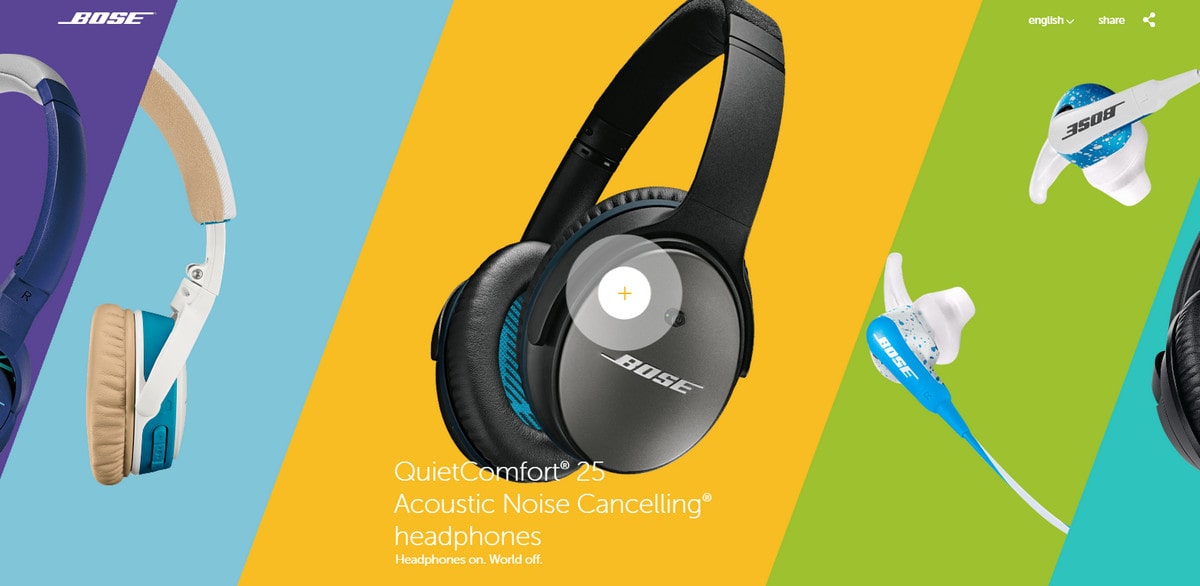
New from Bose
One Last Thing
This year, bright color is all-embracing; even the tiniest details, like buttons, are subject to its influence. Consider Instant love project. The website is a fantastic example that gets its beauty from a tandem of pastel colors and careful injections of bright, almost neon shades. The latter helps buttons catch the eye naturally. We are not accustomed to such strange combinations – it feels like some kind of fusion – but it works here, and buttons look like calls-to-action.
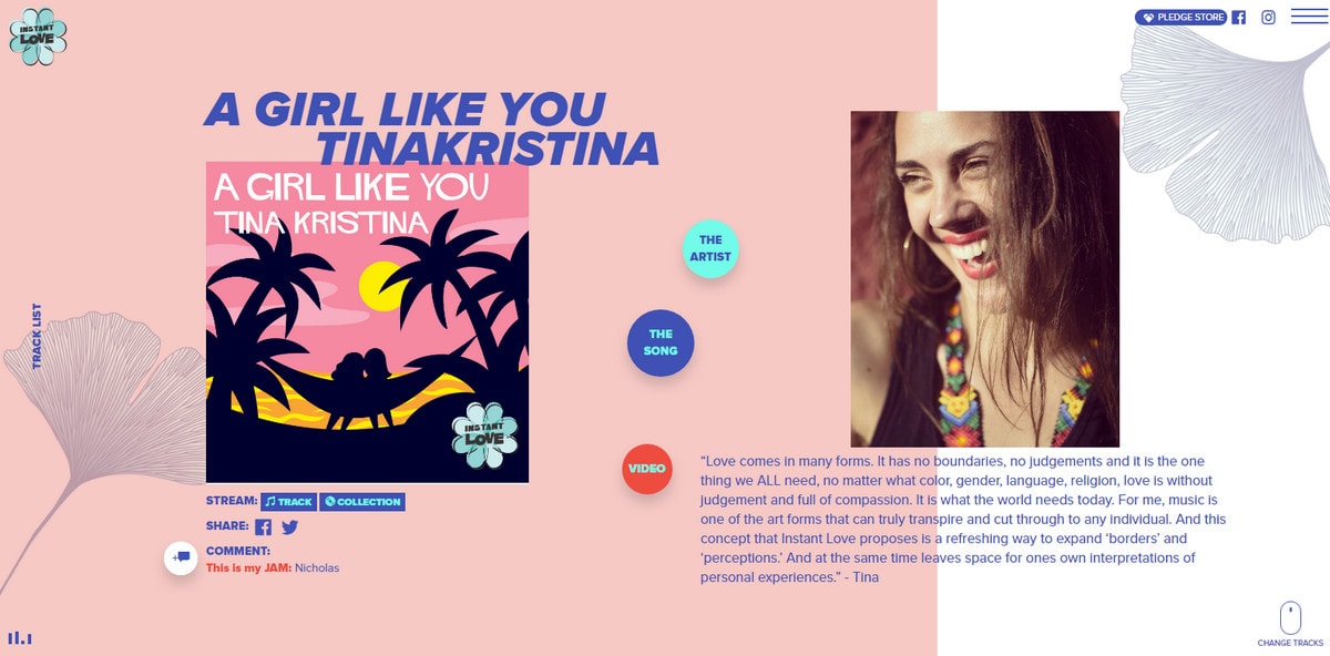
Instant love
Conclusion
Bright color is a trend that does not suit everyone.
- Not every project requires plenty of colors; everything depends on the atmosphere and message.
- It is difficult to master. If you stick to a two- or three-tone palette, it’s a little harder to go astray; but when you need to mix and match five to six colors, it can be challenging.
- Color theory should be taken into account especially when you need to assign colors to their respective elements. Take the previous website as an example. Here, subtle pastel coloring is almost everywhere but still, tiny drops of bright colors draw our attention. Mostly this is because of a striking contrast but the fact that darker and brighter shades placed against the subdued background look closer to us also makes its important contribution.
- Bright color is a popular feature today, but tomorrow it could be a sign of bad taste, so be ready to redo the “makeup” when the trend fades out.
What do you think about bright color and its role in designing interfaces?


