How to Create Calendar using jQuery and CSS3
![How to create Calendar using jQuery and CSS3 [Tutorial] How to create Calendar using jQuery and CSS3 [Tutorial]](https://designmodo.com/wp-content/uploads/2012/04/step5.png)
Difficulty: Intermediate
Estimated Completion Time: 30 mins
In this tutorial we will code the jQuery and CSS3 Calendar. To do it we will use CSS for all the styling and for “functionality” we will use jQuery and jQuery UI. From jQuery UI we will only use the “Datepicker” script. So you don’t have to download all the components available in jQuery UI and the file size will be lower.
Step 1 – HTML Markup
To create the calendar we only need to add a div tag with an id.
<div id="calendar"></div>
Then before the body closing tag we need to add the jQuery and the jQuery UI script.
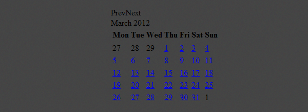
We also need to call the “datepicker”, so you need to use the same id that you’ve used on the div. We will also add some options: the inline will make the calendar visible, so we don’t need to click on a button or input; to make “Monday” the first day on the calendar we need to set it to 1; “show other months” will add the others months days in order to fill all the table. For more info about all the options available read the documentation.
<script src="https://ajax.googleapis.com/ajax/libs/jquery/1.7.1/jquery.min.js"></script>
<script src="js/jquery-ui-datepicker.min.js"></script>
<script>
	$(document).ready(function(){
		$('#calendar').datepicker({
			inline: true,
			firstDay: 1,
			showOtherMonths: true,
			dayNamesMin: ['Sun', 'Mon', 'Tue', 'Wed', 'Thu', 'Fri', 'Sat']
		});
	});
</script>
With Postcards Email Builder you can create and edit email templates online without any coding skills! Includes more than 100 components to help you create custom emails templates faster than ever before.
Free Email BuilderFree Email TemplatesStep 2 – Container
Let’s start by removing all the margins, paddings, borders, etc.
.ui-datepicker,
.ui-datepicker table,
.ui-datepicker tr,
.ui-datepicker td,
.ui-datepicker th {
	margin: 0;
	padding: 0;
	border: none;
	border-spacing: 0;
}
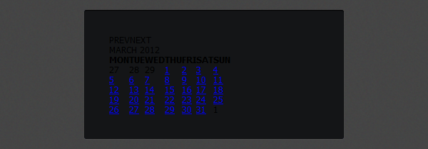
Then we will style the calendar container. Let’s add a background color, rounded corners and shadows. We will also change the text font to “Tahoma” and the text size.
.ui-datepicker {
	display: none;
	width: 294px;
	padding: 35px;
	cursor: default;

	text-transform: uppercase;
	font-family: Tahoma;
	font-size: 12px;

	background: #141517;

	-webkit-border-radius: 3px;
	-moz-border-radius: 3px;
	border-radius: 3px;

	-webkit-box-shadow: 0px 1px 1px rgba(255,255,255, .1), inset 0px 1px 1px rgb(0,0,0);
	-moz-box-shadow: 0px 1px 1px rgba(255,255,255, .1), inset 0px 1px 1px rgb(0,0,0);
	box-shadow: 0px 1px 1px rgba(255,255,255, .1), inset 0px 1px 1px rgb(0,0,0);
}
Step 3 – Header
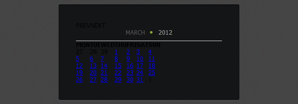
To style the header of the calendar (month and year) we will change the text colors, add a border bottom and some more basic styles.
.ui-datepicker-header {
	position: relative;
	padding-bottom: 10px;
	border-bottom: 1px solid #d6d6d6;
}

.ui-datepicker-title { text-align: center; }

.ui-datepicker-month {
	position: relative;
	padding-right: 15px;
	color: #565656;
}

.ui-datepicker-year {
	padding-left: 8px;
	color: #a8a8a8;
}
To add the green circle we will use the :before pseudo selector. This will allow us to insert content before the “month” element and then we will style and position it.
.ui-datepicker-month:before {
	display: block;
	position: absolute;
	top: 5px;
	right: 0;
	width: 5px;
	height: 5px;
	content: '';

	background: #a5cd4e;
	background: -moz-linear-gradient(top, #a5cd4e 0%, #6b8f1a 100%);
	background: -webkit-gradient(linear, left top, left bottom, color-stop(0%,#a5cd4e), color-stop(100%,#6b8f1a));
	background: -webkit-linear-gradient(top, #a5cd4e 0%,#6b8f1a 100%);
	background: -o-linear-gradient(top, #a5cd4e 0%,#6b8f1a 100%);
	background: -ms-linear-gradient(top, #a5cd4e 0%,#6b8f1a 100%);
	background: linear-gradient(top, #a5cd4e 0%,#6b8f1a 100%);

	-webkit-border-radius: 5px;
	-moz-border-radius: 5px;
	border-radius: 5px;
}
Step 4 – Prev & Next Month
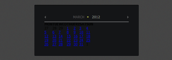
We will use a background image to style the next and previous arrows and then we will position the previous on the left and the next on the right.
.ui-datepicker-prev,
.ui-datepicker-next {
	position: absolute;
	top: -2px;
	padding: 5px;
	cursor: pointer;
}

.ui-datepicker-prev {
	left: 0;
	padding-left: 0;
}

.ui-datepicker-next {
	right: 0;
	padding-right: 0;
}

.ui-datepicker-prev span,
.ui-datepicker-next span{
	display: block;
	width: 5px;
	height: 10px;
	text-indent: -9999px;

	background-image: url(../img/arrows.png);
}

.ui-datepicker-prev span { background-position: 0px 0px; }

.ui-datepicker-next span { background-position: -5px 0px; }

.ui-datepicker-prev-hover span { background-position: 0px -10px; }

.ui-datepicker-next-hover span { background-position: -5px -10px; }
With Pulsetic you’ll be instantly notified the moment your website, API, or server becomes unavailable. Monitor uptime from multiple global locations and respond to incidents before your users are affected.
Create beautiful status pages in minutes to keep customers informed during outages and build trust with transparent communication.
Start Monitoring for FreeStep 5 – Calendar Styles
To style the days of the week we will add a top and bottom padding and change the color.
.ui-datepicker-calendar th {
	padding-top: 15px;
	padding-bottom: 10px;

	text-align: center;
	font-weight: normal;
	color: #a8a8a8;
}
Then we will style the “days grid” by adding some paddings, changing the colors and we will add a transparent border to each number. This is needed because we will add a border to the active number so to avoid it to jump when we click on a number we need to add this transparent border.
.ui-datepicker-calendar td {
	padding: 0 7px;

	text-align: center;
	line-height: 26px;
}

.ui-datepicker-calendar .ui-state-default {
	display: block;
	width: 26px;
	outline: none;

	text-decoration: none;
	color: #a8a8a8;

	border: 1px solid transparent;
}
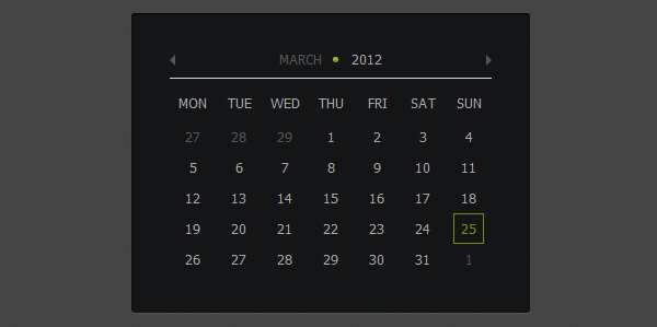
For the active state we will change the text and border color to green. For the “other months days” we will change the color to a darker one.
.ui-datepicker-calendar .ui-state-active {
	color: #6a9113;
	border: 1px solid #6a9113;
}

.ui-datepicker-other-month .ui-state-default { color: #565656; }
Conclusion
We finished our calendar. If you have any question let me know in the comments. Also don’t forget to leave some feedback and share it with your friends. Follow us if you want to be the first to know about the latest tutorials and articles.


