Crazy Sliders – 10 Ways of Taking Sliders to the Next Level
Every other website seems to include a full-screen slider. It is a tested way to quickly and unobtrusively interest users with important stuff such as featured products or portfolio pieces.
Its realization is pretty banal. In a nutshell, it is just a container with two controls where the content is circling in the loop. Nothing fancy at all. But as a presentation tool, it should transmit the message in a certain entertaining, and engaging manner. As a rule, designers experiment with transition effects to make things interesting. However, it is not the only way to improve the slider. We have found 10 other ideas that will help to take it to the next level.
Add a Sensation of Depth
The sensation of depth in web design is widely associated with parallax effects that do not need any introduction. Although the technique is increasingly overused and seems to have lost its wow factor; in combination with other trendy features and some original solutions, it can bring incredible results. Just consider the slider in a personal portfolio of Matthieu Tourdes that relies on a parallax.
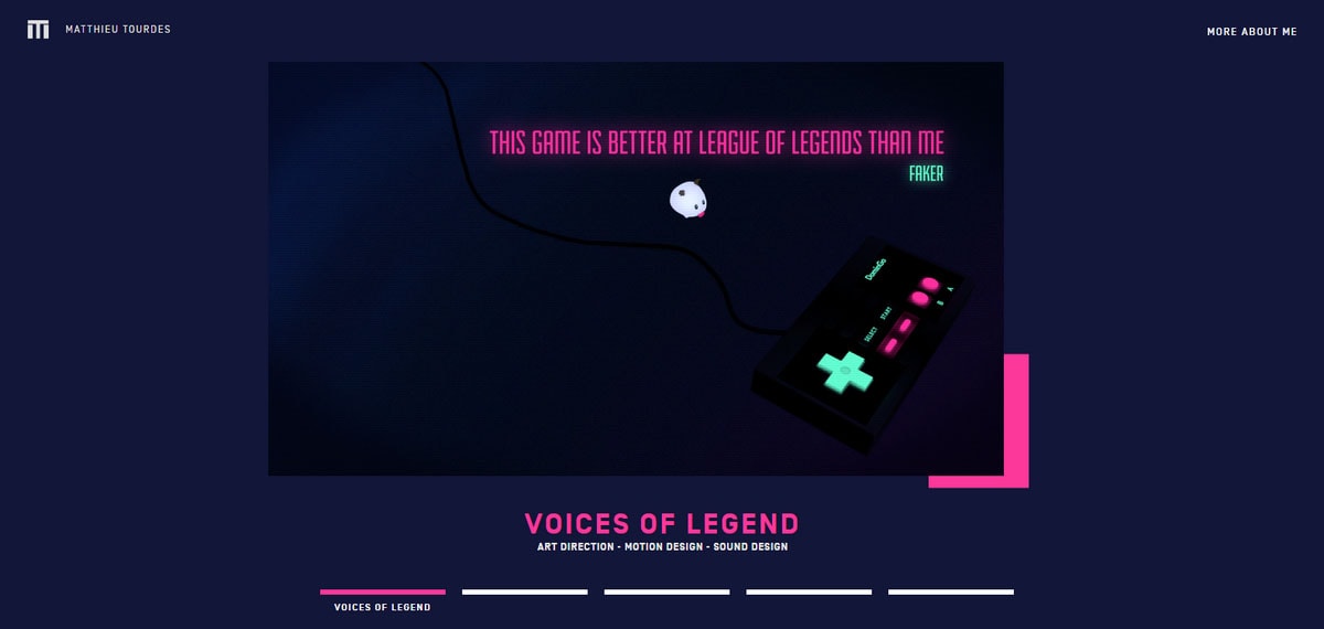
Personal portfolio of Matthieu Tourdes
As individual units, these two can be boring, but together they make a sweet couple. The component feels alive, intriguing, ambitious and enticing. Also, it is worth to mention that Matthieu did a great job in choosing the color scheme that glues everything together.
With Postcards Email Builder you can create and edit email templates online without any coding skills! Includes more than 100 components to help you create custom emails templates faster than ever before.
Free Email BuilderFree Email TemplatesEnliven with a Sprinkle of Three.js
If you are not afraid of testing your merits then this approach is for you. Three.js is a powerful library that hides so many opportunities for visionaries that it would be a sin not to take an advantage of it; though it certainly lacks of browser compatibility and lightness. With its pitfalls, it can be hard to crack, but when done right it can produce an effect that is tough to beat.
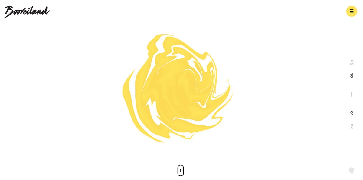
Booreiland
For example, the slider in Booreiland is equipped with an eye-catching liquid-like animation. It grabs the attention from the first seconds and does not let go.
Adopt an Artistic Approach
Unlike the previous method that breathes with innovation and ambitions, this one is the old-school toolkit. This nothing-new solution proves once again that even in the era of WebGL and artificial environment a traditional artistic approach will always have its own charisma, authentic charm and inimitable features.
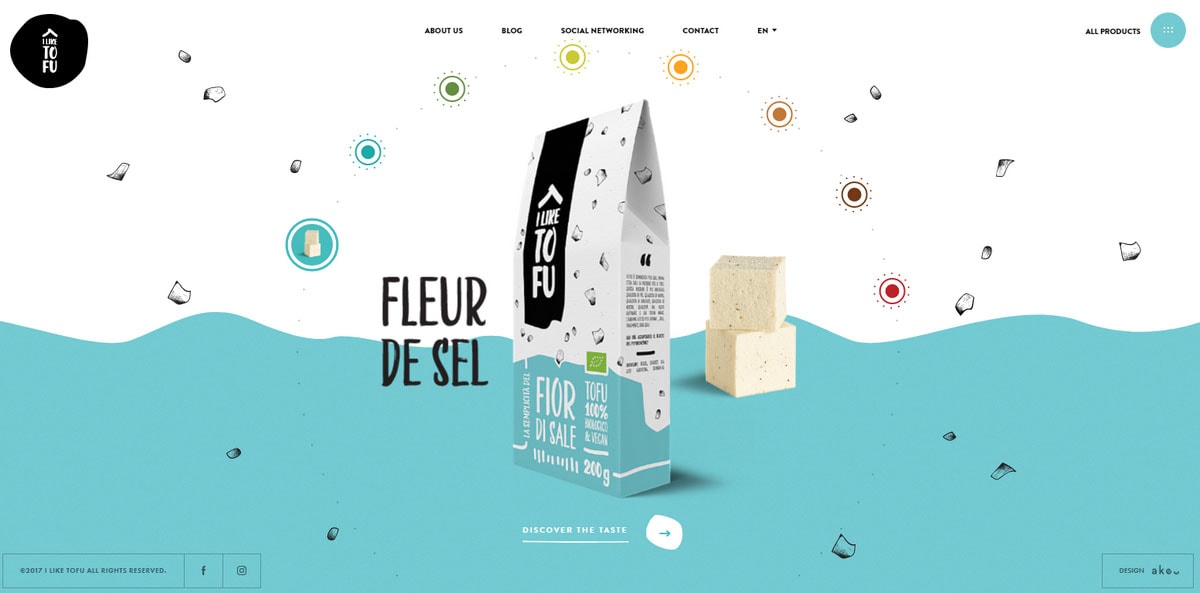
I like tofu
Take a look at homepage’s slider in I LIKE TOFU website. From the get-go, it enchants with its alluring ornamental and highly exquisite atmosphere. Each picturesque scene is charged with motion. The unique circular navigation is also a smart touch. The slider looks awesome.
With Pulsetic you’ll be instantly notified the moment your website, API, or server becomes unavailable. Monitor uptime from multiple global locations and respond to incidents before your users are affected.
Create beautiful status pages in minutes to keep customers informed during outages and build trust with transparent communication.
Start Monitoring for FreeTwist an Angle
We are accustomed to carousels where slides move either in horizontal or vertical direction. These two axes for the majority of developers seem to be the only way; however, nothing stops you from ditching the classic right angle and leading visitors in a diagonal direction.
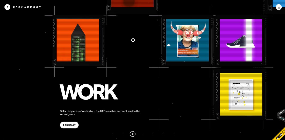
Ufomammoot
Ufomammot shows how to properly twist an angle. Of course, it is not a classic carousel; the sliding technique lies in its core. Each move takes you in an unexpected direction. Together with a unique design, it feels extraterrestrial.
Make it Colorful
Color is a powerful tool that sometimes stays disregarded and underestimated. In its powers to set the mood, place accents, freshen up design and much more. In general, it plays a minor role; however, not in the case of Laborfit where it underlies the whole aesthetic.
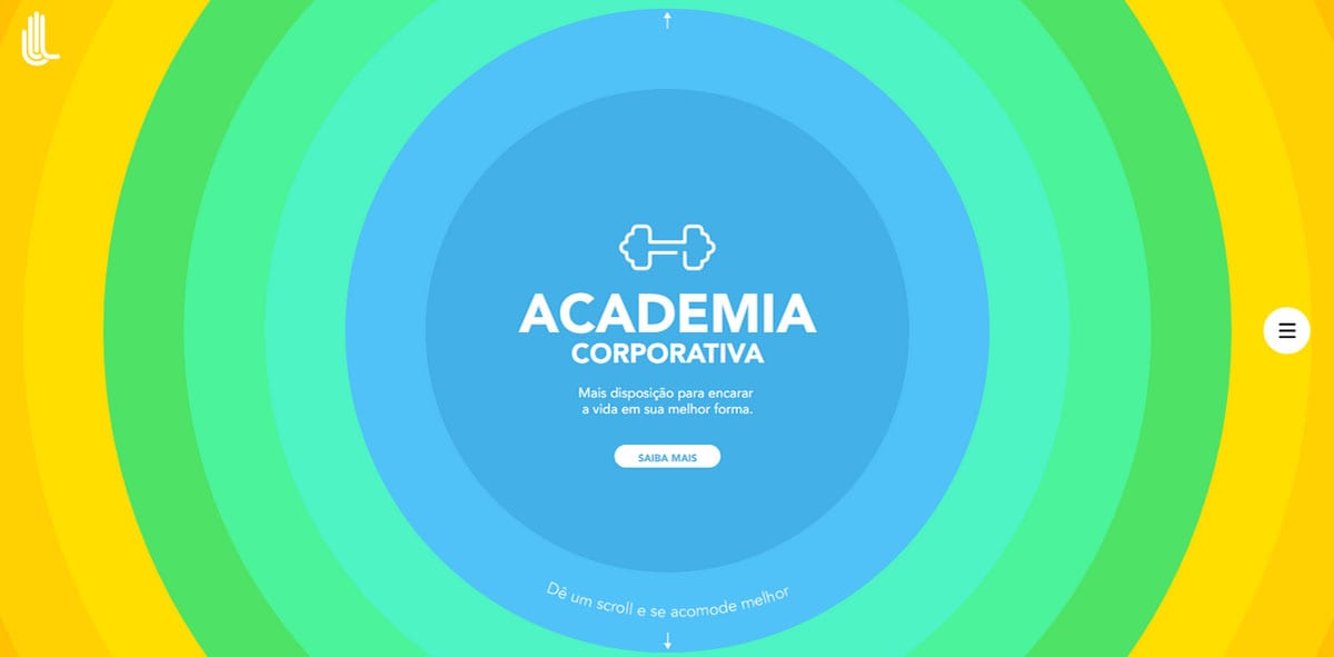
Laborfit
Each slide has its own assigned tone. The radial shape of the component and smooth animation not only naturally establish a focus on the center, where the content is, but also make it interesting and exceptional. The choice of colors inspired by material design enhances the design even more.
Focus on Transitions
Sometimes when you are short of a good idea, that will transform the whole composition into something grandiose, you can start with the small changes, for example, improve exits and entrances.
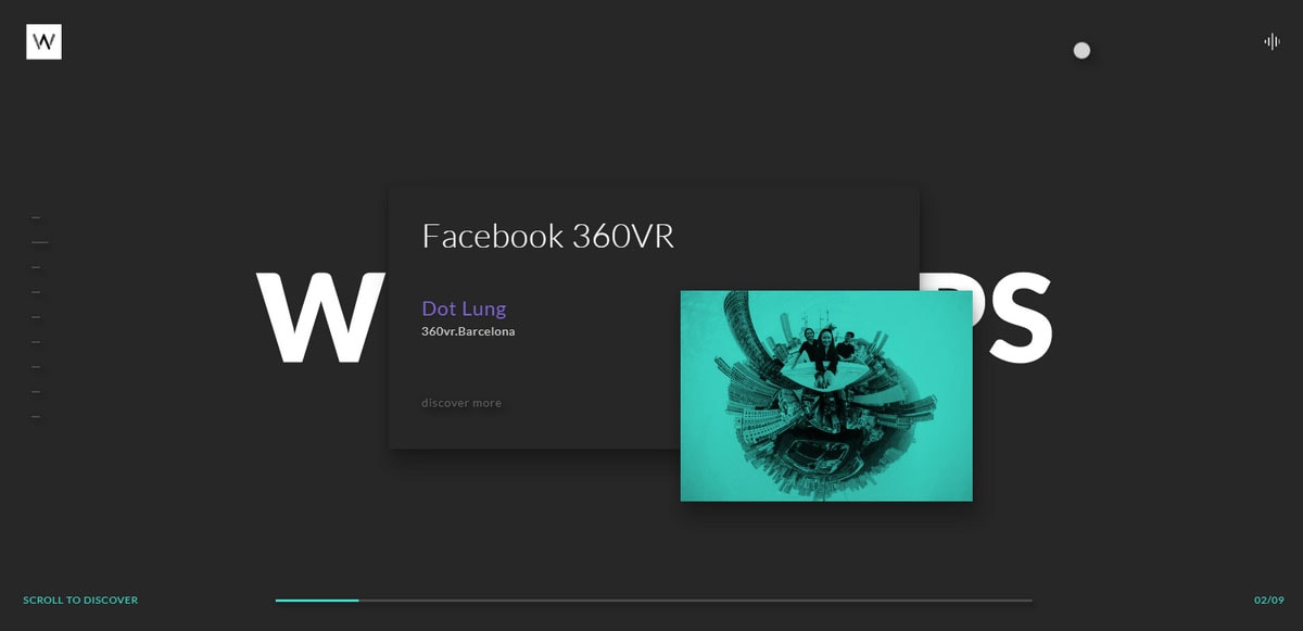
Workshop
The team behind the Workshop shows how unconventional transitions between the slides easily enhance the user experience and place the component at the heart of the action. Although the effect is not something extraordinary, it stands out and that is all you need. What’s more, it helps to illustrate the tagline “Scroll to discover” and benefits the intricate environment of the slider
Use the Block Reveal Effect
In continuation to the previous solution, if you can’t make up your mind on what kind of effect for entrances to choose you can always try something trendy like block reveal effect. The latter is highly popular these days. Showing content in some kind of schematic boxy fashion is truly engaging.
On one hand, it brings a sense of seriousness and businesslikeness; and on the other, it adds a subtle touch of playfulness.
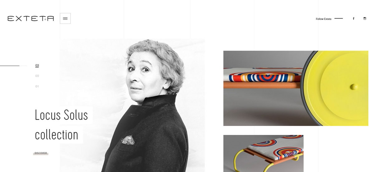
Exteta
Exteta provides the user an experience with spice, yet cements a certain level of seriousness in the project.
Dive Into a High-Tech Atmosphere
The first thing you should know about high-tech design is that it is usually associated with something innovative and ingenious. So that if you want to impress on visitors the sense of a pioneering company you should probably try to adopt this solution. The high-tech atmosphere exudes an image of confidence, boldness and trustworthiness.
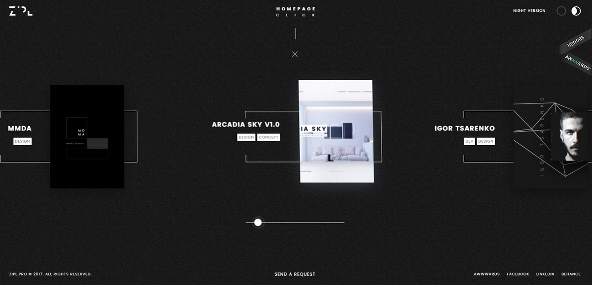
Zipl
Zipl follows this idea. The slider feels cutting-edge and avant-garde. Elegant line-style graphics, tiny neat images, dark coloring, fancy accompanying effects, and magnificent boxy vibe – everything contributes to the design.
Split It in Two
Split layouts and sliders work together like magic, making the latter look exceptional. Dividing content into separate areas gives you an opportunity to show two types of information separately and at the same time form a common space that draws the attention to one particular topic.
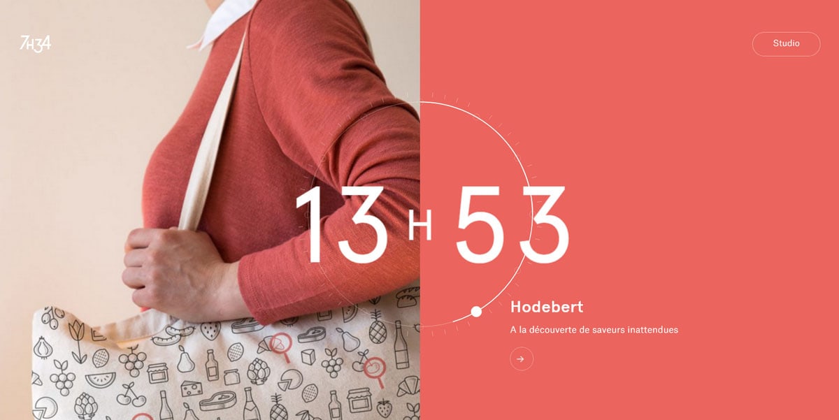
7h34
7h34 illustrates this. The team behind the website breaks the area into halves and spruces them up with subtle animations. As a result, the component looks fantastic; it conveys the message and gets all the attention.
Master the Multilayered Approach
Mastering multilayered aesthetics can be challenging; however, when done right it can be rewarding. It is all about striking a balance in overlapping components, determining priorities for the blocks and staying conservative with the dynamic effects. As for the latter, just add to the component a feeling of “levitation” and you will end up with a pretty nifty solution.
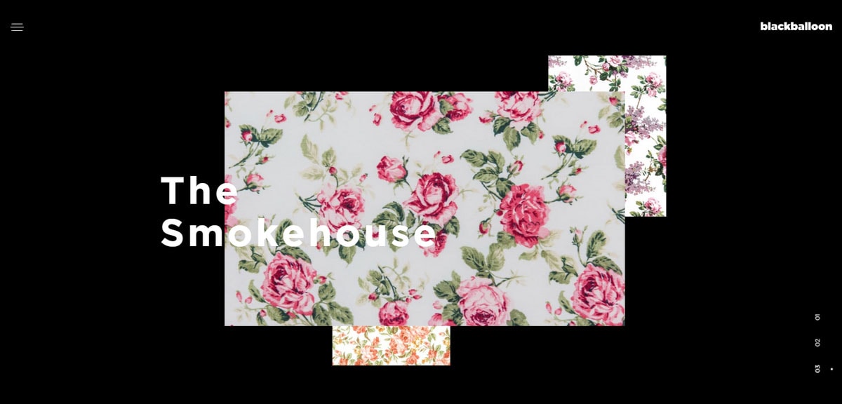
Blackbaloon
Blackbaloon is good at this. Each slide features three partially overlapped details that mildly soar in the thin air. The idea and realization are ingenious.
Conclusion
When you force yourself to look at things at another angle even the most trivial elements of the interface are able to surprise you. With these 10 interesting, innovative and in some cases unexpected solutions a regular slider component gets new life and becomes the heart of the design and user experience.


