Creating a Custom Bootstrap Landing Page with Startup
Designmodo’s Startup Framework is an affordable tool to help you create excellent web pages quickly and is one of the best bootstrap website builder. The framework is a drag and drop page builder, made with Bootstrap. This means you can easily and quickly generate production-ready, responsive pages in a manner of minutes.
Looking for a Bootstrap online builder?
- 👉 Try our Bootstrap Builder and create unlimited projects for unlimited clients.
- 👉 Start to build a website using our Bootstrap Templates.
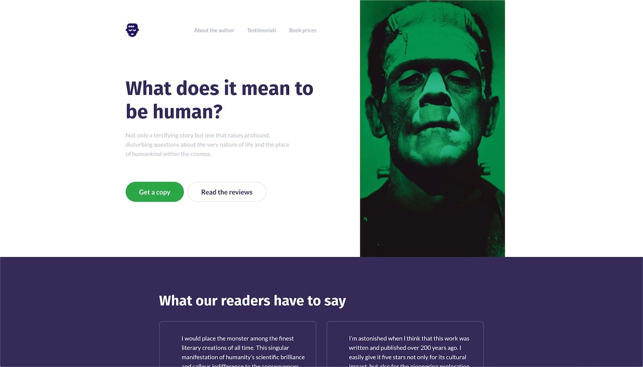
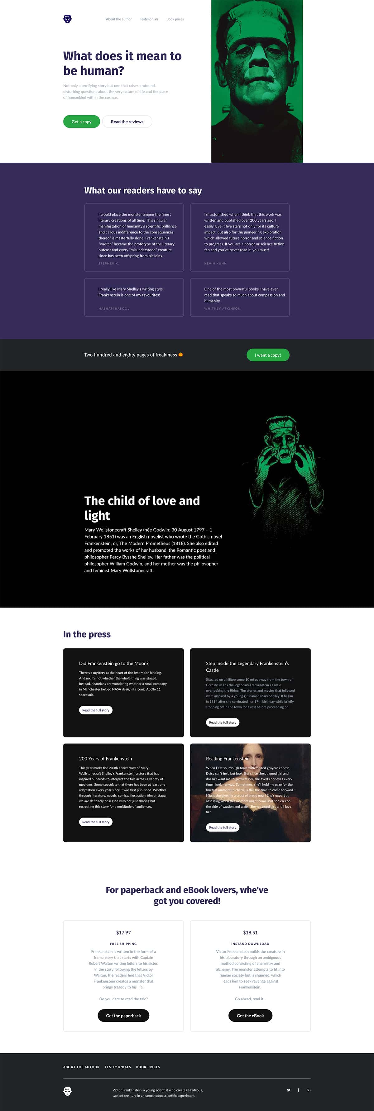
In this tutorial, we’re going to go over Startup’s basic features and showcase precisely how easy it is to use Startup from conceptualizing your idea to editing page content. Oh yes, and the theme of this design is a single-page landing page for Mary Wollstonecraft Shelley’s Frankenstein.
Why Use Startup?
Before we jump into the tutorial, I do want to point out a few key benefits of Startup Framework for those of you who aren’t familiar with it. It’s an easy to use tool with a drag and drop interface. It’s built on the Bootstrap framework, which has an amazing responsive grid system. It’s also written with HTML5 and CSS3 for effective, optimized and up-to-date code structure.
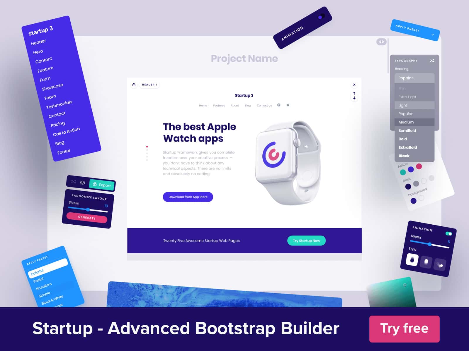
What else? Startup features a large collection of pre-made bootstrap templates for all kinds of section styles including headers, footer, pricing, blogs, and a large selection of various content section. There are over 40 blocks specifically for e-commerce purposes (with plans on releasing additional blocks for apps and restaurants). The designs are retina-ready, which means it’s optimized to look great on high-resolution screens.
The framework also features a few global customization options including page typography, colors an animations – more on those later.
With Postcards Email Builder you can create and edit email templates online without any coding skills! Includes more than 100 components to help you create custom emails templates faster than ever before.
Free Email BuilderFree Email TemplatesBest Practices for Using Startup
If you plan on using Startup to build your pages, there are two ways you can go about this. The first is to use the different section blocks to plan out your page flow and use it as a source of inspiration for your designs. This is great if you’re in the beginning stages of your design and don’t want to create a concept (or content) for something that Startup cannot accommodate.
Or, you can go the content-first route which we covered in another blog post here on Designmodo. The idea is to develop the overall flow of the page and identify the various content section and start generating the content before you start the visual design.
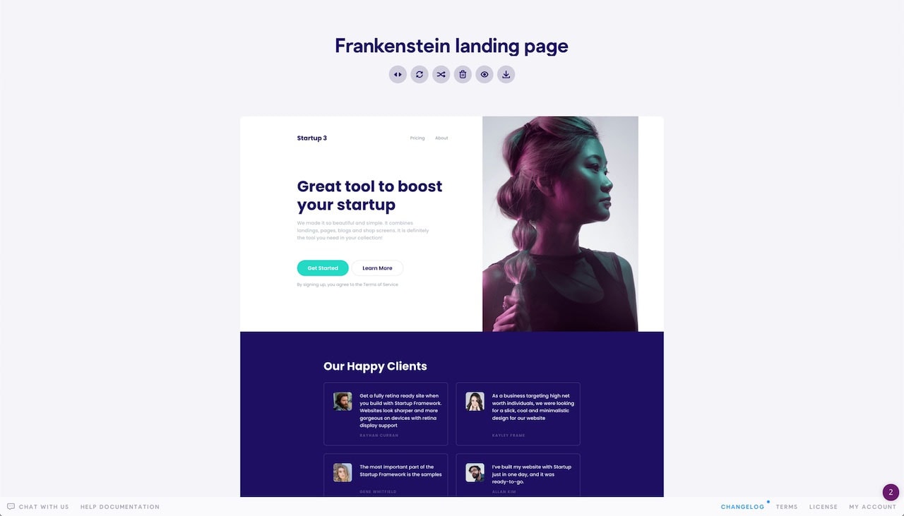
For this tutorial, I combined the approaches. First, I took a look through all the different block components available in Startup and used it to create the general flow of the page that matched the content I wanted to present. Once I was happy with the flow, I gathered all of my content so that I can easily plug into the page after exporting it from Startup. This made working with Startup a much faster process for me.
Setting Up the Page and Content
The image above is the basic design I started with, and I’ll get into those detail next. Once I had this established, I started on the content. Because this is such a simple page, it didn’t take much for me to gather it all.
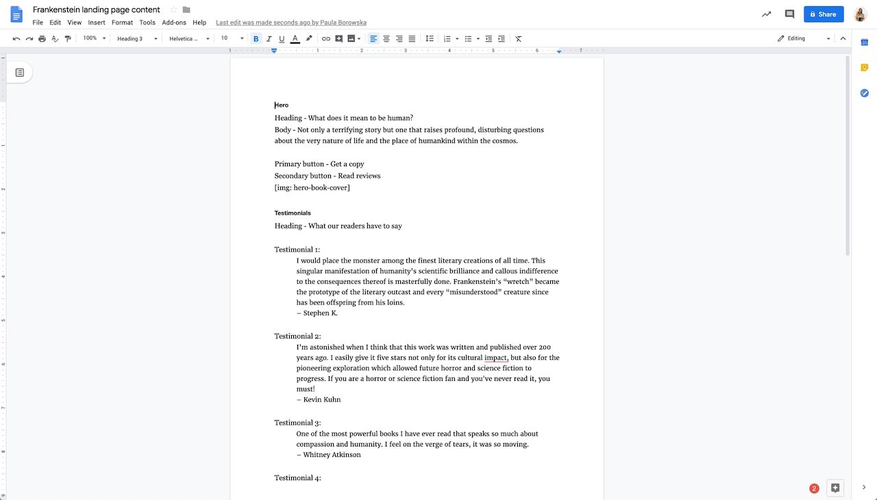
I took the time to figure out which images, texts, headlines, and CTAs were going where. I kept all of it in a Google Doc. Later, I plugged this content into the HTML generated by Startup. I’ll walk you through this shortly.
With this said, let’s talk about the design setup inside the Startup.
Getting the Page Started in Startup
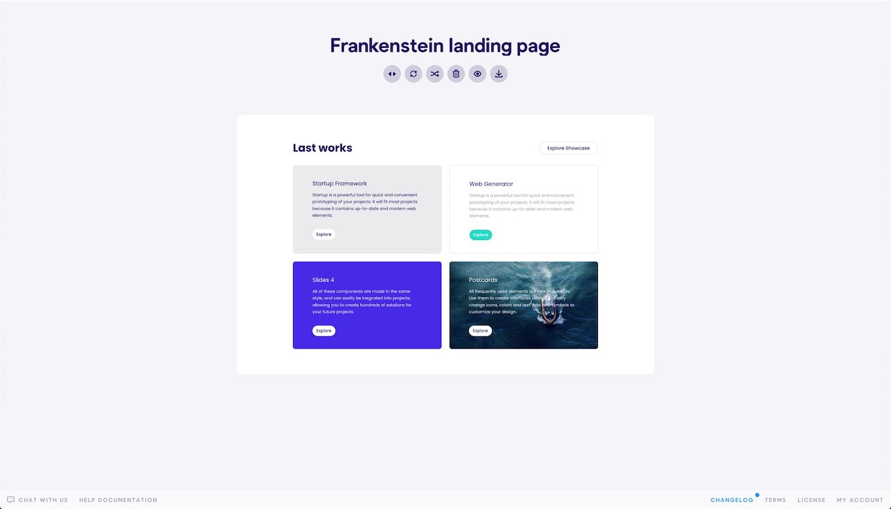
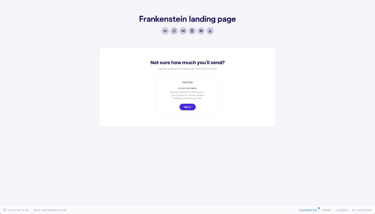
As I briefly mentioned, I had a good idea of what I wanted the design of this page to look like. I’ve used the following sections, in order, to create this landing page design:
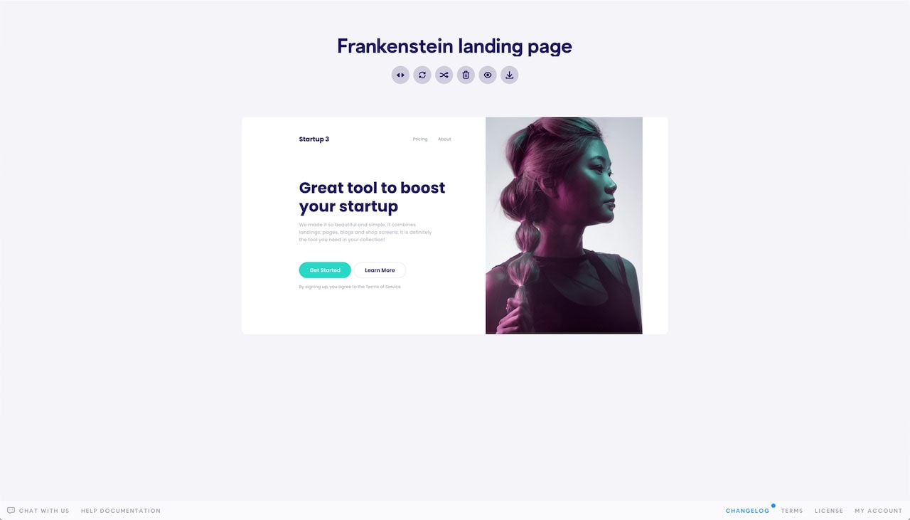
Header 7
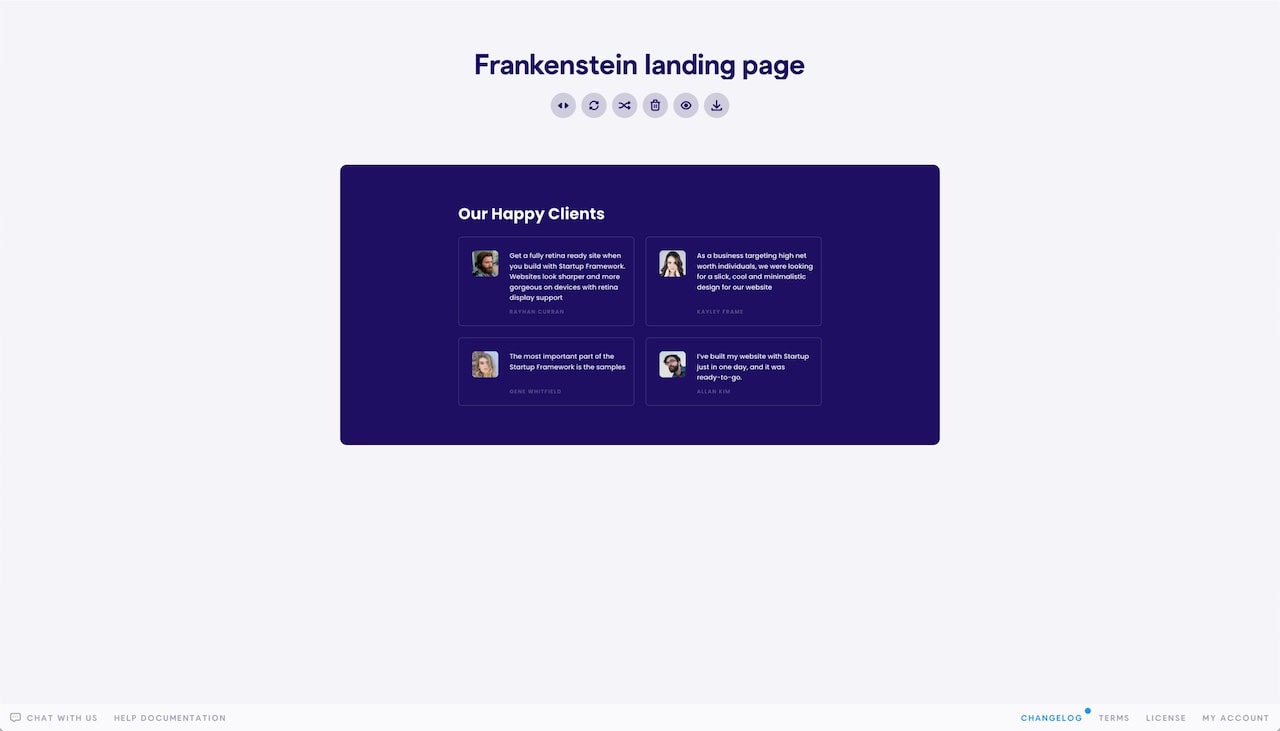
Testimonials 6
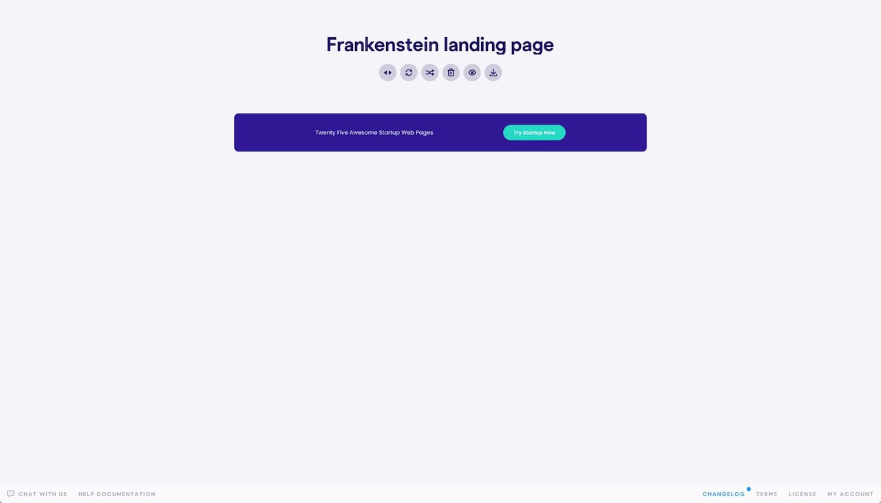
Call to action 11
Content 15
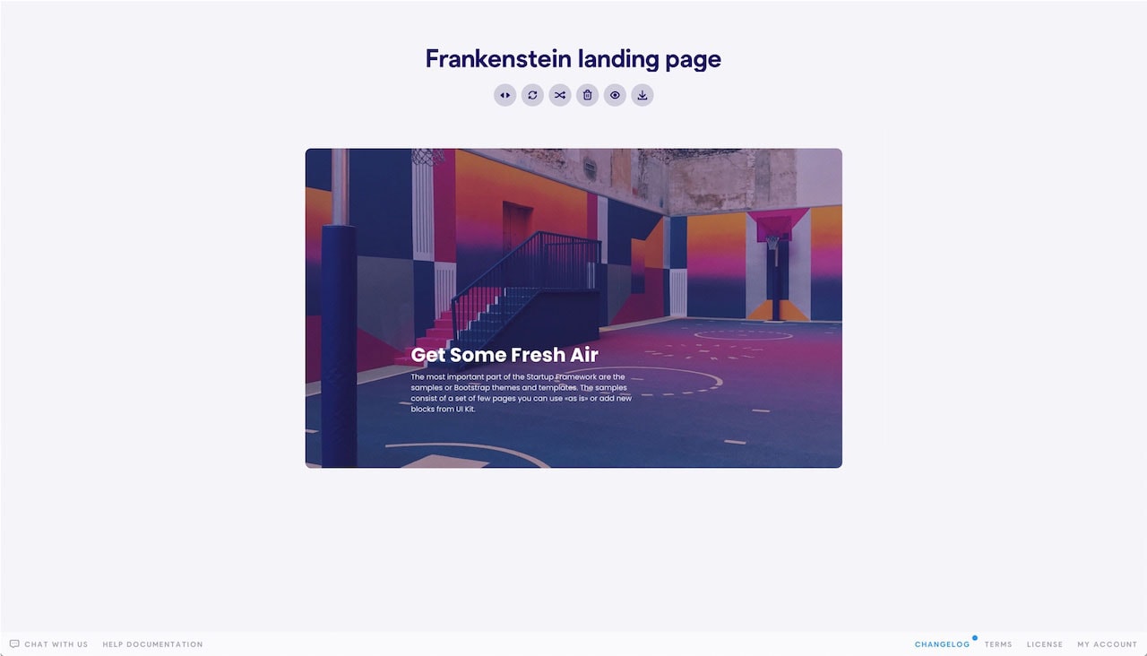
Showcase 10
Pricing table 7
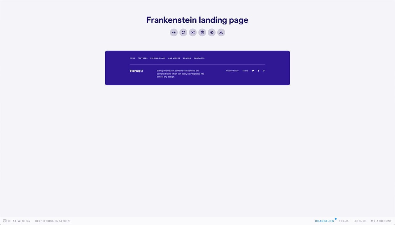
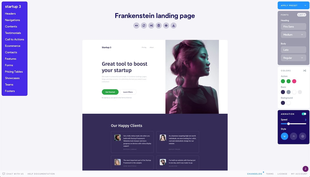
In the top middle of the screen are a variety of useful icons including ones to toggle the side controls or delete your current page layout to restart. The second to last icon is particularly helpful because it lets you preview the design in the browser.
With Pulsetic you’ll be instantly notified the moment your website, API, or server becomes unavailable. Monitor uptime from multiple global locations and respond to incidents before your users are affected.
Create beautiful status pages in minutes to keep customers informed during outages and build trust with transparent communication.
Start Monitoring for Free
Additionally, Startup has a few design settings that are global to the whole page, including typography, colors, and animations. You can find those setting to the right of the page.
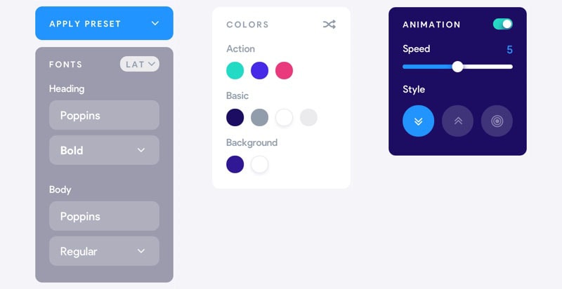
I’ve changed my fonts to Fira Sans (Medium) for headings and Lato (Regular) for the body. The default colors were close to what I needed but not quite so I changed them a bit. My design colors include: #28a745, #352c58, #919dab, #212529, and #111111.
Feel free to use the randomizer tool to another color scheme or enter your own. I’ve also slowed down the animation from 5 seconds to 3. Adjust or remove the animations for your page as you see fit.
Export Your Startup Page
Now that we have the basic structure set up, it’s time to export the page to add in our content and finalize the design. To export, click the last icon in the top middle icon set. This will generate a zip file.

Customize Your Startup Page
Unzip your file and open up index.html in an editor of your choosing. The zip files come with everything you’d need to publish your new page. If you’re comfortable, you can edit the CSS, HTML, and JS as you see fit to customize your page further.
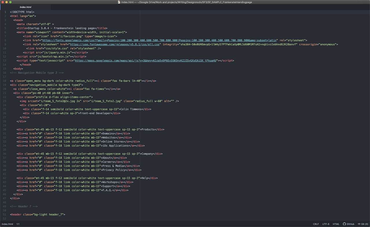
Now let me show you how I went about customizing a few different sections of this landing page to give you an idea of how to edit these on your own.
It’s easy to spot the various sections in the index file because of their corresponding titles being commented out in the markup. For example, <!— Header 7 —>, <!— Call to Action 11 —> or <!— Pricing Table 7 —>.
First, I’m going to change the default Startup 3 logo with my own. You’re going to need to do this in two separate places, one for the desktop layout and one for mobile.
Old code:
<div class="logo">Startup 3</div>
…
<div class="mb-3 logo d-block d-xl-none logo_mobile">Startup 3</div>
New code:
<div class="logo">
  <img src="imgs/frank-logo.svg" alt="Frankenstein logo" height="40">
</div>

<div class="mb-3 logo d-block d-xl-none logo_mobile">
  <img src="imgs/frank-logo.svg" alt="Frankenstein logo" height="40">
</div>
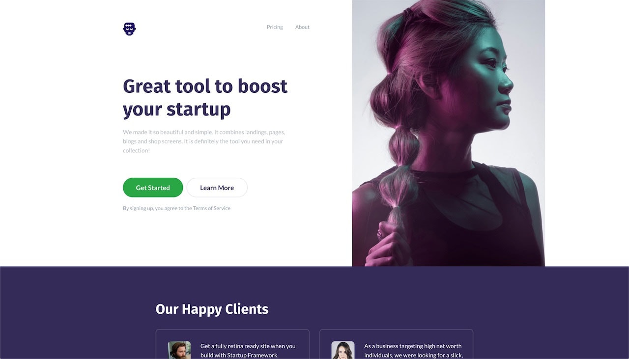
To update the navigation links, we need to do these in two separate places as well because of the desktop and mobile navigations. If you have another page you’d like to pair this one with, internally or externally, change out the link placeholder (#) with the desired URL. Don’t forget to update the name of the link as well.
You’re free to add more too or remove this altogether if it doesn’t serve your design. I’m going to change these links to be internal to the other page sections and add one more link. I’m starting with the desktop navigation first.
Old code:
<a href="#" class="link color-heading medium ml-35">Pricing</a>
<a href="#" class="link color-heading medium ml-35">About</a>
New code:
<a href="#aboutAuthor" class="link color-heading medium ml-35">About the author</a>
<a href="#testimonial" class="link color-heading medium ml-35">Testimonials</a>
<a href="#pricingTable" class="link color-heading medium ml-35">Book prices</a>
The mobile navigation in this design has two different sections. One is a short profile section which I don’t need for my design. I removed this altogether.
Removed code:
<div class="profile d-flex align-items-center">
  <img srcset="i/[email protected] 2x" src="i/team_5_foto2.jpg" class="radius_full w-60" alt="" />
  <div class="ml-20">
    <div class="f-14 semibold color-white text-uppercase sp-15">Colin Timmons</div>
    <div class="f-14 color-white op-3">Front-end Developer</div>
  </div>
</div>
Again, there are a lot of additional links here that aren’t needed. I’m updating them accordingly. Keep in mind, I’m not just copying and pasting the code from the desktop nav because they two have different classes.
Old code:
<div class="mt-45 mb-15 f-12 semibold color-white text-uppercase sp-15 op-3">Products</div>
<div><a href="#" class="f-18 link color-white mb-15">Domains</a></div>
<div><a href="#" class="f-18 link color-white mb-15">Websites</a></div>
<div><a href="#" class="f-18 link color-white mb-15">Online Stores</a></div>
<div><a href="#" class="f-18 link color-white mb-15">iOS Applications</a></div>

<div class="mt-45 mb-15 f-12 semibold color-white text-uppercase sp-15 op-3">Company</div>
<div><a href="#" class="f-18 link color-white mb-15">About</a></div>
<div><a href="#" class="f-18 link color-white mb-15">Careers</a></div>
<div><a href="#" class="f-18 link color-white mb-15">Press & Media</a></div>
<div><a href="#" class="f-18 link color-white mb-15">Privacy Policy</a></div>

<div class="mt-45 mb-15 f-12 semibold color-white text-uppercase sp-15 op-3">Help</div>
<div><a href="#" class="f-18 link color-white mb-15">Workshops</a></div>
<div><a href="#" class="f-18 link color-white mb-15">Support</a></div>
<div><a href="#" class="f-18 link color-white mb-15">F.A.Q.</a></div>
New code:
<div><a href="#aboutAuthor" class="f-18 link color-white mb-15">About the author</a></div>
<div><a href="#testimonial" class="f-18 link color-white mb-15">Testimonials</a></div>
<div><a href="#pricingTable" class="f-18 link color-white mb-15">Book prices</a></div>
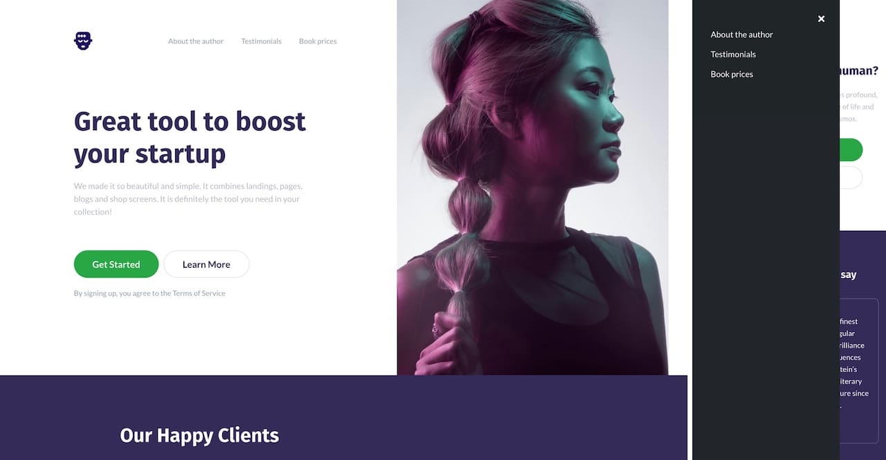
Now, I’m taking the time to update the header section’s text and image content. First, I updated the H1 copy and the paragraph underneath it.
Old code:
<h1 data-aos-duration="500" data-aos="fade-down" data-aos-delay="0">Great tool to boost your startup</h1>
<div class="mt-20 mw-500 color-heading f-18 medium op-7 text-adaptive">
    <span data-aos-duration="500" data-aos="fade-down" data-aos-delay="250">
        We made it so beautiful and simple. It combines
        landings, pages, blogs and shop screens. It is definitely
        the tool you need in your collection!
    </span>
</div>
New code:
<h1 data-aos-duration="500" data-aos="fade-down" data-aos-delay="0">What does it mean to be human?</h1>
<div class="mt-20 mw-500 color-heading f-18 medium op-7 text-adaptive">
    <span data-aos-duration="500" data-aos="fade-down" data-aos-delay="250">Not only a terrifying story but one that raises profound, disturbing questions about the very nature of life and the place of humankind within the cosmos.</span>
</div>
Then the buttons:
Old code:
<a href="#" class="btn lg action-1">Get Started</a>
<a href="#" class="ml-10 btn lg border-gray color-main">Learn More</a>
New code:
<a href="#pricingTable" class="btn lg action-1">Get a copy</a>
<a href="#testimonials" class="ml-10 btn lg border-gray color-main">Read the reviews</a>
Additionally, I don’t need the “Terms of Service” text from below the buttons, so I removed it.
Removed code:
<div class="mt-20 color-heading text-adaptive" data-aos-duration="500" data-aos="fade-down" data-aos-delay="500">
    By signing up, you agree to the <a href="#" class="link color-heading">Terms of Service</a>
</div>
Last, for the header section I’m going to update the image. As you can see the code for the image has two sources, one for the default 1x resolution and the other for 2x for high-resolution, retina screens.
Old code:
<img srcset="i/[email protected] 2x" src="i/team_5_foto2.jpg" class="radius_full w-60" alt="" />
New code:
<img src="imgs/green-frank-bg.jpg" class="d-none d-md-block ml-700 h-full absolute header_7_bg" alt="Frankenstein's monster." data-aos-duration="500" data-aos="fade-down" data-aos-delay="750" />
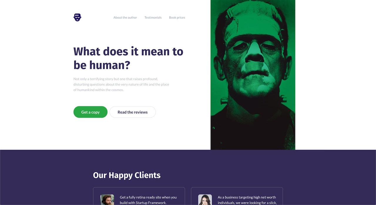
So far, I’m only changing the content as needed without adjusting the code itself – expect the occasional removal of unnecessary content. I’m not touching any of the code generated by Startup. I don’t need to. If you want to use your Startup page template as a jumping-off point for a much more customized design, go for it! However, without doing so, this page is still great, which is what makes this one hell of a tool.
Testimonials Section
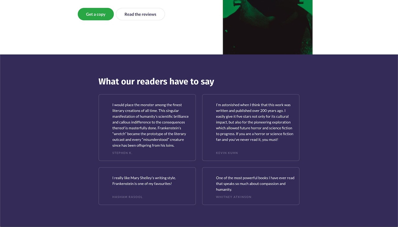
Here I’m planning on doing three things, updating the section’s title, removing the customer avatars as I don’t have those and replacing the testimonials copy.
Up first, the H2:
Old code:
<h2 class="mb-35 small">Our Happy Clients</h2>
New code:
<h2 class="mb-35 small">What our readers have to say</h2>
I’m going to tackle removing the images while I update the testimonials with my own in one go:
Old code (single testimonial example):
<div class="relative d-sm-flex align-items-stretch pl-35 pr-20 pt-35 pb-25 inner">
	<img srcset="i/[email protected] 2x" src="i/testimonial_6_img_1.jpg" class="mb-10 img-fluid align-self-start radius10" alt="" />
	<div class="relative ml-30 pb-35 info">
		<div class="f-18 medium text-adaptive">
			Get a fully retina-ready site when
			you build with Startup Framework.
			Websites look sharper and more
			gorgeous on devices with retina
			display support.
		</div>
		<div class="absolute f-14 semibold text-uppercase sp-20 op-3 author">Rayhan Curran</div>
	</div>
</div>
New code (single testimonial example):
<div class="relative d-sm-flex align-items-stretch pl-35 pr-20 pt-35 pb-25 inner">
	<div class="relative ml-30 pb-35 info">
		<div class="f-18 medium text-adaptive">
			I would place the monster among the finest literary creations of all time. This singular manifestation of humanity’s scientific brilliance and callous indifference to the consequences thereof is masterfully done. Frankenstein’s “wretch” became the prototype of the literary outcast and every “misunderstood” creature since has been offspring from his loins.
		</div>
		<div class="absolute f-14 semibold text-uppercase sp-20 op-3 author">Stephen K.</div>
	</div>
</div>
Pricing Section
Here, I’m changing the copy but also adding a second pricing option. I wanted to give you one more example of how easy it is to work with Startup even if the default design block is almost perfect but needs some modification.
Let’s tackle the duplication first.
Old HTML code:
<div class="row justify-content-center">
	<div class="col-xl-6 col-lg-7 col-md-8 col-sm-10" data-aos-duration="500" data-aos="fade-down" data-aos-delay="500">
		<div class="pt-40 pb-45 radius10 inner">
			<div class="row justify-content-center no-gutters">
				<div class="col-xl-7 col-lg-8 col-sm-9 col-11">
					<div class="f-22 title">Free Plan</div>
					<div class="mt-25 f-14 text-uppercase semibold sp-20">20,000 customers</div>
					<div class="mt-10 color-heading f-18 medium text-adaptive">
						Startup Framework is free forever —
						you only pay for custom domain
						hosting or to export your site.
					</div>
					<a href="#" class="mt-35 btn lg action-2">Sign In</a>
				</div>
			</div>
		</div>
	</div>
</div>
What we want to do is duplicate the content inside the row div <div class=”row justify-content-center”>.
New code:
<div class="row justify-content-center">
<div class="col-xl-6 col-lg-7 col-md-8 col-sm-10" data-aos-duration="500" data-aos="fade-down" data-aos-delay="500">
<div class="pt-40 pb-45 radius10 inner">
<div class="row justify-content-center no-gutters">
<div class="col-xl-7 col-lg-8 col-sm-9 col-11">
<div class="f-22 title">Free Plan</div>
<div class="mt-25 f-14 text-uppercase semibold sp-20">20,000 customers</div>
<div class="mt-10 color-heading f-18 medium text-adaptive">
Startup Framework is free forever — you only pay for custom domain hosting or to export your site.
</div>
<a href="#" class="mt-35 btn lg action-2">Sign In</a>
</div>
</div>
</div>
</div>
</div>
Once you do you should get something like this:
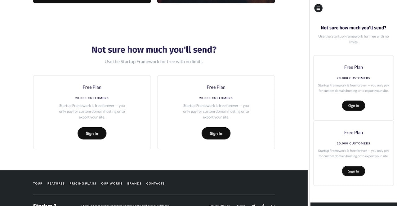
There is no spacing between these when they’re stacked which doesn’t look very good. However, I also don’t like their breakpoints (as they weren’t meant for two side by side elements). We’ll deal with both, first with the HTML classes.
If you’re unfamiliar with Bootstrap, they use a 12-column grid system.
So an element will take up 10 columns if it’s col-10 or six if it’s col-6. Our two elements have the following breakdown structure: col-xl-6 col-lg-7 col-md-8 col-sm-10. The -lx, -lg -md and -sm represent screen sizes. So, on extra-large screens (≥1200px) the elements are both 6 columns in width, on large screens (992px – 1200px) they are 7 and so on. Again, the Bootstrap Grid system documentation has a fantastic breakdown for all of this if you’re unfamiliar.
Old code:
<div class="col-xl-6 col-lg-7 col-md-8 col-sm-10" data-aos-duration="500" data-aos="fade-down" data-aos-delay="500">
...
</div>
New code:
<div class="col-sm-6 col-xs-10" data-aos-duration="500" data-aos="fade-down" data-aos-delay="500">
    ...
</div>
On screens smaller than 576px are they stacked, otherwise they are side by side.
Using CSS, we can add margins below the first pricing box when they are stacked:
Added CSS code:
@media (max-width: 575.98px) {
  .pricing_table_7 .inner:first-child{
    margin-bottom: 40px;
  }
}
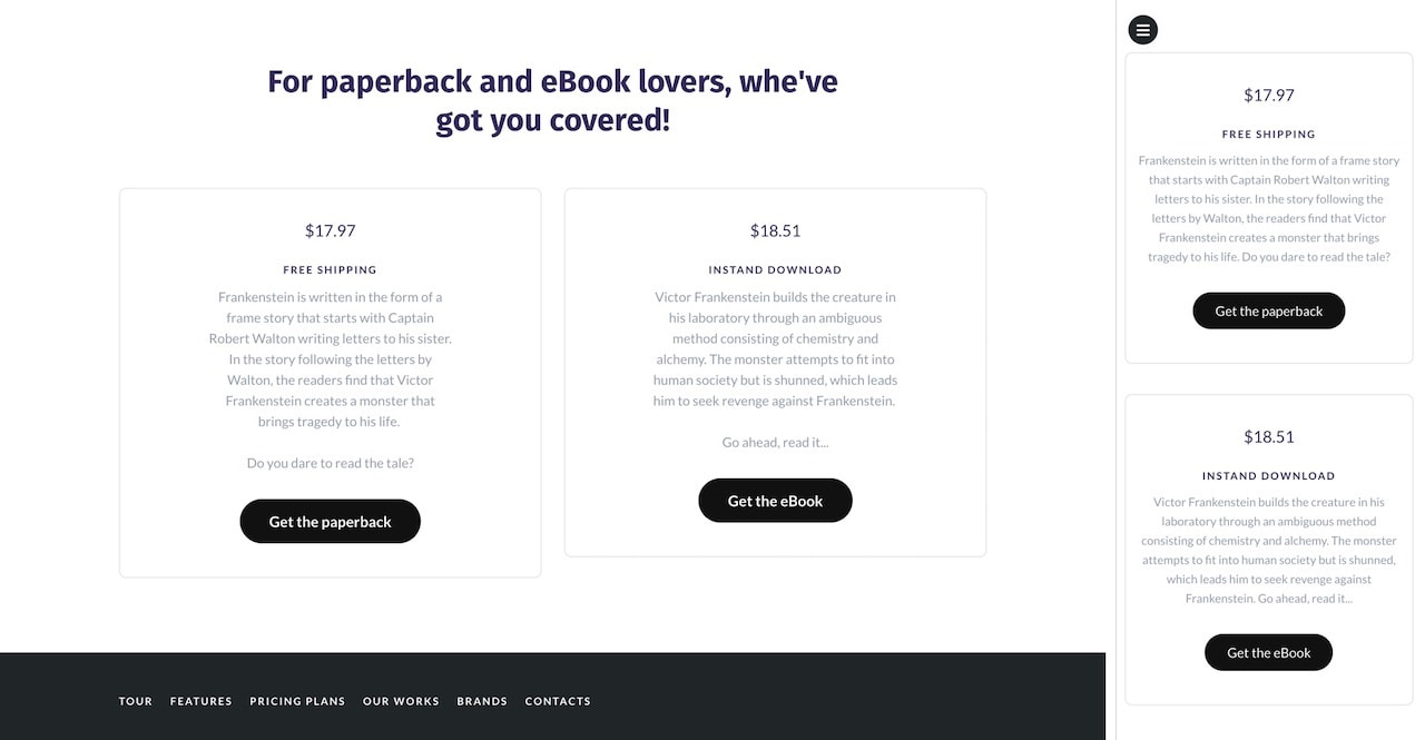
And, of course, I’ve updated the copy as well.
Final Design
Once you’re done making all your content/design changes your page is ready to go live. I’m attaching the Frankenstein landing page files for you. It’s the fully edited page.
Here is the final design:
Download the HTML
Conclusion
As you can see, creating pages with Startup and editing them to fit your needs is neither difficult nor complicated. The Startup is a wonderful tool to help you create beautiful and fully-responsive web pages quickly and efficiently.

