Create an E-Commerce Web Element with CSS3
Difficulty: Intermediate
Estimated completion time: 1 hour
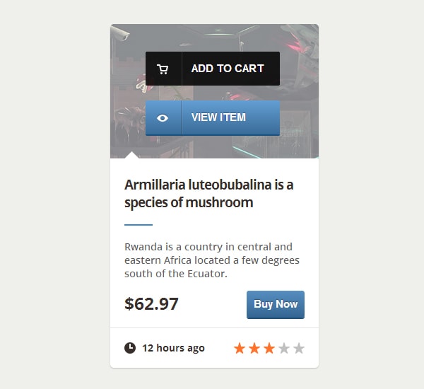
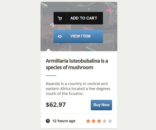
In this tutorial you’ll learn how to create a web element very popular among E-Commerce websites. The design of this element can be found in The Bricks UI.
Let’s get started:
Step 1: HTML Markup
First, include this line inside the head of your HTML file, because we’re going to use the font “Open Sans” from Google Web Fonts:
<link href="https://fonts.googleapis.com/css?family=Open+Sans:600,700" rel="stylesheet" type="text/css">
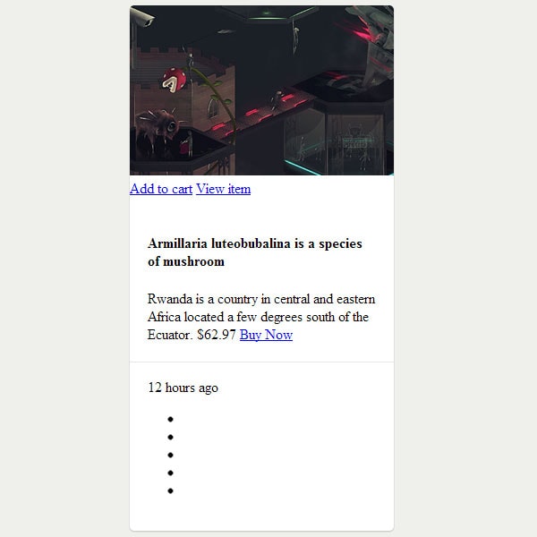
The main container of the element will be the div with the class block. Inside of it, there are three other divs: the first one shows the preview image of the product and two buttons (product), the second one contains informations about the product (info) and the last one contains additional details, like the rating of the product:
<div class="block">
    <div class="product">
        <img src="img/product.jpg" alt="Product Image">
        <div class="buttons">
            <a class="buy" href="#">Add to cart</a>
            <a class="preview" href="#">View item</a>
        </div>
    </div>

    <div class="info">
        <h4>Armillaria luteobubalina is a species of mushroom</h4>
        <span class="description">
            Rwanda is a country in central and eastern Africa located a few degrees south of the Equator.
        </span>
        <span class="price">$62.97</span>
        <a class="buy_now" href="#">Buy Now</a>
    </div>

    <div class="details">
        <span class="time">12 hours ago</span>
        <ul class="rating">
            <li class="rated"></li>
            <li class="rated"></li>
            <li class="rated"></li>
            <li></li>
            <li></li>
        </ul>
    </div>
</div>
Step 2: Basic Styling
Let’s start with the main container: we’ll make it 295 pixels wide and we’ll add rounded corners, a white background and a subtle shadow.
With Postcards Email Builder you can create and edit email templates online without any coding skills! Includes more than 100 components to help you create custom emails templates faster than ever before.
Free Email BuilderFree Email Templates
.block {
	display: block;
	position: relative;
	width: 295px;
	border-radius: 5px;
	background: #fff;
	box-shadow: 0 1px 2px rgba(0, 0, 0, .2);
}
Now, the div which contains the preview image of the product:
.product {
	display: block;
	position: relative;
}
The actual image will also have rounded corners and it will take the width of its container:
.product img {
	width: 100%;
	border-top-left-radius: 5px;
	border-top-right-radius: 5px;
}
Next, the divs which contain the informations about the product:
.info {
	display: block;
	position: relative;
	padding: 20px;
}

.details {
	border-top: 1px solid #e5e5e5;
	padding: 18px 20px;
}
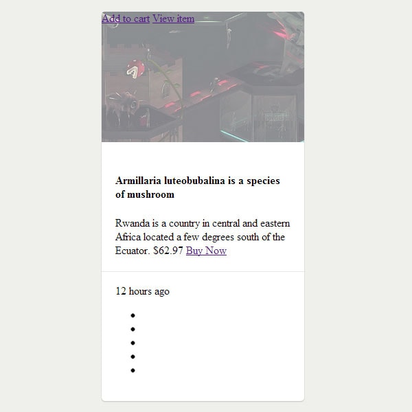
The buttons are contained by the div with the class buttons. When the preview image of the product is hovered, the buttons should appear with a transition. First, let’s take care of the div, which will have a semi-transparent white background when the preview image is hovered:
.buttons {
	display: block;
	position: absolute;
	left: 0;
	top: 0;
	width: 100%;
	height: 100%;
	border-top-left-radius: 5px;
	border-top-right-radius: 5px;
	background: rgba(255, 255, 255, .5);
	opacity: 0;
	-webkit-transition: opacity .25s ease-in;
	-ms-transition: opacity .25s ease-in;
	-moz-transition: opacity .25s ease-in;
	-o-transition: opacity .25s ease-in;
	transition: opacity .25s ease-in;
}

.product:hover .buttons, .product:hover a {
	opacity: 1;
}
The hover state should look like this:
Next, some basic styling for the buttons:
With Startup App and Slides App you can build unlimited websites using the online website editor which includes ready-made designed and coded elements, templates and themes.
Try Startup App Try Slides AppOther Products
.buttons a {
	display: block;
	position: absolute;
	left: 50px;
	width: 115px;
	border-radius: 2px;
	padding: 15px 10px 15px 65px;
	font-family: Helvetica, sans-serif;
	font-size: 15px;
	font-weight: bold;
	text-transform: uppercase;
	color: #fff;
	text-decoration: none;
	opacity: 0;
}
The icons from the buttons will be contained by pseudo-elements:
.buttons a::after {
content: &amp;amp;quot;&amp;amp;quot;;
display: block;
position: absolute;
height: 48px;
width: 50px;
border-right: 1px solid rgba(0, 0, 0, .25);
box-shadow: 1px 0 0 rgba(255, 255, 255, .17);
top: 0;
left: 0;
z-index: 1;
}
Now, let’s style each button individually. First, the “Add to cart” button. The button has a semi-transparent black background and will be positioned vertically using percentages because the preview images have a fixed width, but their height is variable:
a.buy {
	top: 20%;
	background: #414141;
	background: rgba(0, 0, 0, .85);
	-webkit-transition: background .2s ease-in;
	-ms-transition: background .2s ease-in;
	-moz-transition: background .2s ease-in;
	-o-transition: background .2s ease-in;
	transition: background .2s ease-in;
}
On hover, its background will be a little bit lighter:
.buy:hover {
	background: #515151;
	background: rgba(45, 45, 45, .85);
}
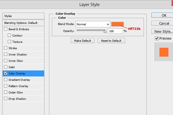
Next, we’ll add the cart icon, which can be found in the Unicons pack (it’s included in the Bricks UI). Open up the PNG icon from the 16 folder with Photoshop and apply the following layer style:

Save it as a PNG image. Now, let’s set the icon as background for the button’s pseudo-element:
.buy::after {
background: url(&quot;../img/cart-icon.png&quot;);
background-repeat: no-repeat;
background-position: 16px 18px;
}
Let’s add some style to the “View Item” button too. As you probably noticed, the “Add to cart” button changes its background on hover with a transition. Unfortunately, this button has a gradient as background, but transitions won’t work with gradients. So, what’s the solution? Well, we’re going to increase the background size so it will be bigger than the actual button, then we’ll use background-position to move the background gradient on hover. Also, the button has a subtle 3D effect and it is “pushable”. We’ll create the 3D effect using box-shadow and the “push effect” using CSS transforms.
a.preview {
	bottom: 20%;
	text-shadow: 0 -1px 1px rgba(0, 0, 0, .4);

	background: #286398;
	background: -webkit-linear-gradient(bottom, #1d4970, #639ed3);
	background: -ms-linear-gradient(bottom, #286398, #639ed3);
	background: -moz-linear-gradient(bottom, #286398, #639ed3);
	background: -o-linear-gradient(bottom, #286398, #639ed3);
	background-position: 0 -15px;
	background-size: 400px 80px;
	background-repeat: no-repeat;
	box-shadow: 0 2px 0 #165181;

	-webkit-transition: background-position .2s ease-in;
	-ms-transition: background-position .2s ease-in;
	-moz-transition: background-position .2s ease-in;
	-o-transition: background-position .2s ease-in;
	transition: background-position .2s ease-in;
}

.preview:hover, .buy_now:hover {
	background-position: 0 0;
}

.preview:active, .buy_now:active {
	-webkit-transform: translateY(2px);
	-ms-transform: translateY(2px);
	-moz-transform: translateY(2px);
	-o-transform: translateY(2px);
	transform: translateY(2px);
	box-shadow: none;
}
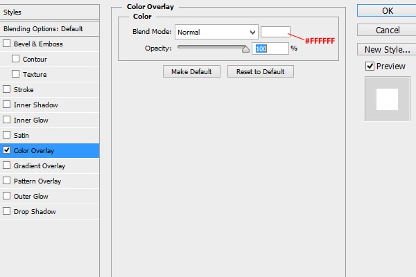
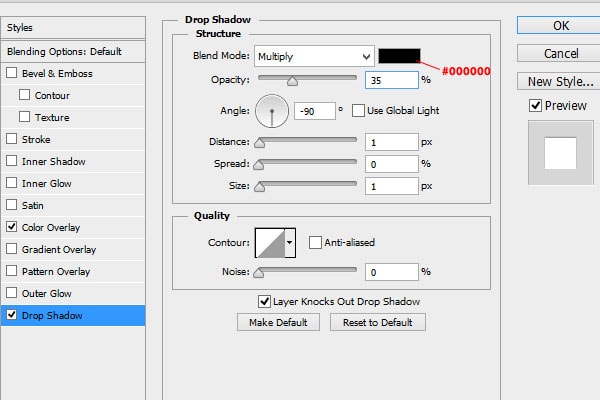
As you can see, the “View Item” shares some style with another button with the class buy_now. Next, we’ll add the icon. Open up the “eye.png” icon from the same folder with Photoshop, press Ctrl/Cmd + Alt + C or go to Image > Canvas Size and increase the canvas size to 16 by 16 pixels. Then, apply the following layer styles:
Save the icon as a PNG file and let’s set it as background:
.preview::after {
background: url(&quot;../img/eye-icon.png&quot;);
background-repeat: no-repeat;
background-position: 16px 17px;
}
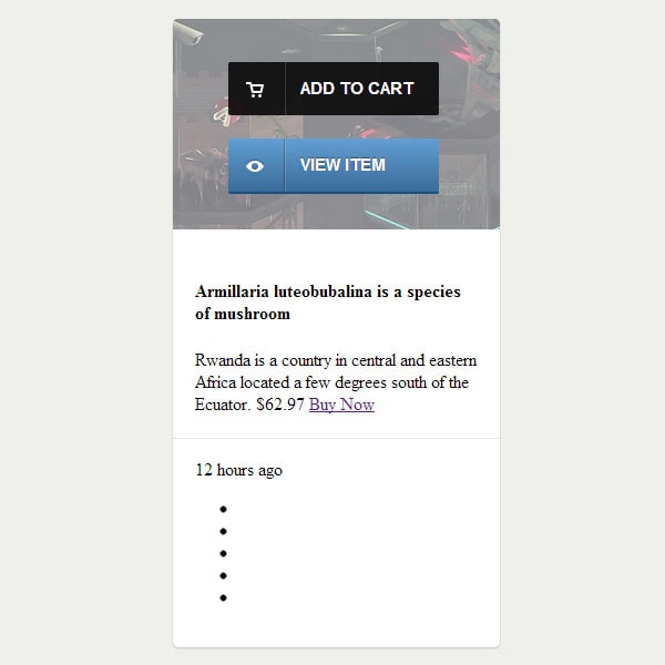
Our buttons should look like this:
Step 4: The product description
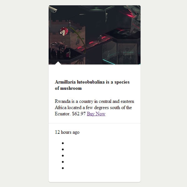
As you noticed in the preview, there is a small triangle at the bottom of the product/item image. We’ll create that triangle using a pseudo-element of the div with the class info. The triangle will actually be a square rotated by 45 degrees using CSS transforms:
.info::after {
display: block;
position: absolute;
top: -12px;
left: 23px;
content: &quot;&quot;;
width: 15px;
height: 15px;
background: #fff;
-webkit-transform: rotate(45deg);
-ms-transform: rotate(45deg);
-moz-transform: rotate(45deg);
-o-transform: rotate(45deg);
transform: rotate(45deg);
}
Next, we’ll add some style to the item name. Also, we’ll add a blue line at its bottom using a pseudo-element:
.info h4 {
position: relative;
padding: 0 0 20px 0;
margin: 0 0 20px 0;
font-family: &quot;Open Sans&quot;, sans-serif;
font-weight: 700;
font-size: 19px;
line-height: 25px;
color: #372f2b;
letter-spacing: -1px;
}
.info h4::after {
display: block;
position: absolute;
bottom: 0px;
content: &quot;&quot;;
width: 40px;
height: 2px;
background: #3b86c4;
}
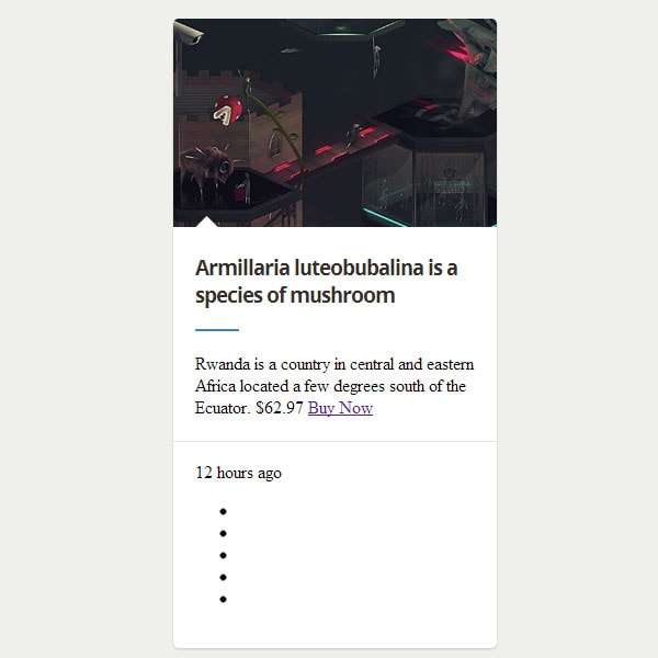
Now, let’s format a little bit the description of the item:
.info .description {
display: block;
padding-bottom: 20px;
font-family: &quot;Open Sans&quot;, sans-serif;
font-size: 14px;
font-weight: 600;
color: #5f5f5f;
}
The item’s price:
.info .price {
font-family: &quot;Open Sans&quot;, Helvetica, Arial, sans-serif;
font-size: 24px;
font-weight: 700;
color: #372f2b;
line-height: 26px;
}
And now the “Buy Now” button:
.buy_now {
float: right;
position: relative;
top: -5px;
display: block;
padding: 10px 10px;
border-radius: 3px;
font-family: &quot;Helvetica Neue&quot;, Helvetica, Arial, sans-serif;
color: #fff;
font-weight: bold;
text-decoration: none;
font-size: 15px;
text-shadow: 0 -1px 1px rgba(0, 0, 0, .4);
background: #286398;
background: -webkit-linear-gradient(bottom, #1d4970, #639ed3);
background: -ms-linear-gradient(bottom, #286398, #639ed3);
background: -moz-linear-gradient(bottom, #286398, #639ed3);
background: -o-linear-gradient(bottom, #286398, #639ed3);
background-position: 0 -15px;
background-size: 400px 80px;
background-repeat: no-repeat;
-webkit-transition: background-position .2s ease-in;
-ms-transition: background-position .2s ease-in;
-moz-transition: background-position .2s ease-in;
-o-transition: background-position .2s ease-in;
transition: background-position .2s ease-in;
box-shadow: 0 2px 0 #165181;
}
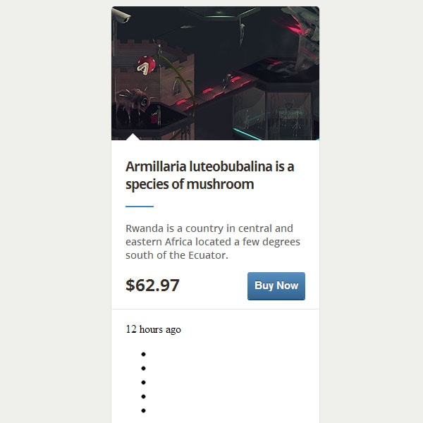
Step 5: Additional Details
In the final step, we’ll take care of additional details, like the time when the product was added or the product’s rating. First, let’s open the clock icon from the Unicons pack and apply the following style:
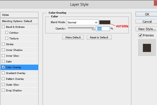
Save it as a PNG file and let’s use it as background for the span which informs the user about the time passed since the product is available:
.time {
padding-left: 25px;
font-family: &amp;amp;quot;Open Sans&amp;amp;quot;, sans-serif;
font-size: 14px;
font-weight: 700;
color: #372f2b;
background: url(&amp;amp;quot;../img/clock-icon.png&amp;amp;quot;) no-repeat;
background-position: 0 2px;
}
Now, let’s create the rating system using an unordered list. The principle is quite simple. By default, every list item will have a grey star as a background. If the product has a four-star rating, the first four list elements will have the class rated and a yellow star as background. We’ll start by creating a sprite image for the stars. Open the star icon in Photoshop and increase the canvas size to 16 x 32 pixels. Then, duplicate the layer and arrange the two layers like this:

Add this layer style for the top layer:
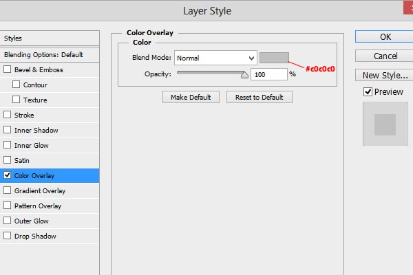
And this for the bottom layer:
The image should look like this:

Save the file as a PNG image and let’s get back to coding. First, we’ll format the unordered list a little bit. We’ll remove the margin and the padding, then we’ll float it to the right:
.rating {
	position: relative;
	top: 2px;
	float: right;
	margin: 0;
	padding: 0;
}
Next, the list elements. We’ll display them inline using float and we’ll use the obtained sprite image as background:
.rating li {
float: left;
display: block;
height: 16px;
width: 16px;
margin-left: 5px;
background: url(&amp;amp;quot;stars.png&amp;amp;quot;) no-repeat 0 0;
}
.rating li.rated {
background-position: 0px -16px;
}
That’s it, folks! I hope you enjoyed the tutorial!


