10 Websites with Data Visualization Driving User Experience
As an instrument for enriching user experience in website design, infographics have come into our life pretty much recently.
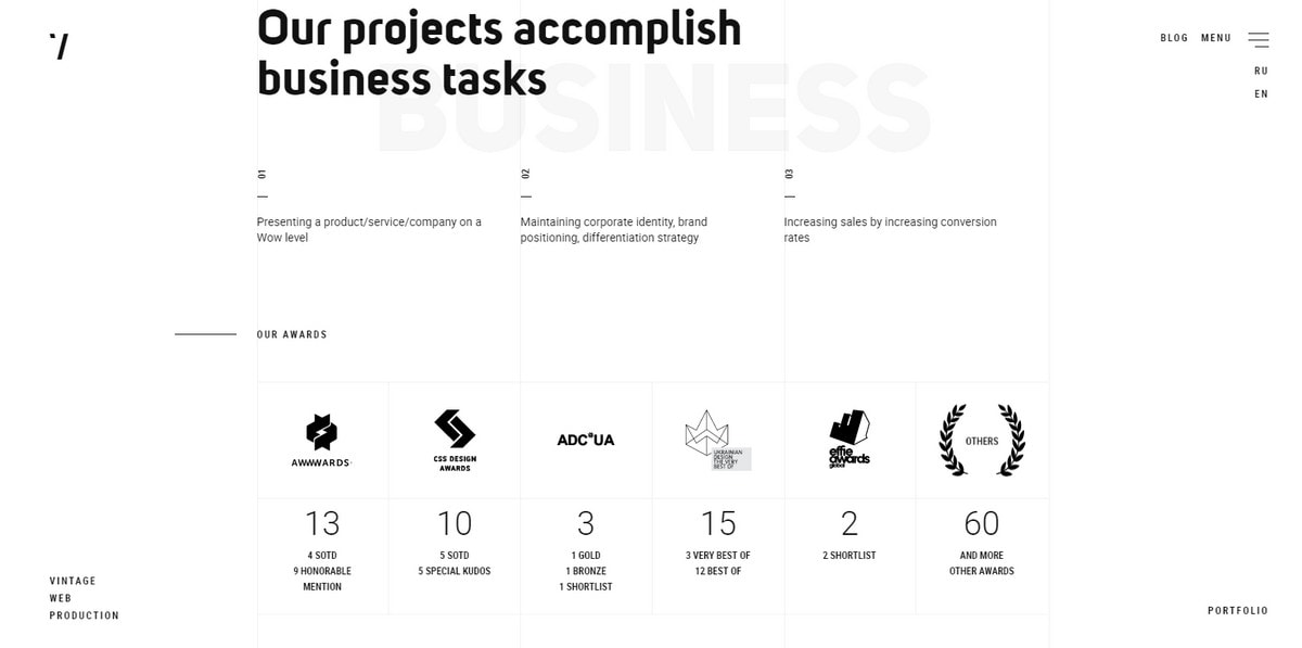
But that’s not the first time that developers used stats in personal portfolios or corporate websites to win over visitors with numbers. Take a look at Vintage Agency.
Along with impressive portfolio works, the team did not miss an opportunity to show off agency figures. Here, stats are skillfully incorporated, contributing to experience as well as perfectly matching the general aesthetics.
Data visualization is a tool to impress not only in an informative sense but also in a visual one, as part of the storytelling. For example, Corning Glass Class. It tells about the many properties of glass with a graphical approach. That’s what the first stages of data visualization in websites looked like in 2012.
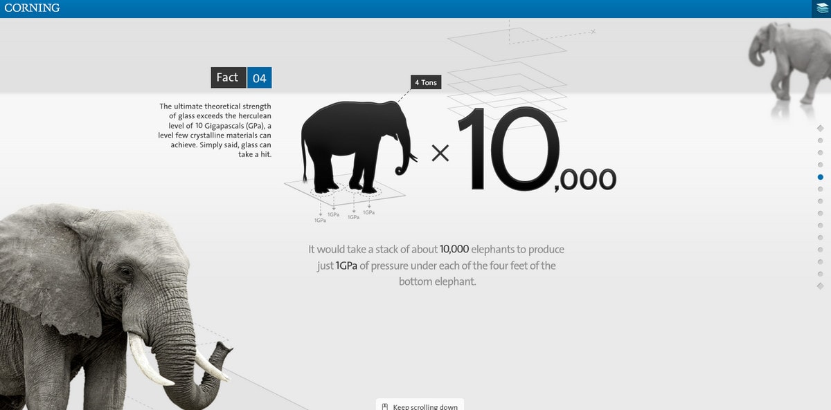
In comparison to Brand Love Score, it may look primitive. However, it was cool at that time.
The approach has improved by leaps and bounds. Consider Brussels Airport in Numbers. It is an online infographic where modern trends set the tone for everything. Subtle outlined iconography, smooth typography, vertical lettering, vertical lines and gorgeous photography take stats to the next level.
With Postcards Email Builder you can create and edit email templates online without any coding skills! Includes more than 100 components to help you create custom emails templates faster than ever before.
Free Email BuilderFree Email Templates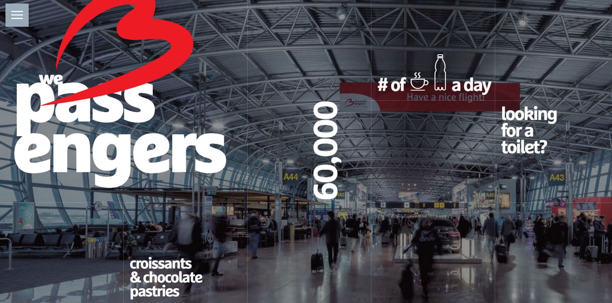
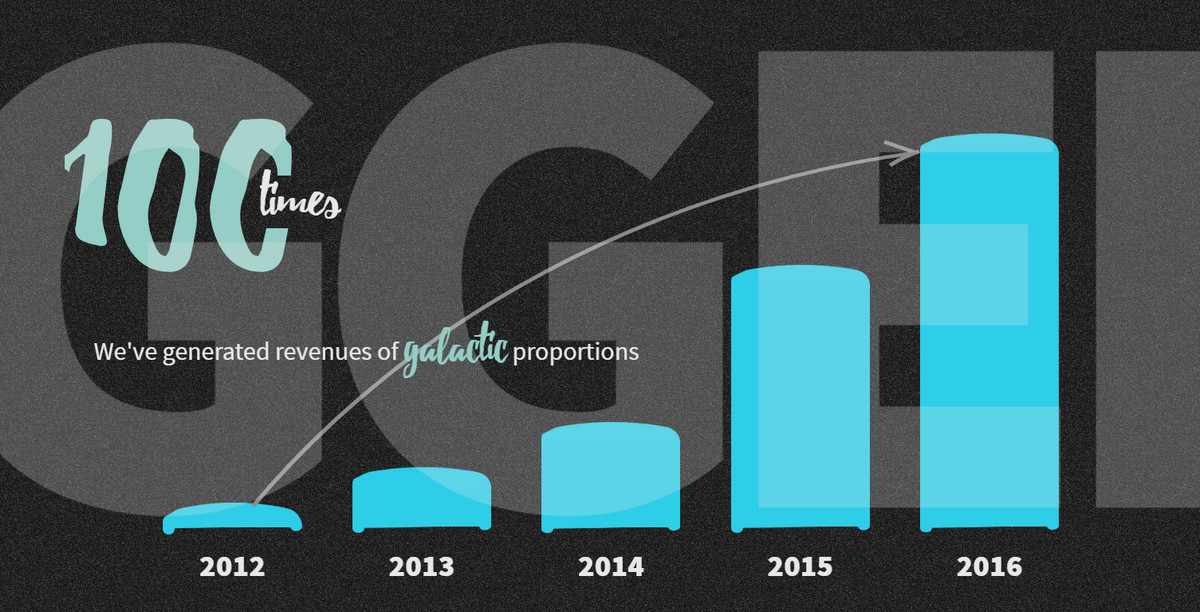
As mentioned earlier, Brand Love Score is another representative example. It is an apotheosis of modern techniques brought of data visualization.
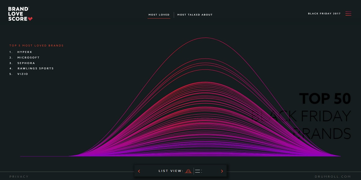
The project visualizes the content (such as insights and sentiments) taken from social media during Black Friday weekend. You are welcome to toy with it and explore tweets in a unique manner.
Not all contemporary uses of data visualization are as sophisticated and advanced as Brand Love Score. Consider The Software House and Campaign Monitor. These are representative “year in review” projects.
The first uses a cosmic theme that is realized with the help of primitive graphics, huge lettering and dynamic effects. The team converts a summary into an engaging narration infused with figures.
The second uses clean, simple aesthetics with a subtle high-tech vibe. It features traditional data visualization elements like charts and bars with clever, yet unobtrusive, animations.
These examples give us several hints as to how to incorporate data visualization into a website design and not ruin the experience.
- Make numbers bigger
- Use short sentences
- Choose a clean or seamless background
- Adopt a one- or two-tone palette
- Use white space well
- Split your screen into two imaginary parts, one graphical and the other informative
- Ditch boring designs and go for an artistic approach; use beautiful iconography, elegant typography or fancy illustrations
- Add dynamic effects; they make a difference these days
Basic Elements
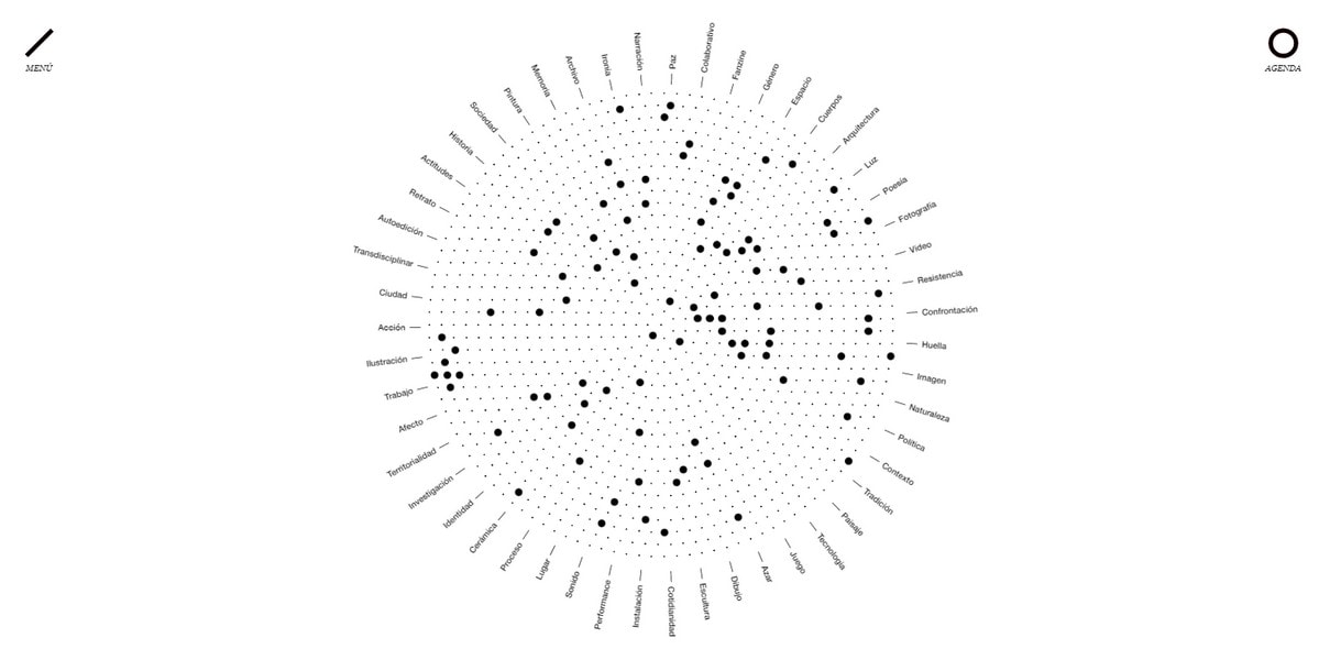
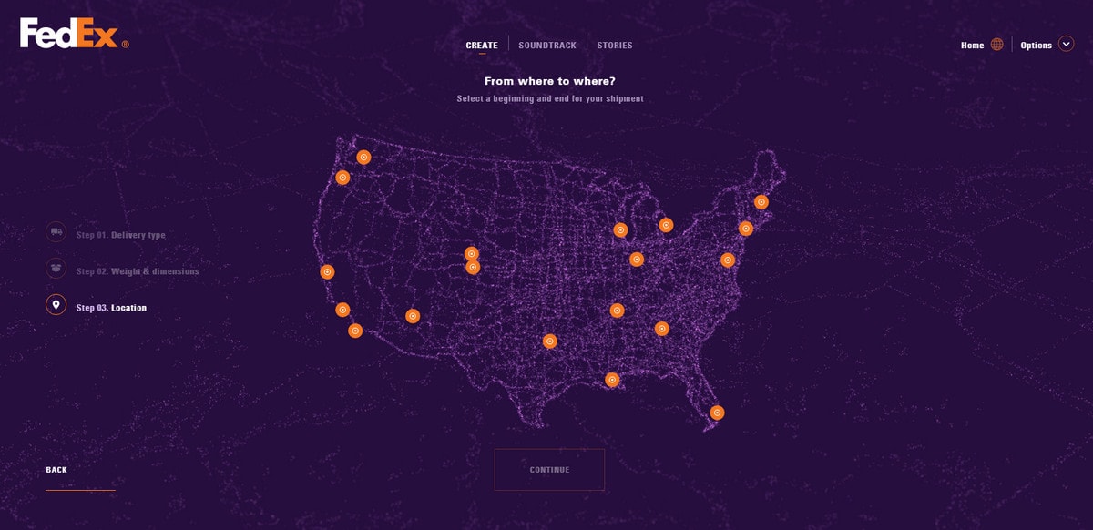
The traditional instruments for graphical representation of data are charts, bars, lines and graphs. We have already plenty of these examples. Let’s explore maps and globes. They can be static or dynamic. Feel free to explore some impressive examples: Okela, Clarity, Fedex Soundtrack and Game of Canada.
Clarity relies on a live 3D globe visualization to make its point clear, to say nothing about the producing a powerful general impression. The globe looks outstanding.
With Pulsetic you’ll be instantly notified the moment your website, API, or server becomes unavailable. Monitor uptime from multiple global locations and respond to incidents before your users are affected.
Create beautiful status pages in minutes to keep customers informed during outages and build trust with transparent communication.
Start Monitoring for FreeOkela reinvents a radial chart, giving it a fantastic makeover. Not only does it ideally blend in the clean and elegant aesthetics, but it also serves as some kind of a “conductor” to the portfolio pieces.
If you are hankering for intriguing symbiosis between old and new, take a look at FedEx Soundtrack. It features a classic map vigilantly infused with modern techniques. Also, note the color scheme that is just gorgeous; it perfectly reflects the mood.
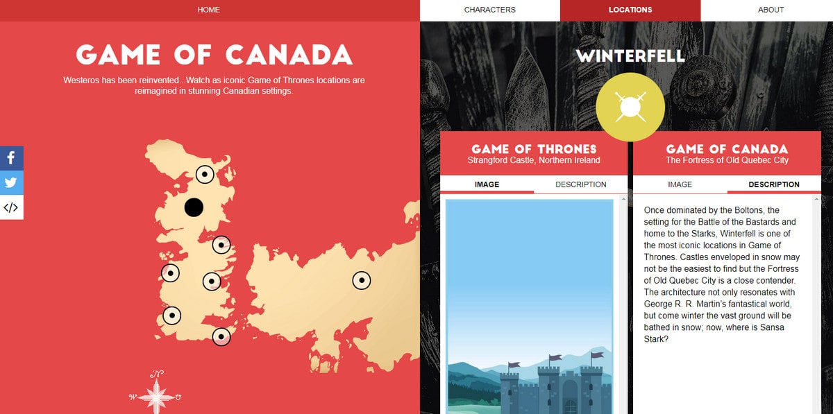
Charts can work in any environment when you put your heart and soul into it. Game of Canada is a perfect example.
The team has adopted almost the same approach as in the previous example. The map is an integral part of the experience; however, this time it is placed in a flat graphical entourage. Hit the pointers to explore the project that re-imagines Game of Thrones locations in Canadian settings.
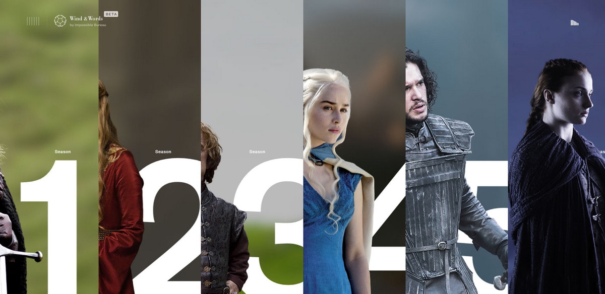
Speaking of which, the next example is also for fans of George R. R. Martin’s fantasy novels. It is called Wind and Words. It is dedicated to the first six seasons of the popular HBO series. It collected data from the subtitles to vividly showcase interactions of each character.
Other Ways of Using Data Visualization
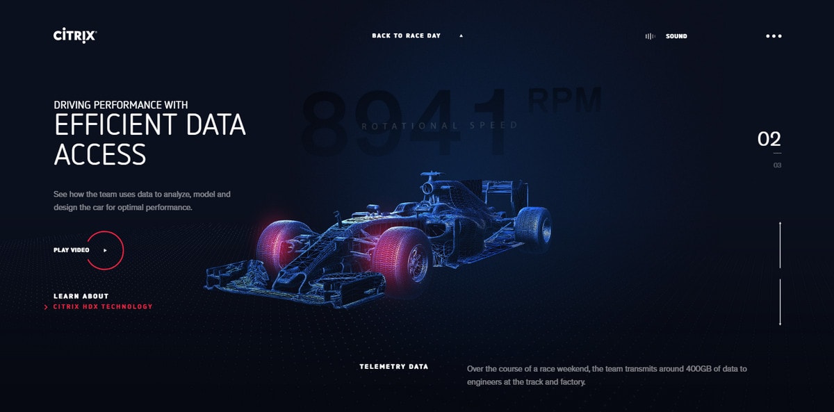
How about a non-traditional way of using data visualization? Consider Red Bull Racing + Citrix. It feels top-notch and ultra-modern thanks to futuristic neon-like illustrations, a predominantly dark palette and fancy dynamic effects. Here, numbers are merely informative details.
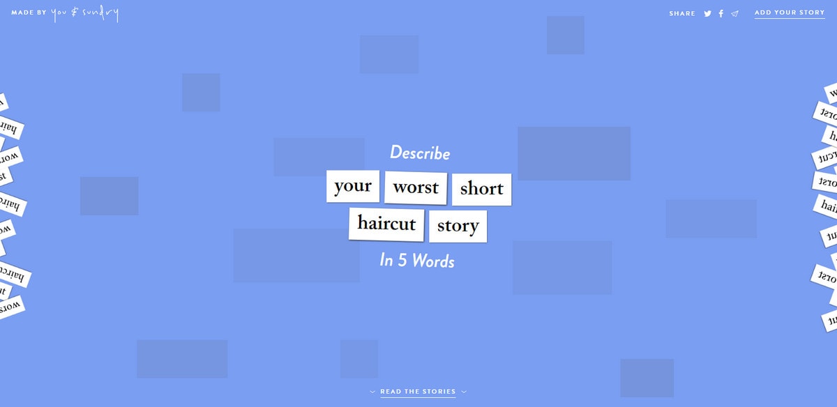
Also, pay attention to Your Worst Short Haircut Story. It doesn’t look like a data visualization at first, but it represents a bad experience smartly. The design is just like it should be when you need to give the idea a central place. I use only three words instead of five allowed describing this project: funny, simple, ingenious.
Conclusion
The traditional tools of data visualization have evolved into solid instruments to entertain and enrich experiences. Of course, a creative attitude can’t take all the credit for this metamorphosis. There are several other important things.
First, graphical representation has improved. Charts look more like illustrations than dull mathematical sketches. Second, animations and dynamic effects change the situation. Third, WebGL, integration with social media and other advanced tools greatly enhance the approach. Finally, trends have impacted this type of design. As a result, we have replenished our toolkit with a sophisticated and matured solution.
What do you think about such projects? Do you use data visualizations?


