Designing Email Signup Forms that Turn Visitors into Leads
Typically, there are three kinds of people that will visit your website:
- First-time visitors trying to feel things out.
- Leads gathering information so they can decide if the brand and/or site has what they’re looking for.
- Customers/clients/users returning to buy more stuff, read more content, or otherwise re-engage with the brand.
Now, there’s no guarantee that visitors will become leads and that leads will become customers. And there’s no real guarantee that one-time customers, readers, or subscribers will return either.
That is, not without the help of email marketing.
Newsletters and other email marketing messages enable your business to send valuable content or offers directly to subscribers’ inboxes. By providing ongoing value, you’ll stay top-of-mind with people who’ve already expressed interest in your brand and are just waiting for a gentle nudge to take the next step.
The only thing is, you have to get them to sign up for your email communications first.
The design of your email signup form is going to have a huge impact on the success of this, so that’s what we’re going to look at next. These are the 8 things you should do to design email signup forms that turn your visitors into leads (and eventually customers).
With Postcards Email Builder you can create and edit email templates online without any coding skills! Includes more than 100 components to help you create custom emails templates faster than ever before.
Free Email BuilderFree Email Templates1. Make Your Email Signup Form Responsive
For the last few years, the majority of website traffic has come from mobile users:
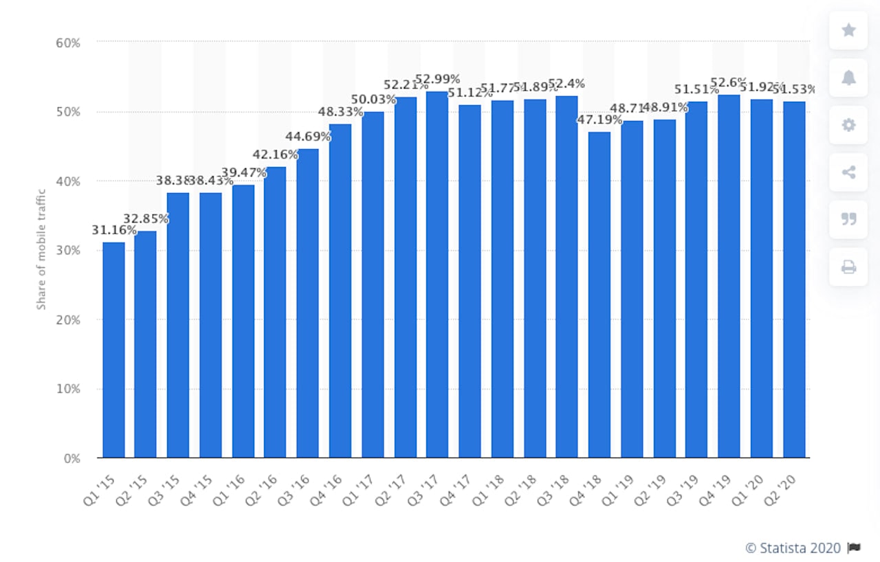
With a growing majority of consumers visiting websites from their smartphones, it’s in your best interest to make sure — before you do anything else on this list — that your email signup form is responsive.
That doesn’t just mean making it look good on mobile devices. It means:
- Not putting it in a pop-up that Google might penalize you for (and visitors would hate just as much, too).
- Designing it so that it’s large enough to see, but doesn’t require visitors to scroll to see the full message or form.
- Programming the right input type so your potential subscribers don’t have to change the keyboard to fill out the fields.
The signup form on the Cesar’s Way mobile site is a good example to follow. This is what visitors see when they scroll down the homepage:
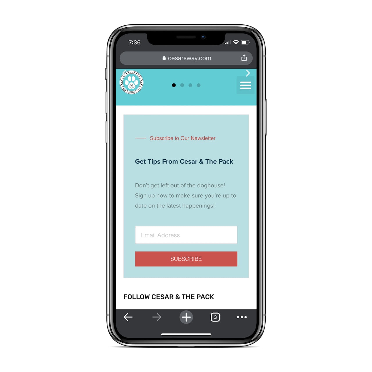
It fits perfectly in this space and the design should cause primed visitors to stop and consider the offer. Then, when they put their cursor into the email field, they see this:
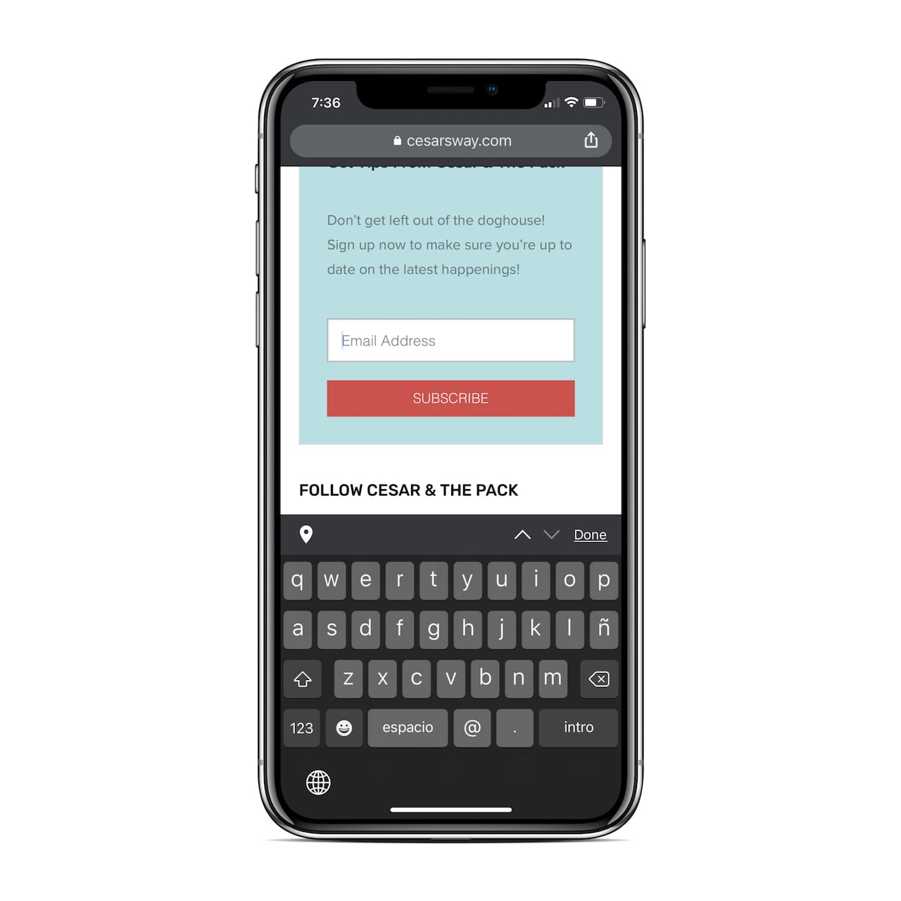
With the “@” and “.” symbols in the keyboard, this means they can type in their email address without having to switch between keyboards.
This is a very straightforward and pain-free form to fill out and should do well for collecting leads on the site.
2. Put Your Signup Form in the Right Place
Don’t drive visitors nuts with pop-up forms that interrupt the reading or shopping experience. And don’t use a “Subscribe” button to lure them to another page or pop-up in order to find your form.
With Pulsetic you’ll be instantly notified the moment your website, API, or server becomes unavailable. Monitor uptime from multiple global locations and respond to incidents before your users are affected.
Create beautiful status pages in minutes to keep customers informed during outages and build trust with transparent communication.
Start Monitoring for FreeJust place your signup form right on the page. As for finding the right location for it, you should consider two factors:
The first is the context.
Let’s use Tim Ferriss’s blog as an example. This is what his readers see at the top of the blog news feed:
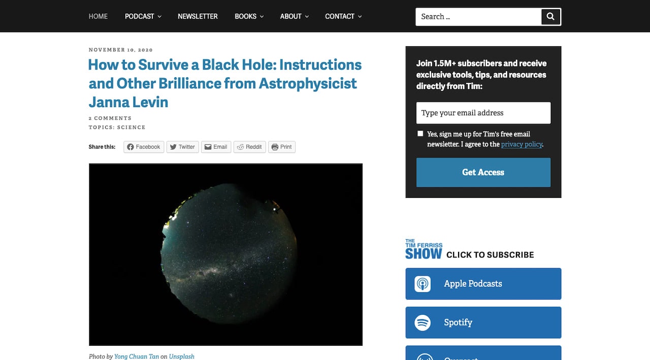
On the left is the snippet for the latest article. On the right (the top of the sidebar) is the email signup form.
The positioning of this form is perfect as it sits within the context of the blog. It’s not asking people to subscribe to the blog’s newsletter from the About or Services page. It makes complete sense here.
The other factor to think about when it comes to placement is your visitors’ reading patterns.
Eye-tracking studies by Nielsen Norman Group discovered that new reading patterns have developed in recent years. That said, most of the reading patterns show a propensity for people to look at the full width of content at the top of the page before scanning the rest. Like this:
So, placing your signup form in the top-right corner of the page makes a lot of sense. Your visitors will start reading at the top-left, go all the way to the far-right, before scanning downwards.
If you don’t have a sidebar or the form doesn’t naturally fit in that part of the page, that’s okay. You simply need to determine the place on the relevant page where visitors’ eyes are more likely to stop and take in the content to ensure your form doesn’t get lost.
3. Keep Competing Forms Away from It
There’s a condition called analysis paralysis and it’s all too common on the web these days. The basic premise is this:
When too many options are presented to consumers, it can lead to:
- Anxiety over making a choice, especially when the options are too similar.
- Fear that they’re going to choose wrong, which can prevent them from taking action altogether.
- Regret with the choice they’ve made because they know how many other options exist and they can’t help but second-guess their decision.
This is a common response to online shopping, though it can also arise when a website presents too many competing forms or CTAs at once to visitors.
You would do well to follow Travel Channel’s lead and keep competing forms out of the vicinity of your email subscriber form:
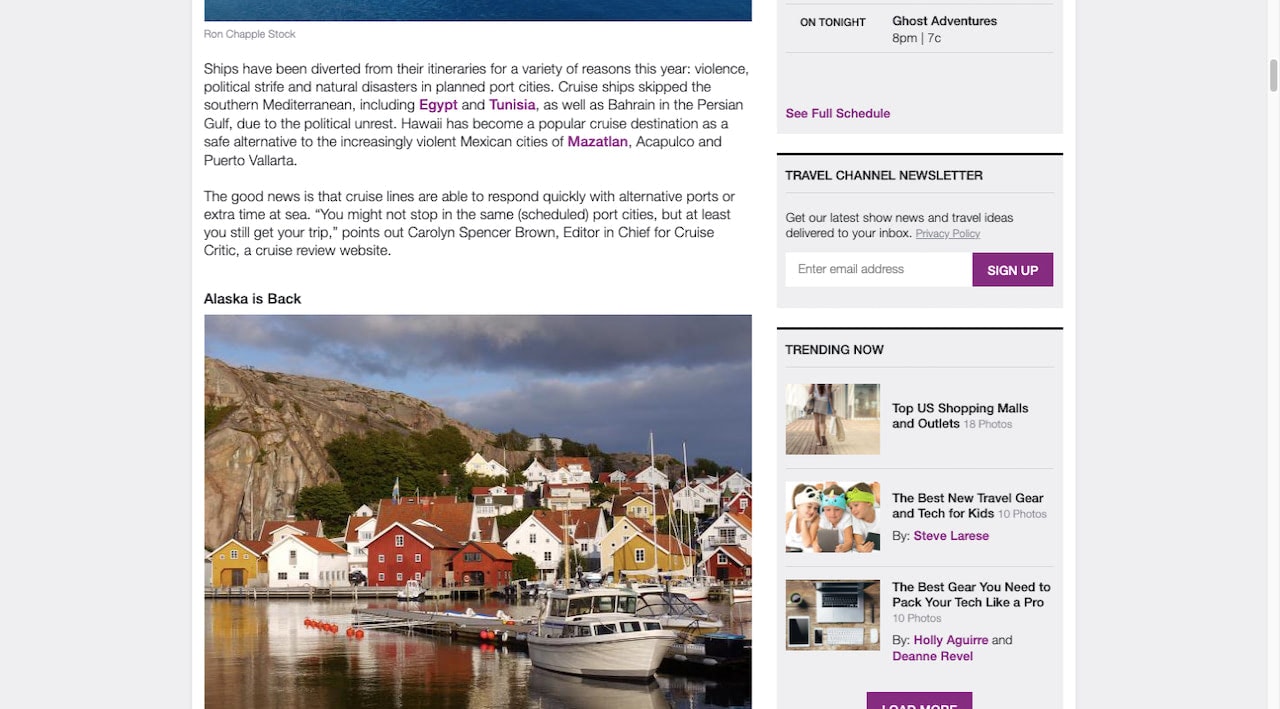
This way, visitors won’t feel like you’re bombarding them with requests to sign up (which can lead to concerns about what you plan to do with their email addressand how many emails they’ll end up receiving in the end).
With the way this is designed, they can take their time reading through the content. Once they realize how awesome it is and how much more of it they want, they can fill out the form that’s conveniently placed nearby.
4. Give It Some Color, But Not Too Much
When it comes to designing any converting element on a website, you have to consider how much you really need it to stand out.
Obviously, you don’t want your email signup form to get drowned out by all the content around it. But there also needs to be a balance, so you don’t go overpowering the design with it.
To do this, you can use color to make the form noticeable without being overwhelming. Using a secondary brand color would be good as it allows the form to naturally fit within the look of the site. However, it’ll stand out due to the variation in branding.
Another good idea is to make the edges of the form line up with the edges of the surrounding content. So, the form shouldn’t be wider or narrower than the content above or below it.
If you scroll to the bottom of this article, you’ll find an email signup form that looks like this:
Now, Designmodo’s color palette is pretty straightforward. It’s mostly black with bright blue and green highlights scattered throughout the site.
This form with the blue gradient background nicely offsets those colors. Readers are sure to notice this at the end of each post and it won’t feel like a shock or disruption as it fits seamlessly within the natural edges of the content.
5. Size Your Fonts for Greatest Impact
When designing the text on a web page, there’s a lot to think about, from the fonts to use to managing elements like kerning and tracking. Another thing that’s important for designers to think about is hierarchy.
Through the use of bigger, bolder header text, a designer can make a web page far easier to read than a wall of regular text. Stylized header text also allows visitors to get a tl;dr (too long, didn’t read) summary of the content.
It’s not just the main content of your pages that should be designed in this manner. Your email signup forms would benefit from clear structure and hierarchy, too.
Let’s look at this example from Entrepreneur:
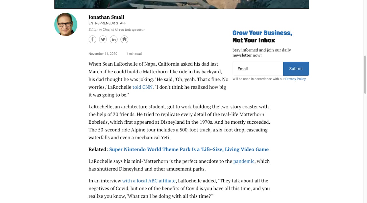
What do we see here in terms of text?
The header is the biggest and boldest element in the form.
Because the tl;dr is summarized by the header, it’s totally fine if visitors miss the smaller body text beneath it. There’s no value lost except maybe the note about the newsletter going out daily.
The form’s field and button text are slightly bigger than the descriptive text above it.
And there’s a note about the privacy policy in much smaller, lighter text below.
This shows us that the priority of actions in this form are as follows:
- Read the headline.
- Fill out the form.
- Check the body to make sure nothing about the newsletter will be a surprise.
- Confirm that user privacy is protected.
While you should leave the writing of the signup form’s copy to your writer, it wouldn’t be a bad idea to give them a template that shows them how (and why) their copy is going to be structured a certain way.
It’ll get them thinking about hierarchy in design and priority of message, too.
6. Include Only the Fields You Absolutely Need
Unnecessarily lengthy website forms can be a major conversion killer. According to a survey done by The Manifest, it’s the reason why 27% of people will abandon a form.
Now, with an email subscription form, it’s not like there’s a lot of information you can ask for. At least, there really shouldn’t be.
The most basic form will ask only for an Email. If you’d like to send emails with a personalized greeting or even subject line, it’s okay to include a field for First Name, too.
Anything more than that has to be something that makes sense in your visitors’ minds, so be very careful about adding anything else.
Ben & Jerry’s, for instance, has a great-looking signup form at the bottom of its pages:
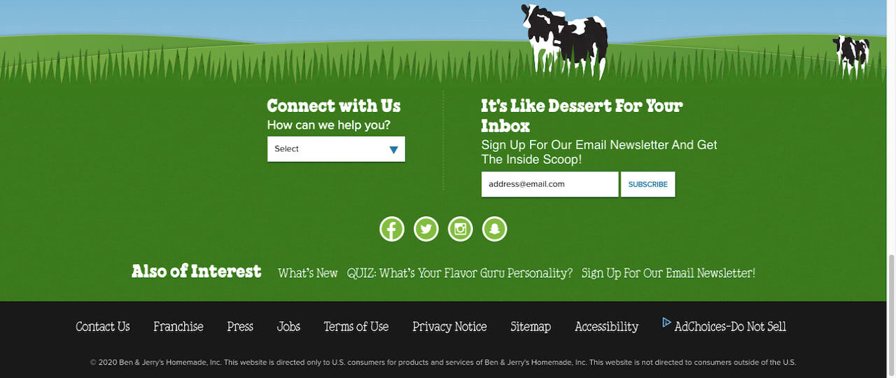
It’s short and sweet. It basically says: “Give us your email and we’ll send you news on our frozen yogurt.”
In addition, there’s a CTA that appears in the sidebar of Ben & Jerry’s blog that invites readers to subscribe to the newsletter. This drives them to this page and form:
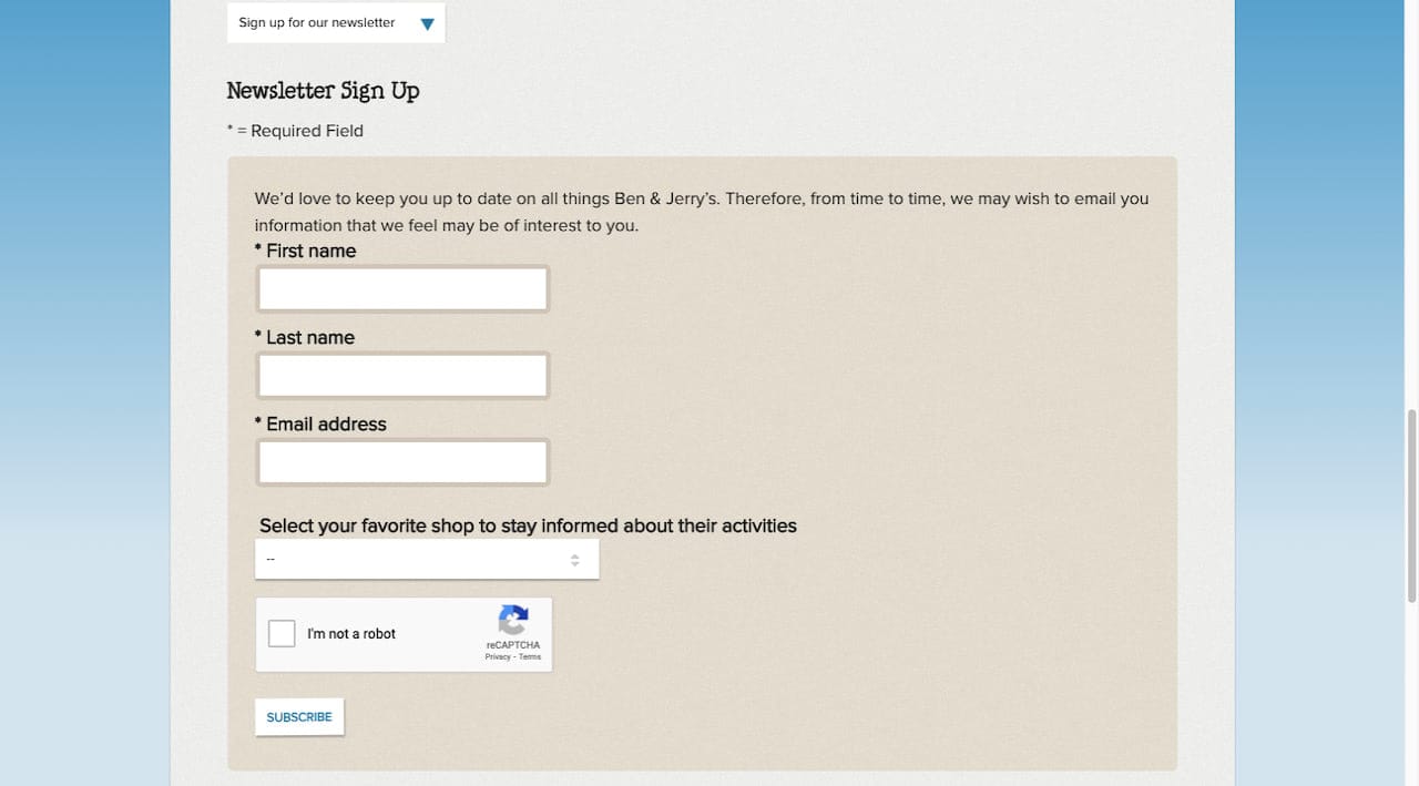
This is one of those rare cases where a longer newsletter signup form (and separate page) is acceptable — because Ben & Jerry’s can justify the additional fields.
In other words, this form says to visitors: “Give us your email as well as this other info so we can provide personalized news for your favorite, local Ben & Jerry’s store.”
If you go back through the examples included in this post, you’ll notice that each of them handles the button design slightly different from one another. There’s nothing wrong with that.
Your branding and the style you’ve pre-determined for your button components will influence how yours comes out.
That said, there are a few things to avoid:
- No ghost buttons. Transparent buttons send the message that this is a secondary action and there are better choices for your visitors to make right now.
- No contrast. Whether you do it with button size, color, or how the text is formatted, the button needs to stand out from the rest of the form.
- No transformation. This isn’t a dealbreaker. However, if the state of the button doesn’t change upon hover, click confidence won’t be as high as it would with that confirmation.
The subscriber form at the bottom of the Omaze website is a good source of inspiration:
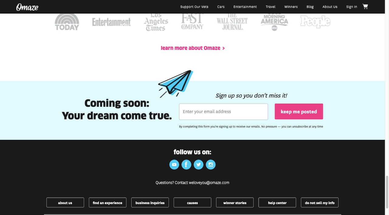
As you can see, the button doesn’t need to have a 3D look to it in order to look clickable. It’s all in how you design it in contrast to the surrounding elements.
8. Include a Trust Mark at the Bottom
The Manifest’s survey reveals that 29% of people abandon website forms because they’re concerned with security and 11% do so out of fear they’ll be badgered by ads and upselling.
Don’t expect potential email subscribers to go digging through the footer of your website to check on your privacy policy or security measures before signing up. If you don’t give them easy access to the information, expect them to have major doubts about moving forward.
There are a number of ways to address these valid concerns with the design of your form.
One option is to include a small statement under the form that informs visitors about your privacy policy (with a link to it). If you’re already asking visitors to accept your privacy or cookies policy when they enter the site, this is fine.
Another option is a checkbox requiring their acknowledgment and acceptance of the privacy policy as MINI does:
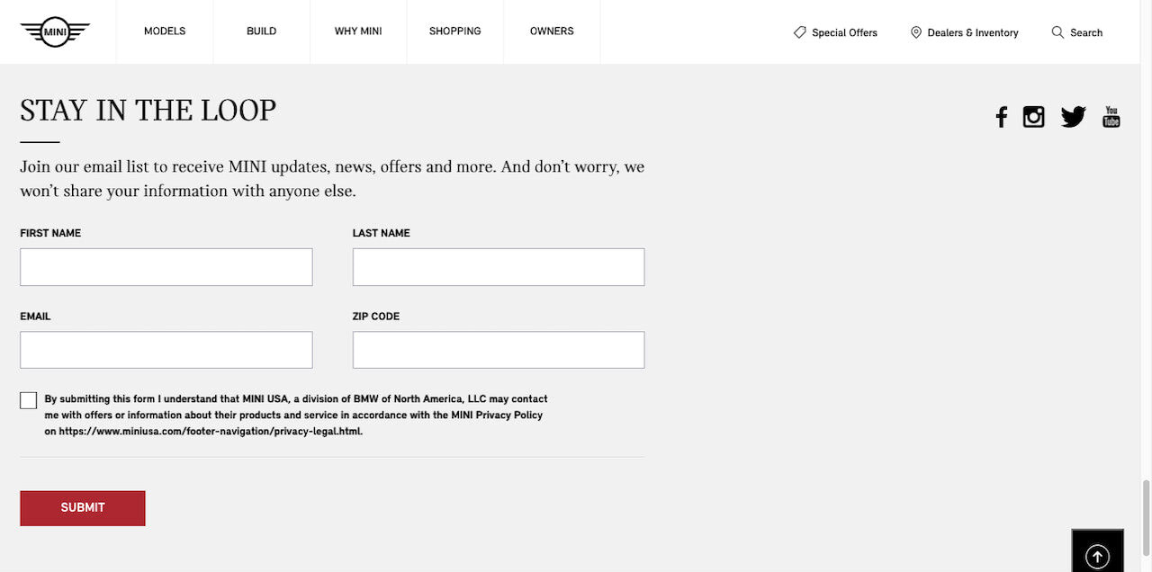
Not only does it point visitors to information about how their data is protected, but it also tells them what kind of content to expect in their email inbox.
This is a good way to ensure that visitors really do want to become subscribers and aren’t going to unsubscribe the second they see a message that is outside their original expectations.
Summary
What happens when someone gives up on your signup form? According to The Manifest, 67% of them will abandon it completely. Only 13% will come back to fill it out another time.
Basically, if you can’t turn your visitors into leads the first time around, you risk never seeing them again. And without the ability to follow up over email, you don’t really have much of a choice.
So, the design of your email signup form is critical.
What’s nice about Designmodo is that it comes with both products for websites and email. This way, you’ll not only be able to create a high-converting newsletter signup form for your site, but you can design it consistently with the emails that follow it.


