Are Website Pop-ups Still a Relevant Lead Generation Tool?
Did you know that the creator of the first website pop-up in 1997 — Ethan Zuckerman — has since apologized for introducing them to us?
At the time, website pop-ups were a way for websites to keep content and ads from conflicting, which is why they popped out into a completely new browser window.
Over time, consumer backlash led to the retreat of these early pop-up ads. But they made a resurgence in the 2010s as an effective lead generation tool. Websites could display pop-ups at any point of the visitors’ journey and ask for a number of things (e.g. their attention, email address, a sale, etc.).
But, again, overuse and misuse of pop-ups (amongst other bad practices) has left consumers feeling sour about them.
As website creators and owners, where do we stand with this? Do we move away from pop-ups altogether or do we pursue alternative ways to get special messages in front of visitors?
This post will explore the current state of pop-ups as well as some best practices you can follow.
With Postcards Email Builder you can create and edit email templates online without any coding skills! Includes more than 100 components to help you create custom emails templates faster than ever before.
Free Email BuilderFree Email TemplatesWhy Have Website Pop-ups Fallen Out of Favor?
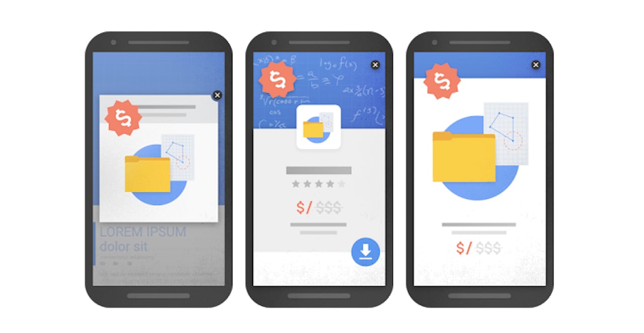
Back in 2017, Google implemented a new ranking penalty. Essentially, Google penalizes mobile websites that use the following types of pop-ups:
- Intrusive pop-ups that cover the majority of the screen at inconvenient times (like at the time of entry or while the visitor is in the middle of reading content).
- Full-screen interstitials that appear the second someone enters a page, preventing them from seeing any of the website until the pop-up is dismissed.
- Faux pop-ups that resemble interstitials, but are not dismissible; instead forcing visitors to figure out that they need to scroll past the ad.
Now, we know why Google would implement such a penalty. Google uses consumer search trends to change up its algorithm and rules. So, if consumers are responding negatively to sites that use pop-ups incorrectly, then they must be bad for the user experience, right?
Sort of. There are a plethora of reasons why consumers have again grown weary when it comes to pop-ups:
- They disrupt whatever the visitor is doing and don’t give them the freedom to decide when to engage or take action.
- There are too many sites that overdo it with pop-ups, often displaying numerous ones at once or repeatedly showing the same one from page to page.
- Pop-ups too often offer little to no value in exchange for the time and effort requested of the visitor.
- Designers who alter the predictable structure of pop-ups — like removing the “X” from the top-right corner — cause visitors undue frustration.
- Shaming pop-ups use two CTAs to manipulate visitors to take action: the positive one encourages them to change their lives for the better while the negative one shames them for the lack of action.
- Pop-ups have become so predictable that many consumers have developed banner blindness to them, which makes pop-ups nothing more than an extra click they have to make.
- Not only that, but pop-ups aren’t the only extra elements competing for visitors’ attention. Cookie consent banners. Live chat widgets. Sticky banners. There’s just too much going on these days.
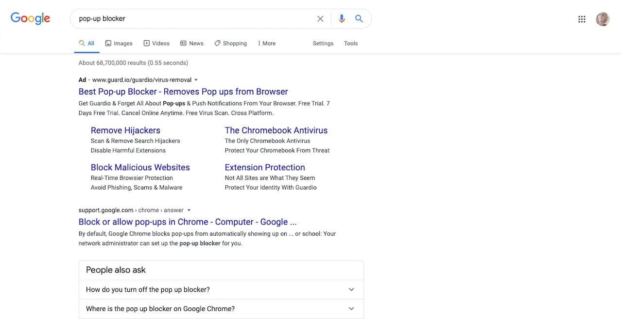
Search for “pop-up blocker” and you’ll find over 68 million search results — many of which teach people how to quickly and effectively hide pop-ups and ads from their view altogether.
It’s obvious that something’s gone wrong here. Marketers and designers have taken a tool that was once useful for generating leads and adding value to the on-site experience, and turned it into something that consumers now actively go out of their way to avoid.
Recent data shared by Google and the Coalition for Better Ads sheds some light on what kinds of ad formats (including pop-ups) consumers like and don’t like:
In general, this is what they do like (on both mobile and desktop):
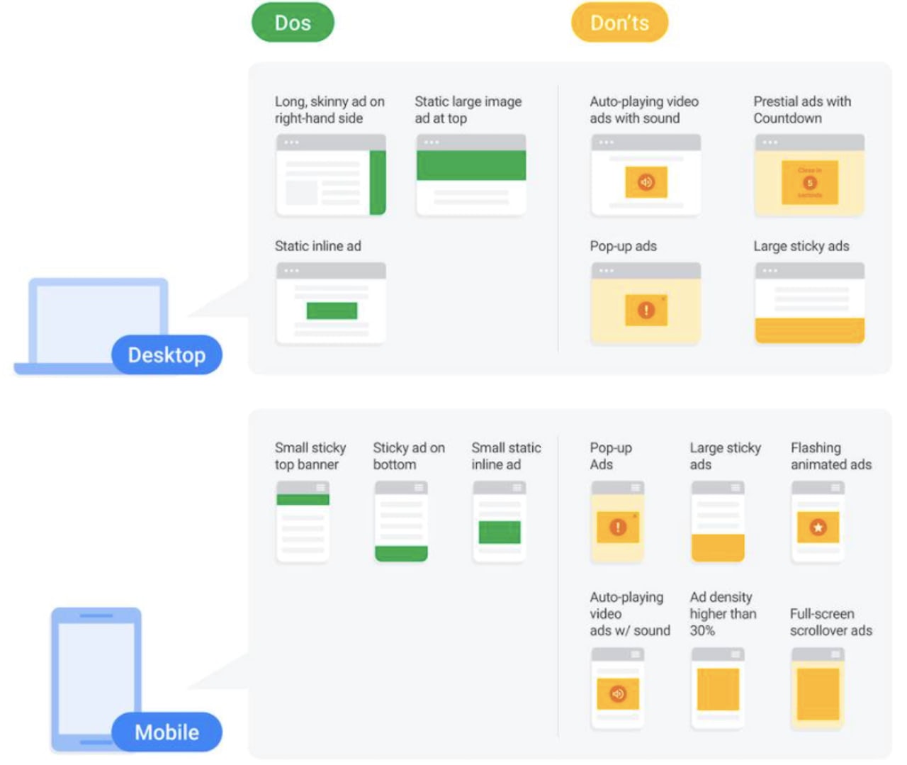
- Thinner ads
- Inline ads
- Small sticky elements
And this is what they don’t like:
With Startup App and Slides App you can build unlimited websites using the online website editor which includes ready-made designed and coded elements, templates and themes.
Try Startup App Try Slides AppOther Products- Thick banner ads
- Auto-playing and flashy ads
- Pop-ups
- Oversized modals
- Full-screen interstitials
I think the reason marketers and designers keep using pop-ups (especially ones designed in contrast with Google’s good pop-up design recommendations) is because there’s still data out there that suggests that they’re effective at lead generation. If you look closely, though, a lot of this data comes from companies in the business of selling lead gen tools and tips (so of course they’re going to want to convince you of this fact).
While I’m not saying you should completely rule out pop-ups, I do strongly advise that you run A/B tests to see if your particular audience is receptive to them. And to experiment with alternative ways to put your special notifications out there. Like sticky banners:
If you look at Google’s Dos/Don’ts graphic above, you can see why sticky banners are much preferred over pop-ups.
Physically speaking, they take up much less space, which is good as there’s more room for your content and there are fewer distractions to pull your visitors away from it. It also teaches us to be more concise in how we share special notifications, given that there’s very little space to do so.
As for when you should use them? Really, you can replace most website pop-ups you’ve used in the past with sticky banners (with a few exceptions that I’ll explain below).
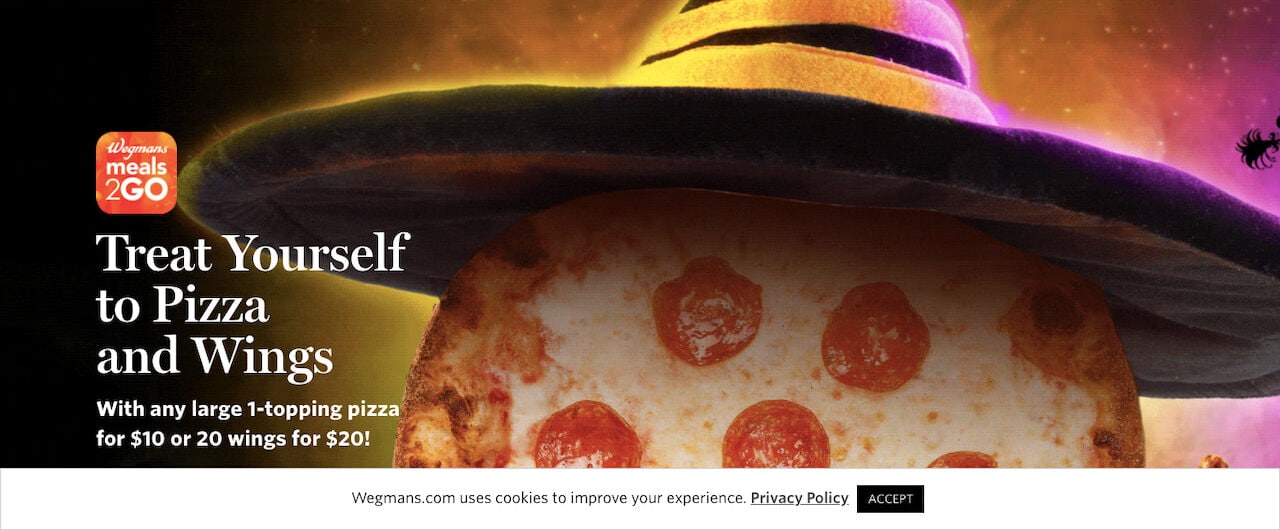
Wegmans, for example, uses its sticky banner to share a cookie consent policy and request that visitors review and accept it:
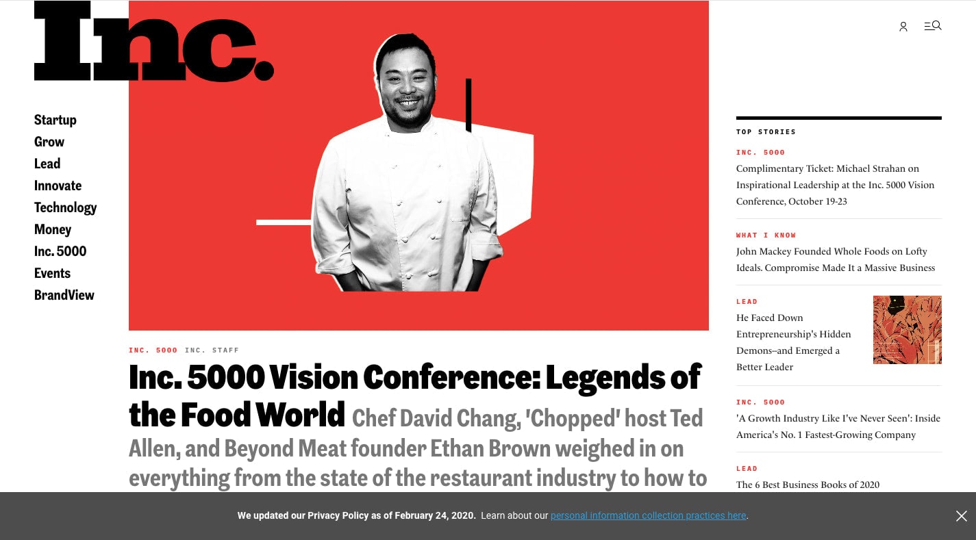
Inc. uses its sticky banner to notify visitors about a change in its privacy policy:
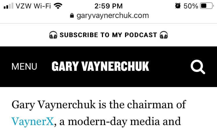
Gary Vaynerchuk uses this sticky banner on desktop and mobile to promote his podcast and to encourage followers to listen in:
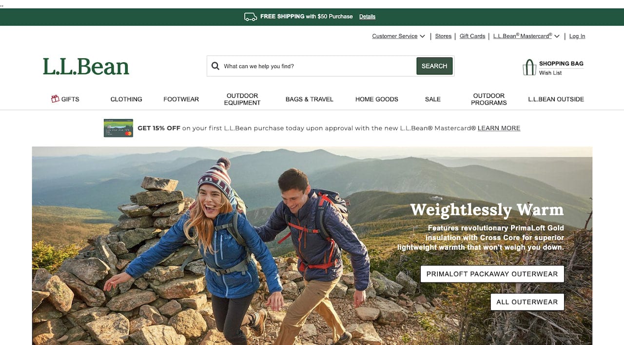
L.L.Bean uses the top sticky banner to announce a free shipping deal (which is a big decision-making factor for shoppers, by the way):
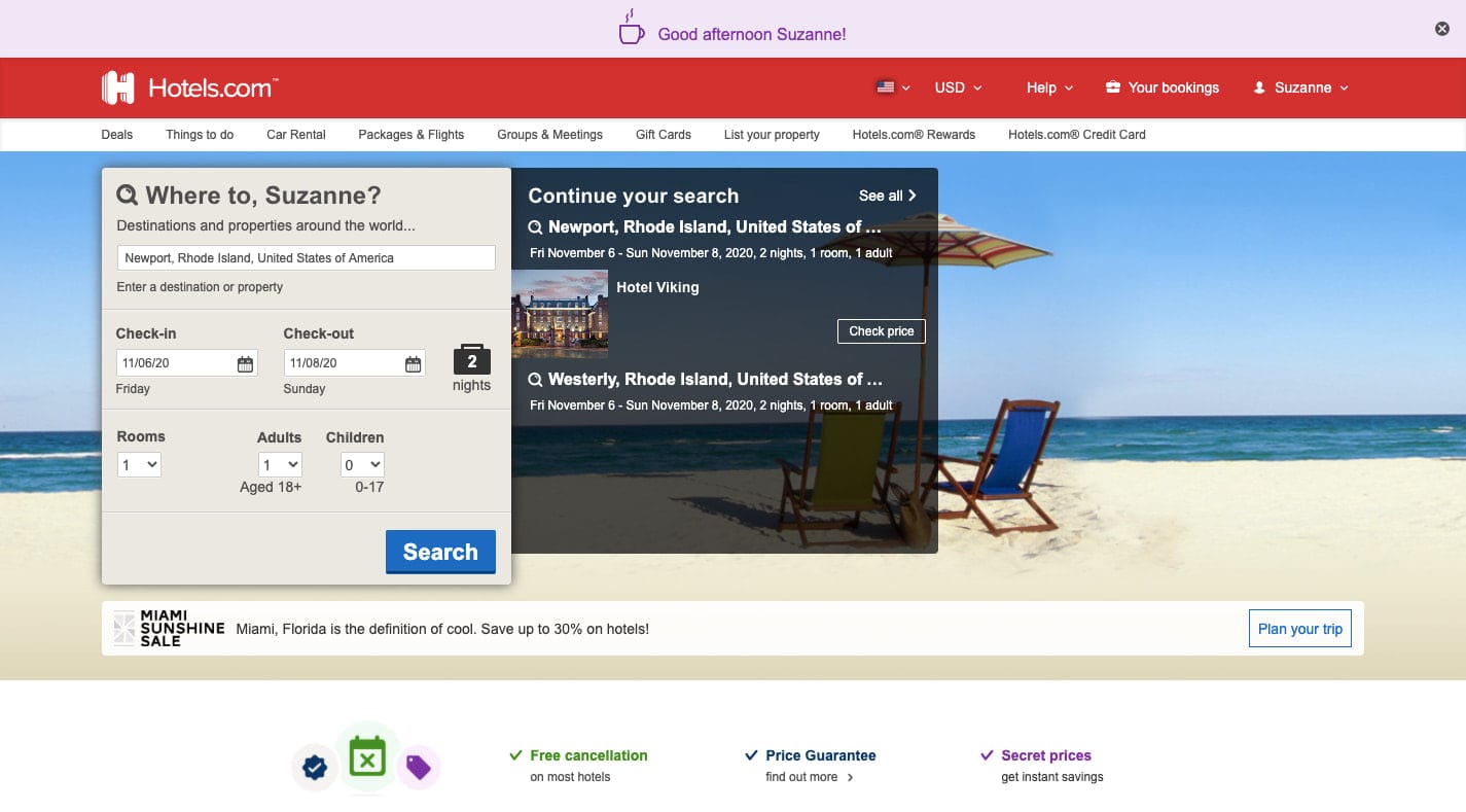
And Hotels.com uses a dismissible sticky banner to greet logged in and loyal customers:
If you wanted to, you could include a newsletter subscription bar in your sticky banner as well. All you’re asking for is an email address, so it’s not as though you’d need much room to do so.
So, Are Website Pop-ups Totally Out of the Question?
Based on recent trends and data, I think there are going to be just a few remaining use cases for website pop-ups where a sticky banner won’t be able to replace them:
1. Click-activated Pop-ups
When you give visitors a valid reason to engage with your site and it’s not unreasonable for them to share their email address in return, a pop-up containing the signup form would work.
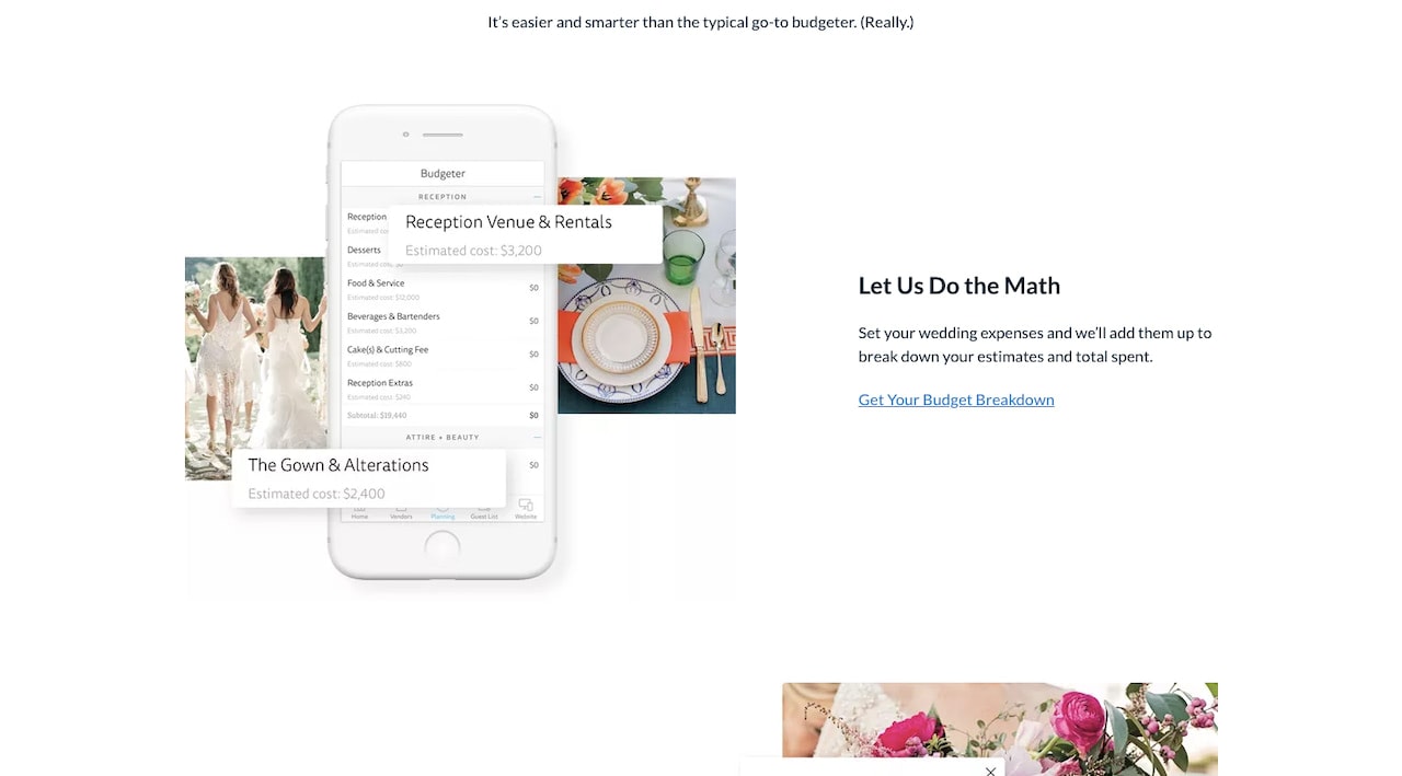
The Knot, for example, invites visitors to “Get Your Budget Breakdown”:
For those interested in getting help setting a budget for their wedding, they’ll see this pop-up:
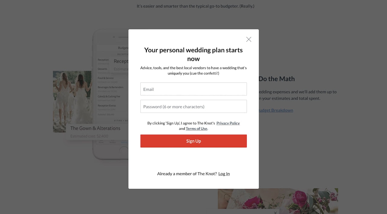
This keeps visitors from having to go to another page to sign up for the wedding budget planner or to get access to the wealth of advice, tools, and vendors provided. They can fill this out and then return to the page to learn more about budgeting.
2. Post-content Pop-ups
When visitors get to the end of a page — like a blog post or a product page — you could just show them the footer and let that be the end. But this part of the experience can be a good time to upsell, cross-sell, or otherwise move visitors onto the next logical page or post.
To ensure that your visitors actually want to read the pop-up and engage with it, you’ll have to abide by the guidelines above.
For instance, Uncommon Goods displays a very small slide-in pop-up that says “Try our gift finder” once visitors pass the product’s description and just before they get to the reviews:
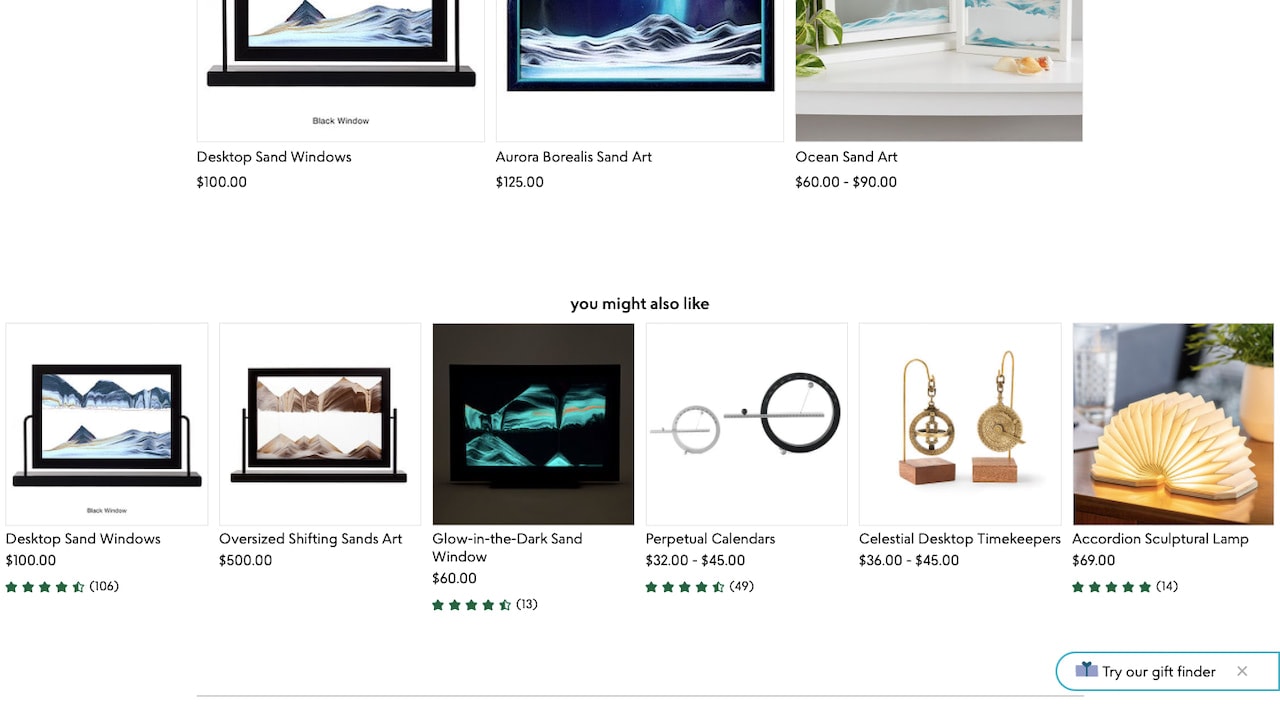
The sliding movement and colorful emoji should be enough to call attention to the very tiny pop-up without fully distracting them from the page.
Blogs also commonly use these kinds of pop-ups to promote related pieces of content as Mangools does here:
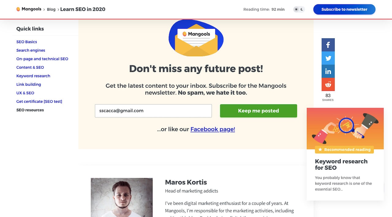
Again, notice how small the “Keyword research for SEO” pop-up is and how it’s positioned off to the right. By staying out of the way, visitors won’t feel overwhelmed, pressured, or annoyed by it.
3. Warning Pop-ups
When you have an urgent message to get in front of your visitors, you can’t always rely on them to discover it in a sticky banner.
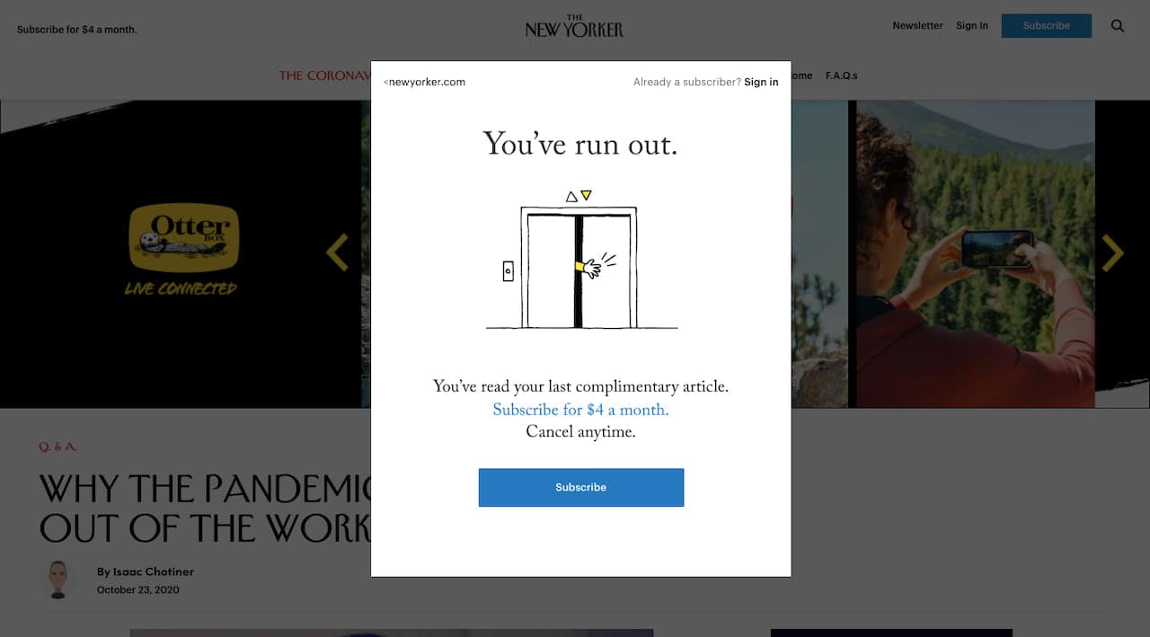
A common example of these kinds of pop-ups can be found on news sites and blogs where content is gated once the visitor has reached a certain limit. As The New Yorker demonstrates:
But you can also use this kind of disruptive pop-up for things like:
- Announcing inventory shortages
- Requesting acceptance of a recently changed policy
- Preparing visitors for a planned business hiatus or website outage
You can also add exit intent modals to this list, so long as they improve the experience (like reminding shoppers they have 5 items in their cart) and not just so you can pester them with something that only benefits you.
Wrapping Up
If you compare the sticky banner examples against the website pop-ups above, you’ll see that the banners all have one thing in common: They create clean and distraction-free interfaces.
It’s no wonder why Google would reward sites that avoid using oversized and intrusive pop-ups then.
Just keep in mind one thing:
We’ve now seen two iterations of website pop-ups get rejected by consumers because we overused and exploited them. If we’re not careful, the same thing might happen with sticky banners.
So, in addition to the lesson we’ve learned about consumers preferring sticky banners to pop-ups, we should also take away the idea that less is more. Just because one type of website notification has become popular across the web, that doesn’t mean we need to use it. Only interrupt your visitors’ experience when you absolutely have to.