Trendy Ways of Enhancing Website Homepages
Images and videos are the most popular options when it comes to enhancing website homepages. But are they the only techniques that form strong first impressions and make websites stand out?
No one can argue with the fact that these stylistic choices are time-tested and crowd-proven methods. Nevertheless, they are not the only options capable of doing wonders with front pages. Thanks to constantly evolving web technologies, each year we witness fresh trends.
New tricks and solutions encourage us to avoid banalities in interfaces. When it comes to something new the issue of compatibility does arise. It is not only a stumbling block but as a rule a “no” answer for majority clients. But let us be completely honest: Is there any solution that is 100 percent compatible with all browsers? (There are still people using IE6 and 7.) Chances are that whatever you choose to work into your project you will still need a fallback. So if plan B is unavoidable after all, why not to say “yes” to fashion?
360-Degree Panorama
Old habits die hard and if you find it difficult to ditch beloved methods then you can start with adopting an improved version of time-tested stylistic choices with interactive or non-interactive 360-degree panoramas.
Nova Skoda
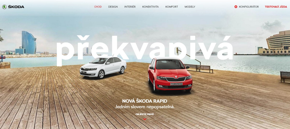
The concept can be based on an image or video. Everything depends on the idea behind your project and budget. The trick can be seen in different types of websites, from those that represent car industry like the official website of Nova Skoda to those that intend to spread awareness of burning questions.
With Postcards Email Builder you can create and edit email templates online without any coding skills! Includes more than 100 components to help you create custom emails templates faster than ever before.
Free Email BuilderFree Email TemplatesParallax
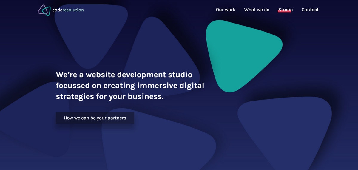
If you do not like the idea of using images or videos on your homepage, then you can go for solutions that involve abstract art. One of the easiest ways is to adopt a parallax effect. It is hard to resist to the subtle sense of depth, especially when it is applied to a bunch of geometric shapes that are carefully scattered throughout the page such as Code Resolution.
Code Resolution
Play With Mouse Effects
In the spirit of mouse-related effects, there is another tiny, charming and actually not-so-new solution to try: Supply the mouse cursor with some kind of a “tail.” As a rule, this “tail” leaves traces or generates shapes or just simply kids around. Consider the Ursa Major Supercluster’s welcome screen.
Ursa Major Supercluster
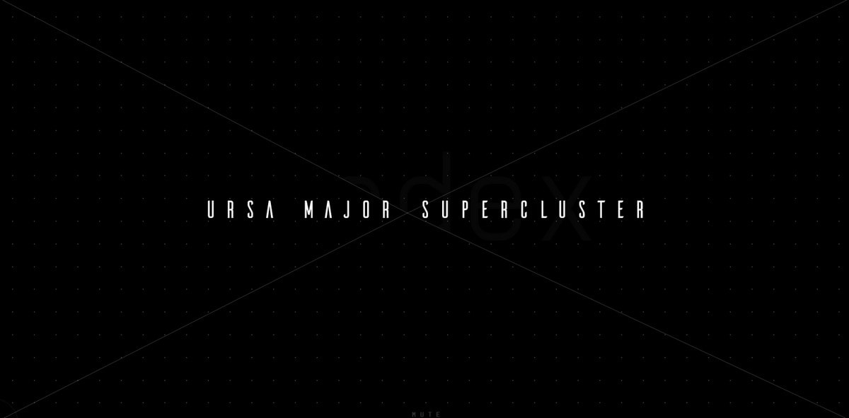
It is built around extreme minimalism with a high-tech vibe in mind. It is neither boring nor insipid. Thanks to mouse cursor that jocosely engages online visitors, it creates a wonderful overall impression.
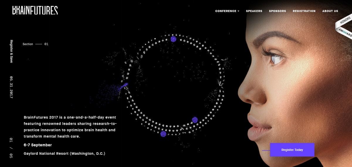
To make a mouse-based interactivity even more fascinating, opt for a trick using particles animation. A couple of years ago it took the web by storm with a cheerfulness and indisputable technical aura. It was really popular for a while, but now it experiences a slight recession of attention due to other options. Nonetheless, it did not lose its charm; by using it you will be able to give an interface a particular appeal much like BrainFutures.
BrainFutures
Animations
Another big area for experimentation is animation. From hand-crafted intros and dynamic canvas-based backgrounds to simple illustrations that are subtly set in motion, the approach of shifting from static to non-static is winning over fans.
With Startup App and Slides App you can build unlimited websites using the online website editor which includes ready-made designed and coded elements, templates and themes.
Try Startup App Try Slides AppOther ProductsWhile enlivened illustrations feel painfully familiar, abstract animations radiate of novelty and originality. Though, both directions are fascinating.
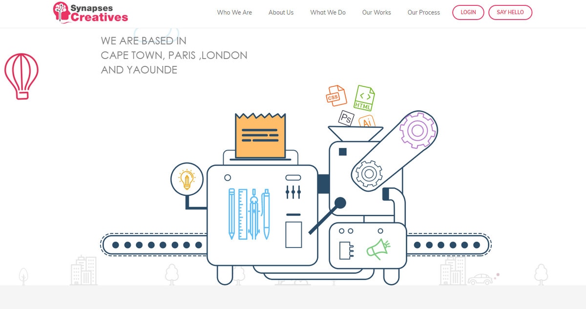
First, take a look at Synapses Creatives. Their homepage depicts a small working conveyor system and urban entourage. The idea is meant to portray the company’s sphere of expertise and at the same time show creativity.
Synapses Creatives
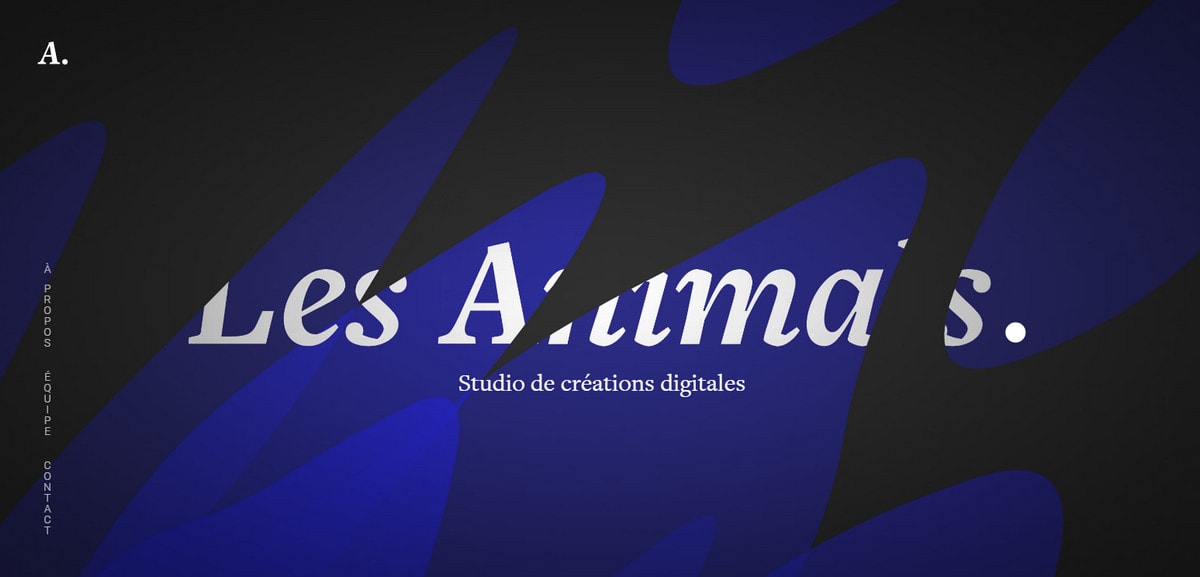
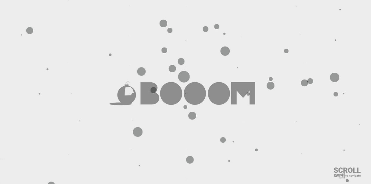
For those that like abstractionism combined with unpretentiousness, the teams behind the Les Animals and I am Boom demonstrate the whole beauty of geometric simplicity brought into life.
Les Animals begins their acquaintance with the online audience with an ingenious fluid-like canvas animation that is eye-catching. Nothing fancy in terms of design, yet it really works.
Les Animals
Whereas the personal portfolio – I am Boom – bets on a bunch of abstract animations. Almost every page is marked by a special dynamic amusement that gets its beauty from relatively simple ideas like generating a mixture of colors, or chaotic explosion of circles in various sizes.
I am Boom
WebGL
Another way of enhancing homepages, is to imply WebGL and its sophisticated fellows like Three.js or GSAP. The vast possibilities are alluring. Despite being partially experimental, to say nothing about its heaviness and low browser compatibility, it offers visitors a real treat as well as adds to a top-notch feeling for projects.
Minor utilization has been widely practiced these days. Not daring to immerse themselves in the trend, artists go for WebGL-powered scenes that play a role of a background. Nevertheless, this is sufficient to produce the desired impression. Look at Bacter.
Bacter
This is the online portfolio of a video production company. The homepage is mind-blowing. The WebGL-powered background is stunning. It grabs your attention but thanks to a neutral color scheme and calm animation, visitors are able to proceed further and focus on important content.
Other Ideas
Animations and interactive features undoubtedly are hard to beat in pursuit of creating a memorable impression; however, they are not the only solution. Sometimes, there are other interesting ways that do not require dynamic features to produce a fantastic effect. For example, the website of Sophie Hustin.
Sophie Hustin
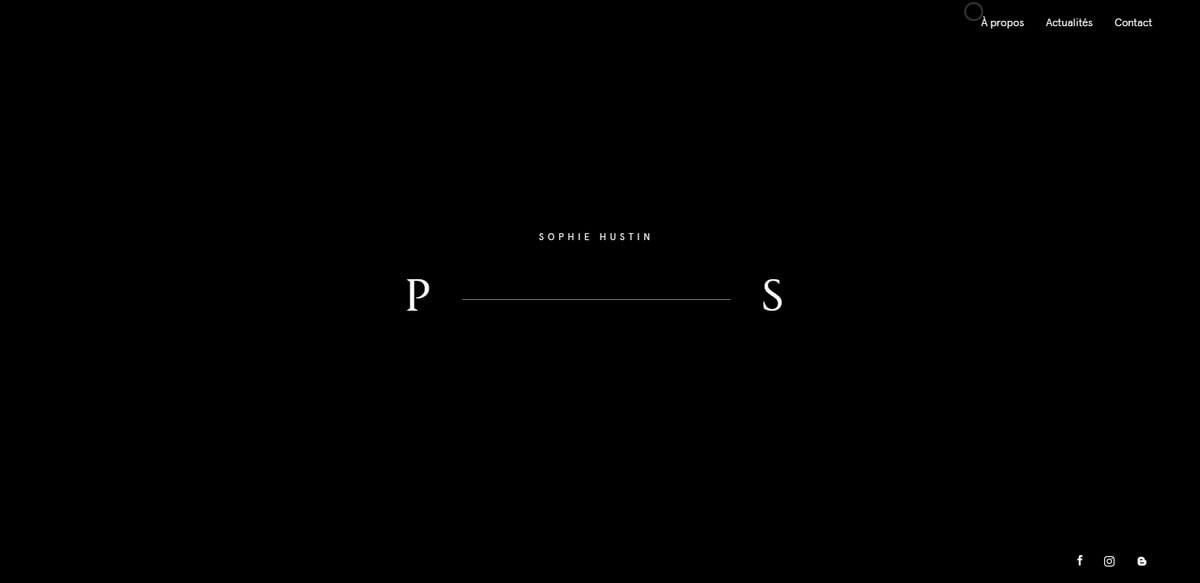
It is minimalistic, clean and tidy. The main menu is hidden, so in order to navigate you should first find the links. This trick appeals to natural human curiosity, separating the project from others. Though it can be a bit annoying for people who are accustomed to getting information right away.
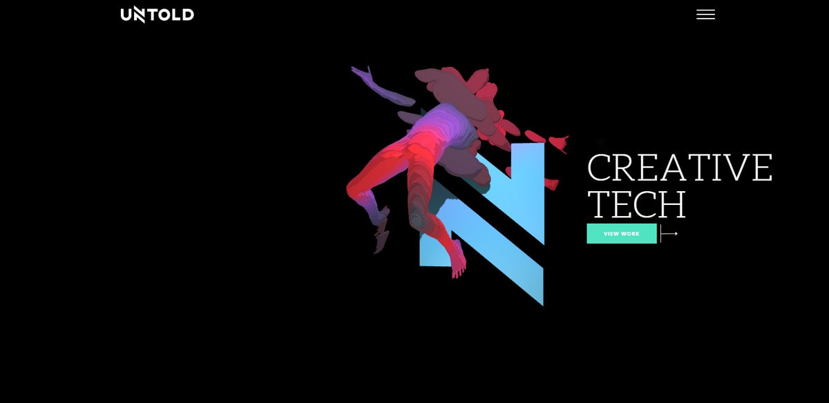
The team behind Untold Digital uses the same technique. For this website, they add some spice to the landing page by incorporating a fantastic WebGL-powered composition placed in the heart of the screen.
Untold Digital
Conclusion
“First impression is the last impression.” Do not underestimate its influence; make sure the first thing that people see on your website is something that you are proud of. It can be a spectacular picture, alluring visual effect, engaging interactive feature, outstanding animation or just an offbeat way of presenting a menu. Do not be afraid of trends since they are most likely help owners to strike users with awe.
What solution do you like most? Do you prefer experiments or improved versions of time-tested things?


