Best Website Designs from Germany: Details, New Technology and Accuracy
Beauty in diversity: The best German website designs are eager to prove it to you. Inspired by a German art culture that embraces various art movements starting from modern vibrant street art (aka graffiti) and ending with lavish pop-art and gloomy but highly thorough international Gothic, it certainly has something to show with numerous exceptionally talented folks.
Nevertheless, this is not the only factor that defines German artists. When it comes to website design, digital agencies as well as individual creatives stick to more contemporary solutions, follow trends and join the mainstream, by and large, leaving vestiges of the past in the past. Meticulous attention to details and use of high-end AI technologies are distinctive characteristics that carefully separate them from others.
Want to find out which German web projects provoke a competition and encourage others to test their limits in this area? Look no further than our collection.
Best German Websites
Jeep Renegade
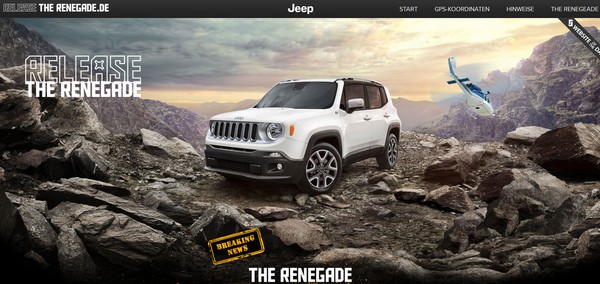
The spectacular photo-manipulated background enlivened by a sharp and geometric typography and sleek grunge touches instantly strikes the eye. The image is certainly worth thousands of words. The design team gets the most out of visuals, creating a distinct and profound impression.
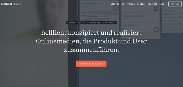
Helllicht
With Postcards Email Builder you can create and edit email templates online without any coding skills! Includes more than 100 components to help you create custom emails templates faster than ever before.
Free Email BuilderFree Email TemplatesThe website exudes an image of accuracy, harmony, subtlety and professionalism. The team is managed to strike a perfect balance between graphical filling and copy as well to meet current web trends, thereby having provided the online portfolio with an absolutely refined and modern look.
Kai Brueckers
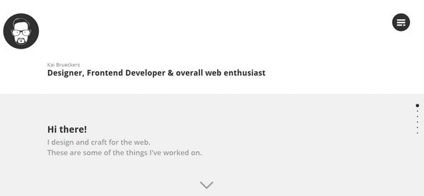
Kai Brueckers has turned the minimalism to its advantage through successfully combining a beautiful restrained color scheme that provides a clear distinction between sections, neat and sharp typography that ideally blends in, several flat illustrations that add a charming artistic note, and tying everything together with a help of a properly-organized horizontal stripe layout.
Tobias Hausler
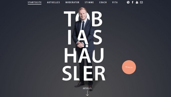
Tobias Hausler relies on a more individual approach equipping the landing page with a strong personality and charisma. This top-notch, one-page online portfolio driven by a regular horizontal scrolling effect is certainly proud of its flawlessly-executed design that is constructed from a wonderful moderate coloring, elegant contour graphics, flat buttons and magnificent high-quality images.
Hochburg
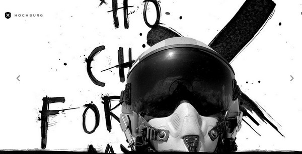
Hochburg has a strong air of creativity that instantly catches the eye. The “welcome” section is an excellent blend of highly realistic mockups, bold, decorative brush typography, complementary brush strokes used for finishing touches and a winning monochromatic color palette. The website looks simply brilliant.
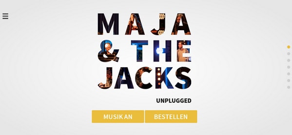
Maya and The Jacks
With Pulsetic you’ll be instantly notified the moment your website, API, or server becomes unavailable. Monitor uptime from multiple global locations and respond to incidents before your users are affected.
Create beautiful status pages in minutes to keep customers informed during outages and build trust with transparent communication.
Start Monitoring for FreeThis music-related website uncovers the artist in a quite pleasant and elegant way. There is nothing to catch in here: No overwhelming nor ingenious elements, the design is quite plain. Nevertheless, delicate and accurate approach of providing information about the singer and the upcoming events is perfectly executed.
Mercedes-Benz
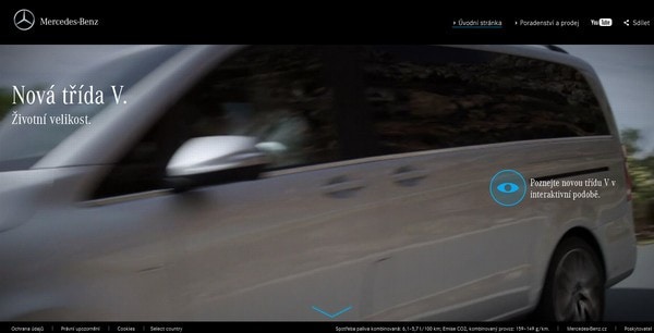
The website definitely excels with visuals: Mind-blowing photo-manipulated backgrounds and dynamic, vivid videos simply occupy the website in order to greatly stimulate users to buy a new version of Mercedes-Benz v-class.
Ok Kid
Ok Kid offers a truly memorable and overwhelming experience. Everything contributes to achieving this goal: Matching sound effects, video, images and interactive elements. The website is a representative example of how to receive the greatest output from new technologies.
14 Tagerbuecher des Ersten Weltkriegs
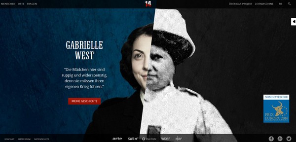
The landing page definitely speaks for itself. The website uncovers 14 dramatic, intriguing, true stories in a pretty interesting way. The team is managed to convert the simple informative website into an engaging storytelling project, though of course, not without a little help of high-end technology, impressive photo manipulation and a fancy air of old time days.
Derpixelist
![]()
Derpixelist is a first-rate digital studio that deals with various sorts of web-based projects. The website has several unique and eye-catching details. For example, an alternative English language is displayed via bust of Queen, the prevailing dark coloring is wonderfully diluted by almost toxic greenish splashes, and of course there are numerous trendy subtle well-crafted line style elements.
Manuel Rueda
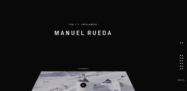
Manuel Rueda has a quite pioneering website that boasts of a magnificent interactivity. Despite of being a video portfolio, it pretty quickly and efficiently functions.
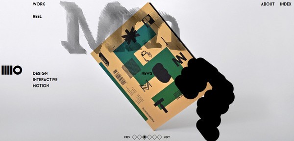
LS5
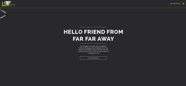
LS5 looks absolutely awesome, appealing and amusing. There are vibrant polygonal backgrounds, contour graphics, brilliant coloring, animated elements, ingenious solutions and a bit of fun that all together brings about an impressive and memorable effect.
17 Grad
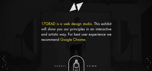
The website is recommended for displaying in the latest version of Google Chrome – and that says it all. The agency is perfectly aware of how to properly derive benefits from powerful possibilities that are hidden in new web technologies, so that this online portfolio is akin to typical projects titled Google Chrome experiment that serve as a fertile source of inspiration.
Bjorn Meier
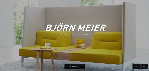
The website looks like a virtual brief introduction of the high-end product design studio. Though it features minimum of graphics, multimedia and content, yet, that is quite sufficient to leave a good impression.
Il-Ho Jung
Il-Ho Jung meets online audience with a startling and pretty informative “hero” area that is spiced up with some pleasant transition effects, sleek graphics and elegant typography. Here, everything is centered around the portfolio pieces in order to bring them into a spotlight.
Zelte
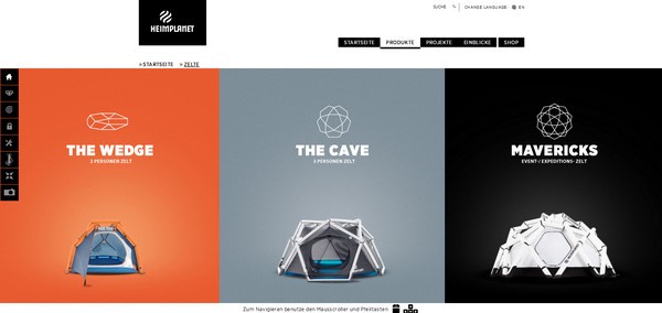
The website has a clean and well-proportioned appearance with a slight boxy vibe. The designer opts for a more traditional color choice and type of layout that allow neatly arranging everything to their places.
Dunckelfeld
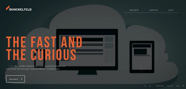
Several catchy slogans placed on top of descriptive illustrations, images and videos certainly do wonders. This small website has its own charm and appeal that won’t leave you indifferent.
Bunt Spenden
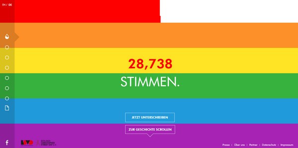
Riot of colors, clear horizontal stripe layout, fully illustrated story, line style controls and ultra-thin sleek typography easily convert a quite serious website that touches discrimination issues into a true masterpiece that showily encourages users to take part in the petition and put their 2 cents.
Conclusion
German websites demonstrate the perfect balance between graphical filling and content as well as careful consideration of details. Creative agencies faithfully follow current tendencies endowing the web with impressive and strictly contemporary projects.


