Visual Walkthrough: Examples of Tiny Animated Icon Gifs
Who would have thought that a popular approach for mobile app developers would come in handy with iconography? Designers are eager to apply this trick even to the tiniest things — user unterface icons.
To be completely honest, keeping icons alive or at least making their emergence a tiny spectacle is not new. Dynamic icons occur in design now and then. However, thanks to intuitive and lightweight after effects, an increasing popularity of creating visual walkthroughs, and the enormous potential of gifs, it is getting more widespread. Although the technique is used to support the message that icon should convey, yet it does not take long when the animated icons invade actual website designs and app interfaces, the more so the ground has been prepared and the way has been cleared.
Nevertheless, as long as it is only a concept, we offer you to take a look at 20 fantastic and first-rate examples of animated icon gifs.
Best Examples of Animated Icons
KickMaterial
![]()
KickMaterial – Kickstarter Material app icon by outline is an eye-pleasing tiny icon inspired by material design that looks refined and stylish due to beautiful soft coloring and neat flat shapes. It has been carefully brought to life for better understanding of its purpose.
Animated Android Webview by Jovie Brett

With Postcards Email Builder you can create and edit email templates online without any coding skills! Includes more than 100 components to help you create custom emails templates faster than ever before.
Free Email BuilderFree Email TemplatesIt’s a simple gear that thanks to skillful manipulations with shades gets a subtle three-dimensional feel. It is powered by several after effects that spin it creatively.
Contacts by Jovie Brett

Contacts has a businesslike vibe achieved through a magnificent bluish coloring and plain yet intelligible graphics. Notebook-style realization is bolstered by a fancy animation that turns pages on the background. It makes an icon look more convincing.
Icons for Business School Strategy Simulator by Valeria Ruiz-Schulze
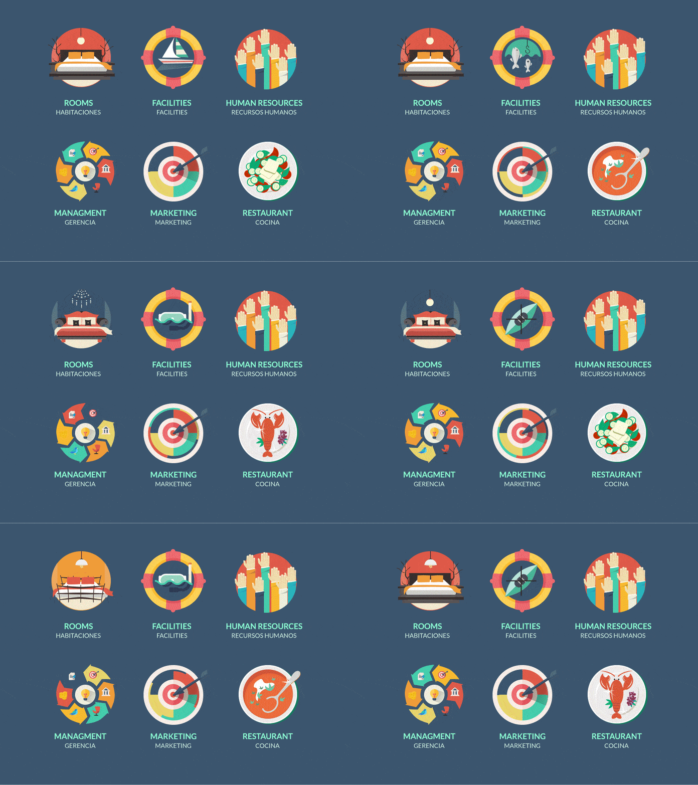
The designer exhibits a whole set of nifty circular vibrant icons that get the most out of flat style. Each item is vigilantly charged with a motion that helps to serve its purpose more efficiently.
Icon Animation | Immersus Media by James Prola
![]()
The project includes three top-notch thoroughly detailed flat icons. Each one is powered by a tiny smooth animation that enhances the appearance and enriches the user experience. Vibrant coloring in tandem with dynamic touches make them stand out from others.
UX Camp Proposals by Tim Walsh

With Startup App and Slides App you can build unlimited websites using the online website editor which includes ready-made designed and coded elements, templates and themes.
Try Startup App Try Slides AppOther ProductsThe project includes two neatly created camping-inspired icons made in contour style and monochrome color palette. Thanks to after effects, map and horn are full of energy and express movement that easily benefit any static interface.
Twitter Canada by Al Boardman

It is another bright and professionally executed set of flat circular icons that should reflect some activity. The designer has done an excellent job by animating people inside the graphics, having made each item look brisk, unique and engaging.
Animated icons by Tommaso Dal Poz
![]()
It’s an excellent example of that even standard primitively looking icons can strike an eye and add to aesthetics. The key feature lies in after effects that accompany and prettify each item, increasing visual appeal.
Animated Icons by Zach Murphy

The series comprises three well-elaborated flat circular icons that serve different purposes. An emergence of each icon is animated. Each one showcases a process of assembling the item piece by piece.
Concept Icon Animation 2 by ReignDesign
![]()
Concept Icon animation features a basic chat icon that you can meet on various interfaces. What exactly draws the attention is an accompanying animation. It is a fancy walkthrough that briefly demonstrates the process of icon’s drawing and colorizing.
Houston, We Have a Problem by Mike Russo

Houston, We Have a Problem by Mike Russo includes two medical icons that look a bit plain and simple. Here an animated constituent gives these two sprucing up, bolstering their meaning and refining their appearance.
Thumbs Down by Mike Russo

Thumbs Down has a slight grunge touch that provides an icon with an artistic feeling. While flat style unifies all elements, soft pastel coloring adds a retro vibe. The animation that shows the emergence of an icon adds a playfulness and positive energy.
Tiny Icon Animations: New & Fixed by Fabricio Rosa Marques
![]()
Not only has the artist created highly detailed icons that are marked by a gorgeous coloring, but he also makes them alive with the help of after effects. Although each icon includes just a tiny animation that makes the boy blink or coffee machine vibrate, it is more than enough to vividly portray their context.
Weather Icon by Miguel Natividad
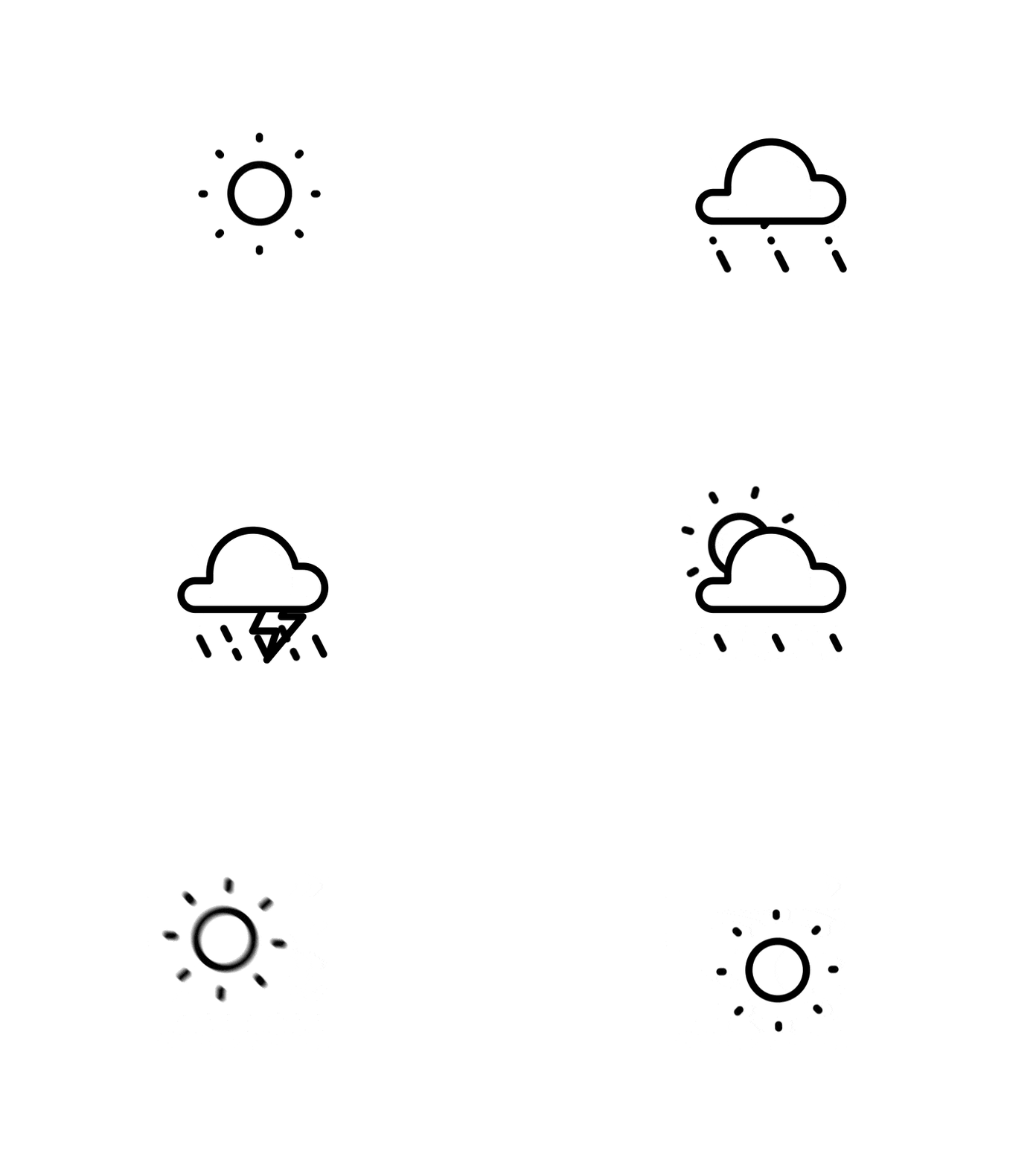
The designer shows off a series of icons well-suited for creating weather forecast app/widgets. Each one is charged with motion. Thus, there is a cloud icon that rains or a sun icon that rotates and shines. It is another great example of simple line style realization that can look outstanding thanks to several interesting dynamic effects.
Google Express by Jason Zigrino
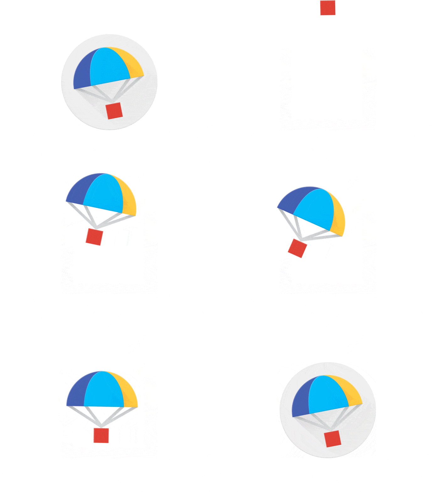
Google Express by Jason Zigrino includes a small smooth animation that charges this vibrant icon with motion. It draws the parachute with a cargo that gradually descends from the top right into the central circle, unobtrusively directing the attention to its function.
B by Al Boardman
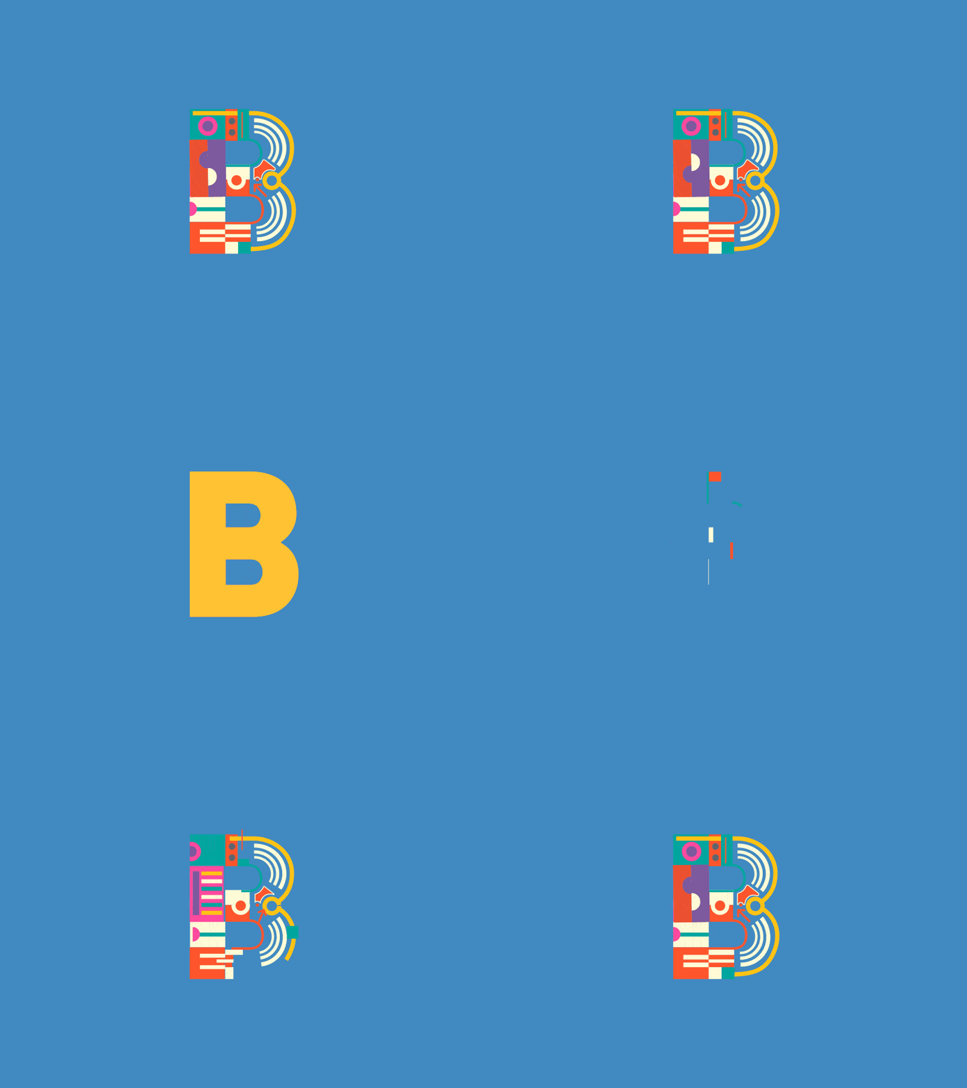
Although it is not exactly an icon, sometimes symbols are used as pictograms to help visitors to navigate or improve menu links.
The project includes small yet advanced type animation that transforms regular solid “B” into a vibrant abstract piece of art with a Kandinsky-inspired appearance.
Sports Analytics Icons by Mike Mirandi
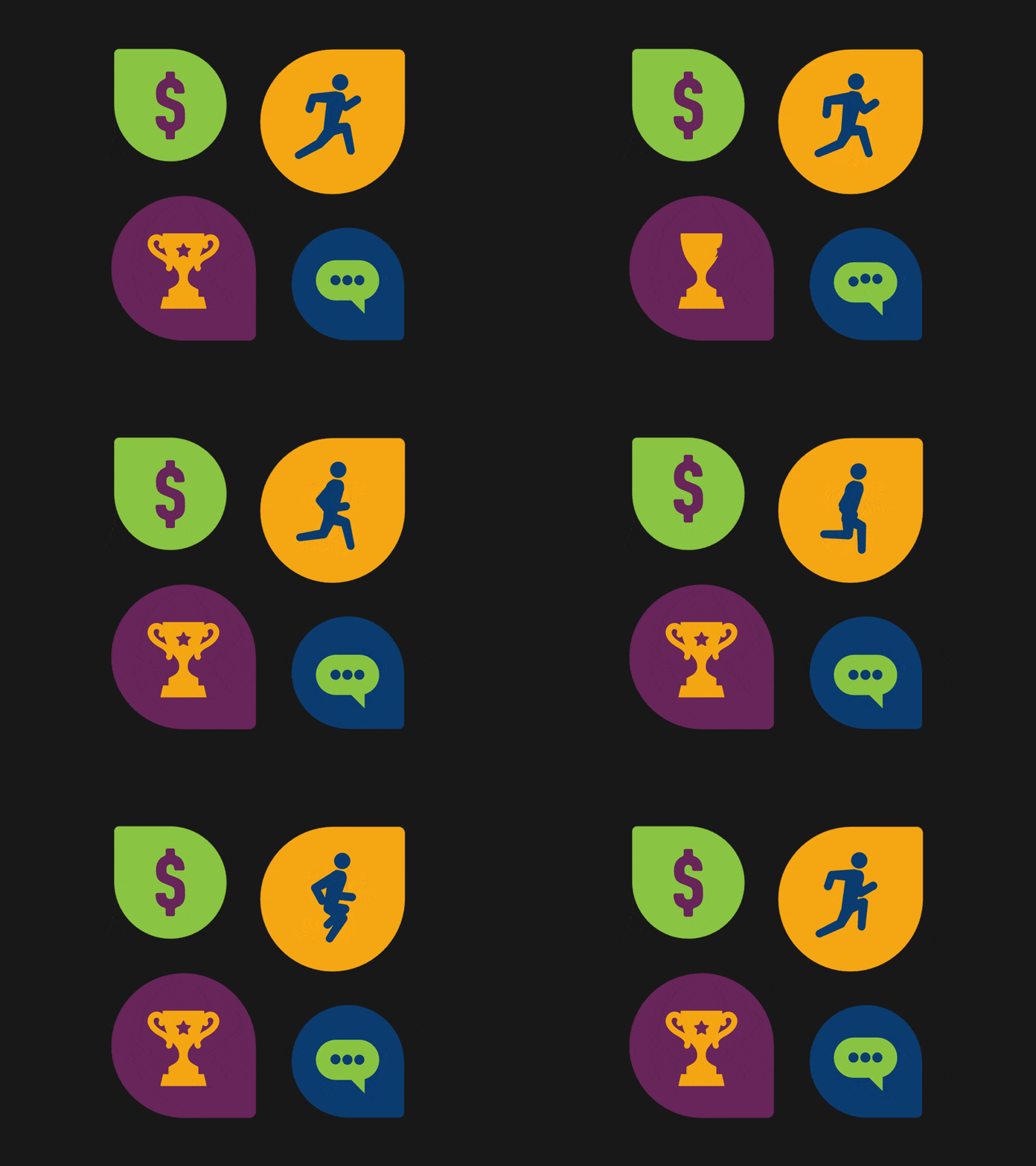
This is another series of plain icons in our list where after effects save the day. It is a great example of how to improve you old website or spice up a boring interface. Just add some motion to you icons, and your project get a refreshing appearance.
Concept Icon animation by ReignDesign
![]()
Concept Icon animation by ReignDesign takes a simple mail icon to the next level just by setting it in motion and animating the routine of inserting the letter in an envelope. Flat style, bright coloring, and material design create a great aesthetics.
Conclusion
Material design-inspired icons that are brought to life with the help of After Effects or JS tricks look intriguing and refreshing. Moreover, even plain line style icons constructed from basic geometric shapes naturally become focal points in UI thanks to some motion.
