Explicit Grid-based Website Designs: Showcase and Practice
Nowadays, the majority of website designs are based on grids; days of chaotic layouts are gone, and today is the era of ordering and structuring, although it is invisible to the naked eye. Such layouts are well-balanced, and, as a rule, aesthetic and neat. Grid frameworks that are the basis of all modern sites do all the work, providing the end-user with perfect undistorted design.
Although the grid is generally associated with no more than just a simple intersection of horizontal and vertical lines with a specified interval that would hardly seem to bear any independent decorative component, many designers use it as an embellishment with obvious underlining of geometric shapes. We are accustomed to see clear grids in galleries sections, blogs, news-related websites, but sometimes skillfully treated grids draw users’ attention on websites dedicated to portfolios or other creative websites. And it’s not surprising since besides of general advantages that related to functional side such as:
- creating visual paths in order to direct people;
- demonstrating sorted data;
- combining different components together, and at the same time, leaving them as independent units,
it also plays the role of good pedestal for demonstrating the full beauty of straight lines.
In our showcase, you will find appealing website designs with skillfully implemented grids that can be easily detected by the unaided eye.
Grid-based Website Designs Examples
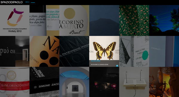
Spazio Dipaolo divides the main page into equal, square, slightly darken cells which represent images of different portfolio artworks.
With Postcards Email Builder you can create and edit email templates online without any coding skills! Includes more than 100 components to help you create custom emails templates faster than ever before.
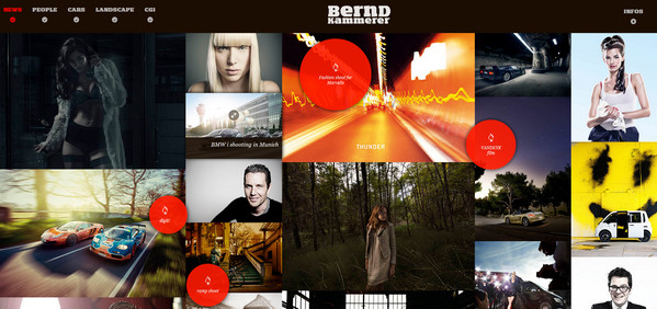
Free Email BuilderFree Email TemplatesBernd Kammerer has a 3-columned layout; each column has its own image flow, demonstrating various bright shots. Furthermore, red circular links to other image series alternately appear while you are scrolling through the site.
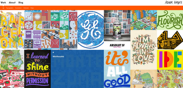
Adam Hayes orderly shows off spectacular artworks, full of color and graphics.
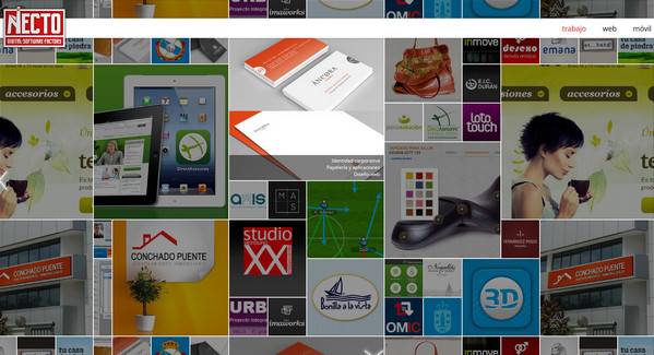
Necto utilizes unequal, but rather balanced grid in order to shed a light on previous works, using size of a cell in order to put emphasis on an item. The bigger size, the more complicated work is.
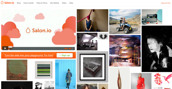
Salon is another good example of using uneven grid, where location of rows varies depending on the column.
With Pulsetic you’ll be instantly notified the moment your website, API, or server becomes unavailable. Monitor uptime from multiple global locations and respond to incidents before your users are affected.
Create beautiful status pages in minutes to keep customers informed during outages and build trust with transparent communication.
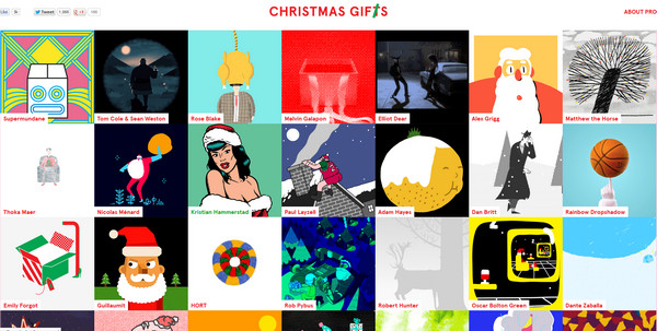
Start Monitoring for FreeChristmas Gifs leverages clear well-proportioned grid that includes varied animated gifs dedicated to Christmas.
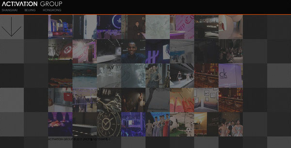
Activation Group does a great job of using dark color palette, specifying every cell with its own shade. Such diverse and at the same time restricted color utilization adds to a home page a slight chessboard feeling.
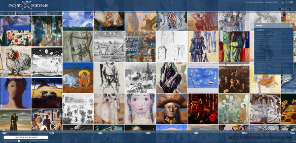
Portal Portinari is a fully animated website that includes timeline in order to show different artist masterpieces via grid-based gallery, which occupies the entire first page.
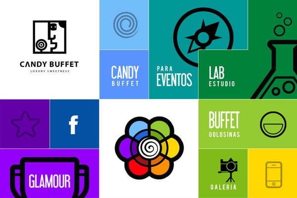
Candy Buffet takes on modern clean and clear flat style, spicing up plain geometric shapes with bright colors.
Betel Bar and Kitchen recreates strong feelings by neatly-organized landing page which harmoniously brings together images and text blocks.

RVLT represents home page as a meld of navigation links and store items that have been enclosed in rectangular shapes with variable location.

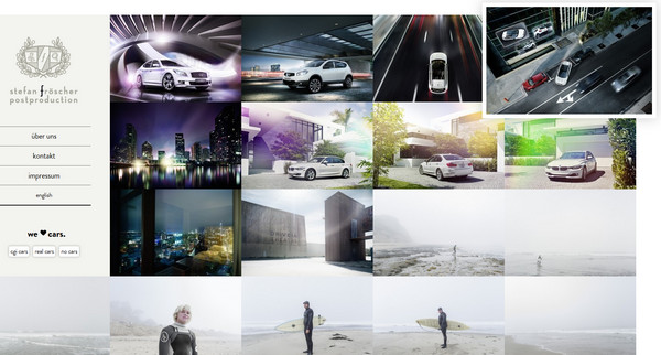
Stefan Froescher is a standard left-sided portfolio that welcomes its users with ordinary image gallery.
Jean-Georges has an exciting huge photo-based navigation system that is realized by means of grid.

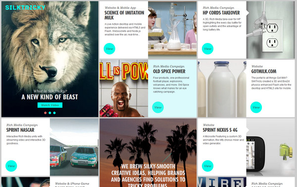
SilkTricky divides each cell in a half in order to clarify both visual and content aspects of an issue. Moreover, designer adds a couple of big square-shaped sliders that make a grid to look slightly heterogeneous.
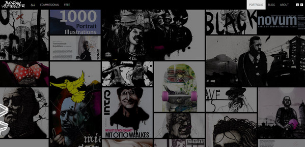
Bastian Preussger looks rather enigmatic and peculiar due to black one-colored background and moderately obfuscated grid, which showcases artworks in miniatures.
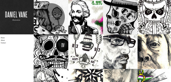
Daniel Vane plays heavily on black-and-white color scheme and grid in order to make a website look clean and accurate.
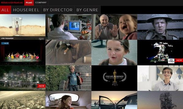
Rosas and Co Films AG utilizes a common approach of sorting video miniatures by filters demonstrating results via grid system.
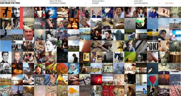
Far From the Tree fills the whole main page with miniatures that all together form a perfect detailed grid, though a website has a rather heavy and messy outward.
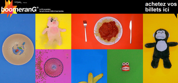
Boomerang 2013 has a truly explosion atmosphere. The whole design focuses on users, engaging them in unique and spectacular animations that have been stuffed into the grid.
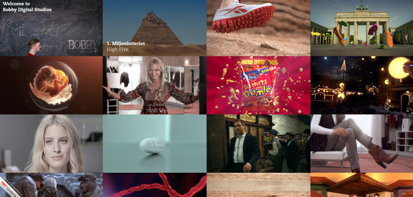
Bobby Digital Studios does a good job of using all power of gallery component, instantly familiarizing users with their works that are orderly and accurately placed. showcased via grid.
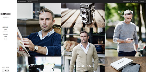
Hommard has a modern sophisticated look. Website is mainly based on grid and a bunch of high-quality photos.
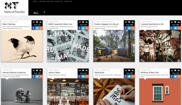
National Traveller is a conventional well-structured blog with a great deal of rectangular-shaped functional blocks.
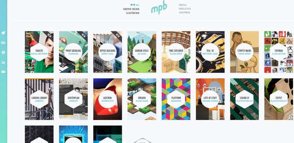
My Poor Brain wonderfully utilizes narrow-column grid in order to show as much information as possible.
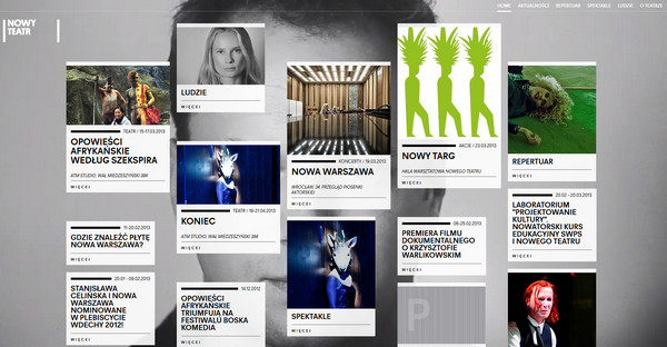
Nowy Teatr adds a bit of chaos using different intervals between rows and columns.
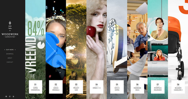
Woodwork Amsterdam represents visual data in columns, harmoniously eliminating use of lines. Such method allows to better showcase huge photos.
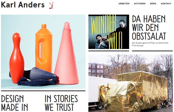
Karl Anders has a fresh vibe with a lot of blank space. Designer harmoniously divides layout into 4 columns, filling each cell with huge title or descriptive image.
Reflection
Grid is an integral design tool that easily turns chaos into order, and in website design, such ability is really important. Majority of ordinary users wants to get information easily and quickly and there’s no better way to provide them with data than represent it in well-organized structure. But this doesn’t mean that website appearance has to be plain and insipid. Even simple geometric shapes that are skillfully diluted with colors, images and graphics can be overwhelming and truly attractive. Moreover, explicit grid-based design perfectly fits into any type of website whether it’s an online magazine or creative portfolio.
So, what do you think of grid-based website designs? Does such explicit and intentional division into cells look appealing? Is it appropriate for creative designs? Or such an approach is more suitable for blogs, online magazines and news-oriented websites?

