
![Typography Cheat Sheet [Infographic]](https://designmodo.com/wp-content/uploads/2016/10/Typography-social-319x207.jpg)
Latest Articles
-

What is an Interaction Designer?
These two little words are being used a lot in the design sphere these days. …
-

Working with Color: Create a Monotone Design Scheme
Creating a dark color scheme can result in a beautiful, elegant design. There are a …
-
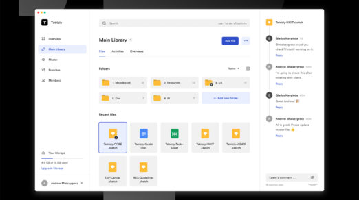
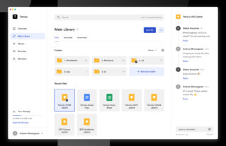
How to Create a Well-Organized File Management System for Designers
File organization for designers can be tough since we work on so many different projects, …
-

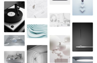
Mood Boards for Product Designers
Most designers know that wireframing and prototyping are essential parts of the design process. Without …
-

How to Draft a Design Brief for Successful Projects
A design brief is a document that helps a designer and client align on project …
-

How to Create a Customer Journey Map for Better Product Design
A customer journey map is a visual representation of the different steps a customer goes …
-
A Helpful Guide for Overcoming Design Frustration
Every designer wants to be successful. But success is a subjective measure. For many designers, …
-
9 Tips for Design Job Applicants to Get that Interview
Applying for a design job, like any job, can be stressful. Whether it’s your first …
-
6 Benefits of Using a Copy-First Approach for Designers
A copy-first design approach is beneficial in helping design projects of all sizes. Whether it’s …
-

Sit at a Computer All Day? You Need These Glasses
If you are anything like me, you probably sit in front of a computer most …
-
![The Short History of Website Building [Infographic]](https://designmodo.com/wp-content/uploads/2018/11/The-History-of-Website-Building-522x292.png)
The Short History of Website Building [Infographic]
Website design has come a long way in a relatively short time. From zeros and …
-
Web Designers, Eliminate These Design Pains Before They Kill Your Productivity
Every job can have its ups and downs. Yet, it seems that this is especially …
-
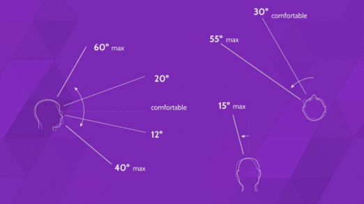
Motion Design in Digital Experiences of the Future
When designers create products, they tell stories to users. Designers have a lot of tools …
-

What is a Design Audit and Why You Should Conduct One?
Design consistency heavily influences the customer experience. It ensures that your customers (and potential customers) …
-

How to be a Great Design Mentor and Where to Find one for Yourself
There has been a lot more discussion online about mentorship among the designer community. Being …
-

What is a Design System, Why It is Important and What to Include
What is a design system, why is it important and what do you include in …
-
Basic Design Concept of VR Design
Over the last couple of years, companies such as Apple and Google have been investing …
-
![How to Start a Web Design Project [Infographic]](https://designmodo.com/wp-content/uploads/2018/03/How-To-Start-a-Project-522x292.png)
How to Start a Web Design Project [Infographic]
There’s a first time for everything — and it’s finally time for your very first web …
-
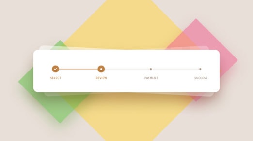
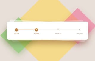
Progress Step UI Design Patterns: Tips, Freebies & Code Snippets
Progress steps are great for user experience. You typically find these on signup pages and …
-
Trending Ways to Use Color in Web Design
Color is a staple design element we see everywhere in our lives such as on …
-

What is Conversational UI, and Why It’s Important
Conversational UI is simply a chatbot experience that processes language in a natural way as …
-
![How to Pair Typefaces & Ensure Readability [Infographic]](https://designmodo.com/wp-content/uploads/2017/09/How-to-pair-typefaces-first-522x292.png)
How to Pair Typefaces & Ensure Readability [Infographic]
Every designer wants to master the art of pairing typefaces. Good typography enhances design and …
-

Design Stereotypes: Masculine and Feminine Design Techniques
A user’s first impression of your site can be a lasting one. In the first …
-

How to Protect Your Design Work on the Internet
Are you worried about people stealing your designs after you publish them on the web? …