Great Places, Great Interfaces: Fantastic Hotel and Travel Websites
Great places – great interfaces: That can be definitely said about the contemporary travel websites. Whether it is an page for a local hotel or a feature-heavy portal that belongs to big holiday company, it fantastic interfaces are user magnets. These websites grab the attention with breathtaking images and videos as well as modern techniques such as the hamburger menu button, panoramic views, parallax, responsive layouts, cinemagraph and much more. The best designs skillfully harmonize multimedia, text and various effects, achieving equilibrium and offering readers an immersive user experience.
What’s more, one does not forget about vital functions such as integration of social media, booking, or other essential services for tourists. Today, we are going to showcase 20 distinguished and thrilling travel-related websites.
Hotel and Travel Website Examples
Pygmy Elephant
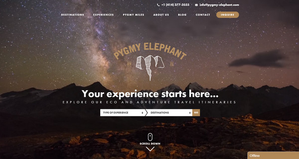
Pygmy Elephant is a travel agency whose website provides visitors with an immersive visual experience. It is rich in multimedia that encourages visitors to embark on a journey. Dynamic background, videos, beautiful graphics and interactive details are what make the project so exceptional.
Cruise Me
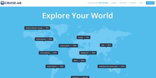
The team employs the cutting-edge features to benefit the project. The homepage greets the online audience with an interactive map of destinations. Each mark is equipped with a pop-up window that offers visitors to choose the cruise according to their budget. The next section includes a selection of tours that are presented as cards. The design is pleasant and friendly.
With Postcards Email Builder you can create and edit email templates online without any coding skills! Includes more than 100 components to help you create custom emails templates faster than ever before.
Free Email BuilderFree Email TemplatesBird Luxury Travel PR
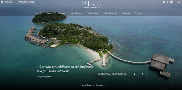
Bird Luxury Travel PR is populated with spectacular images. Some are enclosed in a full-screen slider, whereas others are scattered throughout the page. The structure is conventional, yet it treats the content pretty well, making exploration of a website an enjoyable pastime.
The Art of Travel
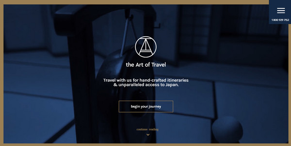
The Art of Travel breathes with tendencies. It uses several modern solutions such as a hamburger menu button, centered layout, ghost buttons and parallax effects. The latter activates tiny fancy transitions between sections. There is plenty of fresh air that beneficially livens up the content and places emphasis on important details.
S-Trip
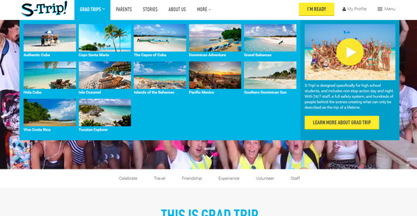
S-Trip has a content-intensive interface that balances multimedia content and text. Nevertheless, everything is neatly arranged. The mega drop-down menu is filled with images, videos and widgets – it is a pretty informative device. A bright color scheme expresses the spirit and attitude of the company.
Henge Travel
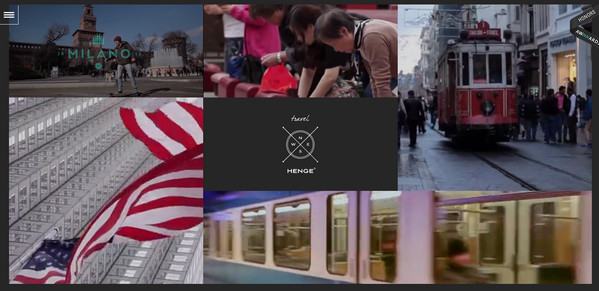
Henge Travel uses boxes in a creative way. Five small videos are tightly placed together to showcase five different places. Together, they form a single space and serve as a primary navigation through the project. The idea gives the “welcome” screen zest and reflects an adventurous mood.
With Startup App and Slides App you can build unlimited websites using the online website editor which includes ready-made designed and coded elements, templates and themes.
Try Startup App Try Slides AppOther ProductsBatty Langleys
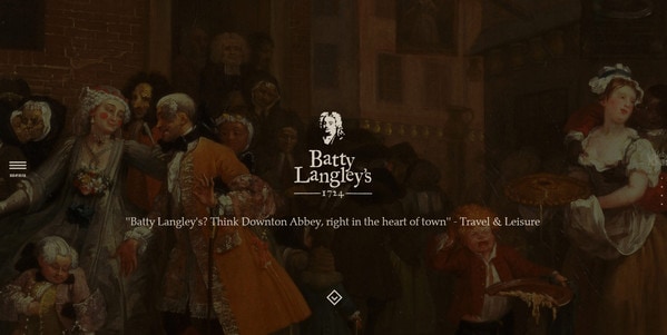
Batty Langleys radiates of authority, luxury and class. The website is a symbiosis of gorgeous images and fantastic illustrations that are enriched with little dynamic effects. It perfectly conveys the atmosphere of the Victorian era that promotes the hotel in an outstanding fashion.
Kivo Hotel
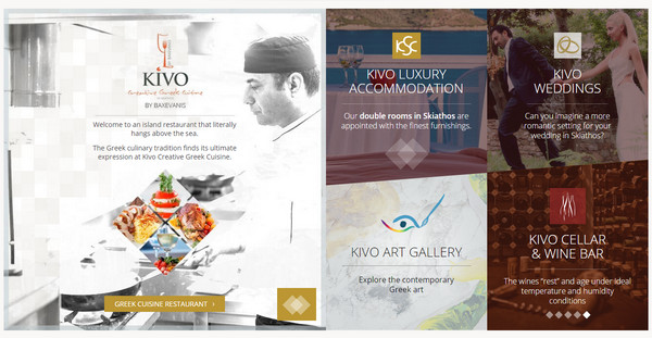
The website gets its nice look from a cooperation of a standard horizontal stripe layout and grid system. It is marked by some original artistic traits such as watercolor effect, lopsided boxes, pixel art and sleek line-styled icons. Booking is neatly placed on the top and provides visitors with a quick access to vital function.
The Cambrian, Hotel Adelboden
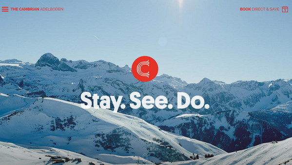
Here, images steal the show. They are dramatic, appealing and splendid. Each section includes a gorgeous picture that ignites interest and reflects the atmosphere. The two-column layout looks pretty modern: it deals with all the visual stuff.
Villa Honegg
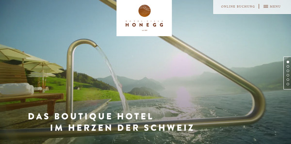
The portal offers visitors to get acquainted with the place not only with the help of images but also with a panoramic video tour that showcases the hotel in the best light. The front page is a huge vertical slider that seizes users’ attention.
Matterhorn Focus
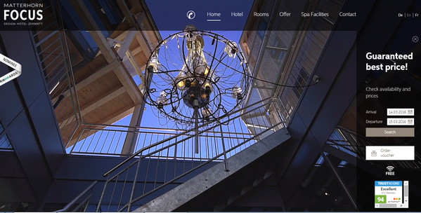
Matterhorn Focus exudes an image of elegance and sophistication. The chic photo background encourages users to move across the project. It works effectively as an introduction. A refined, streamlined navigation bar paired with a control panel to the right gives users all the necessary instruments to get the most out of the website.
Lloyds Baia Hotel
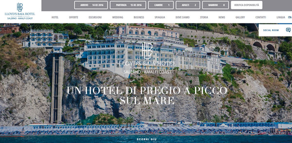
The website is highly informative: It covers all the data that may come in handy. Nevertheless, the front page maintains a clean aesthetic. It is based on an asymmetrical split-in-two layout that gives images a top priority and arranges content in digestible fragments.
Le Germain Hotels
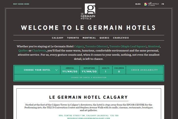
The website breaks away from the other lavish representatives with its tidy, robust flat design and boxy vibe. It is structured and neatly organized. The content is carefully delineated. The coloring places accents in the right places and produces a distinct impression.
Alex Perry Hotel and Apartments
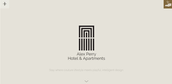
The website effectively embraces the power of minimalism. A considerable amount of white space brings the content into the focus. It feels elegant, approachable and friendly. It gives off charm and personality inherent to the promoted hotel and apartments.
TZVG
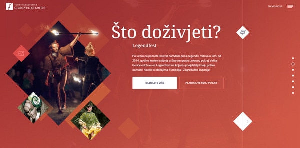
TZVG is a parallax-driven website with a charged interface full of energy and a subtle sense of movement. The geometric vibe in tandem with smooth transitions produces the overall aesthetic, drawing visitors in. Some of the sections are based on slider, providing even more information on the matter while others just beautiful getaways.
Giannoulis Hotels and Resorts
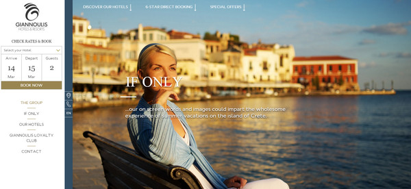
The front page is broken into two parts. The first is relatively narrow, yet it is sufficient to demonstrate all the necessary components such as a booking form or navigation. The second is aimed to impart an impression on viewers thanks to its spectacular photo background. There is a third column sandwiched between the other two. It comprises several icons that lead to the map, telephone number and language options.
Isabela Galapagos Cruise
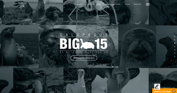
The landing page includes seven sections that are linked to seven different tours. Each is personified by a spectacular photo. Slim contour graphics that accompany each slide adds a refined and exquisite touch to the design.
St. Moritz
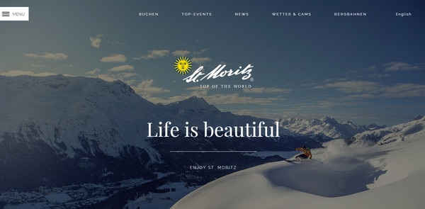
The team avoids overloading the interface with too many images and too much text so that it houses only the important stuff. Pieces of data are placed into carefully outlined boxes that divide the content flow into digestible portions. The atmosphere conveys the idea and the structure is easy to scan.
THB Hotels
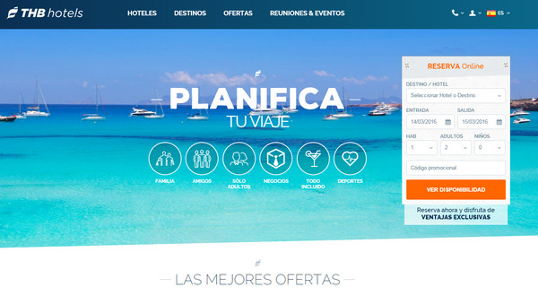
The website uses bright colors and magnificent photos that naturally deliver a cheerful and buoyant summer mood. There are many visual cues, sliders, cards and widgets that guide users through the project and describe place and hotels in an enjoyable fashion.
Travelscope
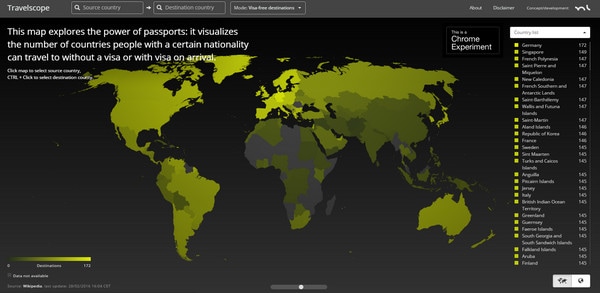
Travelscope is a small, fully interactive Chrome experiment that visualizes travel possibilities for different countries. Choose the area and the system will show its power of passport. The only drawback is that it experiences some problems when viewed on tablets.
Conclusion
Travel and hotel websites have outstanding interfaces. They look stylish, beautiful and sublime as well as satisfy current trends. They often combine functionality and aesthetics, taking care of various aspects and letting people quickly book the desired tour or room.


