Imbalanced Layouts Offer Different Patterns to Adopt
For a long time, web interfaces were the places where balance, proportion and symmetry were considered to be the signs of good taste and attributes of great design. Everyone was struggling to achieve complete harmony and equilibrium of details. But the situation has changed. There were many attempts to embrace chaos.
These days we witness another attempt to turn chaos to its advantage, represented by imbalanced layouts and compositions. Designers in the examples below choose solutions wisely, evidently taking into account the mistakes of the past. But still, they are not afraid of incorporating unexplored approaches coming up with peculiar and distinguished designs.
How to Create an Imbalanced Layout
The imbalanced layout, much like chaos itself, can be created in many ways. The easiest is to let your imagination run wild and hope that it won’t lead to a disaster. This path does not fit everyone, obviously; sometimes it is better to follow general practices and learn from patterns that are successfully adopted by others. These proven and “matured” methods include:
- Going outside boundaries
- Using the one-sided organization
- Manipulating space
- Overlapping blocks
- Mixing text and visuals
- Employing the untraditional grid
Mix Text Blocks and Visuals
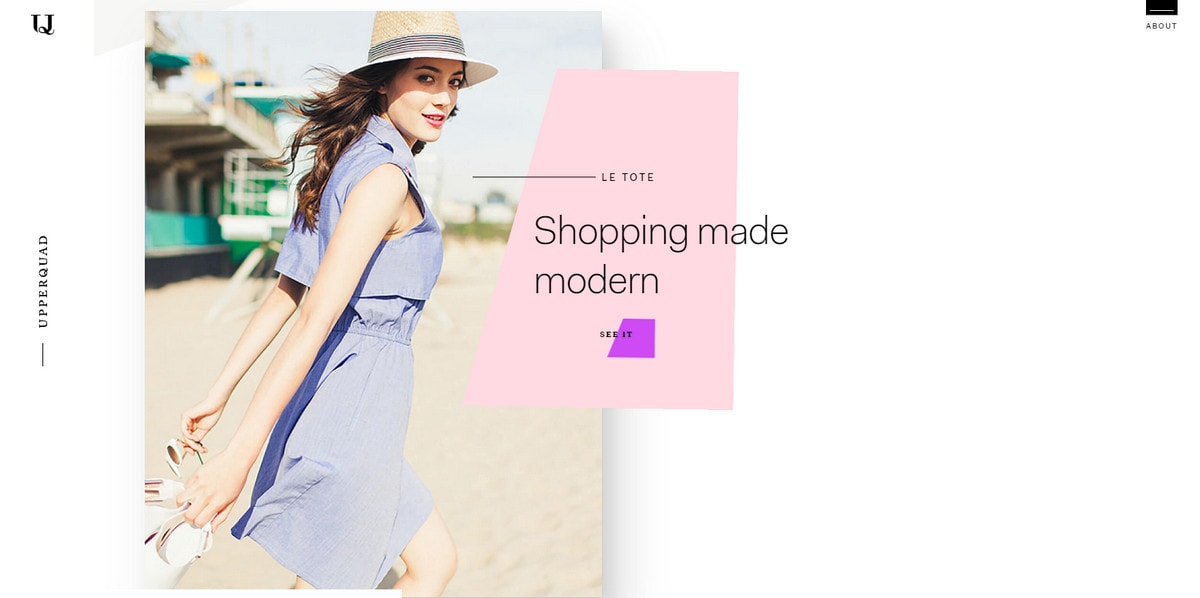
The simple way to achieve the imbalanced layout is, of course, to play around a little. Take two main constituents of the design — text blocks and visual material — and mix and match them until you get the desired effect. Forget about the general rules of symmetry and balance; enjoy the process to create something unusual. If you prefer to take baby steps, simply start with the smallest changes like shifting the content on one side a bit lower or a bit higher to avoid concordance in the horizontal plane.
With Postcards Email Builder you can create and edit email templates online without any coding skills! Includes more than 100 components to help you create custom emails templates faster than ever before.
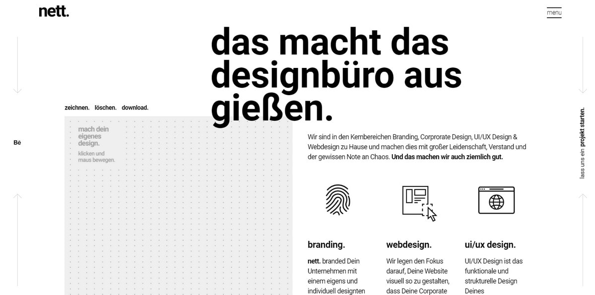
Free Email BuilderFree Email TemplatesNett is a representative example of how to do this and still strike harmony.
Go Outside Imaginary Boundaries
“Oh, that can be easily arranged; what is difficult to do is to force all the UI elements to stay inside the desired grid.”
However, going outside imaginary boundaries is not as easy as it sounds. In fact, it is tricky since you need to fake it. The main stumbling blocks are to save the structure from falling apart and to make it behave the way you want.
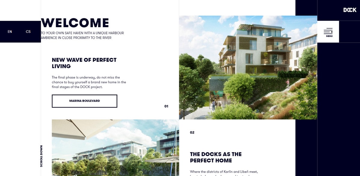
Dock made by Crestyl is one of those that nailed the technique.
Here, one image is inside the grid; the other is not. The subtitle under the main headline tightly sticks to the border, whereas the main text block that is right underneath it and uses some space on the left. It feels like the design requires some job to be done with leveling and adjustment. However, all these tiny apparent discrepancies effectively form a complete composition. As a result, the website feels extraordinary in an elegant manner.
Forget the Rules of Classic Grids
Unconventional grids can help to achieve the desired result. Forget about the strict customary organization of rows and columns; just place blocks wherever you want. One thing to keep in mind is that while you are messing around with the positioning, consider creating a visual path. In this way, you will manage to set focal points and gently guide users from one point to another much like the Heartbeat does.
With Startup App and Slides App you can build unlimited websites using the online website editor which includes ready-made designed and coded elements, templates and themes.
Try Startup App Try Slides AppOther Products
One-Sided Organization
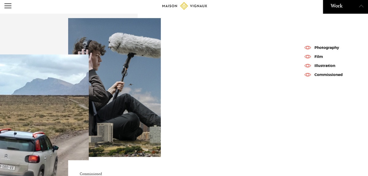
If you are in no mood for experiments and finding your special way with the trend, you can pretend like you have never heard about the centered layout like Maison Vignaux with his portfolio section. He placed the content on the sides of the page and leaves the middle untouched, with a very interesting result.
Add Space
Well thought out use of white space lies at the heart of any good user experience. It is an almost universal answer to the majority of problems. The imbalanced layout is nothing without white space. Gaps are one of those elements that are responsible for making the design work.
Don’t be afraid to experiment with it. Follow Upperquad’s example. Here, the free space is king of the situation. This space does not push the user away; on the contrary, it creates a particular flair.
Let Blocks Slightly Overlap Each Other
The overlapping technique is the simpler, more elegant and more subtle version of the multilayered design with fewer challenges in the way of adopting the trend. Just remember to stay flat and avoid skeuomorphism like in case of The Esbeginnt.
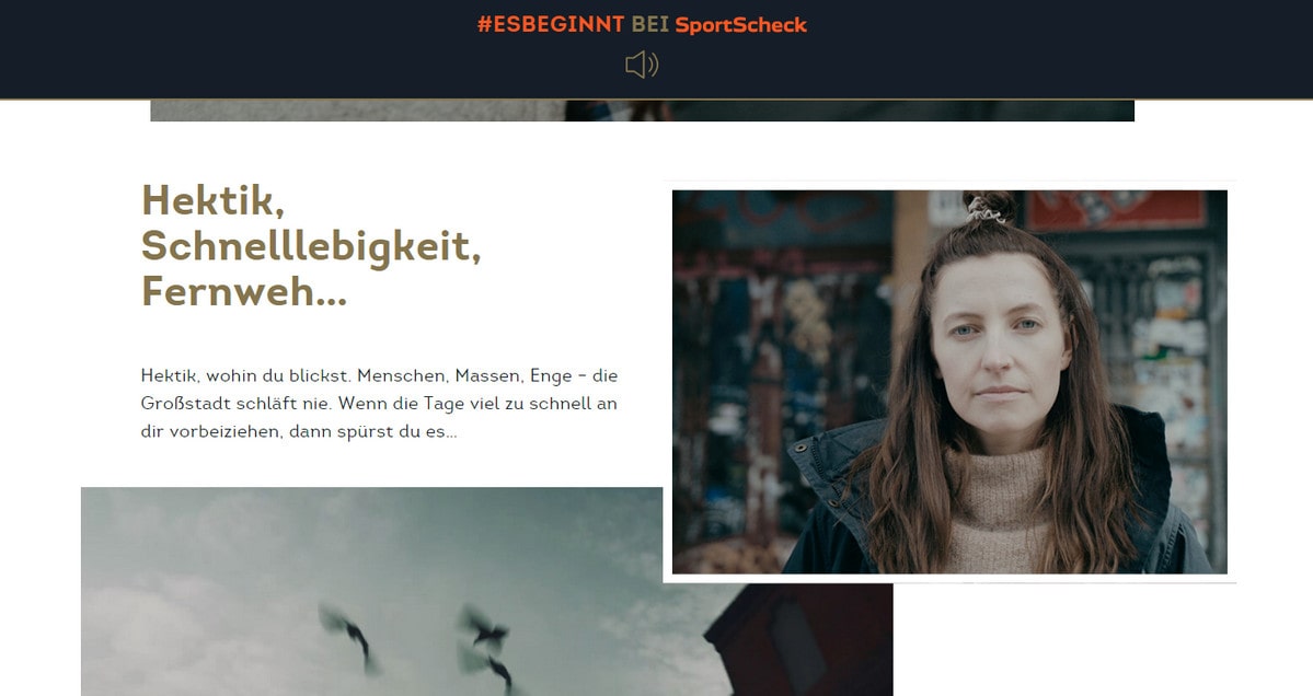
In the website above, text blocks and accompanying images do not form one region as pictures partially overlap each over. However, everything looks fine with a harmonious feeling and pleasing zest.
Tips to Make the Most Out of the Trend
Enjoy Multilayered Aesthetics
Multilayered aesthetics, in a nutshell, are an attempt to embrace visual chaos. It is obvious that the imbalanced layout seems to be an ideal partner for it. Both concepts rebel against habitual order.
These designs effortlessly draw attention, adding a tempting and provocative flair to projects. But, like in real life, it is hard to put a halter on them and bring them to their senses.
Trevarefabrikken succeeds in finding a key between the two concepts. The team has bet on neat precise blocks, a clean background, flat style and a bunch space.
Form a Tandem with an Illustrative Approach
Everything can go wrong just with one tiny mistake. Not everyone can master the illustrative approach, especially with an imbalanced layout in play. Both concepts should be treated with caution. The key to success is to remember that measure is a treasure. Take a look at Fitness Body Star, a representative example.
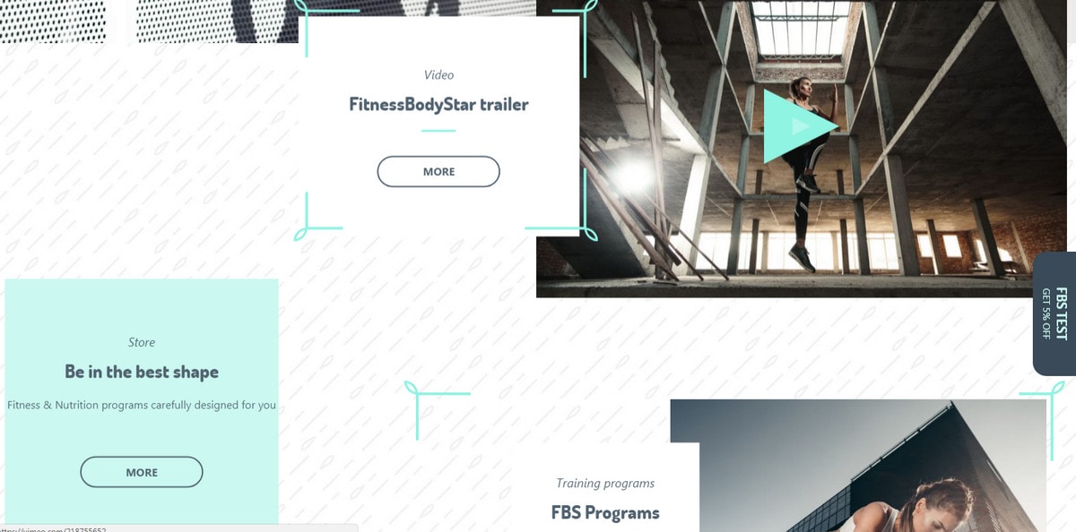
Fitness Body Star
The harmonious blend of imbalanced layout, heavily patterned background and decorative elements that are scattered throughout the screen makes the design so unique. Every detail fits like a glove. The website looks simply fantastic.
Enrich with Parallax and 3D Renderings
Everything looks better with a vigilantly recreated parallax effect. It adds a subtle sense of interactivity that is hard to resist. The same applies to realistic renderings in which the artificial environment looks so warm and enticing that you just want to touch them. These elements perfectly cooperate with the imbalanced layout.
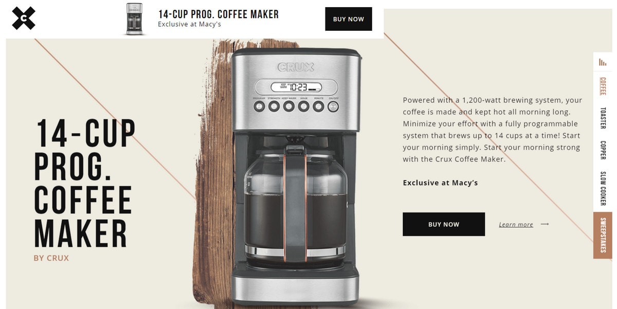
Copperstyle Sweepstakes
Copperstyle Sweepstakes has successfully adopted this approach enriching it with some carefully applied inequalities in the typography. The outcome is impressive.
Conclusion
It is in our nature to instinctively seek symmetry in design. It is one of the reasons why imbalanced layouts don’t always work for users. Nevertheless, the situation has improved.
Thanks to revised and enhanced solutions, we the trend is better than ever. Designers have taken great steps and also thrown themselves into offering new prospects and achieving intriguing designs.


