What is Interactive Email? Examples and Tips
We are entering a new era where static solutions no longer hold the reins. People are smarter and more demanding, and so is email marketing. Old tricks are giving way to more sophisticated ones. It is time to switch to an interactive email.
This format meets the demands of society and, most importantly, has that sought-after wow factor that helps your brand excel in the inboxes to generate sales.
Although the approach is quite new, there are many ways to add interactive content to a regular email. You can go for time-proven hover effects, create small, eye-catching click-based actions, incorporate playful quizzes, use carousels, or even delight contacts with an entertaining game.
It is not surprising that, along with personalization, interactive email newsletters are considered one of the top email design trends of 2025.
Interactive Email Elements
Interactive emails are a type of email design that allows recipients to interact directly within the email itself rather than being redirected to a website. These emails include elements that can be clicked, swiped, or otherwise engaged with to reveal additional content, animations, or
functionality within the email.
With Postcards Email Builder you can create and edit email templates online without any coding skills! Includes more than 100 components to help you create custom emails templates faster than ever before.
Free Email BuilderFree Email TemplatesThe primary purpose of interactive emails is to enhance user engagement, provide a better engaging experience, and try to increase conversion rates.
Elements in Interactive Emails
Emails have numerous interactive features, but here are the primary ones:
1. Hover Effect
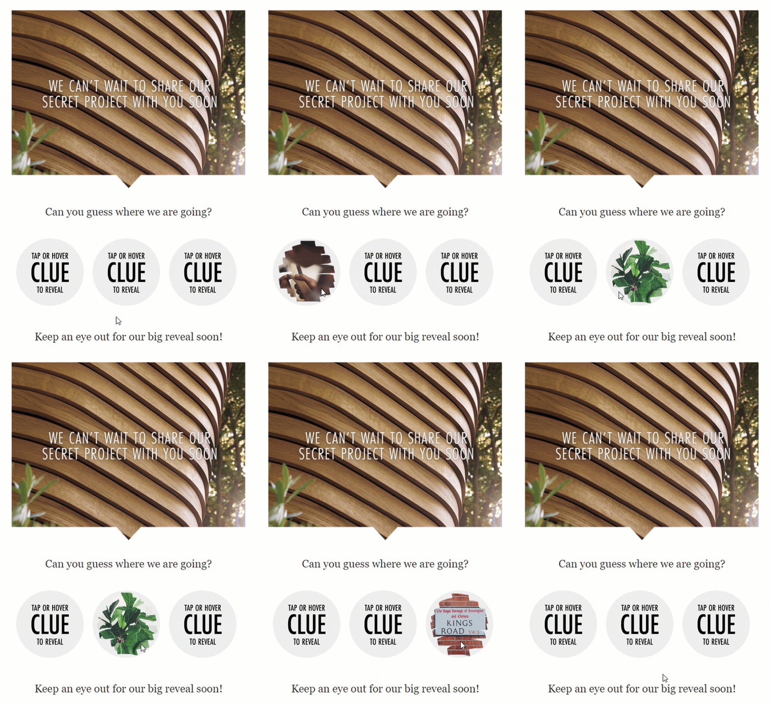
Here, the elements can change appearance or reveal additional information when the cursor is hovered over them. This can include text changes, color changes, or image swaps.
Hovers are mainly used to highlight buttons with CTAs or point to links to enhance clickability.
2. Image Carousels or Sliders
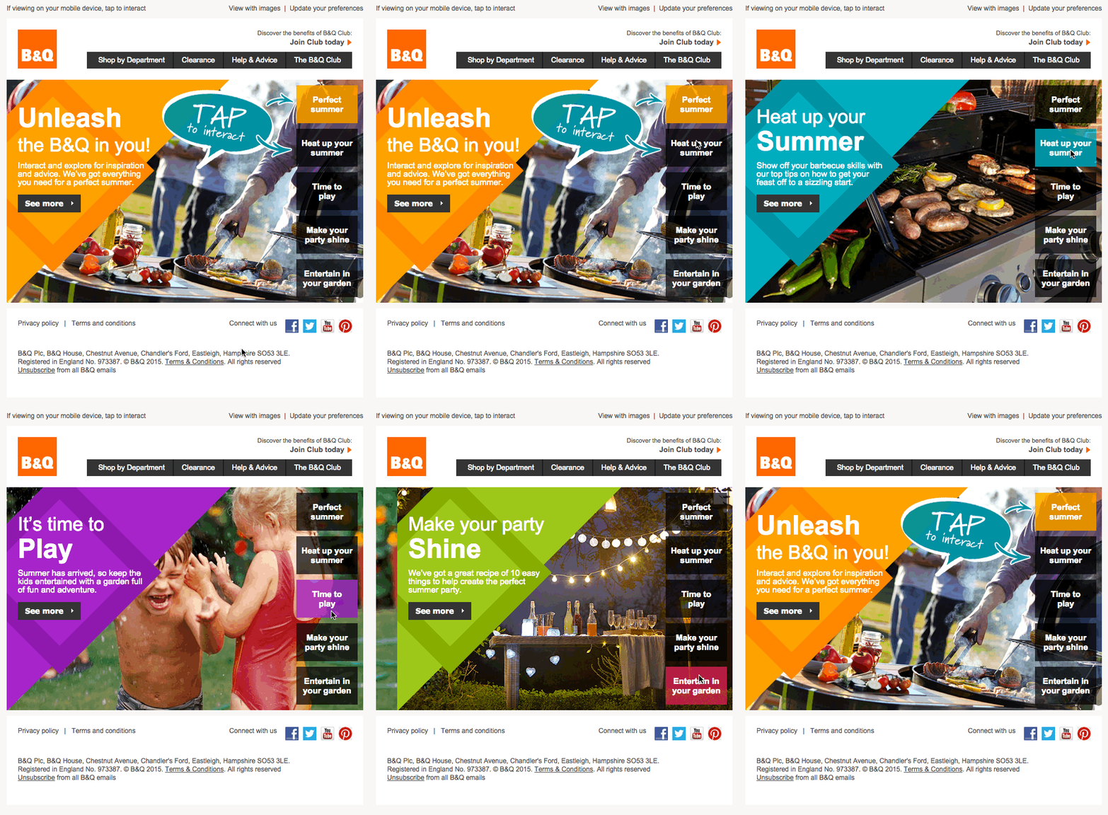
Image carousels, also known as image sliders, are interactive elements used in emails to display multiple images in a limited space. They are particularly effective for showcasing a range of products, features, or content in an engaging way.
Here are some of its benefits:
Maximize the limited space in an email by consolidating multiple images into a single area
Increases user engagement by encouraging active participation in viewing the content
With Pulsetic you’ll be instantly notified the moment your website, API, or server becomes unavailable. Monitor uptime from multiple global locations and respond to incidents before your users are affected.
Create beautiful status pages in minutes to keep customers informed during outages and build trust with transparent communication.
Start Monitoring for FreeMakes emails visually more appealing and dynamic, leading to a better user experience
3. Gamification Elements
Gamification elements leverage game design techniques to engage and motivate users, turning the email experience into something more playful and interactive.
These elements encourage recipients to interact with the email content in a way that’s fun and engaging, often with the goal of increasing brand engagement, customer loyalty, and conversion rates.
Some gamification elements you can leverage in interactive emails are:
- Quizzes and polls
- Spin-to-win wheels
- Scratch-off discounts
- Leaderboards
- Puzzles
Why Send Interactive Emails?
Sending interactive emails instead of traditional, static emails enhances customer engagement and experience.
Interactive emails capture the recipient’s attention more effectively, as they offer an engaging and dynamic way of presenting content.
This heightened engagement often translates into better email performance metrics, like higher click-through rates and increased time spent on email, ultimately leading to improved conversion rates.
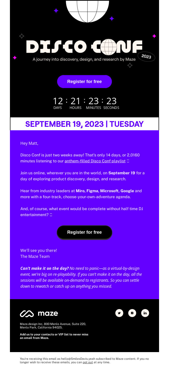
For instance, an interactive email with elements like image carousels, quizzes, or clickable tabs not only provides a more enjoyable experience but also allows for a deeper level of interaction with the content.
Before jumping into modern interactive stuff, we are going to refresh your memory with conventional ways of creating email newsletters.
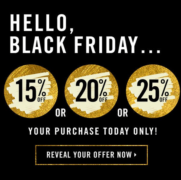
Traditional interactive email newsletters imply clever use of animated gifs. They are responsible for creating a sense of emotion using skillful loops and repetitions that, at first sight, may easily deceive users. The so-to-say game of imitation is what you need to achieve when you try to put this approach into action. Consider Email Newsletter from Forever21.
Here, the team skillfully faked scratching cards. For several seconds it feels like you actually have the ability to reveal a discount hidden under golden foil. The trick directs full attention to the offers. Brilliant.
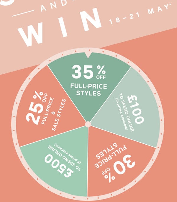
Another excellent example of a game of imitation is Spin and Win. It is a commonly used solution. Here, subscribers feel like they are participating in a game of “Wheel of Fortune,” where they can win a discount. Circle shapes and loops greatly work together to fake a sense of constant motion. The email wins subscribers over with a range of good offers that are presented playfully. It is a promotion without promotion.
These examples are great. They are smart and engaging. Without a doubt, these email newsletters outdo others. However, they are fakes. How about real interactivity? Let us consider examples of modern interactive email newsletters.
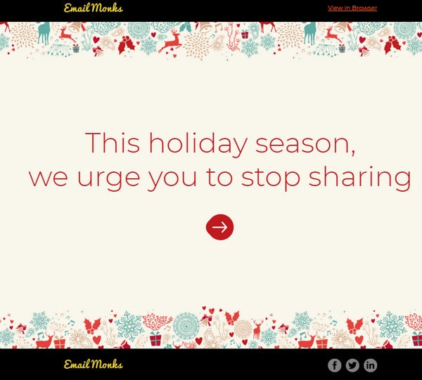
Modern interactive email newsletters are quickly gaining popularity. Unlike gif-based solutions, they win over customers with credibility and a real opportunity to take part in the action. Even the smallest use of real interaction may drastically change the game and benefit not only your current email campaign but also your relationships with the prospects. Consider Happy Holidays from the monks!
Much like the email example from Forever 21, this one is an excellent example of skillfully embraced minimalism. Actions speak louder than words, even though the dynamic constituent is just a tiny detail of the user interface. There are no lavish backgrounds or animated gifs. A small round-shaped CTA is a star of the show. It has a beautiful, smooth liquid-like behavior that instantly draws attention. Everything is made with the help of CSS. (Note, the solution is primitive and takes only several lines of code, but its effect is startling.)
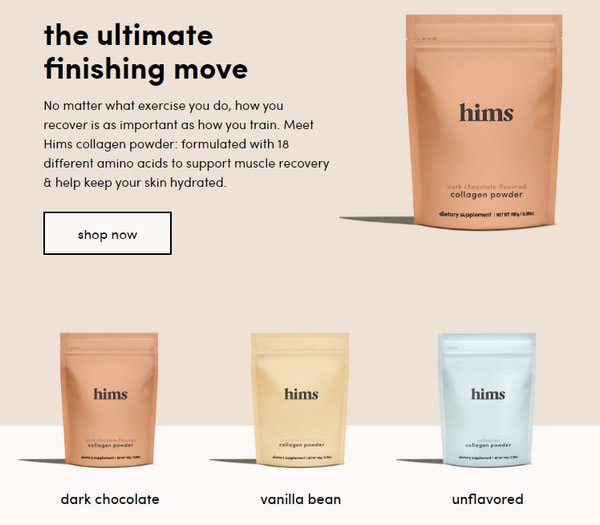
One of the popular interactive solutions is the use of hover effects that produce an impression. Consider Guys, do you even have collagen?
This is a traditional email newsletter in the sense of filling, structure, and design. What makes it engaging is hover states that are applied to several elements of the user interface, such as buttons and images. Using a classic approach of alternating between active and hover states, the copy is more user-friendly and enjoyable.
Examples of Interactive Emails
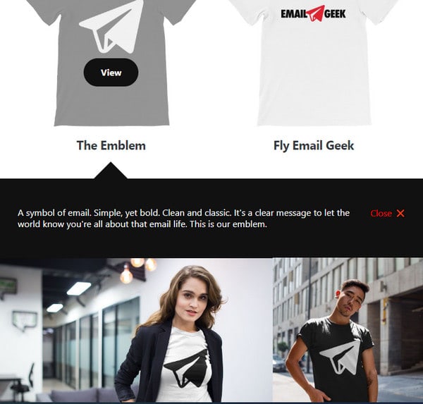
From hover states to old-school clickable actions that are a solid foundation for lots of cool things in UI. There are a dozen outstanding solutions, and we are going to consider the most promising and inspiring ones. First, look at the Emailtess Debut Newsletter.
Emailtess Debut newsletter grabs you with the ability to click a button and see the result without leaving the inbox. Boring as it may be on a website when it comes to the email newsletter universe, it feels like a pleasant surprise. This technique is used to provide each product with additional information that can influence the decision-making process. The email is cleverly informative.
Clickable events can also entertain. Consider XmasTree.
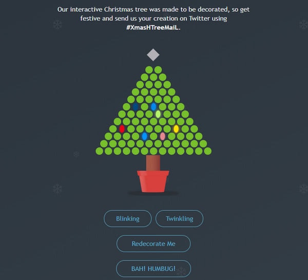
XmasTree represents a traditional type of newsletter that email marketers send to contacts during the winter holiday season. While several years ago, the only option you had was a beautiful Christmassy image or animated gif, today you can set everyone in the festive mood with the help of an interactive scene.
Subscribers have an opportunity to force the Christmas lights to dance. All they need to do is choose the mode and click the dots to bring everything to life. Outstanding.
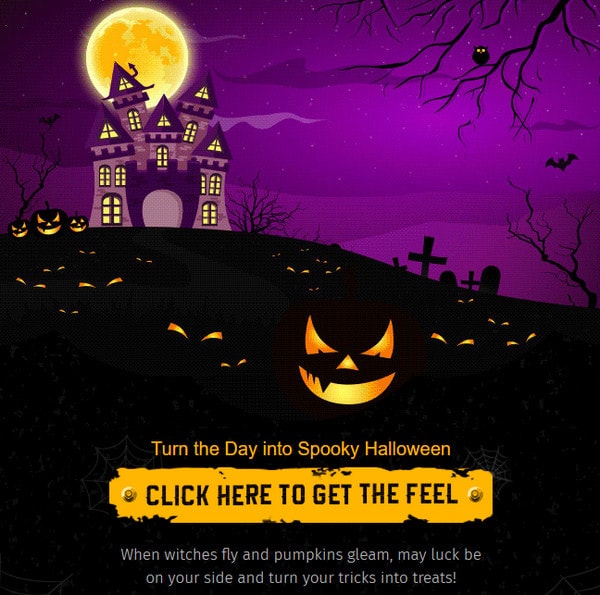
Witching You Happy Halloween is another good example. Although it is less complex in terms of realization, it looks amazing. Here, you can see a smooth transition from the daytime scene into a night Halloweeny one just by clicking on the button.
Interactive hotspots represent a special case in the bigger picture of clickable events. Much like the website’s tooltip, they hide helpful information and reveal it on demand. Discover more with BBC is a typical example.

The email newsletter sent by the main broadcasting channel of the UK has only one area. It uncovers the leading stars of a promoted TV program. To make things more engaging and informative, each animal in the picture is supported by a block with content that you can explore after clicking on the hotspot. Inside each panel is a short description and animated gif. The email newsletter is informative, enticing, and playful.
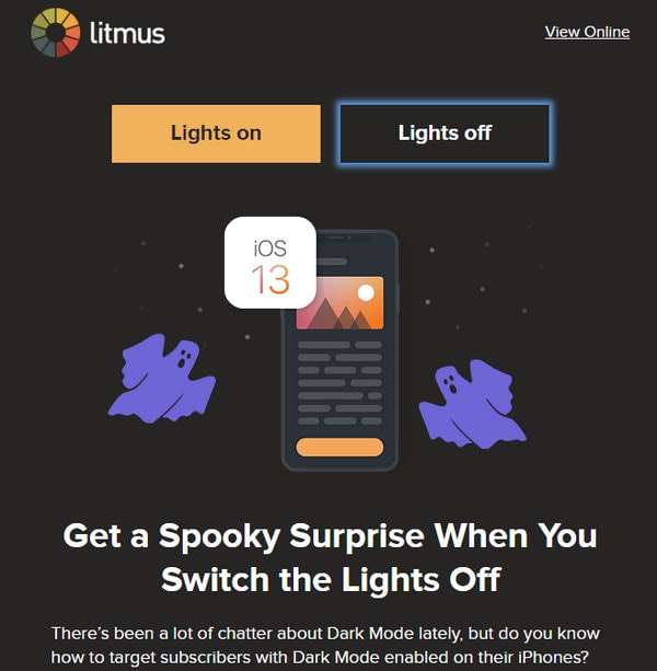
Click-triggered events do not preclude the use of other interactive solutions. They work together, making the user experience richer. Consider Are you afraid of the dark?
The email newsletter is packed with small yet eye-pleasing interactive details. First, you can choose the mode for the hero area. By default, it is dark. However, if it feels too spooky, you can always turn the lights on, making things brighter. Second, all the CTAs have hover states that make interaction intuitive. Finally, graphics have hover states that help indicate your movement across the newsletter. The email has a well-thought-out UI.
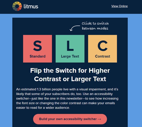
Interactive content can also be used for noble purposes. Consider Accessibility Matters, the email newsletter whose title speaks for itself.
This incredible email newsletter was created to inform contacts about accessibility matters. To pique interest, the team created an interactive hero area that transmits the idea. Choose between standard and large font sizes and set the contrast to make reading comfortable. This way, readers take part in the accessibility issue. Smart.
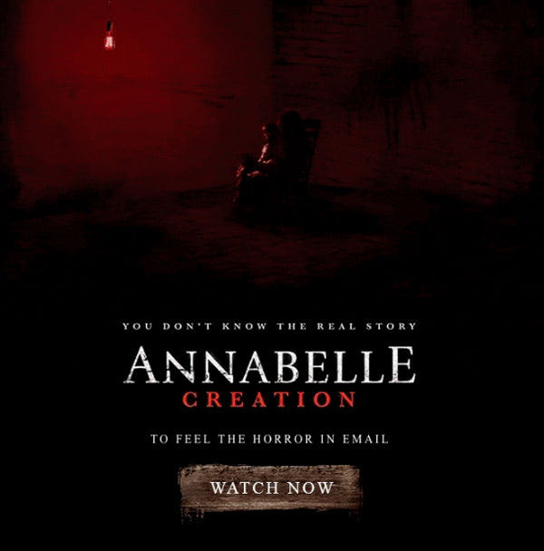
Let’s take things to the next level by combining animated gifs, clickable events, and audio. Check out The First-Ever Spooky Email which is an outstanding result of this trio.
The design meets the audience with a spooky feel pulled together by an animated background. By adding audio, they produce an extra sinister feeling that makes the skin crawl. In the end, you can click on the button and reach a culmination of the story where the sudden appearance of a Chucky doll makes things as frightening as ever.
That is enough of a storytelling experience. Clickable events can be a great help when you need to get extra information from contacts. How? Simply incorporate a survey or a quiz into an email. Check out some fantastic examples.
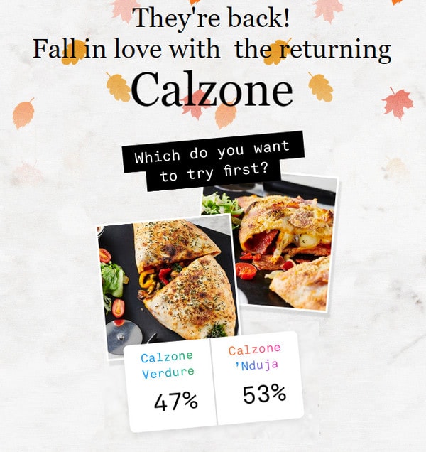
The most important vote of the year. The email newsletter sent by Pizzeria includes not only information about the establishment but also a small survey in the header. All it asks is to choose between two options by clicking the preferable choice. It is very simple. It will take only several seconds and provide the marketing team with helpful information.
This is a primitive way of using a survey; how about something more complicated? Look at Quiz: which shower scent fits you best?
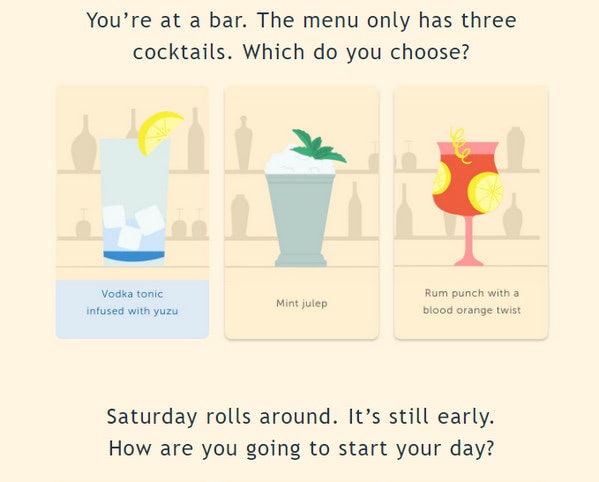
The email newsletter sent by Harry has a small quiz. Each question is presented as an illustration. All you have to do is to click on the suitable option; and, at the end of the newsletter, find the scent that matches your personality.
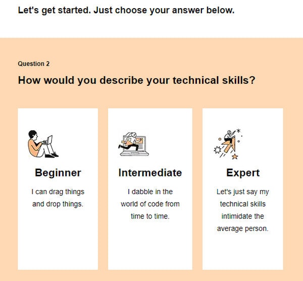
Email newsletter from GoDaddy also includes a quiz that helps to decide which builder you need in order to create a website for your business. Unlike the previous one, this one pops up questions in a sequence leading users from start to the end and keeping their interest alive for several seconds. The email proves to be a helpful piece that does not ask much. This is an excellent way to promote services and reinforce the relationships with your contacts.
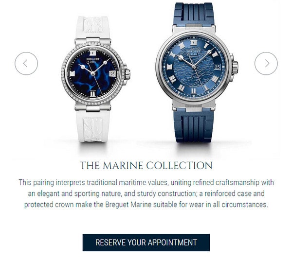
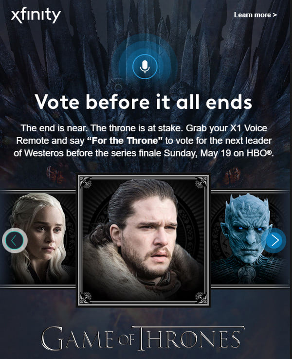
Quizzes, polls, and surveys are not only complex interactive elements these days. Another sophisticated solution is a slider. Take a look at Season’s Greeting from Breguet, and The Iron Throne is Waiting to see it in action.
In the first case, the slider occupies the central position. It is used to show various options for promoted goods. The solution is simple, yet in the context of an email newsletter, it is powerful. The team reveals a variety of products without sacrificing space and without being too pushy. The email newsletter provides a compact landing page that instantly appeals to the prospects.
Unlike the previous example, an email newsletter dedicated to the GoT season finale uses a slider as a leading visual driving force that should promote the poll. Thanks to such a solution, the design is compact and, at the same time, informative and engaging. You cycle through all the options without moving anywhere.
An apogee of modern interactive email newsletters is gamification. Bold as it may sound, email newsletters with small games inside are real. It is the holiday season that is proof of that.
Sent by EmailMonks, this holiday greeting undoubtedly stands out with a game. Click on arrows to force the car to move in the right direction. How cool is that?
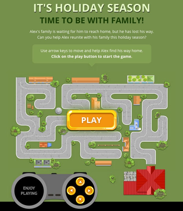
While this email newsletter may seem like a small step for game console aficionados, in fact, it is a giant leap for interactive email marketing.
Conclusion
Interactive email newsletters are a great step forward for email marketing. Even though they are relatively young, they have already proved that they work. They easily engage subscribers, drive website traffic, and increase conversion rates. They help reinforce brand awareness, build trust, and give contacts what they want in a playful manner, making experiences unforgettable. And if they are guided by AMP, they will certainly gain some points from Google.
There is always a catch. The main obstacle to using interactive emails lies in the sad fact that popular email readers support neither JavaScript nor many useful CSS features that stand behind all these extravaganzas. Therefore, to pull this off regularly is a challenge. However, there is always a workaround. One way out is to use special tools, like Postcards, that have built-in functionality to add interactive elements like hotspots into newsletters.


