Modern Lock, Home, Start and Login Screens used in Mobile Apps
Today we are going to take a gander at various basic and fundamental functional screens that are intrinsic to the majority of mobile applications as well as a mobile operating system. Our discussion is particularly centered on the home screen, login screen and lock screen.
Let’s briefly get to know them.
- Home screen is like a front page of a website; it briefly familiarizes users with an app and provides customers with basic, key instruments.
- Login and Sign Up screens are quite familiar to us; they are ubiquitous, being some kind of virtual doors that directly related to our accounts.
- Lock screen has become widely popular namely due to gesture-based devices. This feature allows displaying prevalent, quite habitual information such as date, time, weather forecast, email notifications and others – that are constantly updated – while the device is still locked and safely protected from accidental and unwitting human interventions.
While the first two, as a rule, encountered in various applications, the latter is a basic attribute of any touch screen device.
In this collection, we are sharing with you impressive and ambiguous concepts of various practical screens with splendid professional UIs.
Lock, Home, Start and Login Screens Examples
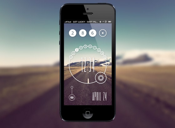
Lock Screen Concept by Eli Williamson has a perceptible circular vibe. The outline style elements in tandem with a large ultra-narrow type beautifully set off from the picturesque background.
With Postcards Email Builder you can create and edit email templates online without any coding skills! Includes more than 100 components to help you create custom emails templates faster than ever before.
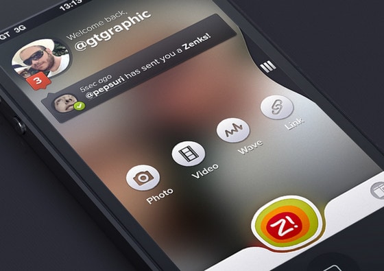
Free Email BuilderFree Email TemplatesHome Screen by Gert Tzafa is based on a heavily blurred background that gives the UI a polished and sleek feel. Such a turbid background easily highlights foreground elements, while the curved borders add a tone of elegance.
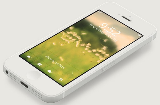
iPhone Lock Screen Design by Asher Charles lets out a delicate nature breath of a warm summer day. A spectacular greenish background is skillfully complimented by several components: white slightly bold typography in the header and saturated white glyphs at the bottom of the screen.
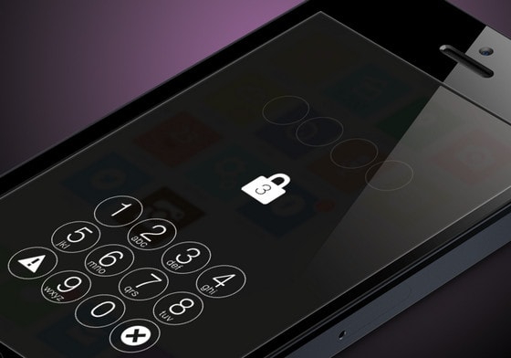
Unlocking iOS7 by Nandor Tamas involves nothing more than a few basic integral elements. A monochrome dark background helps to direct users’ eye to a contrasting keypad with circular outline keys. Here, the minimal approach is used as fit as a fiddle.
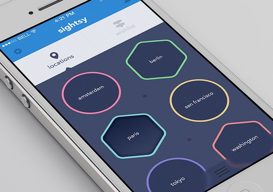
Sightsy – Home screen by Rick Waalders has a sleek and unconventional UI with a lovely geometry touch. The colorful flat shapes are bolstered by tiny captions, leaving a lot of free space.
With Startup App and Slides App you can build unlimited websites using the online website editor which includes ready-made designed and coded elements, templates and themes.
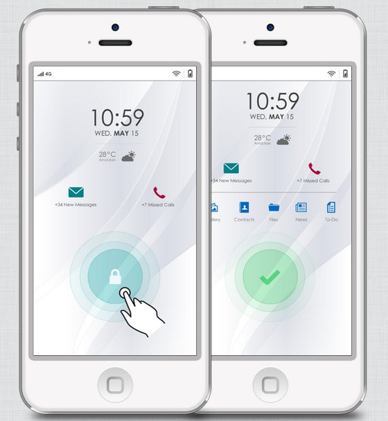
Try Startup App Try Slides AppOther ProductsPart1: Lock Screen by Peyman Eskandari is a smart and quite comprehensive concept that provides users with quick access to essential programs. The lock screen invites action from the user, utilizing a simple drag-and-drop technique.
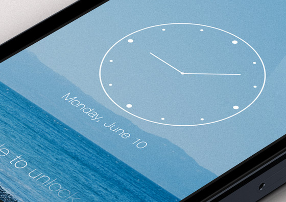
iOS7 Lock Screen by Charles Patterson depicts a marvelous seascape. The blue-tone – which has a powerful calming effect – efficiently collaborates with a subtle clock and casual narrow type.
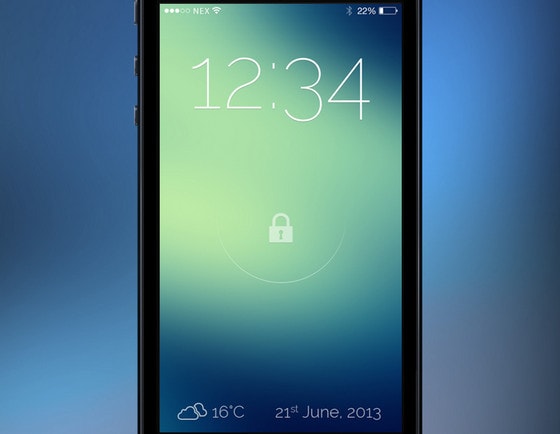
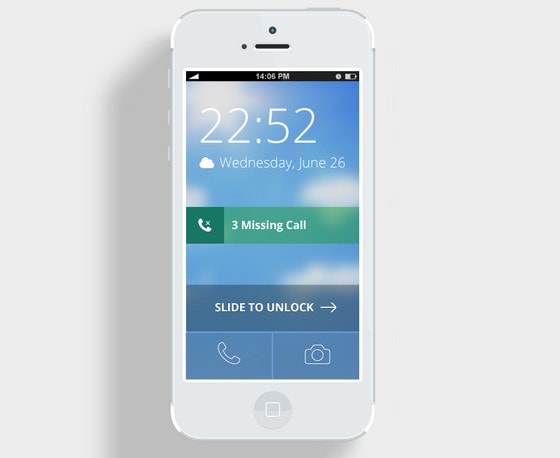
iOS 7 Lock Screen by Maximlian skillfully displays current information that everyone finds fundamental. A vibrant gradient layout looks pretty neutral, and allows not distracting attention from a time block; the darkened bottom strongly emphasizes a small widget that features weather forecast and date.
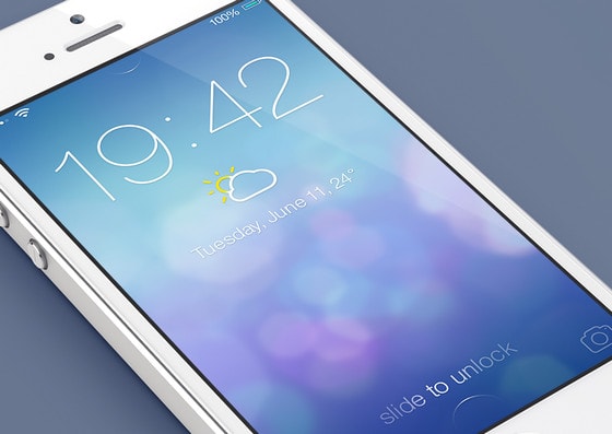
iOS7 Lock screen v2 – Redesign by Mariusz. The concept also familiarizes users with the same set of data. The designer leverages a magnificent gradient background with a lambent bokeh effect in combination with an elegant font and outline icons.
The block of basic information is compactly arranged on the top.
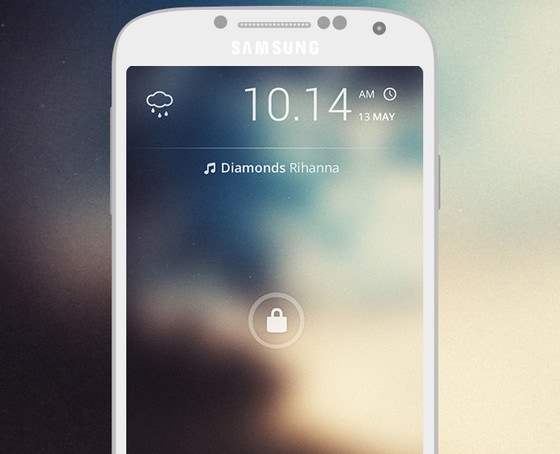
Android Launcher by Graphicure. The designer adopts a minimal approach that makes the UI look simple and clean. The screen is also based on a trendy blurred background that naturally recreates a sense of softness and smoothness.
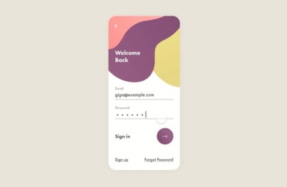
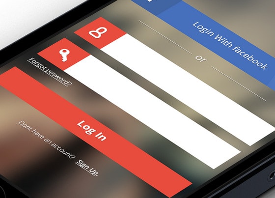
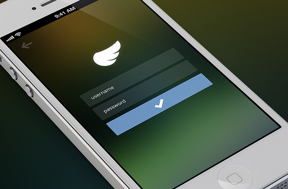
Login iPhone by arjun/aj immediately gives an impression of very delicate work with meticulous attention to details. Although the design features a quite simple login form, it has a truly sophisticated and pixel-perfect appearance.
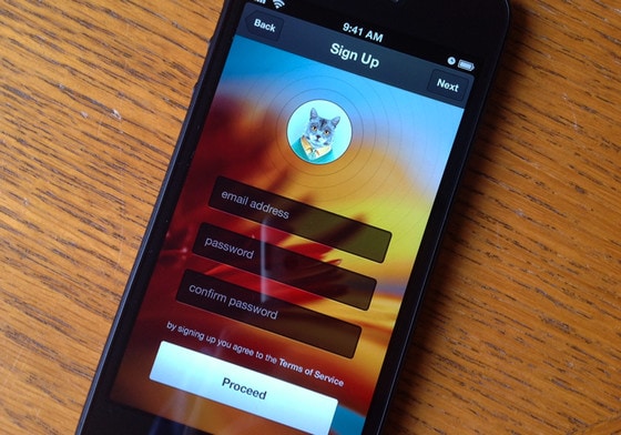
Sign Up by Ari. Here, the sign-up form takes up the whole space, providing users with a pretty handy interface. The top avatar with rings around it adds a feeling of motion and dynamics.
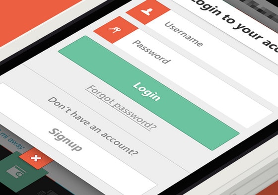
Login to your account by Gert Tzafa looks clean and well-balanced. The contrasting color palette works very well in this case; it laconically sets basic fields apart from a neat grey background as well as effectively stresses type and icons.
Login by Joshua Scott. The designer gives the login form a more dominant position, placing it in the heart of the screen and leaving the rest space clean and pristine.
iPhone Home Screen by Flavio Santana is soaked with a fancy flat style. Several wide stripes, made in a subdued coloring, neatly underline bold font and subtle outline icons.
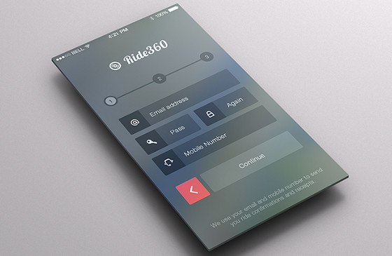
iOS7 Style Sign-Up Page by Kushagra Agarwal demonstrates an in-depth sign-up form with various standard fields that are densely packed together. The UI looks refined and legible mainly due to contrasting color scheme and low opacity layers.
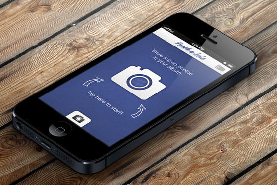
Starting screen by Baris Ertufan – The designer employs a two-color palette in order to support the foreground elements and make interface simple and clean. The huge central camera icon unambiguously communicates the idea behind an app.
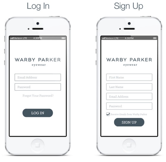
Warby Parker App Screens by Wade Burrell showcase both ‘login’ and ‘sign up’ screens that are imbued with purity and modesty. An authentic white background wonderfully complements light grey outline boxes.
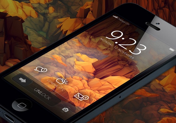
Revisited iPhone home screen by Loris Grillet has a very intuitive UI that notifies the owner about changes with the help of small ordinary glyphs. As always, the screen displays date and time in its usual place.
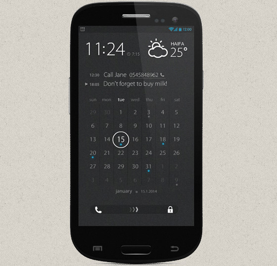
Calendar & Tasks Lock screen by Iluha tsuprun has a content-heavy layout that covers such integral features as date, weather forecast, current tasks and calendar. Although all of these are presented on one small screen, the black-and-white color solution is suffices to create a sharp contrast and make elements look distinguishable and crisp.
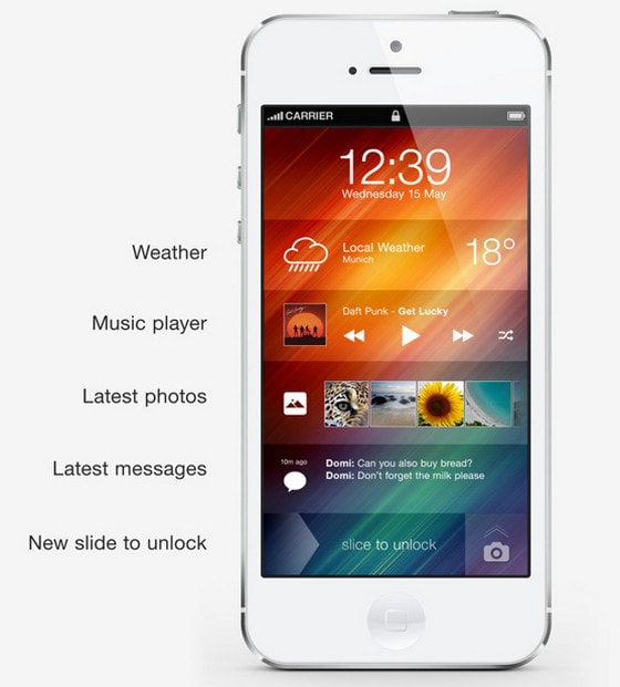
iPhone home screen concept by Andre R Almeida is aimed to provide as much information as possible. The stripe layout helps to avoid a sense of chaos, recreating the properly-balanced design.
Reflection
Usually, designers adhere to a minimal approach that delivers quite spacious and intuitive screen layout that is supported by several (4-5 no more) separate small widgets which, as a rule, represented by means of intelligible icons.
However, there are those who prefer to give extra information that, typically, is tightly packed together and has an appearance with striking contrast.
