All About Onboarding Emails with Templates & Examples
Getting a new subscriber is just the beginning of any email marketing plan. The real challenge comes when you’ve to convert those clicks into customers.
And onboarding emails are the right way to do that.
Why?
Because they guide new users and build trust from day one. And this works for all types of businesses, whether it’s an e-commerce brand, a SaaS platform, or a content-based website.
In this guide, we will walk you through the strategy and sequence behind high-performing onboarding emails with real-world examples and templates.
What are Onboarding Emails?
Onboarding emails are the friendly guides your new subscribers or users receive right after signing up or subscribing to newsletters. They welcome your audience with an introduction to your brand and explain your product’s key features or offerings.
With Postcards Email Builder you can create and edit email templates online without any coding skills! Includes more than 100 components to help you create custom emails templates faster than ever before.
Free Email BuilderFree Email TemplatesYou can add how-to guides, helpful tips, or only a welcome message in such emails. Because the purpose is to create a smooth, engaging first experience that keeps people coming back.
Benefits of Onboarding Emails For Business Growth
Suppose you walk into a clothing store and no one greets you or comes to guide you on where the product you’re searching for is.
Wouldn’t you feel lost?
Your customers would feel the same if you don’t immediately engage with them after they have signed up. That’s why you should always send them onboarding emails to make them feel welcomed.
But that’s not just it.
Let’s look at some other benefits, too.
Subscriber Engagement
People are most curious right after they sign up. So a thoughtful onboarding email (like a welcome message or relevant tips) keeps that momentum going.
They are like a reminder for your customers that you exist, and it’s a more effective way to help them make a purchase decision right away, as signing up is a signal of buying interest.
Take the Salesforce onboarding email as an example, in which they immediately shared tips on how to use their platform to guide users quickly.
With Pulsetic you’ll be instantly notified the moment your website, API, or server becomes unavailable. Monitor uptime from multiple global locations and respond to incidents before your users are affected.
Create beautiful status pages in minutes to keep customers informed during outages and build trust with transparent communication.
Start Monitoring for Free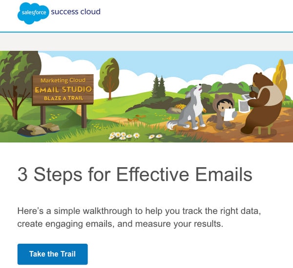
Onboarding from SalesForce
More Lifetime Customers
When someone signs up for your product or service, they may be interested but not fully invested. But an onboarding email can make your customers see the value in your offerings early on.
And when users know what to do next and why it matters, they’re far more likely to stick around. And that’s what turns casual sign-ups into lifelong fans.
A perfect example is this email by Marvel that shows how you can use its capabilities to the fullest by integrating with other tools:

Onboarding from Marvel
Increased Conversions
Whether a user has subscribed to a free trial or made their first purchase directly, onboarding emails guide them to take action.
Let’s say someone booked a demo, and before a cold call, you send them a helpful onboarding email that explains what to expect next.
See this example of how Tinder has sent a complete step-by-step guide on what you should do next.
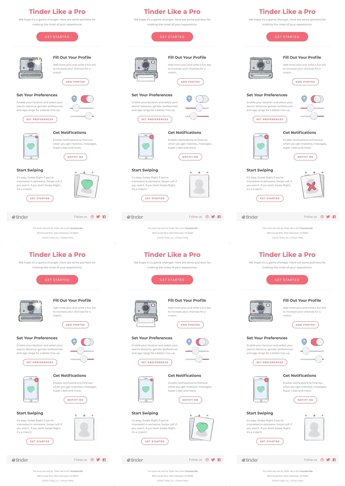
Onboarding Newsletter from Tinder
5 Tips and Best Practices For Creating Onboarding Emails
Make sure you follow these tips and practices so your onboarding emails look perfect.
1. Create an Automated Email Sequence
An automatic onboarding email sequence is a series of emails sent to new users or subscribers right after they sign up. The goal of this series is to provide value to your customers as quickly as they are onboarded.
But instead of bombarding them with all the information in one welcome email, create sequential emails that are like step-by-step guides for users.
For example:
- Getting started with the setup
- Exploring key features
- Seeing success stories or tips
- Encourage upgrades or purchases
The visuals in your emails should create harmony between the most important details of your business and be entertaining. This way, the instructions would be easy to follow, like a friendly piece of advice.
Here’s how you can nail it:
- Position headlines, subheadings, and CTAs in a way that guides the viewer’s eye through the sequence of the next steps to take.
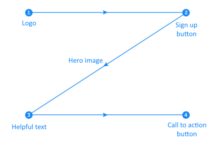
- Let the content breathe and don’t cram every feature into one email. Instead, focus on the most important ones.
- Keep your emails mobile-friendly because 64% of emails are opened on mobile devices. So stick to a single-column layout, use short text blocks, and add normal-sized call-to-action (CTA) buttons.
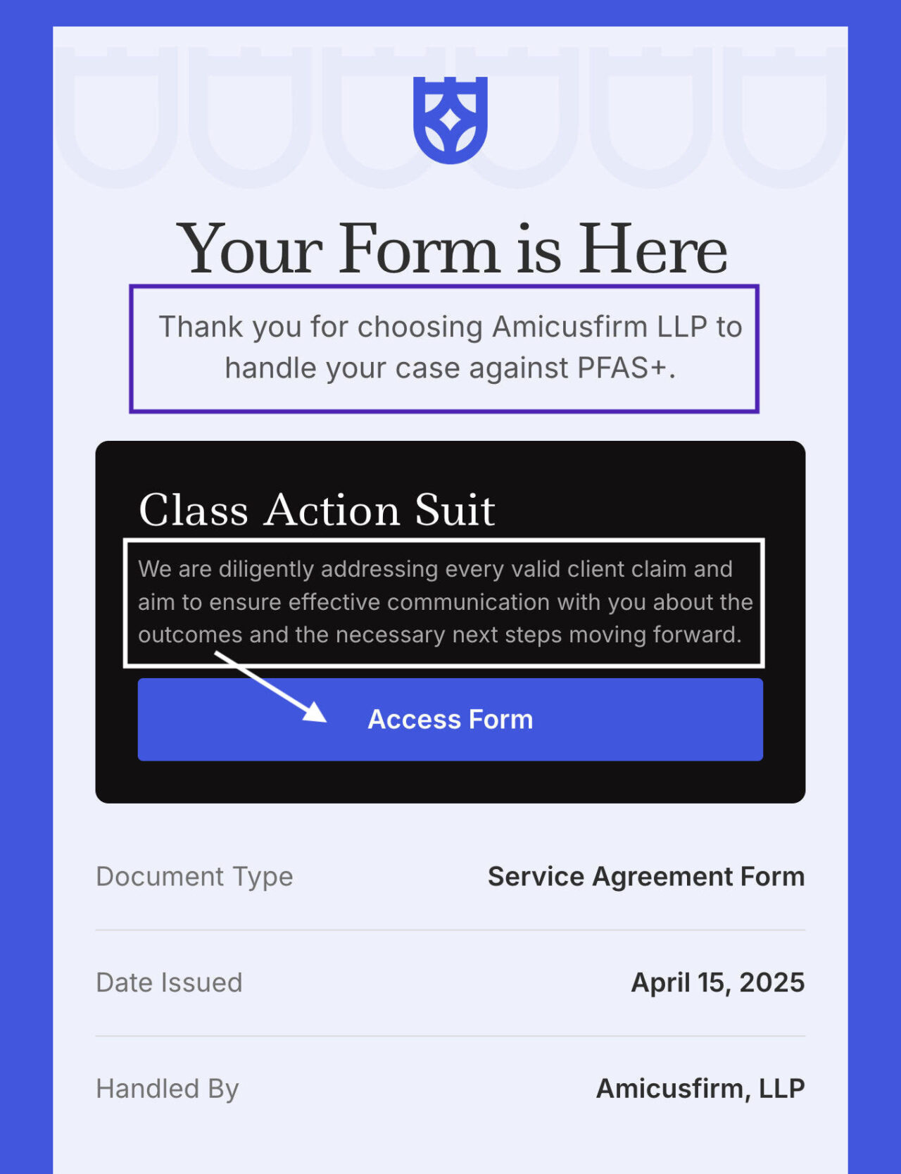
See the Full Email Template in Postcards
- Be consistent with the colors you use, as it makes the email look decent.
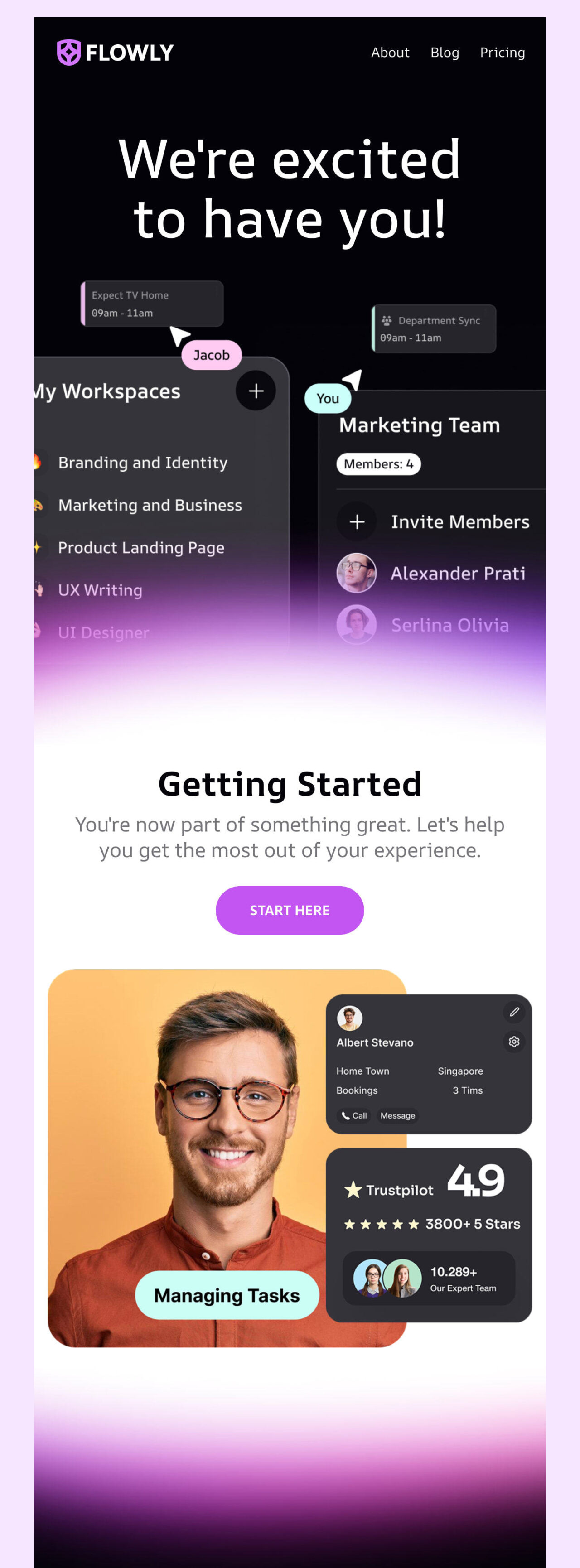
See the full email template in Postcards
3. Use Email Builders for Perfect Email Design
If you’re not a tech person or a designer, there’s no need to worry. You can use Postcards, a no-code email builder, to design a visually polished onboarding email newsletter without writing in HTML.
You can use Postcards’ drag-and-drop interface to lay a structure and populate it with text, image backgrounds, GIFs, and even interactive hotspots within minutes.
4. Add Catchy Subject Lines
The best subject lines for onboarding emails are clear and immediately offer valuable information. They should let users know what to expect and provide a clear reason to open, without sounding overly salesy or vague.
So, aim for a conversational tone and keep it short (under 50 characters works best on mobile).
Unlike BFCM campaigns, seasonal emails, or holidays like Christmas or Halloween, onboarding emails have limited subject line choices.
Possible subject lines for these informative emails can be:
- Let’s Get Started!
- Welcome on Board! All you need to know is here
- A Helpful Guide only for you
- Ever wondered how we can help you? Find out here
- Don’t Feel Ready to Use the {Product}? Read this
- Introducing Our Newest/The Most Popular/ The Best Product
- Here’s how to get started
- Master {Product} in under 2 minutes
- Wait, what’s inside?
- Time for your First Ever…
- Have you ever Heard of {Product}
- You now have access to the {Product}! What’s next
- Getting the most out of {Product}
- Supercharge your workflow with these tips
- 4 ways to get started
- Customize your account. See how
- Why wait? Get started today
- Hi, I’m here to help
5. Write and Design Clear CTAs
A good CTA is impossible to miss and easy to understand. That’s why it’s best to use bold buttons with action-driven text like “Start Your Setup” or “Explore Features.”
You should keep CTAs above the fold when possible, so users don’t have to scroll to find them.
But stick to one main CTA per email to avoid overwhelming your reader, and make sure the button stands out visually (contrasting color helps!).
As a rule, onboarding email newsletters include content that is divided into digestible chunks.
But what content should you include?
You cannot cover everything since you will end up with a “TL; DR” piece, and nobody wants that.
First, decide on the goal of an onboarding email. After that, start building the content and design.
Here are some good ideas to start with:
- Show step-by-step instructions on how to start with the service/product/website.
- List helpful links to core sections of the website. Add a direct link to chats with the support team.
- Display the advantages of the product/service, supporting each with short instructions.
- Familiarize newcomers with website essentials.
- Explain how the product works in simple language.
- List the reasons why your product is better than others.
If you’re in doubt about where to get some inspiration for your onboarding email newsletter, refer to big names, as their marketing email teams know what they’re doing.
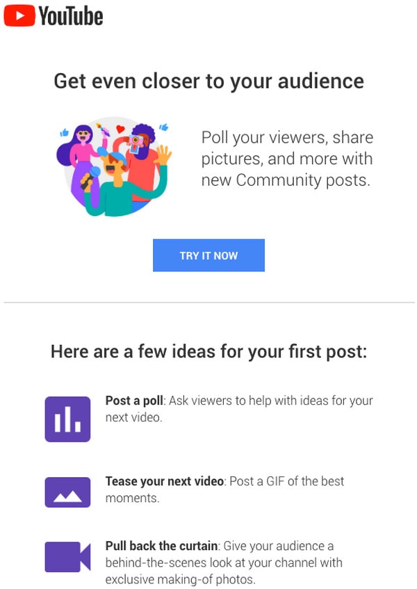
Here’s an example welcome email from YouTube:
1. Welcome to YouTube
The goliath of the video streaming industry, YouTube, is the first example in our collection. If in doubt where to get some inspiration for your onboarding email newsletter, refer to big names since their marketing email teams know what they are doing.
The email includes only important stuff, and the design is vibrant yet spacious.
2. Onboarding from Glitch
The team behind Glitch sends two onboarding emails as part of a series. Each has a bright appearance and irresistible charisma that echoes the website’s design and brand identity.
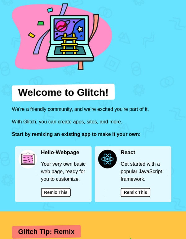
Despite adding too much information, you can see how smartly they’ve used an illustrative approach. They turned an informative piece into artwork with engaging and enjoyable narration.
3. Onboarding from Outdoorsy
For those who cannot decide whether to create a plain-text email or a rich-media HTML version, take a look at Outdoorsy. Although this is not a classic plain newsletter, as it features some graphics, it is still a great take on the old-school approach.
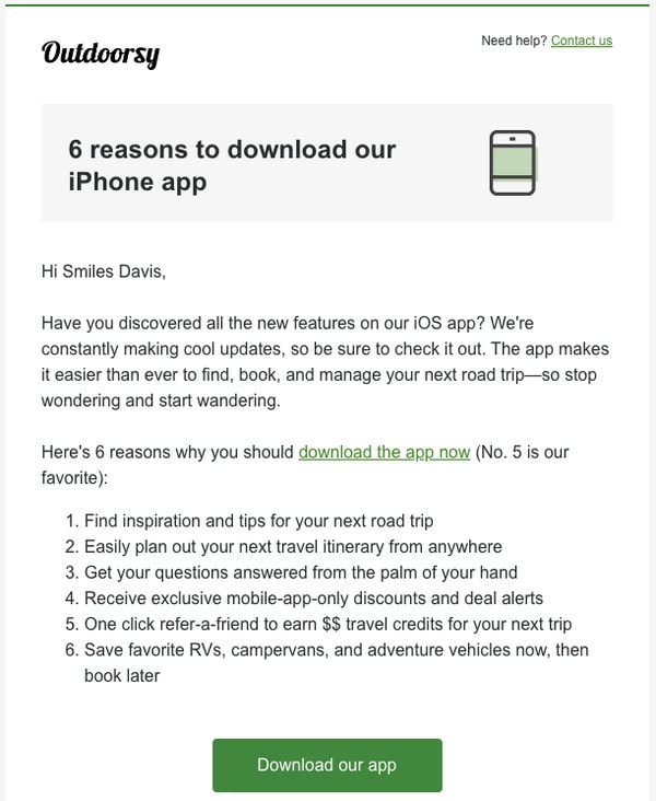
It is plain but still gives all the information a user would need in an easily readable format. The CTA is also focused and is directly redirecting to the next step.
4. Onboarding From MindNode
MindNode also sends a series of emails when you subscribe to their platform. Each email uses aesthetic illustrations and bright colors to convey the desired mood.
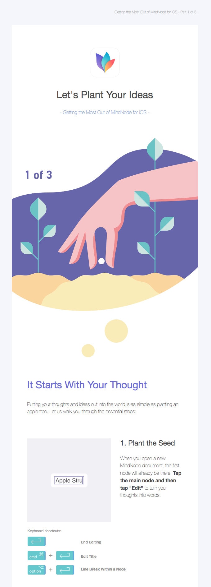
This email looks perfect. It follows a zigzag pattern that makes scanning easy and uses a bunch of whitespaces to balance the impact of pictures and text.
5. Onboarding from Good Eggs
Onboarding from Good Eggs has a unique and refreshing way to show information.

The marketing team has included information about all the popular choices by listing and highlighting them on the header. This way, they win over clients with “delicious” imagery from the get-go. There are only two CTAs that lead to additional information. Overall, the email newsletter is simple, straightforward, helpful, and appealing.
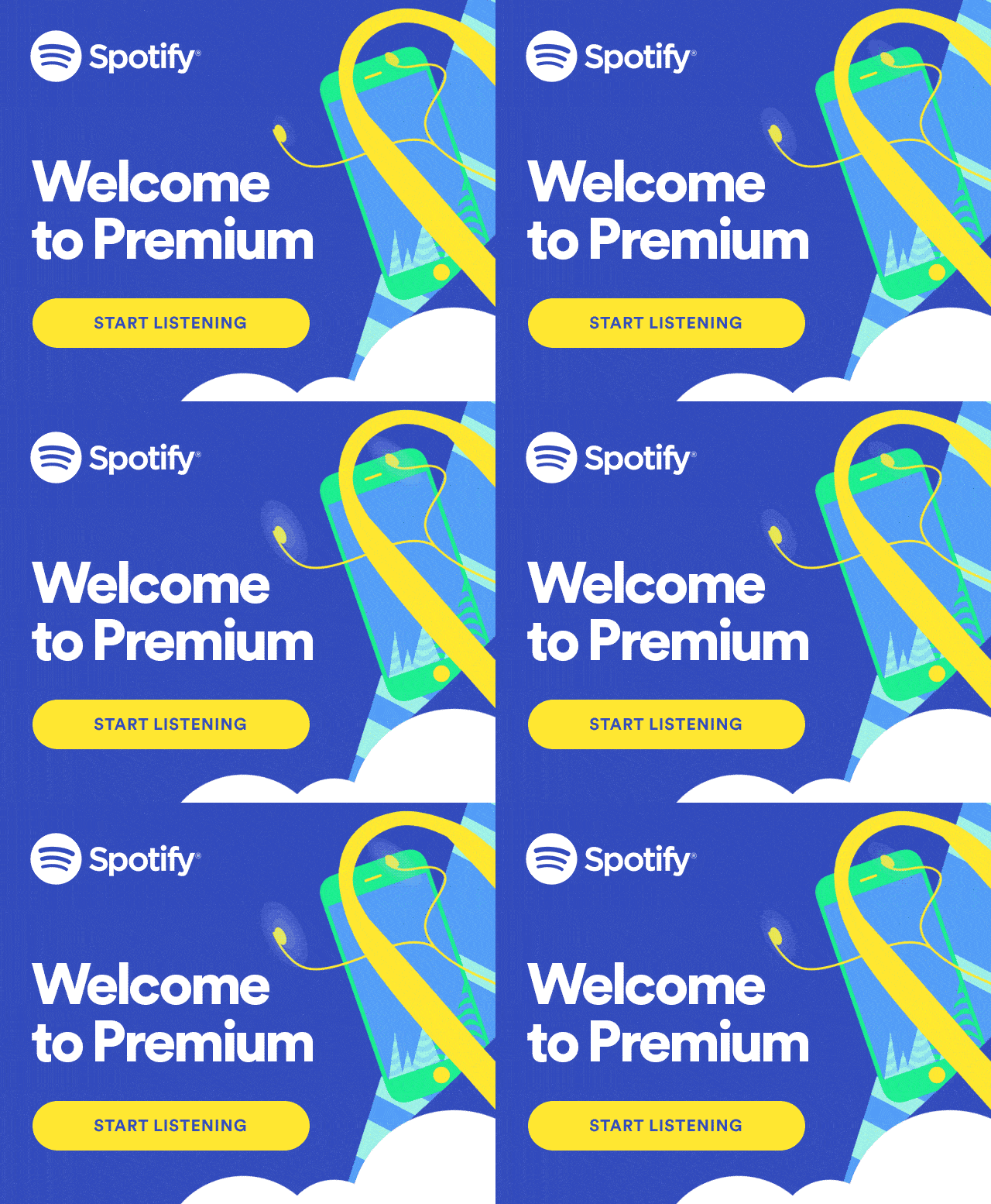
Welcome to Spotify
Spotify’s onboarding email has a minimalist design, but the visual branding makes the newsletter elements pop. It immediately directs the viewer to the CTA, “Start Listening.”
Ready to Build Your Onboarding Emails?
Use an email builder like Designmodo to simplify your email design process. It allows you to create beautiful, high-performing emails without writing even a line of code. Just drag, and drop, and see your ideas come to life.
Give it a try and make your onboarding flow as smooth as you want your customer experience.
FAQs
Why is it called onboarding?
It’s called onboarding because it helps new users “get on board” with your product or service, guiding them through their first steps to success.
What is the onboarding email sequence?
It’s a series of automated emails sent to new users or customers to educate, engage, and guide them toward activation or value.
What to include in an onboarding email?
Key elements include a warm welcome, next steps, product tips, useful resources, and a clear call to action.
What is the open rate for onboarding emails?
Onboarding or welcome emails consistently outperform other email types, with open rates generally ranging from about 50% to over 80%, significantly higher than average marketing email open rates, which tend to be around 20-40% depending on industry.


