6 Ways to Improve the User Experience of Online Hotel Booking
There is a lot of talk about the impact of user experience in the e-commerce checkout process on conversion rates and there is also a lot of useful advice on how to fix usability issues. But somehow these materials do not cover or even come close to a specific field of e-commerce – online hotel booking. This is a kind of overlooked topic in terms of user experience, which may be one of the reasons it lacks even some basic usability principles.
With a growing share of online sales in hotel revenues, it is becoming critical to have a strong online sales tool. Even more challenging is that hotel websites need to compete with such giants as Expedia, Booking.com and other aggregators that have more resources to build and constantly improve the website user experience.
Most of independent hotel websites use third-party hotel booking engines that are also accredited to work with booking channels, such as Expedia. Why? This way hotels can easily manage rooms and rates across all booking channels from one place. So they have to comply with the design and experience of the third party service or dare to have something of its own.
The problem with the UI of these websites is that they were good a long time ago, but they haven’t changed since then. It seems like time stopped somewhere in 2004 and whatever new features were added have just been incorporated into existing design without significant changes. The world wide web has moved forward and users now have more requirements for the websites and far less tolerance for bad UX. This means that if hotel aggregators like Expedia and Booking.com have better, more comprehensible and easy booking process compared to independent hotel websites, users will be even more willing to book through those channels.
But all is not lost for hotel websites. With some essential usability fixes, hotel websites will be able to provide a better experience for their guests or at least not appear too annoying.
With Postcards Email Builder you can create and edit email templates online without any coding skills! Includes more than 100 components to help you create custom emails templates faster than ever before.
Free Email BuilderFree Email Templates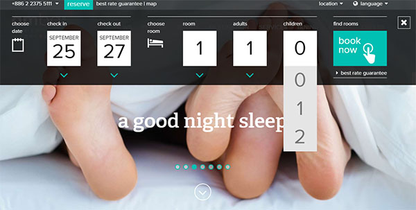
Booking Calendar Usability
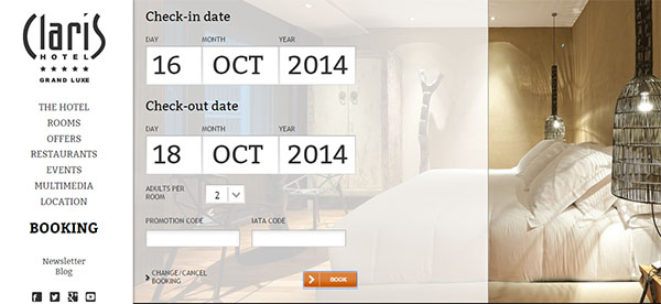
The first thing that a user encounters when trying to go through a hotel booking process is the booking calendar and you want to make sure it meets and exceeds main user expectations, right? Bring theuser one step closer to the desired result by filling in the check-in and check-out fields with current date, plus one. This may sounds too obvious, but since lots of hotels still have blank calendar fields, a gentle reminder won’t hurt.
Moreover, when selecting a check-in date, the check-out date field should change accordingly (plus one) and mark all previous dates as unavailable. This elementary measures prevent input errors, such as invalid date selection, which is one of the 10 Usability Heuristics by Jacob Nielsen.
Booking Progress Bar
Users love to feel in control of the process and be able to predict how long it will take, so why not give them that vision? Usually it’s a good idea to split the long process of booking a hotel room into a few steps and making it more digestible. At the same time showing a progress bar removes the anxiety of not knowing what amount of time and effort is required to fulfill the task. Show the users how close they are to accomplishing their goal with a simple progress bar, which will also encourage them to move forward with the process.
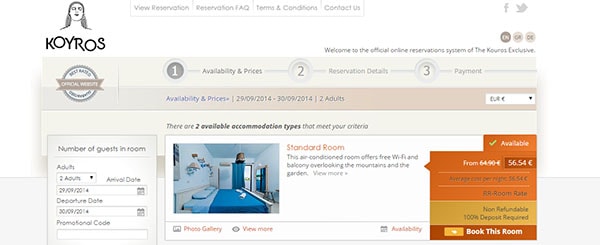
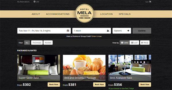
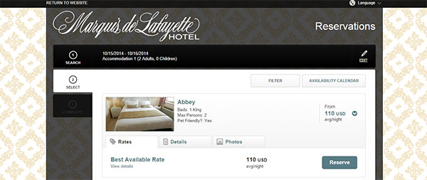
Detailed Room Information and Photos
No, I don’t mean photo galleries and fancy description copy somewhere on your website. What I want to point out is the importance of having those photos and essential room information right in front of the user at the moment when users have to choose one of available rooms. Room categories like “Deluxe Double Room,” “Royal Balcony King” and “Pool Level Standard Room” don’t tell the user anything unless they are paired with relevant images and key features that will also justify corresponding room rates. Here again, the bigger and the more impressive images you can provide the more satisfying user experience you will have.
Accurate and Comprehensible Rate Information
The difficulty with a hotel website in terms of e-commerce is that hotels usually have a few different rates for the same time period and even for the same room category. And it is rather challenging to design an easy and comprehensible rate information section. Try to clearly highlight the rate differences and extra charges that may apply, while also removing the clutter and avoiding tiny font copies to explain the rates.
With Pulsetic you’ll be instantly notified the moment your website, API, or server becomes unavailable. Monitor uptime from multiple global locations and respond to incidents before your users are affected.
Create beautiful status pages in minutes to keep customers informed during outages and build trust with transparent communication.
Start Monitoring for FreeBooking Form Usability
This is the most painful part of a booking process in terms of usability. It is essential not to burden the user with extra data fields that are not necessary to process a booking request. First, never ask users to register and/or login in order to make a booking unless you have an advantage to offer in exchange. Don’t torture the user with extra tasks for marketing purposes. That’s not a good user experience.
So what kind of information does a hotel need to process a booking?
Sure enough there is no default list of requirements, because each hotel has its system and operational standards, but generally the bare minimum would be; full name and email address. Other than that you may include a couple of optional fields, like telephone number, special requests and arrival dates. Even a small change in a booking form may either make or break your user experience, so make sure to run a couple of A/B tests to find the best form structure for your particular website.
Credibility and Trust
One of the main weak points of a hotel website is credibility in the eyes of the user. If I can book through a long-trusted and established booking website like Expedia, why would I trust my credit card details to some unknown hotel website? This question is inevitable and as a hotel website you need to have all it takes to safely process and store credit card details. And what is even more important, prove your credibility to the user with security badges and icons that he/she is familiar with.
Closing Thoughts
Hotel websites are facing a severe competition and thus cannot afford to have a lousy user experience. Although some usability issues may require a lot of trouble or negotiations with third-party service providers, the effort will pay off in terms of better user experience and happier customers. And in this context it is essential to know exactly who your users are and optimize the online booking process accordingly.
Needless to say that different age ranges would require different approach to everything from usability fixes and design of microcopy wording.
So before anything else, take some time to research and understand your target audience and then think of designing better experience for them.