5 Best Practices for Single-Page UX Design
Everybody loves single-page websites.
There is definitely some chemistry with this design trend. It has been around for quite a while, but it’s still on the rise and too many websites opt for it.
A long time ago, having a single-page website was not something you would be proud of. Those were purely informative, “business card” websites that were considered cheap and boring.
But now single-page as a design trend is something entirely different. It removes clutter from a design, leaving a clear, but beautiful user interface with concise and focused content. From a UX perspective, there are both good and bad things about single-page design, but usually users love navigating these websites, which is already something to consider.
Although there is little evidence, some experts argue that single page websites tend to have higher conversion rates as compared to traditional navigation websites with multiple pages. The only case study I can find is by 37signals. It turns out that a single long landing page lead to 37.5 percent more signups compared to the original multiple page version.
With Postcards Email Builder you can create and edit email templates online without any coding skills! Includes more than 100 components to help you create custom emails templates faster than ever before.
Free Email BuilderFree Email TemplatesWell, it’s not surprising.
- One-page navigation is more straightforward; there is no way to get lost and everything is just a couple of scrolls away.
- The page is more focused and clear, which makes it easier to communicate the main message of the website.
- Single-page websites work smoothly on almost all devices, since the navigation is mainly though scrolling or swiping instead of clicking or tapping.
The biggest challenge in single-page design is to keep users scrolling. High resolution images, bold color and beautiful type grab attention, but it’s not always enough to spark a user’s interest. With some user data analysis and A/B testing, you can find the way to the heart of your audience. Let’s go through some tips on making your single-page website even more user-friendly.
1. Split Content into Small Chunks
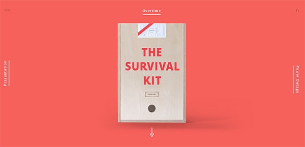
When you have just one page to tell your story, it’s important not to overwhelm users with too much information. Don’t be afraid to go below the fold and have multiple sections. Make sure to keep the messaging and media content clear and concise from beginning to end. And what is even more important, single-page websites should have a continuous and sequential flow of content (what->why->how->where->when). Brilliant examples of such a smooth and meaningful content flow are Mijlo’s designawatch.mijlo.com and agencysurvivalkits.com.
Another way to keep users following your point is to tell a story using both visual and text content. Storytelling is a powerful way of delivering content and it’s actually another trend but this time in content marketing. Storytelling breathes life into the core message and more strongly relates to the user. This doesn’t mean you have to hire a fiction writer. Just focus more on the emotional side of your content and try to be more human in what you write.
Single-page websites are all about scrolling, sometimes even infinite scrolling. It’s like diving into a sea of content and not knowing exactly how far you may go. Keep users safe and always on track; try to combine scrolling with a traditional navigation system. A general practice is to have a sticky navigation bar that stays on top of the page no matter how deep you scroll. This is a good solution in terms of usability, too. Sticky navigation can replace more traditional breadcrumbs in a more visual and interactive way.
With Startup App and Slides App you can build unlimited websites using the online website editor which includes ready-made designed and coded elements, templates and themes.
Try Startup App Try Slides AppOther ProductsIf your single-page website is quite long, it makes sense to have a “back to top” button or a vertical scroll bar that will give users quick access to the top and other sections of the website.
3. Use Strong Calls to Action
If you ask a digital marketer what is the most influential factor in a conversion, the answer will almost certainly be the call to action. A well-crafted CTA does half of the job, if not the whole job. I dare say this is true for any website that is designed for some particular purpose, whether it be mobile app download, order placement, demo request, email signup or as simple as a contact form submission. Regardless of the purpose, the quality of a call to action determines chances for a conversion.
According to one KISSMetrics case study, “making call to action more prominent increases conversions 591 percent.”
The good news is that single-page websites being more focused and clear also do better at crafting CTAs. In a one-page website, there is little text and media content to distract the user from the main goal. Also, with good storytelling you guide the user through the website up until the culmination point, where you should have a strong call to action.
Again, conduct a couple of A/B tests to determine which CTA works best for your website, because sometimes even the smallest change in the color, placement or the wording may bring drastic changes in conversions.
4. Keep It Simple, But Not Boring
The design of traditional multiple page websites is pretty much about creating a design theme and then having a few templates of inner pages to work on. Designing a single-page website is more challenging but there’s also more room for creativity. With the recent developments in CSS3, HTML5 and Javascript there are endless opportunities to create a simple, but engaging website. Adding small animations and beautiful, smooth transitions are merely details but isn’t a good UX all about details?
Just don’t get too carried away by the charms of CSS and don’t overdo with all those bouncing, floating and tossing elements all over the website.
5. Make It Light
One of the biggest disadvantages of single-page websites is slow load times. Since there is only one page to deliver the content, usually these websites get heavier and take more time to load. Following the previous point, don’t stuff the website with unnecessary animations and other design elements that will significantly impact the load time. Saving a user’s time should be your top priority. Slow loading may also hurt your website SEO, which is obviously not the biggest strength of a single-page website. It requires more attention and effort on your side to make the website agreeable also for Google spiders.
Keep on scrolling and you quickly and easily get all content you need, spiced up with thrilling illustrations, artistic graphics and various dynamic stuff. There is no unnecessary surfing through the inner structure, iterative clicking or jumping from link to link. Today we are talking about single-page website designs that are huge trend.
The approach of compactly arranging and providing only essential data brings a number of benefits, making your online property look modern and up-to-date. Mainly thanks to the elaborate parallax effect, the ability to have everything in one page becomes real and convenient. Depending on particular area or topic, you can stumble upon long one page designs that generally shed a light on various social problems, showcase infographic or statistical data; short single page designs that are usually used to promote mobile applications; and, of course, standard one page websites (that as a rule include 3-5 tiny sections) dedicated to online portfolios or creative agencies.
In a collection below you will find inspiring examples of various single page website designs.
Single Page Websites
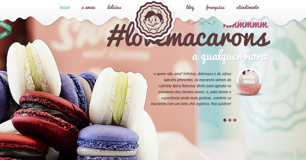
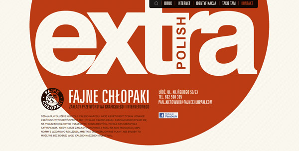
Sweez has a vibrant sweet vibe. Delicious color scheme, creamy-like smudges, tag with funny cook icon, yummy photos in slider fully justify the name of a site.
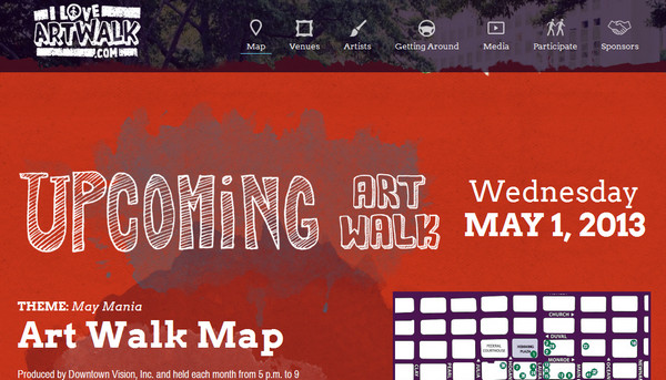
Jacksonville Art Walk exhibits marvelous typography treatments on each subpage, mainly taking on graffiti style and beautifully utilizing watercolor effect.
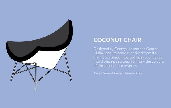
Iconic Furniture does a good job of utilizing minimal approach. Every page gets its own clean vector illustration of a chair, brief description and monotonous background in muted color.
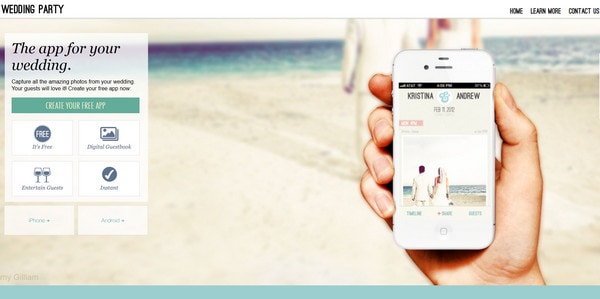
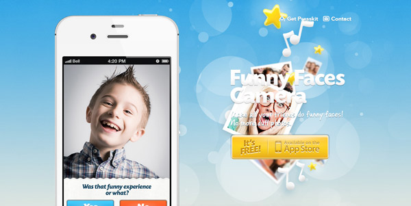
Wedding Party App is dedicated to iPhone sphere. It wonderfully represents all potential of a program in a brief form, spiced up with a spectacular image background.
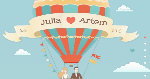
Artem and Julia wedding plays heavily on vibrant flat vector illustrations, familiarizing users with upcoming event and simultaneously depicting a story of 2 loving people.
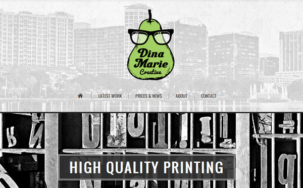
Dina Marie Creative exemplifies how classic black-and-white color palette can seem sophisticated and lively. It also adds a note of whimsical appeal due to slightly rough, odd pear-inspired logo.
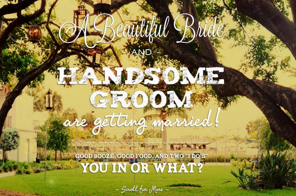
Srofewedding skillfully combines together warm landscape photo background and mix of various typefaces that perfectly supplement each other.
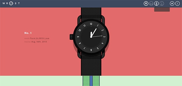
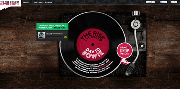
Rise of Bowie has a strong skeuomorphic feeling due to high-quality wood-textured background and truly realistic illustration of the turntable, which reveals the nicely-executed timeline of David Bowie musical life.
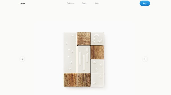
Mylapka charms with a spacious almost pristine feelings, which are generated by airy landing page with white as a core color. Home page demonstrates device by means of tiny slider with transparent background that harmoniously integrated into environment.
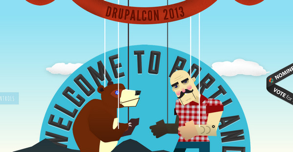
DrupalCon Portland has a cheerful and rustic look thanks to dramatic fair-themed illustrations, slightly crooked fonts, textured background and nice small animations.
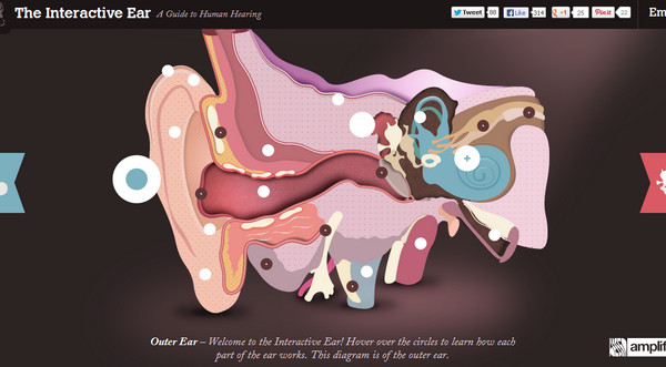
The Interactive Ear features amazing vivid illustration of an ear that includes a lot of amusing interactive elements.
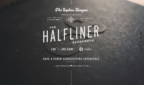
Halfliner is another great example that utilizes black-and-white color palette, showcasing devoid of color background and white typography. The latter occupies central part and has a strong sense of traditional flyer layout.
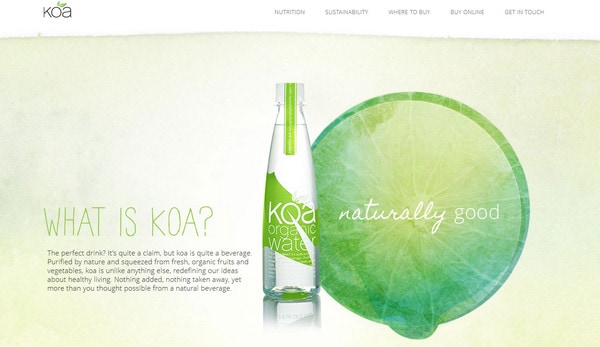
Koa Water has a nature-inspired design with ably implemented watercolor brushes and illustrations. Green and yellow colors add to design organic feel.
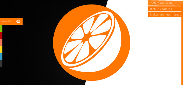
Scroll for your health loudly screams out flat style that is spiced up with bright colors, monochromatic vector illustrations and neat bi-colored backgrounds.
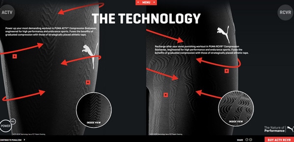
ACTV is an interactive website that capably leverages power of parallax effect, dividing screen into 2 parts which move in different directions.
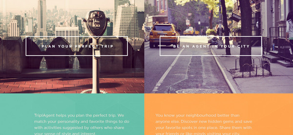
TriplAgent fascinates by astonishing colors, neatly placed elegant typography, warm photos with barely noticeable lomography touch, and highly-detailed execution of graphics.
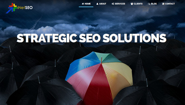
iNetSEO is based on traditional vertical parallax. It exudes image of seriousness and reliability due to sharp lines, darken urban images in slider, bold font and accurately implemented clean flat style.
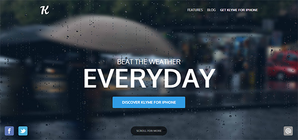
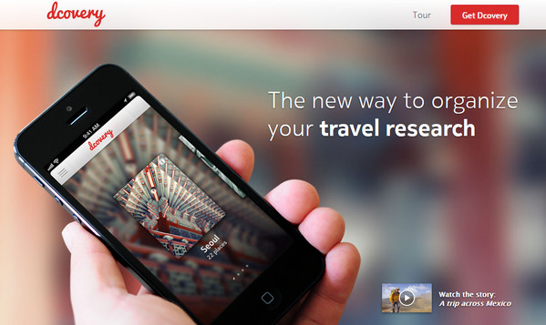
Dcovery – Single page website designs are hugely popular among designers who create websites for promoting mobile applications, and “dcovery” is not an exception. Developer briefly and comprehensively introduces its program, utilizing lively blurred background with distinctive iPhone mockup placed ahead, and white plain typography
SoLoMo easily brings visitors’ attention to statistic data that is wonderfully showcased by means of colorful infographic. The latter includes plane graphics that goes well with black rigorous font.
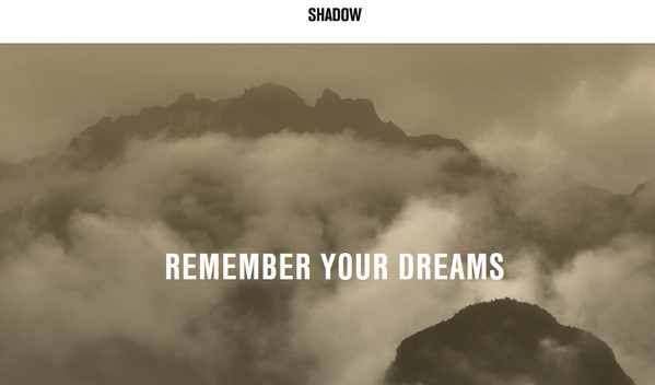
Shadow does not fully utilize the whole space of a screen, representing all information in a separate rectangular block, which has a predetermined indent from all the boundaries. On the whole it seems like you are surfing website inside of a slider.
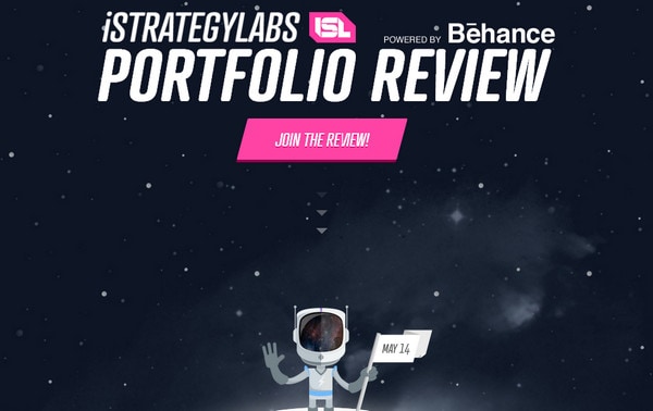
Isl has an adventurous cosmic atmosphere that tells about an event in a story manner; even description and text blocks are written in a specific style.
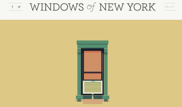
Windows of New York has a similar interface to number 3. The website showcases diversity of windows in New York, graphically illustrated each sample in details.
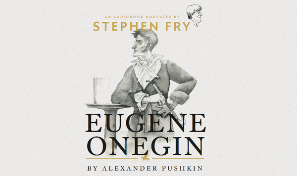
Eugene Onegin brings a note of artistry by means of greyscale hand-drawn illustrations with ink touch, subtle noised background and sharp regular type.
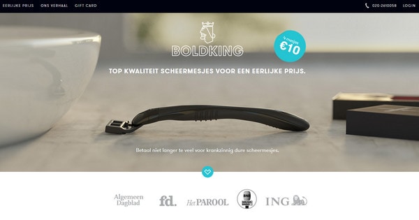
Boldking ably and captivatingly promotes its product. Mainly based on the contrast between the white background and plain dark typography, designer gives to website clean and accurate appearance.
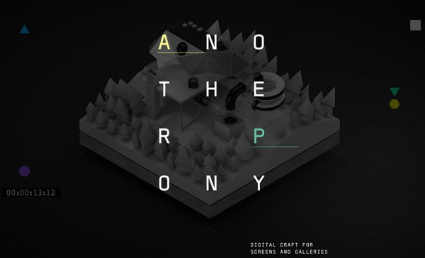
Another Pony – Low-poly illustrations with an obvious feeling of the third dimension and capitalized titles with a relatively huge space between letters give website unconventional and outside-the-box look.
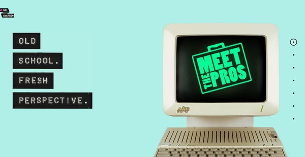
Meet the Pros 2013 uses a number of retro devices that in conjunction with blue background and lettering, which massively resembles fancy typewriter font, establish old-school atmosphere.
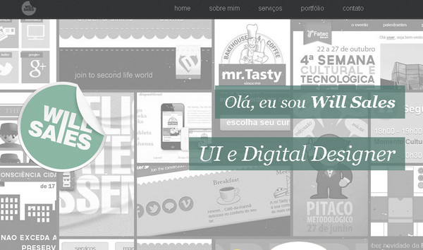
Will Sales has a content-heavy landing page; whereas the rest of a site looks organized and spacious, since designer harmoniously distributes data on different sections.
One page website designs are very popular and more complex and sophisticated than ever before. Well-thought and properly executed, they are able to bring the same user experience as a standard classical website with sub pages and extensive internal structure, becoming comprehensive examples of advanced and progressive cooperation between CSS, HTML and Javascript.
Tell us, what do you think about our collection. Do you find it helpful? Do one page websites look engaging and alluring?
Not every website needs to be complex or include multiple pages of content and information.
Sometimes one page is enough.
But just because you are creating a website with only one page, does not mean that it will be easy.
Developing a single-page layout can require just as much thought and planning as some more complex sites. It needs to have all the same basic parts as a bigger site and should look visually stunning, work as expected and have a clear purpose.
Here we take a look at some awesome single-page designs, which are more popular than you might expect. While you can see what these sites look like, go ahead and visit them to experience some of the great user interface features built into many of these sites.
What is Single-Page Design?
A single-page website is built in a single window.
The single-page concept is based more on scrolling rather than clicking (although clicking is not outlawed either) to see and move through the site and its contents.
A single-page website can be as simple as a “page” that fits neatly in a browser frame and is contained above the scroll. But that is not always the case. Single-page websites can scroll (although it is important not to create too deep of a page that can be overwhelming for users).
Simply, a single-page website is one that does not include links to other pages within the domain and all of the content is located in a central frame.
Why Opt for a Single-Page Design?
Single-page web design comes with a lot of caveats and is not for every project.
Where it is gaining popularity is as a preview to an upcoming app or site with an e-mail opt in form, as a portfolio tool, as a page that encourages you to go elsewhere or for a company that can showcase its product or message simply.
Single-page websites are often highly designed, because they get one chance – one impression – to grab a user’s attention in a cluttered visual landscape.
These types of pages only work for sites that don’t have an abundance of content – sites that sell a single product; site aimed at promotion of another site, app or item; small portfolios or simple information.
While the design of these types of pages is often highly visual, text is kept to a minimum. Single-page sites also require a clear and easy-to-understand user interface so visitors know exactly what they are supposed to do with the site.
Have a Purpose and Goal
Start the single-page website design process with a clear purpose and goals. What do you want users to do on your site or what information should they soak in while there?
If you are previewing an app, for example, you might want users to provide an e-mail address so you can tell them when it launches. If you are selling a UI kit, your goal is to convert visitors into sales.
Other actions might include, filling out a form, watching a video or clicking through to another website all together.
Know what you want users to do before you begin the design and re-emphasize this throughout the process.
Design Tips for Success
Now that you know what you want to happen with your website, use this set of simple tips to get on the road toward publication.
Create a first impression. You only get one chance to bring in new users. Your site needs to have visual appeal and tell users why they are there quickly.
Stay focused. Remember your goal and eliminate any tricks, design elements or copy that could get in the way.
Play up strong visuals. Whether it is color or images or beautiful typography, pick a great visual and use it in a big way.
Develop clear navigation. Even though you may be wondering what you need navigation for – it is only one page after all – any site that contains multiple scrolls, forms or links of any sort needs clear navigation. Tell users what different buttons will do (especially if they take you away from the site). Even sites with a small amount of content need to include clear and understandable directions or calls to action.
Stay organized. You will never be able to say everything you think of in the format (or space) of a single-page design. Stick to what’s important and order everything based on hierarchy. Write clean, clear copy and edit until the words are sharp and concise.
Have fun with the design.
Cool Tricks and Effects
![]()
There are an unlimited number of cool tricks and options out there that can help you make the most of a single-page web design. Some of these are even “stolen” from mobile concepts, where single page design is quite common.
Parallax scrolling: Scrolling effects are one of the most popular “tricks” in single page design. With the flick of the mouse, users get a new page without clicking or navigating away from the initial landing page. This type of effect can encourage users to see what comes next in the design by continuing to scroll, read and interact with the site. (You can learn even more about parallax scrolling in this previous Designmodo article.)
Mobile app landing pages: Create a specialty landing page that encourages users to download an app when visiting on your site on a mobile device or tablet. This “pop-up page” can help convert web users into regular app users.
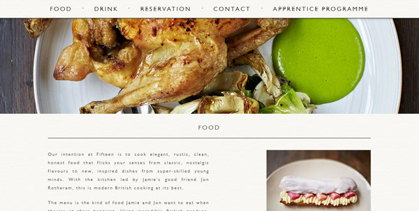
Hidden navigation: Menus that pop in and out of the frame when the mouse comes near is a way to help save space in the overall design and provide navigation in a familiar location (most commonly at the top of the page). You can also experiment with other navigation tricks such as the one on Jamie Oliver’s Fifteen page where the navigation starts in the middle of the screen and moves to the top (and locks in position) as you scroll down the page.
Animation: If parallax is not your thing, consider an animated or video background for visual interest. Movement entices users to stick around and see what happens next.
Conclusion
Single-page design can be a powerful way to engage users and convert them into leads. But this heavily depends on the business type and the purpose of a website. Usually, one-page design is best for single action websites, like app downloads, single item purchases, donations, etc. But don’t be limited by best practices, because those are still others’ experience which doesn’t have to match yours.