Use of Transparency in Website Design, Examples
The transparency has become widely popular among web developers after the CSS managed to provide developers with essential tools that are responsible for controlling this feature. Nowadays, you can easily set a specific level of transparency to any of your functional blocks simply by adding one small line of code. Despite the fact that this effect can bring numerous challenges especially when it comes to readability and contrast, it still offers considerable benefits for those who can effectively cope with it.
The transparency is applied to various widgets and blocks that contain data. The designers greatly prefer to use this approach to sliders when the description needs to be neatly presented or to regular widgets when the backdrop has to be muted in order to elements on the foreground naturally come into focus.
The designers also resort to different levels of transparency; they employ those that can help widget to stand in stark contrast to the backdrop and those that naturally blend content in the canvas. Only one thing remains constant – the areas, with altered opacity, should perfectly complement the scene and enhance the theme in order to maintain the required harmony and achieve the proper balance.
Take a glance at our fresh collection of website designs that effectively leverage this refined and, at the same time, tricky effect.
Transparency in Website Design
Wavefront has an offbeat energetic website that easily conveys an atmosphere of the festival. There are numerous spirited photo backgrounds with stylish neon touches. The huge semi-transparent blocks, made in vivid coloring, effectively support the white letterings and ideally fit into the flamboyant composition.
With Postcards Email Builder you can create and edit email templates online without any coding skills! Includes more than 100 components to help you create custom emails templates faster than ever before.
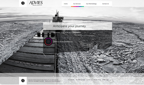
Free Email BuilderFree Email TemplatesAdvies. The front page features several delicate horizontal stripes with low opacity, and relatively huge block with the description that also rayed. These elements are perfectly combined thanks to neat monochrome color palette that is traced throughout the design, and is intended to firmly tie key components together.
Medialink has an eccentric and peculiar home page that is based on a realistic glassy background. The translucent circular navigation, as well as enormous central circle (that is a starting point for further website exploration), ably complement the theme.
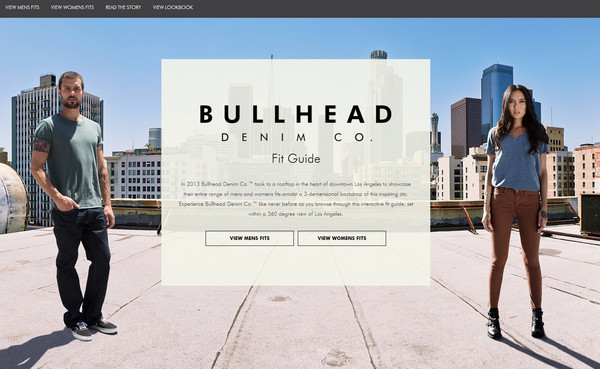
Bullhead. The main page welcomes visitors with a distinctive slightly limpid rectangular block that contains useful information for customers and offers to choose one of the two basic categories. The unobtrusive widget ideally interacts with photo background.
Unknown Croatia. The transparent blocks are placed on the edges of the theme in order not to divert visitors from the main aspects. They perfectly play a supporting role. The small vertical menus look neat and modern, adding to the website a special zest.
With Pulsetic you’ll be instantly notified the moment your website, API, or server becomes unavailable. Monitor uptime from multiple global locations and respond to incidents before your users are affected.
Create beautiful status pages in minutes to keep customers informed during outages and build trust with transparent communication.
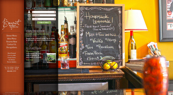
Start Monitoring for FreeBouquet Restaurant. The website provides users with a comprehensive navigation in order to make an exploration of the website comfy and pleasant. Thus 2 sidebars – both placed on the left side – embrace all necessary information. The second one, which serves as a supplementary panel, has a lovely transparent vibe.
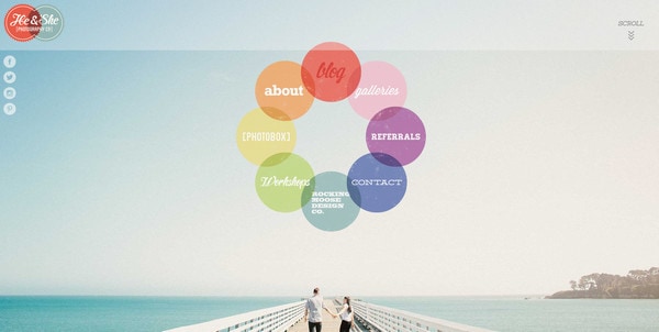
He and She Photography. The distinctive feature of this theme is a bright positive navigation that successfully collaborates with backdrop due to its soft coloring and lovely grunge touches. All main components on the site upfront are effectively connected with each other through the same level of transparency.
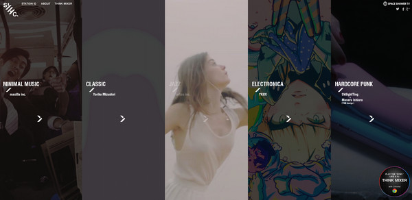
The front page of the SYNC includes a full screen navigation that represents links by means of vertical stripes each of which comprises small video. In order to add usability, the designer ably mutes inactive menu items with a help of dark semi-transparent layers.
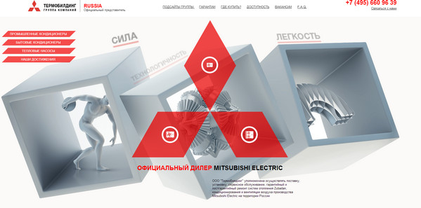
Mitsubishi Electric. The central part of the home page is occupied by a huge Mitsubishi logotype that is based on low opacity layers. Each diamond embraces its own category that is presented by means of simple intelligible glyph. On the whole, the central menu naturally complements a backdrop.
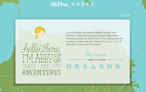
Abby Putinski has a fantastic fully illustrative online portfolio that simply fascinates by its professional, detailed execution and unique concept. The gauzy pop-up message capably welcomes newcomers.
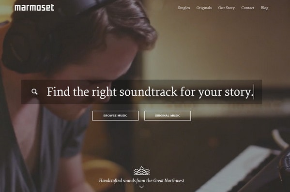
Marmoset. The designer utilizes a video as a backdrop in order to intensify the theme with an appropriate musical background. The neat outline light buttons as well as the wide, long slightly transparent dark stripe (that plays a role of a search field) are really nice touches.
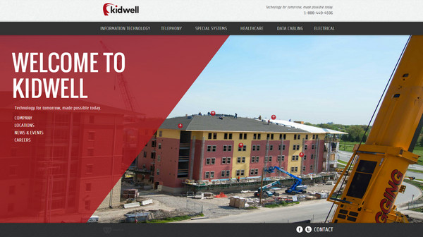
Kidwell. The translucent uneven red shape breaks the usual content slider and recreates a sense of pleasant asymmetry. Although the red tone looks a bit harsh and rough, it effectively contributes to the building theme.
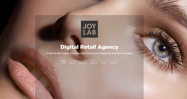
JoyLab is a stylish and refined website that utilizes an amazing full-screen photo slider. The huge almost transparent dark block efficiently embraces all helpful information including basic navigation, logo and tagline.
La robe fendue. As usual, the designer leverages a picturesque slightly blurred image background that nicely collaborates with semi-transparent functional areas. The light components, as well as dark ones, look simply sophisticated.
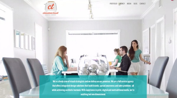
Cinnamon Toast. The small blue rectangle that is placed on the bottom of the front page serves as a peculiar information desk. The blue tone nicely interacts with the light theme, easily standing out from it.
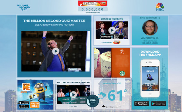
NBC. The Million Second Quiz’s home page has a heavy-content layout that provides visual information about the show. The designer makes almost every widget’s background slightly transparent in order to wonderfully work blocks into the background.
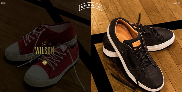
Greats Brand. The diaphanous dark layer is used for muting one of the basic sections and drawing attention to another one. It is quite wide-spread approach that helps to effectively highlight a selected option.
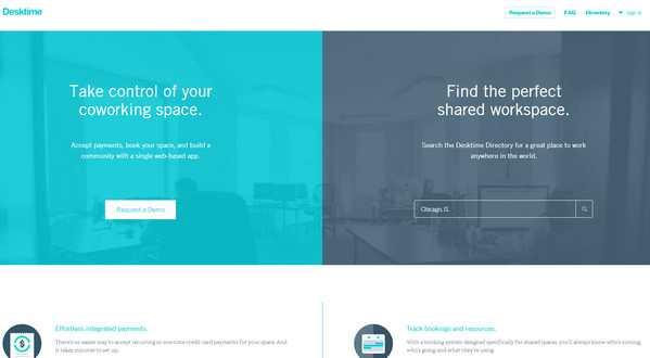
Desktime App has a neat and clean website. The landing page features 2 key videos that are subdued by the limpid layers that hold data. The white content and light buttons look perceptible and legible.
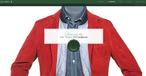
Tom Edwards. This is a fashion-related website that includes a content slider with professional stylish photos. There is only one box that has a transparent backdrop, and it is absolutely suitable for this theme. It serves as an elegant badge with a link to the new collection.
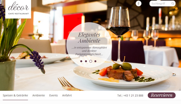
Décor im Augarten has a light and tidy website that also relies on the visual impact, providing users with a set of delicious photos. Every image as well as every slide is accompanied by a subtle gauzy circle that contains description. On the whole, website looks absolutely harmonious.
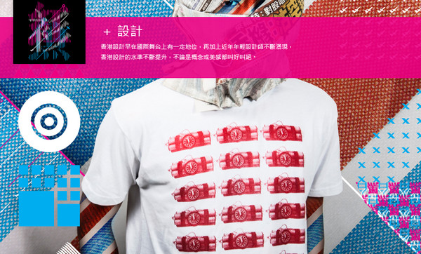
Red Fish Apparel. The designer has quite successfully experimented with a combination of various geometric shapes in order to produce an eye-catching and unique design. You will find circles, squares, rectangles and other regular shapes that simply adorn the website. The transparency of some objects adds a sense of deepness and 3-dimension.
Reflection
The transparent layers perfectly cooperate with different backgrounds whether it is a monochrome clean backdrop that is devoid of bright colors, or it is a picturesque image that shines of vivid tones. The blocks with low opacity firmly hold the information and greatly contribute to the rest theme.


