Best Website Designs from the United Kingdom: Keep Calm and Design
“Keep Calm and … Design” is one of many variations of the original slogan “Keep Calm and Carry On,” a motto dating to 1939. Recent it has become quite popular around the globe again but also stimulates the creative crowd of Albion to come up with some of the best United Kingdom website designs.
The catchphrase is a perfect example of a close and harmonious interaction between old and new (classic and modernity), the idiosyncrasy that is inherent to the art legacy of England. It is not the only the unique symbiosis that shapes the minds of creatives; another tight union is mutual cooperation of English, Welsh, Scottish and Irish art.
So that talented folks certainly receive a boost from their cultural heritage that pushes them on building up clean, ultra-modern flat style websites, or on the contrary, positively-messy vintage designs that are populated with heavy textures or richly ornamental components, crafty illustrated visual storytelling experiences pulled by advanced animations, fully interactive intricate websites, pioneering Google Chrome experiments, or just primitive conventional but flawlessly executed landing pages.
Best United Kingdom Websites
Audience Entertainment
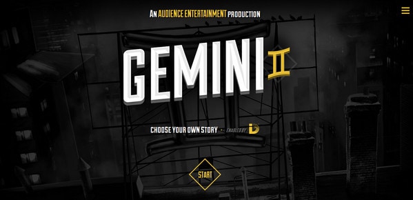
Audience Entertainment justifies the nameplate thanks to a memorable storytelling experience. Do not hesitate, just delve into mind-blowing scenes and enjoy the action.
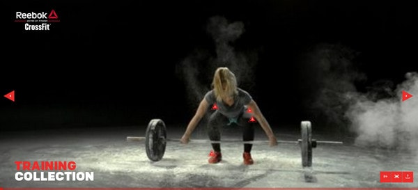
Reebok Lookbook
With Postcards Email Builder you can create and edit email templates online without any coding skills! Includes more than 100 components to help you create custom emails templates faster than ever before.
Free Email BuilderFree Email TemplatesWant to promote your clothes design effectively? Then stick to a fresh approach that involves creating a vivid and engaging online lookbooks. Reebok official website shows how to do it properly by presenting a series of fantastic sport-themed videos.
P&Co
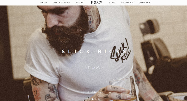
P&Co is an amazing modern online shop that greets online visitors with a descriptive image-based full-screen navigation. The team is riding on an impact produced by visuals that allows the project to differentiate itself from others.
Long Story Short
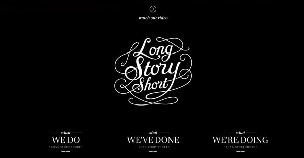
Sometimes you do not have to push your limits since the winning solution is on the surface. Long Story Short leverages such a solution, vividly demonstrating that well-crafted, carefully-selected typography is able alone to bring overwhelming results.
Live to Change
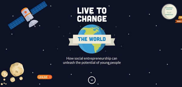
The website rolls out an interesting and engaging story that, thanks to vigilantly-executed illustrations capably intertwined with real images and pieces of statistical data, is incredibly interesting to “read” to the end. This is another well-thought-out infographic that is skillfully dished up to an online audience.
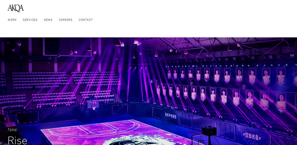
Akqa
With Pulsetic you’ll be instantly notified the moment your website, API, or server becomes unavailable. Monitor uptime from multiple global locations and respond to incidents before your users are affected.
Create beautiful status pages in minutes to keep customers informed during outages and build trust with transparent communication.
Start Monitoring for FreeAkqa has a neat and subtle online portfolio that effectively bolsters the brand and enhances the agency’s presence on the web. Though, it does not feature anything exquisite, only harmonious combination of visuals and copy, classic black-and-white color scheme, simple but sharp fonts and a well-organized layout.
McDonalds McBurger
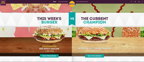
The website speaks completely through appetizing images, vibrant graphics and a divine color scheme. It is also a well-crafted quiz that unobtrusively forces users to vote for the beloved burger thereby directing their attention to its range of sandwiches.
World Baking Day
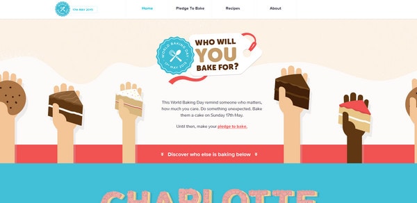
Another food-related website that does a great job of utilizing illustrations, vector graphics, bold decorative typography and matching coloring is from World Baking Day. As a result, the website certainly whets your appetite.
Electric Mainline
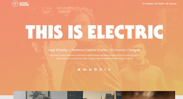
Electric Mainline is an amazing portfolio that radiates of flood of positive emotions. Here, a warm atmosphere is achieved through a semitransparent orange overlay screen and shining bold white slogan.
Lush
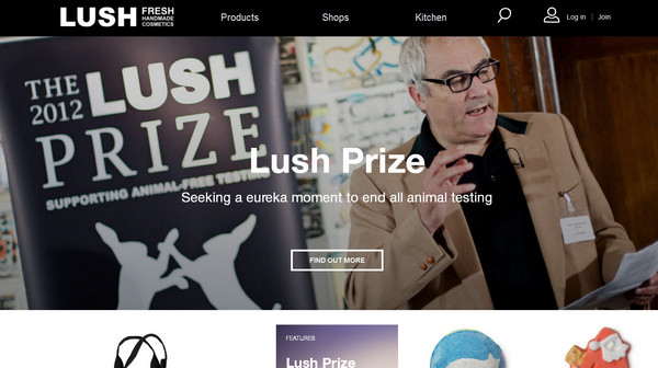
Lush is a website that based on a grid-style layout. The boxy vibe in tandem with properly arranged images makes the page easy-to-explore as well as produces a pleasant general feeling.
British Airways
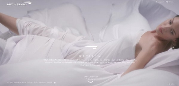
The website affords a modern look due to sophisticated professional photos that serve as an ideal foundation for the copy and subtle graphics. It lets you feel elevation and lightness inherent to the airlines.
Mr. President
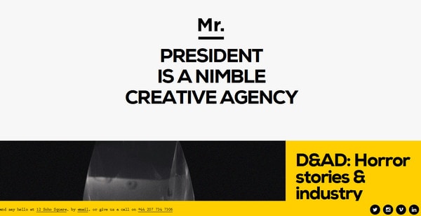
Mr. President breaks the monotony of ideally-proportioned layouts and makes the most out of unbalanced model thereby having placed images and widgets in a slightly chaotic order that certainly strikes the eye.
Pollen London
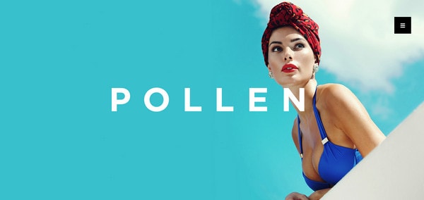
Pollen delivers a strong first impression that concentrates on the beauty of fashion. The magnificent professional photo placed on the “welcome” section uniquely identifies the brand as well as sets the tone of the website right away.
Riley’s Cycles
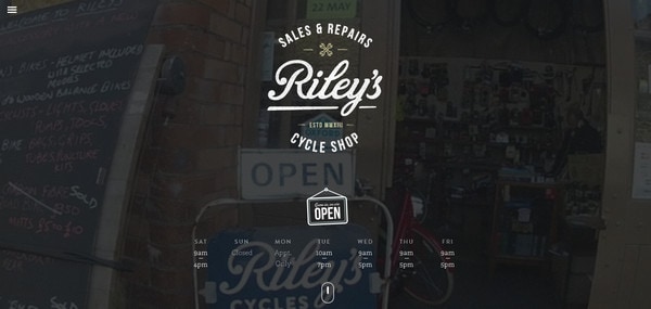
Riley’s Cycles is a perfect example of how grunge design capably meets the modern trends. Thanks to such a strange and ambiguous combination the website has received a quite alluring appearance.
Clicky Media
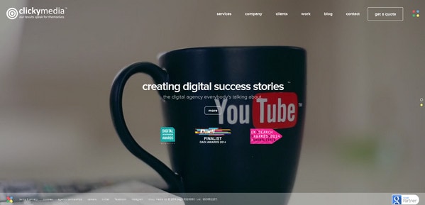
In order to outline its professionalism and convey its powerful individuality the team has highlighted three key points that should instantly “set you on the same wavelength” with them through opting for employing full-screen images instead of long boring descriptions.
Sleep Deprivation
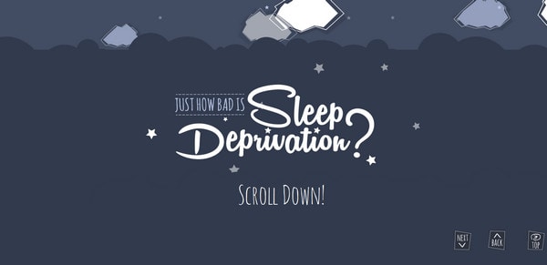
The website features an approach that is already managed to become traditional. The visual storytelling that is brought to life due to marvelous illustrations and small fancy animations effectively engages you in the project.
Paul Mitchell
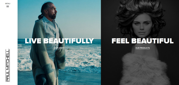
Using a compact left-sided slide-out menu, “hamburger” button, bold typography, high-quality shots and minimal layout, the design team certainly knows how to gain the favor of modern user interface features.
Geox
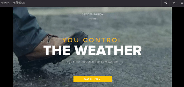
The team succeeded in impressing the audience with an exceptional idea and flawless execution. The website is a sheer inspiration for those who appreciate new possibilities of web technologies.
We Are e3
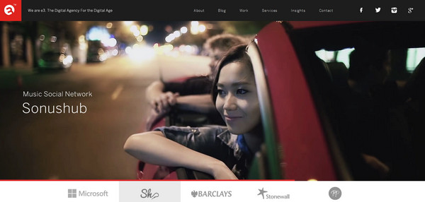
The website tries to focus users’ attention namely on portfolio pieces by means of stripping away everything that can possibly distract attention.
Digital Bodies
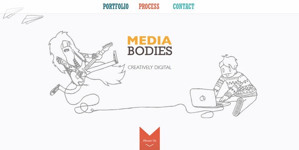
The sketchy energizing illustration gives the website a pleasant, playful look that definitely lightens the atmosphere of the project. For the rest, everything is simple yet well-organized and accurate.
Super-Looper
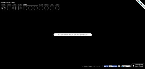
Super-Looper is a fully interactive and highly engaging website that allows you to play songs. Want to lift your mood? Then certainly give the project a couple of minutes.
Lyric
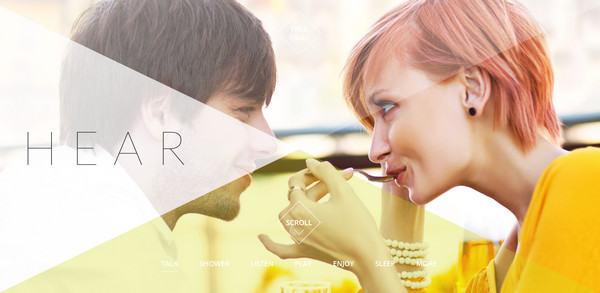
The website is rich with images, though they do not overwhelm users thanks to smooth, colorful geometry-style overlay screens that slightly soothe the impact and make the interface to look wonderful.
Classic Cars on the Big Screen
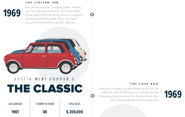
Informative projects made easy. This website that uncovers a short yet bright story of classic cars looks especially attractive and highly intriguing due to a masterful series of detailed vector illustrations ably bolstered by some official figures.
Red’s True BBQ
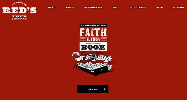
Here, grunge effect applied to different elements in tandem with artistic typography and several complementary elements adds extra flair to the design and creative edge to its aesthetics. Red is a core color that should unobtrusively stimulate appetite.
Engage
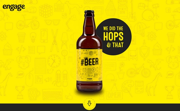
Engage catalyzes creativity with its awe-inspiring, highly artistic hand-drawn background, sketchy graphics, optimistic yellowish coloring, smooth logotype and fine crafty typography.
Icons Mind
![]()
Here the icons package was given an ideal “foothold” that effectively reveals its pros through various means. The website endows the product with a professional look that can increase the sales for sure.
Conclusion
England-based agencies go for less traditional routes for projects, preferring current tendencies, new technologies and fresh solutions to stereotypes and cliches.


