From Top to Bottom: Vertical Orientation in Web Design
From left to right (or for such languages as Arabic or Persian from right to left), from top to bottom that is our accustomed path of exploring things in the books, documents, websites, advertisements, pamphlets, etc. In general, horizontal orientation comes first. So when the things are arranged according to the y-axis, it always feels like a disturbance in the force.
The fascination with vertical orientation became perceptible last year when it started to set the rhythm for primary navigation menus, as designers saw it as an interesting technique to enhance aesthetics. To be completely honest, split homepages (the website of Erkan Demiroglu is a perfect example) that are the product of the vertical orientation, have been in-trend for a couple of years.
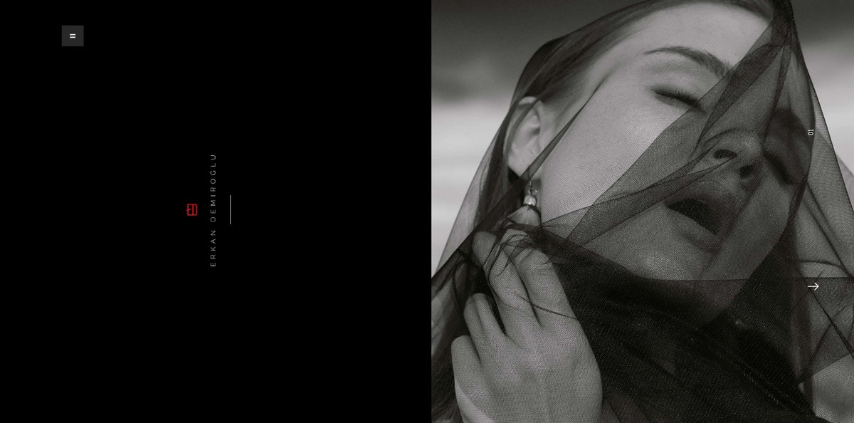
Erkan Demiroglu
But what about 2017? This year, it hits its stride to the full extent, starting to dictate the rules for different elements and aspects of interfaces. If you pay attention, you may notice it everywhere. Unlike the majority of trends that quickly invade the design and eventually become annoying, the solution does not feel overused nor banal; on the contrary, it looks great and fresh like an icing on a cake.
Like “yummy chocolate sprinkles,” it can benefit almost any element of the interface. Let’s start with the minor usage and end with websites that manage to master the mainstream.
With Postcards Email Builder you can create and edit email templates online without any coding skills! Includes more than 100 components to help you create custom emails templates faster than ever before.
Free Email BuilderFree Email TemplatesAt an Easy Pace
Our first stop is websites that distinguish themselves with single or minor usage of vertically aligned elements. In the traditional horizontal entourage, such injections give the general aesthetics an outstanding spice without much effort.
The trend can serve as a way to:
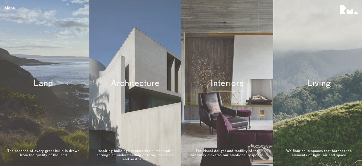
- Present the sphere of expertise. Examine the personal portfolio of Rob Mills. The stack of vertical panels subtly embraces all directions and creates a pleasant sense of order.
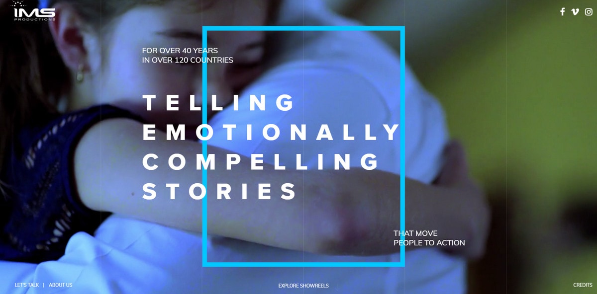
- Convey a message like IMS Productions’ homepage where the perfect combination of vertical typography treatment and decorative elements such as an outline rectangle and striped-like background put the message in the spotlight.
- Organize content flow like Taika Strom. Here the content is densely located in the center with white space on the left and right. This forms a prominent visual path for the readers, saving information from being overlooked.
- Give the brand identity a special spot like Gera & Rod. The majestic floral centerpiece that adorns the typography-based logotype instantly becomes the center of attention.
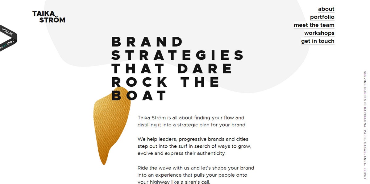
Taika Strom
With Pulsetic you’ll be instantly notified the moment your website, API, or server becomes unavailable. Monitor uptime from multiple global locations and respond to incidents before your users are affected.
Create beautiful status pages in minutes to keep customers informed during outages and build trust with transparent communication.
Start Monitoring for Free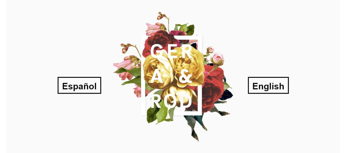
Gera & Rod
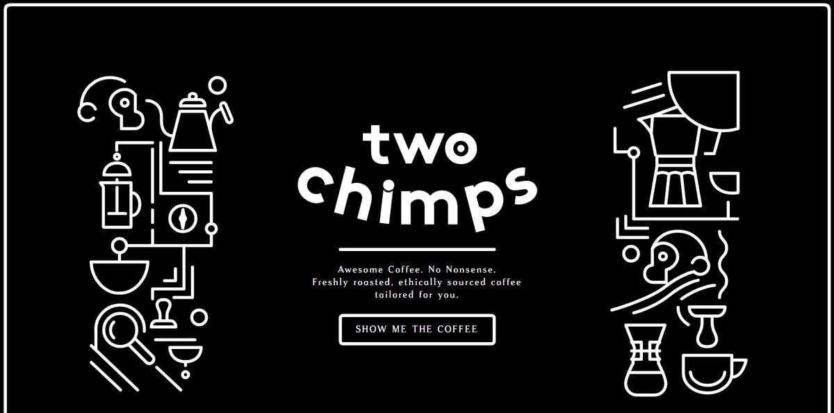
If you think that the trend is applicable for general purposes only, then you are wrong since it can be found in unconventional and unexpected spots these days. The elements of the interfaces that you are accustomed to seeing mainly stretched derive benefits from it most of all. For example, Momento Multimedia and Two Chimps Coffee.
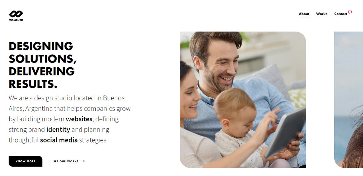
Momento Multimedia
The first opts in favor of a slider that depicts images in full-height rather than at full-width. This trick gives visual content almost the same priority as the text block on the left.
The latter has a neat minimalistic front page where two straight-up outline drawings, which are on the sides, tell the story and establish the mood. This approach works great also with the non-static art; look at the website of Heart of Travel – Southwest Rapid Rewards.
It has a small exhibition of upstanding dynamic computer-generated artworks with one of them featuring in the welcome area. It looks artificial as compared with the previous example, yet still, it charms with magnetic personality.
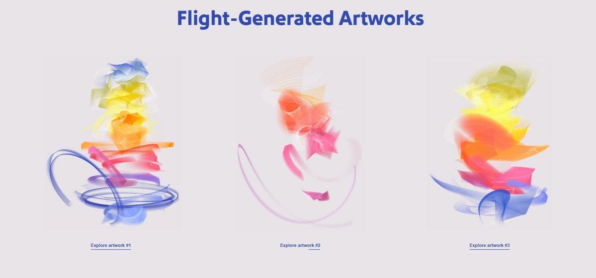
Heart of Travel – Southwest Rapid Rewards
Take the Trend More Seriously
The teams behind the websites of Tender to Art, Canvas United and One Year in Review by One Design Company did not stop with minor changes – they got the most out of the trend. Let’s examine them closely.
As an artistic incubator, Tender to Art avoids the banality of using illustrated approach and proves everyone that even without picturesque environment you can impart the impression of creativity and class.
While the inner pages are rather conventional, the homepage catches the eye with a masterful usage of vertical orientation. The text-based logotype, scroll-down indicator, slider, a hamburger menu button all have elements that are enhanced with vertical appeal.
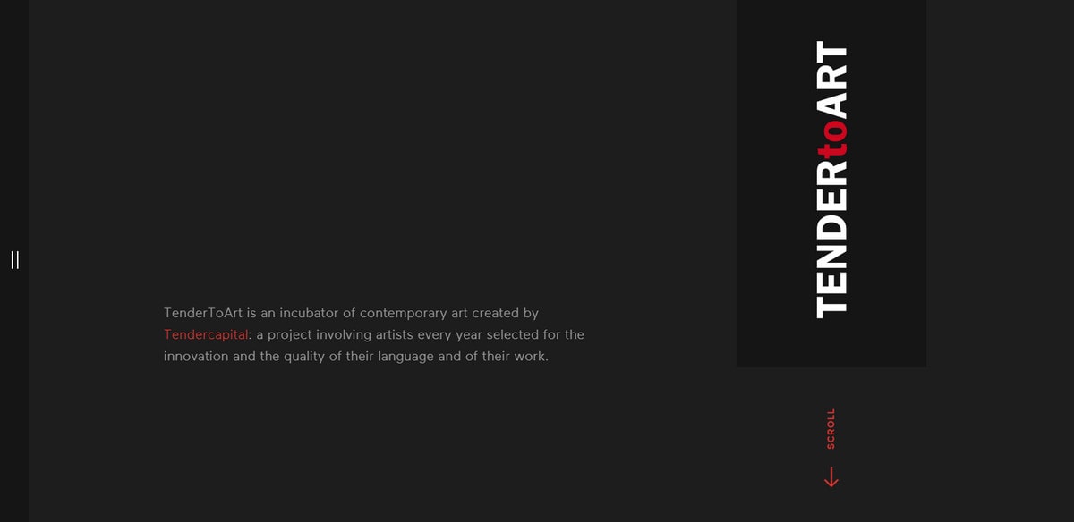
Tender to Art
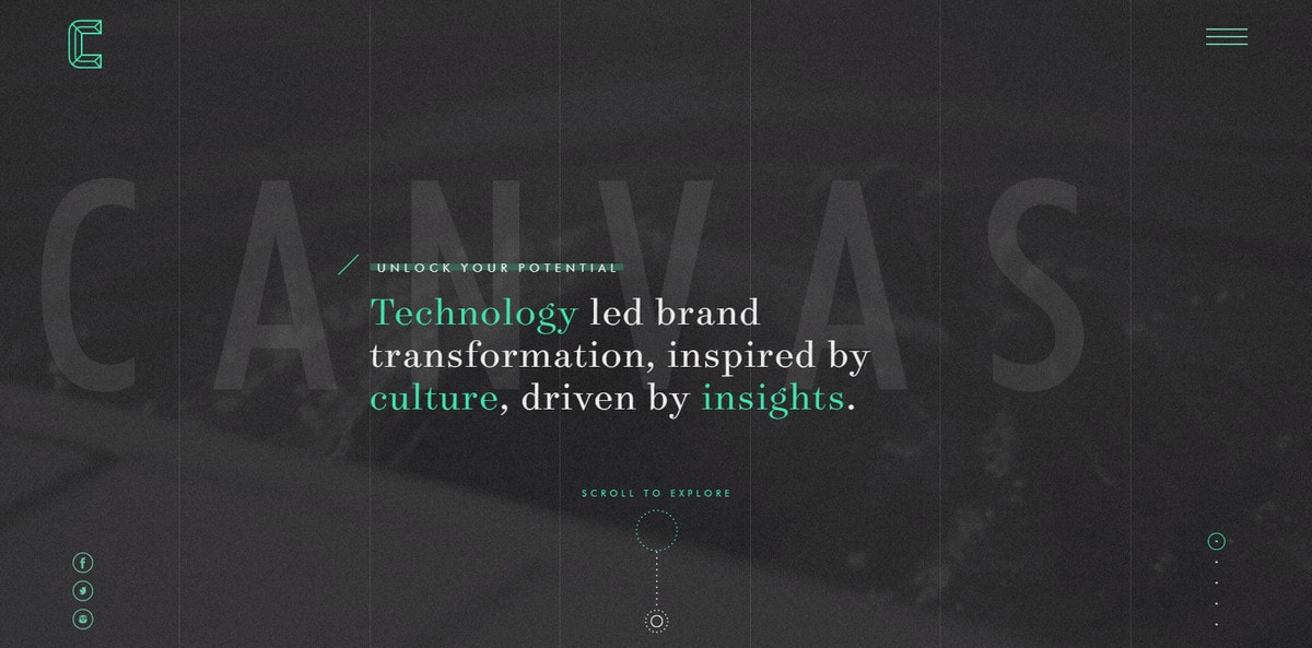
Canvas United is more conservative than the Tender to Art; nevertheless, its take on the trend is worthy of attention for those who intend to use more than one or two vertically aligned elements in the design. Here, the block of stacked social media links, tiny slider pagination buttons, and marvelous striped-like background underlie general aesthetics.
One Year in Review’s landing page consists of four main elements: tagline, dynamic background, thank-you list and a call-to-action button. The first three lie in the vertical plane naturally guides users from top to bottom.
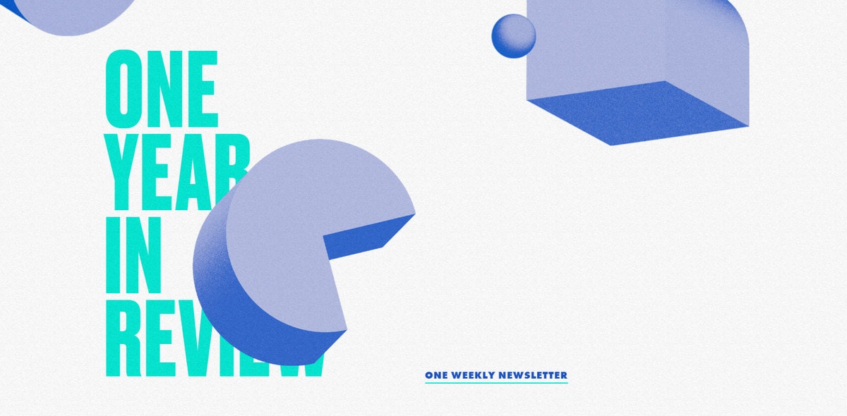
One Year in Review
Vertical Orientation in All its Beauty
It is difficult to go wrong with the minor usage. After all, it is still the same traditional site that rests on the horizontal position with details nicely aligned in y-axis that are focal points without being loud or overwhelming. However, what about creating a website where the vertical orientation lies in the heart of the overall aesthetics? Much like with any other trend, it should be practiced with the caution. If you overdo it, the tendency will fire back ruining the harmony. It is a bold step to take, but when done wisely, it will bring about the fabulous outcome. Consider Crazy and Carazo Arquitectura.
Both websites are thoughtfully constructed. The vertical plane stamped its charming personality on both of them. Notice how the alignment breathes new life into basic elements of the interface.
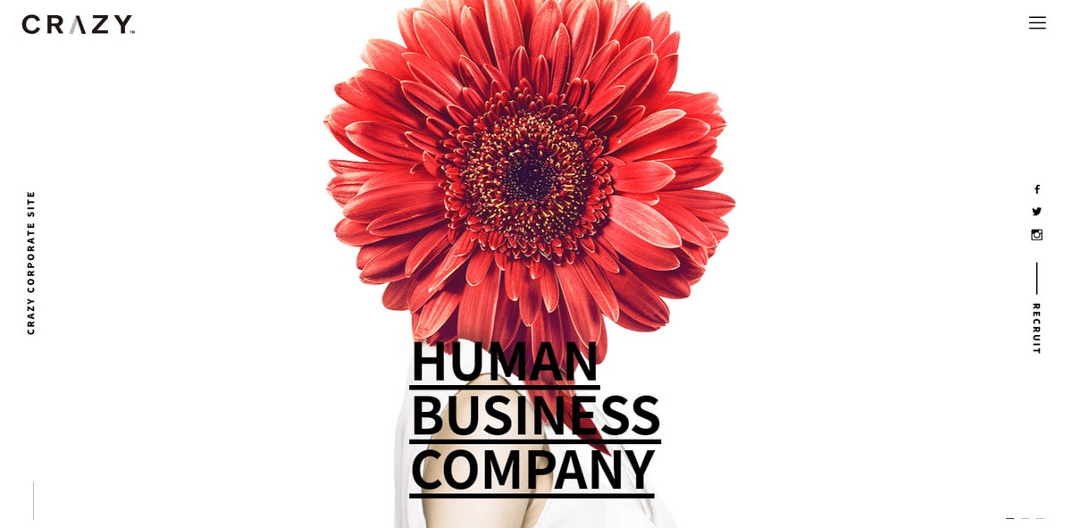
Crazy’s homepage has only two things that obey the traditional x-axis: the logotype and hamburger icon. Everything else is upright. Visually, you can define three columns with sensible gaps and a sense of order. The design breaks out of the classic structure and excels with the visual appeal.
The Carazo Arquitectura’s front page uses vertically aligned elements as decorative details. While the image in the center stays in a precise oblong, the navigation, tagline, caption, and slider pagination with a bunch of complementary carefully scattered throughout the screen short lines remain straight-up as if appealing to move down. The design is sophisticated and elegant.
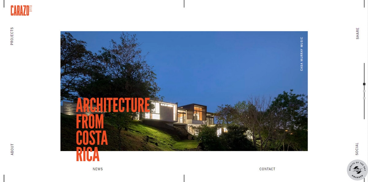
Carazo Arquitectura
Conclusion
Once in a while, it’s great to go off the beaten track just by altering an angle. Vertical orientation is a trick that is quite familiar but is still able to give the boring things a lively zest. Moreover, it works well with almost any element of the interface whether it is a slider or just an ornament.
What do you think about this trend? Is vertical orientation a valid tool to introduce improvements and diversity in designs? In what way does it benefit your interfaces?


