Communicating a Message Through Visual Hierarchy
The goal of every design is to successfully communicate a message. Visual hierarchy enables you to organize information and elements so that the message can be communicated easily. Hierarchies also enable the design to tell a story to communicate the message.
What is Visual Hierarchy?
When you organize information based on importance, that’s hierarchy. Visual hierarchy is simply organizing the information visually. In order to create hierarchy, elements need to be prioritized in terms of importance from most to least important. In a visual hierarchy, those elements are differentiated by the way they look. Through visual cues, you emphasizes that one element is more or less important than the next to create a relationship.
What Makes This Important?
Visual cues allow us to determine what is and what isn’t important. By giving different elements more visual weight, we identify them as more important. If you understand design principles that help create a visual hierarchy within your designs, it will allow you to better communicate with visitors.
With hierarchy, information becomes easier to scan and digest. A well thought out hierarchy will allow the visitors to quickly finish a task, because it is easier to comprehend information. It also makes for a better design because various elements look more cohesive on a page. A successful visual hierarchy will highlight actions or key information.
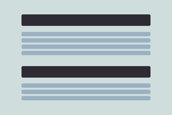
Can You Give Me an Example?
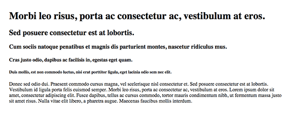
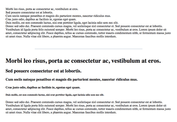
A simple but great example of hierarchy are the six headings available though HTML. H1 is the biggest because it’s the most important, while h6 is the smallest because compared to the previous five it’s the least important. What’s even less important then any of the six heading styles is the paragraph format. All of those elements, and all the other typography related tags like strong, li, or blockquote, are a wonderful example of visual hierarchy within typography.
With Postcards Email Builder you can create and edit email templates online without any coding skills! Includes more than 100 components to help you create custom emails templates faster than ever before.
Free Email BuilderFree Email TemplatesWhich of the two designs is easier to read? Which is more likely to be actually read? Which communicates effectively? The tags help create visual distinction when compared to unstyled text. You can clearly see that styleless text is harder to comprehend. The image with typographical hierarchy is not only easier to scan, it’s easier to look at as various elements help guide your eye along the text.
How Do You Create Visual Hierarchy?
Size, contrast, color, proximity, alignment, repetition are simple design principles. They are some of the basics you learn when you are first introduced to design and they are the principles that you can use in order to create hierarchy. Take a look again at the examples above and you’ll notice that size was a key element in distinguishing h1 from h2 and so on.
Size
Larger elements grab your attention quicker. The bigger an element, the more importance it should hold. The opposite is true too, where smaller elements should hold less importance comparatively. If everything is the same size, nothing looks more or less important. Size guides your eyes from the biggest to the smallest elements, making this type of distinction easy to follow and understand.
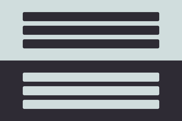
Contrast
Dramatic changes between elements can have significant effect within a hierarchy, such as color change. If one section within your page has a dark background and the next has a light background, it will separate the sections and elements within them and imply relative importance. Contrast can be a great and easy tool in identifying importance of information and developing hierarchy.
Color
Color is an interesting way to bring attention to various elements. You can use the absence or abundance of color to point attention toward something; use a bold color to make something stand out from among duller or pastel colors and vice versa (although making pastels stand out from bold ones will be harder to design). In order to get color right as a way to create hierarchy, you’ll simply have to experiment with color schemes to determine which stand out from one another.
With Pulsetic you’ll be instantly notified the moment your website, API, or server becomes unavailable. Monitor uptime from multiple global locations and respond to incidents before your users are affected.
Create beautiful status pages in minutes to keep customers informed during outages and build trust with transparent communication.
Start Monitoring for Free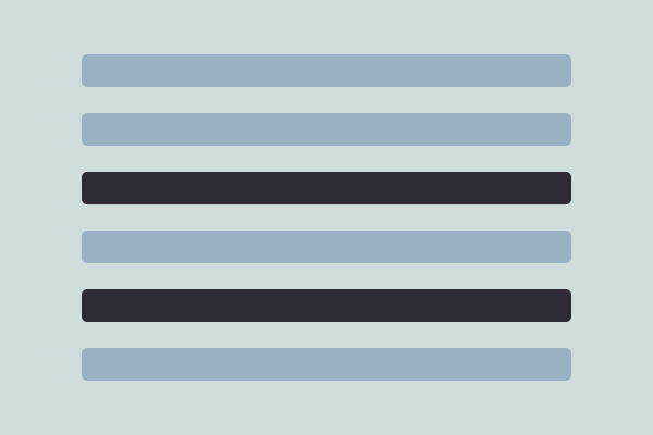
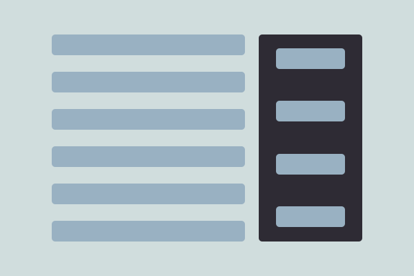
Proximity
Proximity can create separations as well as groupings of elements, which can be identified as sub hierarchies. Take for instance a typical blog post layout with old school sidebars in a typical WordPress blog. The sidebars had titles, headings and paragraphs of text all on their own. The placement of those elements helped identify them as a subgroup of the overall hierarchy of the page. The same is true for the blog post itself; text elements of a blog post are gathered together making it appear as its own entity with different headings, subheadings, etc.
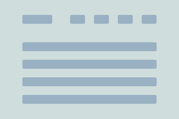
Alignment
Alignment or placement of elements can also signify importance. The best example of this is a stereotypical website where the most important information is perceived to be at the top left of a page. Therefore, items atop the page are also perceived to have higher importance – which is why you often see logos in the top left and navigation along the top. Use this to your advantage; use it to figure out how to strategically place information to emphasize more important over less important content.
Repetition
Repetition is a great tool to represent relative importance. Paragraphs within any design are a wonderful example of this. Within a newspaper, all of the paragraphs will be a certain size and color; the user sees a pattern that emphasizes equal importance. The same is true for headings or subheadings. This is why it’s so important to distinguish links within text; when it appears the same as the reminder of the text no one is going to think it’s a link because there are no visual clues to suggest otherwise.
Is That All?
Actually there are many other things which can affect the visual hierarchy such as shape or prominence. However, the six design principles above are key in helping you figure out what you can do to create hierarchy. In order to successfully communicate your message, you need to understand the basics of creating a visual hierarchy. So go experiment with various elements to see what resonates with visitors best.