Enthralling Website Designs featuring Interior and Exterior
There are certain category of sites that leverage all the charm, sophistication and artistry of architecture and traditional interior designs, and it’s not necessarily websites dedicated to interior design agencies, home improvement ideas or furniture-related e-shops that simply obliged to include this sort of visual data on the home page in order to instantly make clear idea behind a website.
There are plenty of other types of websites that incorporate pictures of interior and exterior in their designs in order to make it more individual, exhaustive, urban and unique. Ones of the brightest representatives are food-related establishments such as restaurants and original pubs, and the majority of hotels, benefits of which depend not only on service they offer but also on warm and intriguing environment. Also, such an approach is no stranger to different creative agencies that try to circumstantially convey the friendly atmosphere of the office, boasting about the organized and appealing workspace.
Today we take a closer look at websites that neatly and skillfully combine modern digital design tricks with aesthetics of interior and exterior.
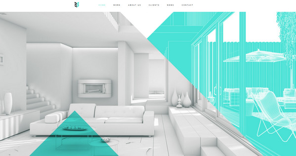
Case 3D gets the feel of cleanliness, purity and style mainly from predominant white color that is accompanied by blue semi-transparent layers and enthralling image of the interior.
Il Borgo Antico has strong natural and rustic vibe. Slightly darkened canvas, dark text widgets and white type wonderfully complement the rural background.
With Postcards Email Builder you can create and edit email templates online without any coding skills! Includes more than 100 components to help you create custom emails templates faster than ever before.
Free Email BuilderFree Email Templates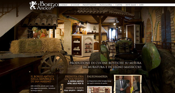
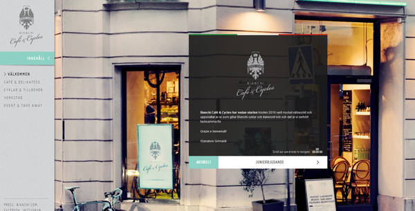
Bianchi looks sophisticated and urban due to properly chosen image background, light grey colors, elegant typography and neat see-through pop-up widgets.
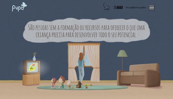
PUPA speaks entirely through high-detailed spectacular illustrations. Site is based on advanced vertical parallax and includes set of vivid interrelated artworks.
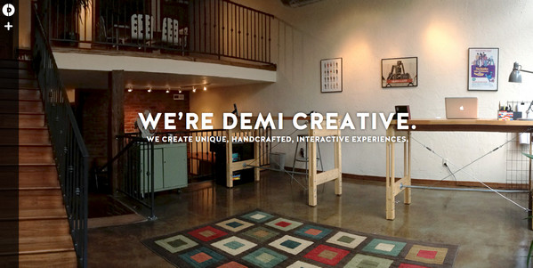
Demi Creative conveys a warm office experience. Landing page employs minimal style, including only huge image, bold distinctive tagline and hidden navigation.
Clean&Smart is another illustration-driven website that ably utilizes neat sketches. A lot of free space, two color scheme and outline doodle-style execution add to website originality and airiness.
With Startup App and Slides App you can build unlimited websites using the online website editor which includes ready-made designed and coded elements, templates and themes.
Try Startup App Try Slides AppOther Products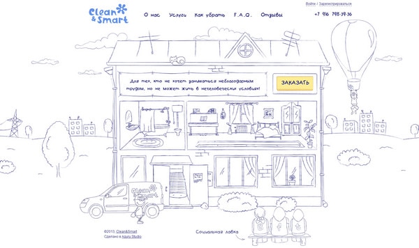
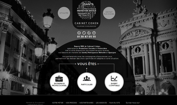
Cabinet Cohen has dark, slightly gloomy atmosphere with elegant feeling. Predominant dark colors in conjunction with harmonious injections of light circular elements and white font give website classic and pomposity touch.
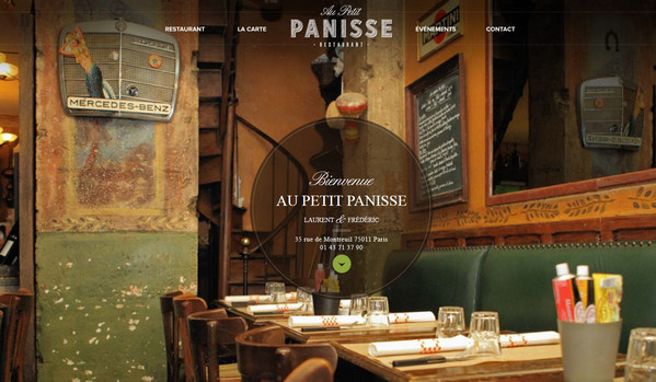
Au Petit Panisse leverages beautiful chalk typography, refined circular widgets and retro-themed image background.
Gasthaus “Zur Linde” includes picturesque welcome page, featuring comely facade of historical restaurant.
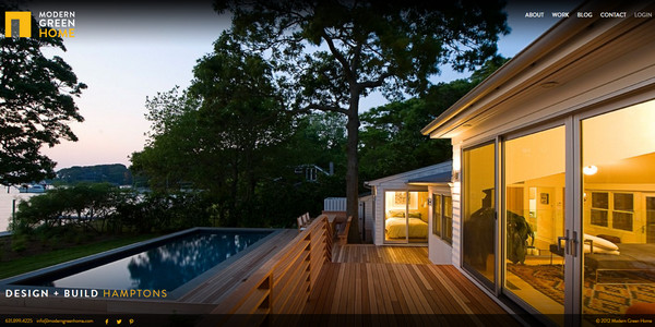
Modern Green Home embodies minimal style, showcasing full screen image background with couple of functional truly essential stuff, such as navigation, logo and social media, placed at the corners.
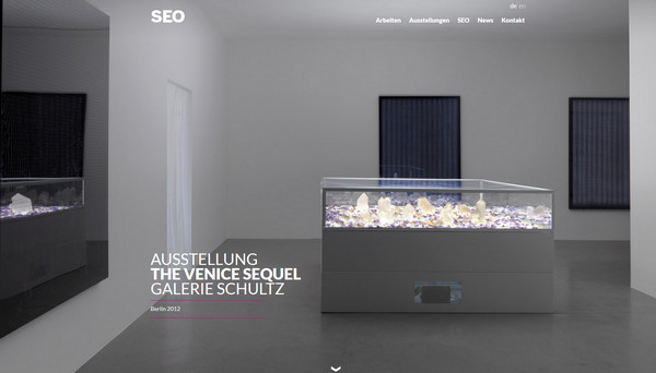
Art SEO utilizes light almost luminous image and white casual typography. Main page keeps things simple and organized.
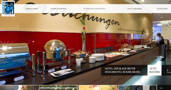
Hotel Der Blaue Reiter familiarizes onlookers both with interior and exterior by means of wide screen image slider. Designer beautifully adds integral controls, menu and titles, using transparency and flat style.
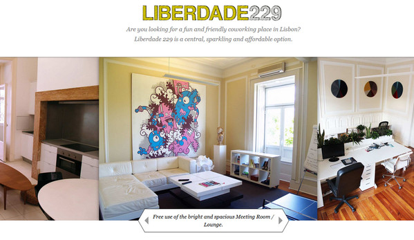
Liberdade 229 sheds a light on its creative office, demonstrating amiable working ambiance.
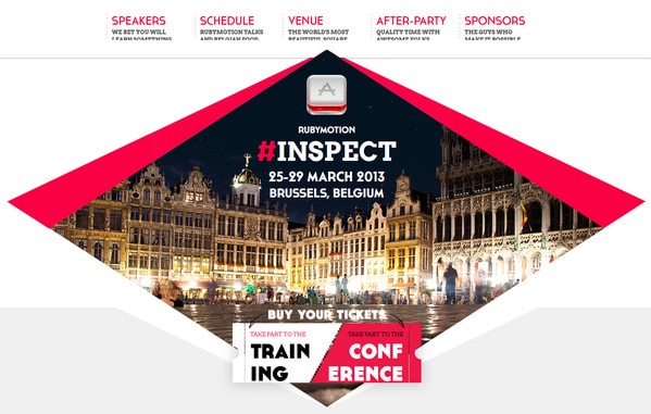
Inspect 2013 has intricate look and bright urban touch due to diamond-shaped key image, light airy background and vibrant scarlet color.
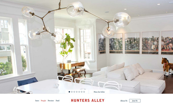
Hunters Alley naturally draws users’ attention by means of light, clean and neat appearance, which is composed of several aspects: bright huge image of a stylish room, white background and tiny typeface.
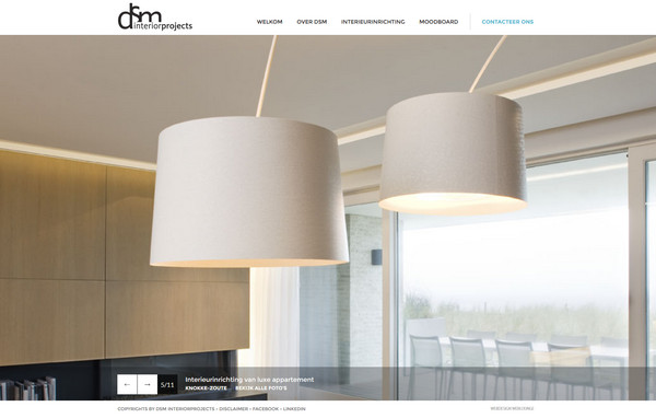
DSM Interior Projects nicely incorporates big image slider, easily drawing attention of onlookers to various fantastic interior projects.
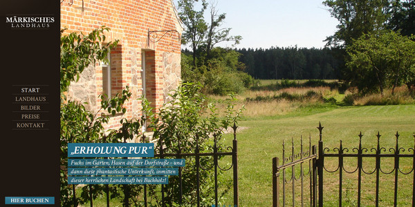
Maerkisches landhaus is one-page website that has static sidebar with all necessary navigating components. First page comprises full screen slideshow that exhibits images of comfort home environment.
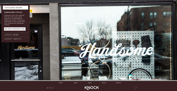
Knock Inc. has ably limited height of website, utilizing only the area of a screen. Home page is wonderfully supported by classic contrast between dark and white colors.
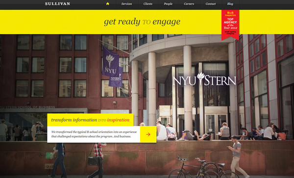
Sullivan NYC – Black and yellow stripes, placed on a spectacular urban background, look representative and potent. Relatively large slim type and diagonal pattern add extra flair.
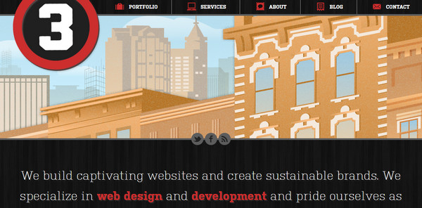
Raleigh Web Design&Development has colorful exterior-inspired header that gives website rather townish touch. Sharp white typography in conjunction with black solid background adds to website business-like appeal.
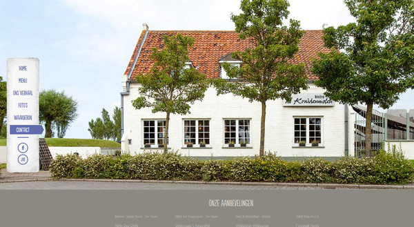
De Kruidenmolen makes contact section more comprehensive and specific by incorporating real image of building facade.
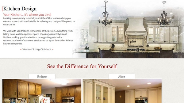
Platinum Kitchens and Designs capably brings a note of artistry and style, beautifully combining together kitchen design sketches with watercolor touch and shots of real design projects.
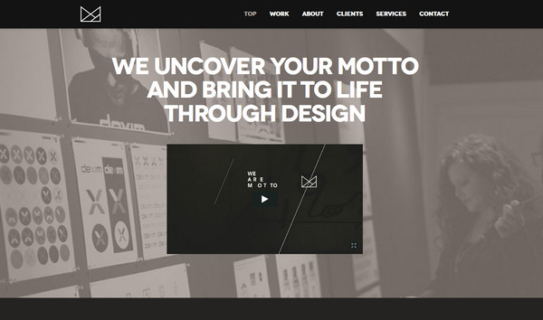
We are Motto relies on traditional and contrasty black and white color palette, utilizing only shades of these 2 basic colors. On the whole website has moderate and organized outward.
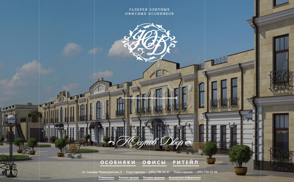
Usupov Dvor is photo-based website that includes a great deal of imposing and exquisite images of luxury mansions. Every section discloses its own set of pictures.
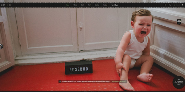
Rosebud welcomes users with truly emotional photo background. Transparent stripes, circular elements and ribbon-style menu splendidly fit into composition.
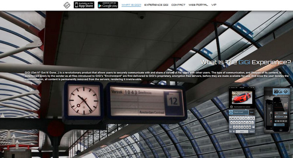
Gigi is another example in our collection that leverages full-screen photo background and capably embodies “less is more”. Home page includes only necessary information.
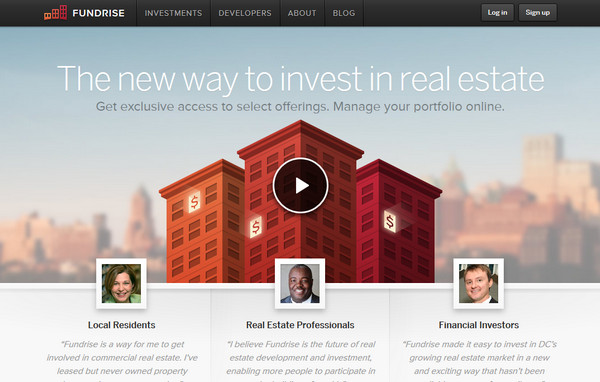
Fundrise wonderfully highlights idea behind a website, taking advantage of graphical and animation tools. Header depicts beautifully illustrated informative video.
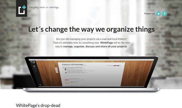
White Page tries to mimic organized and coordinated office environment by means of heavily blurred interior background and clear image of notebook on a foreground.
Reflection
Properly selected images of interior and exterior can add website some kind of personality, more closely familiarizing potential customers with establishment or agency itself, and making website more open, friendly, exhaustive and concrete. As a rule such designers prefer to leverage full screen high-detailed images, which are displayed on home pages, attracting arrivals by its spectacular and potent appearance.
How do you find websites that reflect the interior and exterior design direction? Do they look stylish and comprehensive? What example is able to make you stay and explore site?
We are looking forward to hearing from you.
