20 Websites that Prove Gradients are Making a Comeback
The era of flat design is starting to come to an end, maybe not all together but bit by bit. The biggest evidence of this is the new, up and coming trend of gradients. They are much more subtle than the gradients we used to see in web 2.0 era or after.
Let’s be honest, gradients are in again!
I’ve curated a list of 20 new website designs that feature gradients in one form or another. Some of them are pretty subtle, others are extremely vibrant; either way, gradients are a fun new way to spice up your designs.
VO2 Group
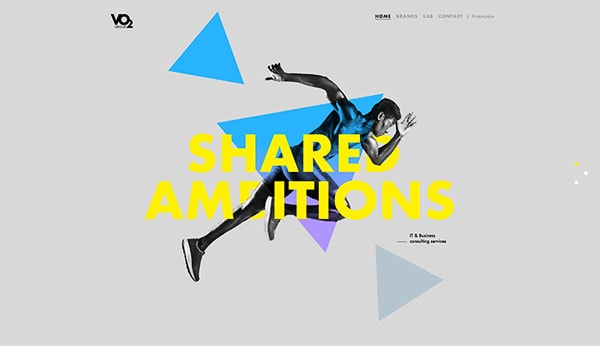
VO2’s new website greats you with atypical design, it’ has a bunch of different elements on top of each other. That’s knothole websites are made! It’s interesting and different. One of the background elements – which are triangles – showcases a slight gradient; it gives the simple triangular element more visual interest for sure.
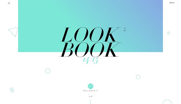
Melanie F – Look Book
With Postcards Email Builder you can create and edit email templates online without any coding skills! Includes more than 100 components to help you create custom emails templates faster than ever before.
Free Email BuilderFree Email TemplatesMelanie’s look book start of with a layout that’s becoming more and more popular among fashion sites where text is unaligned and on top of images. In this case the introductory text is on top of a square that’s used as the site’s header. The rectangular shape is filled with a green to purple gradient and it definitely helps to grab your attention.
Adoratorio
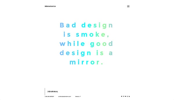
This design agency uses gradients in a different way where they colored a section’s text with a gradient. It’s pretty unique and look pretty cool. It is definitely a creative way to style your text and it works for them.
Qards
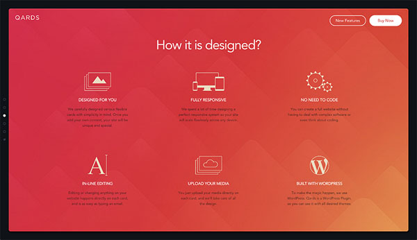
Even our own Designmodo’s Qard’s landing page demonstrates various gradients. Most of the different page sections different colored gradients as background. The one in the screenshot is redan orange, other include light to dark blue or green gradients. In action to the background pattern the gradient adds a unique touch to the website’s design.
Symodd
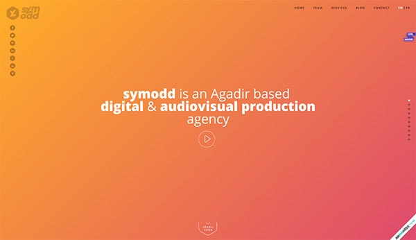
Symodd’s hero or introduction section features a full gradient background from orange to pink. It’s a more subtle gradient as the two hues aren’t too different from each other making this easy on the eyes.
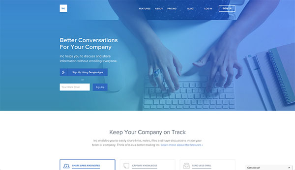
Inc
With Pulsetic you’ll be instantly notified the moment your website, API, or server becomes unavailable. Monitor uptime from multiple global locations and respond to incidents before your users are affected.
Create beautiful status pages in minutes to keep customers informed during outages and build trust with transparent communication.
Start Monitoring for FreeInc uses a gradient in their hero section as well. However, they use it slightly differently as they overlay the blue to purple gradient over a photo. The gradient here too isn’t too drastic as blue and purple are pretty similar hues so it works well when it’s placed over the photo.
Pho
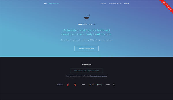
Here we have another blue to purple gradient. This example is much more on the muted side from the collection, but the two selected colors are pretty gorgeous – they are low in saturation but have good contrast making them pretty pleasing to look at!
Impossible Bureau

Impossible Bureau uses a very vivid and contrasting gradient on their page! The cool thing is that once the page is done loading other elements come over this gradient and only sections of it appear less drastic and dramatic.
Customeed
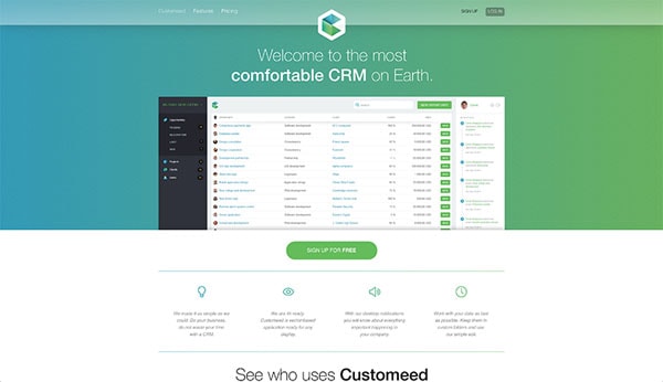
Customeed went with a green gradient which is significantly less common. For some reason, blue, purple or pink gradients are extremely popular. However, there is nothing wrong with a green gradient, it looks visually pleasing and work pretty well for Customeed’s website right here.
Webflow
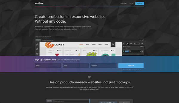
Webflow doesn’t make a big statement with their gradients – at least not compared to the other sites in this list. They use s small splash of pink to purple to blue gradient though out their home page. It’s a nice touch to have just small splashes of this exciting gradient combination here and there.
Product to Profit
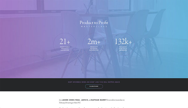
The gradient on this landing page is super light – look lightly washed out maybe. Either way, it does look pretty good because it doesn’t jump out at you very viciously. The light purple to light blue gradient over the photo work pretty well; it actually evoked a friendly vibe for the site.
Table Hero
Table Hero uses small bits of a friend through out their home page and by small bits, I mean tiny splashes here and there. There is a small gradient peeking through the 1px border button or through the very thin font face headlines. It’s an interesting way to integrate a gradient which adds depth and diversity to the design without going overboard gradient crazy.
GoGoRo
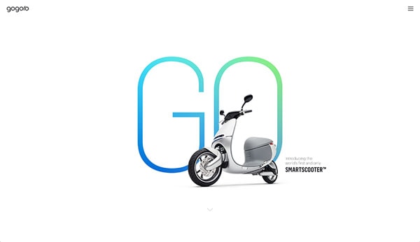
The hero short for GoGoRo is minimal, but definitely attention grabbing. There is nothing there, but big word ‘go’, a photo of the scooter and some small text. The word in itself is thin but because the letters are big in font size have some thickness to it. The designers behind this site took advantage of a fun blue to green gradient and planted it as the font’s color.
Segment
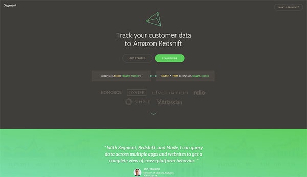
Segment has a darker design where it often uses dark gray background for full sections. However, to spice things up – or even to light things up – they use plenty of light, neon-like green to brighten up their design. The green gradient on some sections brings a lot of attention and adds flair into the design.
Mapbox
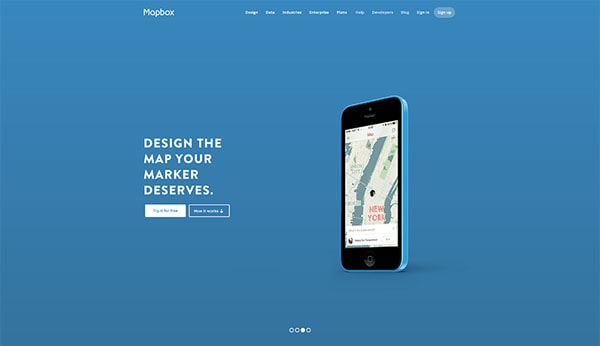
Mapbox has a great hero section when you enter their homepage. A few of their slides use a subtle gradient background to give depth and definition to their design.
Pitney Bowes
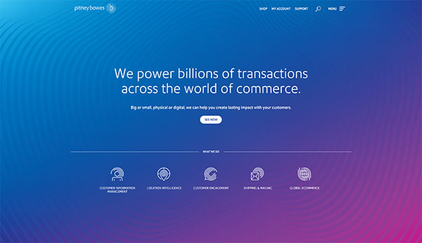
Here we have another example of boldness. The design of this website is pretty sleek, the white text on top of the mostly purple gradient look crisp. The text looks really good actually. The gradient is actually linear, but thanks to the rounded blue pattern on top of it, it appears to be slightly rounded thanks to the visual illusion. Pretty cool stuff, eh?
Stripe
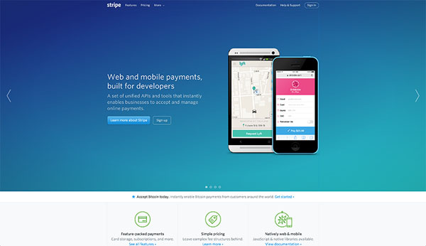
Stripe updated their site recently and they are using gradients! A few of their different hero slides include pretty great looking gradients like the first one you see in the screenshot. The dark, navy blue to green gradient is rich in hue and works really great as a dark background.
One John St
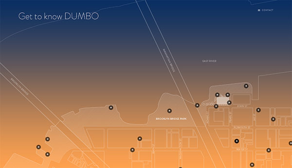
This is a landing page for an apartment complex in DUMBO, Brooklyn. The amazing thing about this website is that the gradient changes colors deepening on time of the day. It’s an interesting and fun feature included in this website’s design.
Wake
The last example shows off the more popular blue and purple gradient that’s all the hype now a days. The gradient can be seen throughout all of Wake’s website as it’ a bit part of their app’s branding.
Conclusion
As you can see gradients can be an interesting design decision; they help make these fun and exciting designs Happen. Overall, gradients are not bad – they never were – it’s just we got sick of them for being so extreme. Although some of these examples have big contrasts, others show off a softer side of things. I hope this list inspired you in your next design endeavors.


