Splendid Websites that Greet Users with Hello
Taglines, slogans and other welcome messages are one of the most common instruments of verbal communication with users in website design. They untiringly mark front pages and set the tone of the project. Although we are accustomed to images and videos are loud, a well-chosen phrase sometimes may “sound” more deafening and be more visually appealing.
From catchy slogans to banal utterance, there are tons of ways to convey that message. Today we are going to brainstorm online portfolios that prefer starting their dialogue with online visitors with the word “Hello.”
All in all, it helps to create a more friendly aesthetic, observes the rules of etiquette, adds positive emotions and makes the website more trustworthy and approachable. It plays a significant role in building strong relationships with users. All these possibilities are hidden in a one small word. Let’s take a look at some splendid examples.
Pixies Agency
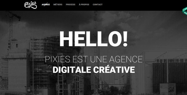
The website is grandiose. The front page skillfully balances a strong, dark urban scene and a well thought out combo of fonts in hard white. The welcoming message that begins with the bold word “Hello” ideally complements the theme.
Michael Villeneuve
With Postcards Email Builder you can create and edit email templates online without any coding skills! Includes more than 100 components to help you create custom emails templates faster than ever before.
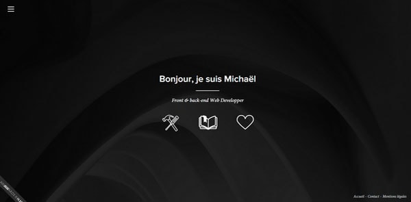
Free Email BuilderFree Email TemplatesUnlike the previous example, the home page of personal portfolio of Michael Villeneuve exudes an image of subtlety and elegance. Nifty contour icons, smooth ultra-narrow type, sleek abstract backdrop and welcoming phrase in French, which fits here like a glove, contribute to the overall aesthetics enormously.
Kalexiko
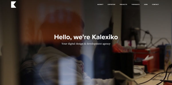
Kalexiko introduces themselves with a phrase that begins with “Hello.” A slightly blurred backdrop that depicts a workplace not only reinforces the message but also strengthens the businesslike atmosphere on the website.
Have You Met Janet
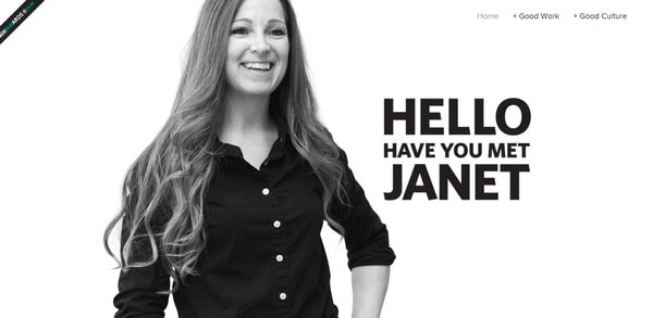
The landing page tries to build up friendly and lasting relationships with an online audience by implementing a human touch via a marvelous self-portrait and a pleasing welcoming message. The latter carries two connotations. The first is obvious, and the second implies omitting from the phrase from the second row in order to see it.
Daniel Spatzek
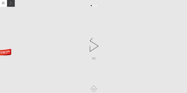
Daniel Spatzek opts for a more traditional route in terms of minimalism with a personal portfolio that has a splendid and modest appearance. Leaving the only informal greeting “Hi,” the artist does not overload the homepage with content and strengthens the minimalist design.
About Marco
With Pulsetic you’ll be instantly notified the moment your website, API, or server becomes unavailable. Monitor uptime from multiple global locations and respond to incidents before your users are affected.
Create beautiful status pages in minutes to keep customers informed during outages and build trust with transparent communication.
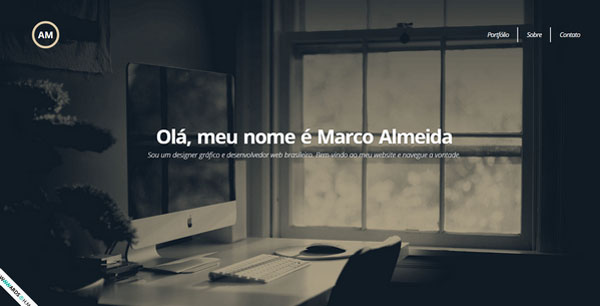
Start Monitoring for FreeSince the website presented in Portuguese, it is not surprising that the welcome message is in that language. Thanks to a darkened backdrop, the relatively bold soft white lettering stands out from the canvas and seizes attention in understated manner.
CK
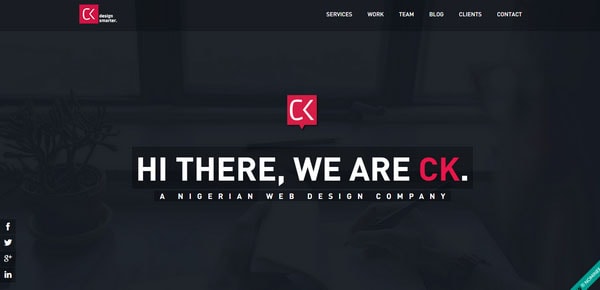
The formal greeting strikes the eye at once. With a pure dark solid color backdrop, absence of everything excessive, streamlined navigation bar, and social media block, it becomes apparent that the artist gives the phrase a center stage. The word “Hi” is an integral part of it.
Elespacio
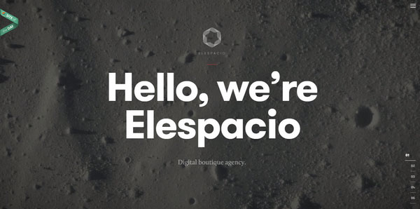
With its welcoming message, the team tries to maintain standards of decency. The formal phrase goes perfectly with the background and sleek graphics, and particular emphasis on the first statement highlights the value of the saying.
Studio Up
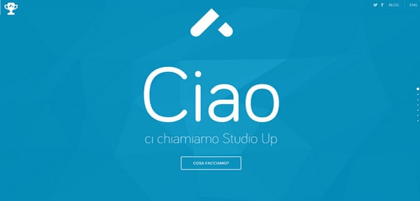
Studio Up is an Italian-based creative agency. So initially the website features an enormous greeting in Italian. However, if you feel more comfortable in the English environment then you can also switch to the international version with the word “Hello.”
Jacob Grubbe
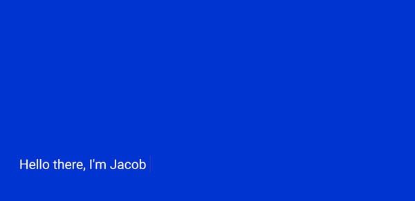
Jacob Grubbe has a fully interactive online portfolio, and in order to reveal what is hidden inside requires some action from the user. When you start typing, the first thing that you see is a salute message that greets users in a more formal fashion. Such a solution adds zest to the project.
Ahoy
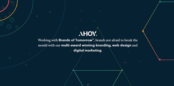
The artist adopts a modern solution to its front page and has populated it with some tiny, eye-catching dynamic elements that enrich the design. The welcome message begins with a non-standard “Ahoy” that ideally fits the offbeat composition and perfectly reinforces the theme.
Wearegoat
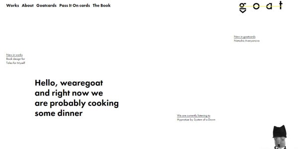
Wearegoat has a clean homepage with a series of welcome messages that are beautifully scattered throughout the entire page. The main statement is densely packed in a pure and open environment, and easily grabs attention and clearly conveys the meaning.
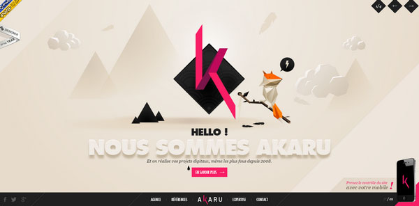
Akaru
Akaru keeps the focus of users’ attention on a statement that depicts the name of the agency. The word “Hello” plays a supportive role.
Jean-Baptiste Calzia
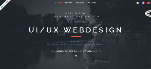
Much like the previous example, the artist unobtrusively stresses his occupation but does not lose sight of the greeting. Although it is made in an ultra-narrow type that slightly falls into the backdrop, it still commands view.
Boy-Coy
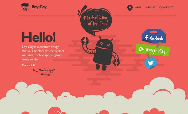
Boy-Coy has a lot of stuff to look at so that the regular user can get lost. However, the artist manages to highlight key features such as social media, the mascot with a tagline, and of course, a welcome message that strikes the eye with its relatively large and bold “Hello.”
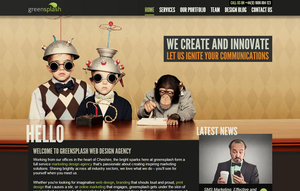
Green Splash
The Green Splash design has a marvelous retro vibe. Although the spectacular and catching image backdrop grabs the biggest piece of the pie, several text blocks refer to public awareness, and the word “Hello” is one of them.
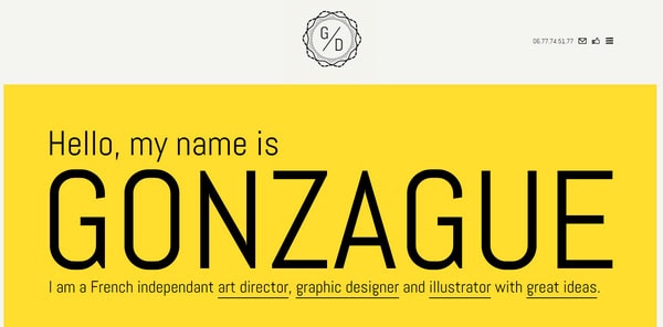
Getgonz
The artist intentionally focuses user attention on his name and sphere of expertise trying to win over potential customers right away. The central phrase naturally comes into sight since the designer wisely ditched a more image-based backdrop and accompanying graphics.
Work
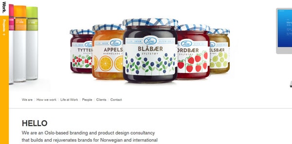
Here, the works play the first fiddle, taking up the central stage of the header. Nevertheless, after examining the whole range of portfolio pieces the first thing that comes into focus is “Hello,” that capably lightens the atmosphere.
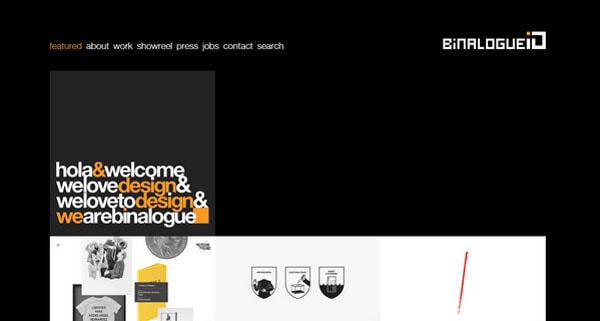
Binalogue
Binalogue features a tightly packed greeting that blends with the unique arrangement of blocks. The designer succeeded in placing emphasis on necessary words through choosing the other color and delighting users with two polite words “Hola” and “Welcome.”
RWS&Z
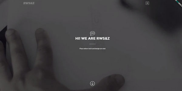
RWS&Z displays a short and concise phrase that appeals to the target market, improves the general feeling of the website and enhances the minimalist solution. Welcoming visitors in a respectful and considerate way is a great plus for this company.
Conclusion
“Hello” comes with an unmistakable and distinctive human touch that is sought-after for the majority of sophisticated website designs populated with artificial stuff. This tiny detail can enormously liven up the general feeling and increase the overall effect.
