16 Websites with Gorgeous Typography
Often we show off websites with great typography or just great websites in general. This time around, I wanted to create a slightly different list. Here is a list of 16 gorgeous websites that also happen to have gorgeous typography.
Whether you’re looking for website or typographical inspiration, this list has you covered!
Creative
Jun Duffy
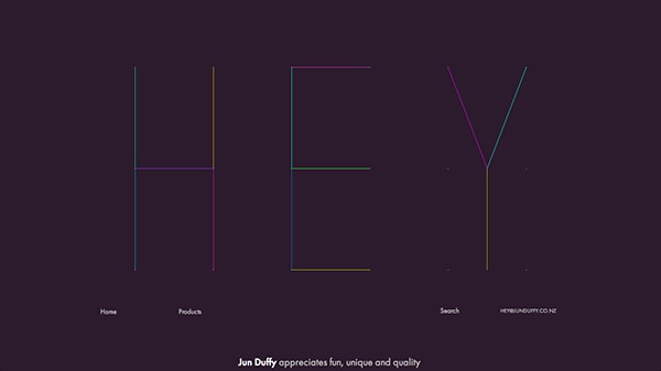
A fashion retailer with an extremely creative website. The sleek typography atop the website that says “Hey Yall” is presented in a unique way. The lines are super thin and are divided into colorful segments. The thin lines are also seen further down the page as you scroll down. The website is colorful and creative too; it’s not just the typography.
Missy Mary’s Mix
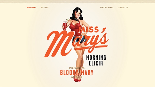
Miss Mary’s is a bloody mary recipe with a lovely and creative landing page. The typography and graphics on the website are classic in a pin up style. They do, of course, look modern rather then outdated thanks to the wonderful art direction present within the website design. The fancy script typography works extremely well within this website’s design and style.
With Postcards Email Builder you can create and edit email templates online without any coding skills! Includes more than 100 components to help you create custom emails templates faster than ever before.
Free Email BuilderFree Email TemplatesSimple and Clean
Mod
Mod’s landing page is clean and extremely well presented. And so is the typography throughout the page. The slim Avenir font family works well; it looks good as a heading and as a paragraph. Using a thin font weight was a good idea. For a long landing page there is little text yet the text itself looks really good.
Jason James
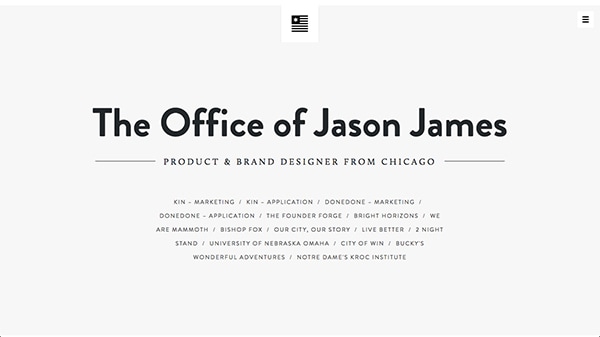
Jason James’s online portfolio is extremely long but also filled with amazing portfolio pieces. The intro section at the very top is all typography and it looks good. The mixed types work well and the gray, white and navy hues do too. Overall, this section is inviting and exciting because when you take a look at the amount of work Jason has under his belt you just must check something out.
1910
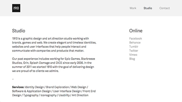
1910 is a graphic design studio with a very minimal styled portfolio. It uses simple black and white shadows as hues and ample of white space to create a professional, yet light, feeling. The typography is well picked, too. The fonts look crisp and are legible without a doubt. This type of typography is well selected for the minimalistic style of the website.
Pleasant and Fun
Cultivated Wit
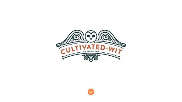
This creative agency’s website is definitely something else. Like their name suggests, the website is witty and fun. The logo is different because most websites don’t show off a logo front and center only. But it works, the logo has great typography but so does the rest of the website as you scroll through it.
With Pulsetic you’ll be instantly notified the moment your website, API, or server becomes unavailable. Monitor uptime from multiple global locations and respond to incidents before your users are affected.
Create beautiful status pages in minutes to keep customers informed during outages and build trust with transparent communication.
Start Monitoring for FreeFranz Sans
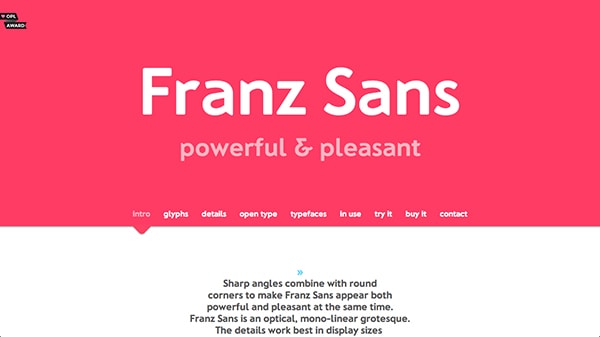
Franz Sans is a font with it’s own landing page. The whole page has amazingly fun colors. Mona Franz created the font and you can see her personality peek through her landing page design and the font itself too. The typography on this page helps make the experience significantly better. Okay fine, the font makes the page. (But the colors help!)
Donguri Music
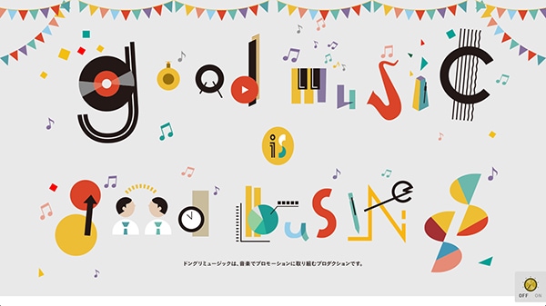
For a music production company this is one great website. They are obviously a bunch of fun and quirky people who love what they do. The introduction to their website has this absolutely amazing slogan that is made up of colorful moving shapes. It’s definitely something else but it shows such good energy. The incorporation of music into this typographical slogan is a nice touch, to say the least.
Bold
Bethany Heck
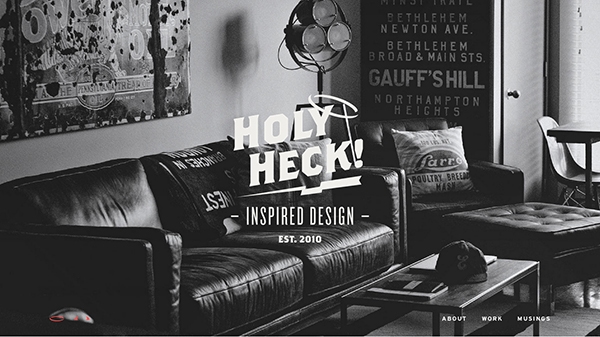
Bethany Heck’s portfolio’s home page is gorgeous for sure. The typography is spectacular when you first enter it. It’s funny and personable too – because it puns off her name. Yes, the font weight is heavy but that is only one aspect of the page. As you scroll the design is implemented with bold color choices, blocks and photographs. The typography there too is on the heavy side. All in all, the design is amazing and so is the type.
Pat Kay
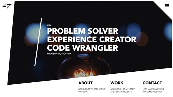
Here we have another creative portfolio. Pat’s home page is certainty bold. The typography is heavy weight; the shapes used within the design are irregular which adds interest. Yet, these shapes are still grand. The links are big and obvious just like the navigation icon. Actually, this is a pretty simple design but due to the grand elements like the typography the portfolio doesn’t come off so simple after all.
Oven Bits
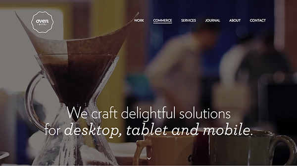
What I mean by bold doesn’t necessary have to mean thick fonts. Here is an agency portfolio with bold typography because their font size is enormous while their font weight is significantly thinner. They also use big design elements like big rectangles or squares that further create the feeling of grandeur.
Thick and Thin
Teehan and Lax
When it comes to showing off case studies the designers at Teehan and Lax know what they are doing. They are masters of storytelling. The typography is often intertwined into their stories but not always. At least they use magnificent thicker headlines in addition to the smaller and thinner paragraphs. At best they create custom written characters that simply look stunning. However, in terms of mixing thin and smaller with thick and bigger fonts, this design team knows what they are doing.
Red Antler
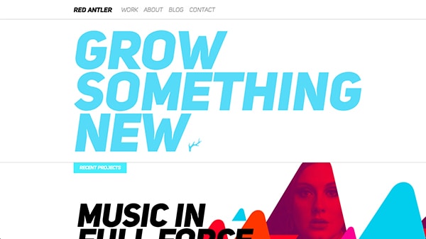
When it comes to combining thick and think fonts Red Antler’s website is a gold mine. They use obnoxiously big headings with thick font weight against think and tiny subheadings. The juxtaposition is well executed and looks so good.
Antro
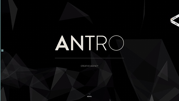
Another creative agency who knows how to mix and combine fonts and typefaces. The intro of the websites spells out their name with each letter being thinner weight. As you scroll down you see larger and thicker headings combined with smaller and thinner paragraphs. And, on top of this, their website is so well designed!
Sleek
Elevate App
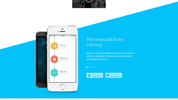
When you first take a look at the website it comes of minimalistic but through the use of great colors and well chosen typography it’s actually pretty elegant. The contrast of white against blue, and the thin sans serif make for an elegant look and feel.
Aria Studio
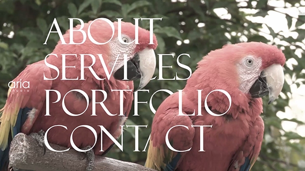
Aria Studio’s home page is their navigation. There are four different, but very large links. The lettering looks so good and crisp. The typography is fluid as the navigation resizes based on your screen size. However, the slim serif font in the crisp white looks exceptionally good against the various vivid video backgrounds.
Can You Add a Page?
Do you have a website you’d like to share that is beautiful and has beautiful typography too? Add a link in the comments.


