Best Website Designs of 2014
As we begin wave goodbye to 2014, it’s a good time to look back on some of the great design this year has had to offer. Many of the trends of 2014 showed up in the best websites designs (and redesigns) out there.
Web designers took time to focus on design trends – flat and almost-flat were still big, minimalism, parallax and video sites were also popular. Another key component of good design is the inclusion of mobile and responsive design plans and usability. What good is a website if any user on any device can’t access it.
So here are 20 of the best websites of 2014, and why they earned consideration. Each of these sites has been featured in the Awwwards gallery this year. Make sure to visit the site regularly to be inspired by great design happening every day.
Website Designs Examples of 2014
The Capitol
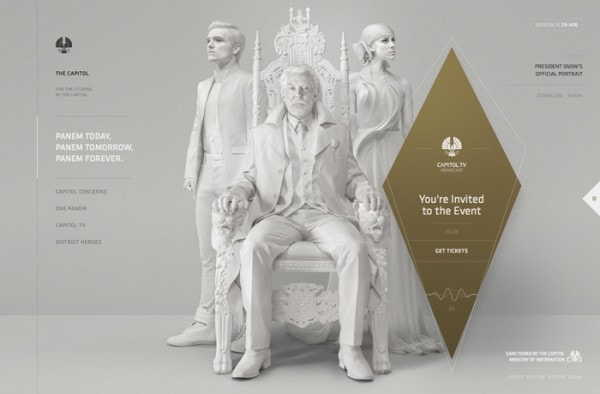
Based on the blockbuster movie for The Hunger Games series, this website features a stark look and feel that matches the tone of the film. It includes a simple style with bold type and a simple color palette with plenty of parallax scrolling features. The site makes you feel like you are part of the action of the movie with messages, videos and other content.
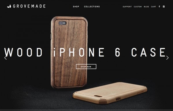
Grovemade
With Postcards Email Builder you can create and edit email templates online without any coding skills! Includes more than 100 components to help you create custom emails templates faster than ever before.
Free Email BuilderFree Email TemplatesThis might just be one of the most stylish sites of the year, combining quite a few trends in a way that just works. The site is built around full-screen hero images. Simple white type helps you understand the message and each button uses the ghost style. After he main screen, the rest of the site it rather stark with images against a white background with few embellishments.
Sokruta
Big, bold images with simple navigation and a puzzle-style slider. Those are the tricks that make this site so visually appealing. There are also plenty of extras as well: Hover over the buttons for a fun effect or pop out the nav on the left side of the page.
Huge Inc.
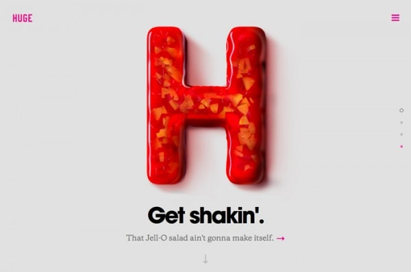
Everything about this simple site design is just done well. From brand connection to space to great typography, Huge nailed it. The parallax scrolling features create perfect “pages” between elements and the navigation is phenomenal. (It pops out to cover the entire screen.)
I Remember
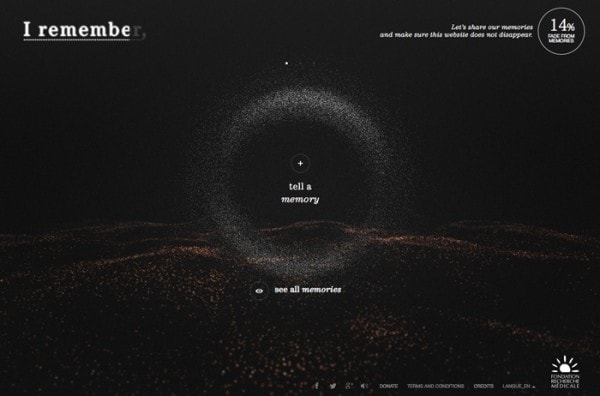
Built as a project to raise awareness about how Alzheimer’s disease impacts the brain, this site is visually intriguing and quite interactive. The stark black coloring helps create the right tone for the site while the little lights are “glimmers of hope” as you learn about lost memories from the illness.
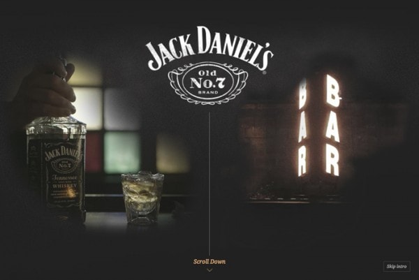
Jack Daniel’s Bar Stories
With Startup App and Slides App you can build unlimited websites using the online website editor which includes ready-made designed and coded elements, templates and themes.
Try Startup App Try Slides AppOther ProductsOn of the big trends of the year that may be harder to see is that websites are more and more trying to tell you a story. That’s what this site aims to do by creating brand and personal connections. The imagery and typography are a fun combination with simple buttons and a unique style.
Quay
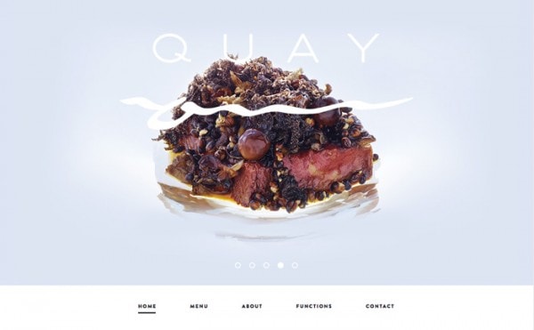
Minimal design has never been more beautiful. Quay restaurant uses beautiful photography with a simple backdrop to entice customers. The full-screen slider is perfect, load quickly and paces well and the navigation is dropped to the bottom of the screen for a better, page-style experience. (With a scroll, the navigation then locks to the top.) The website design exudes class and sophistication.
Sortie En Mer
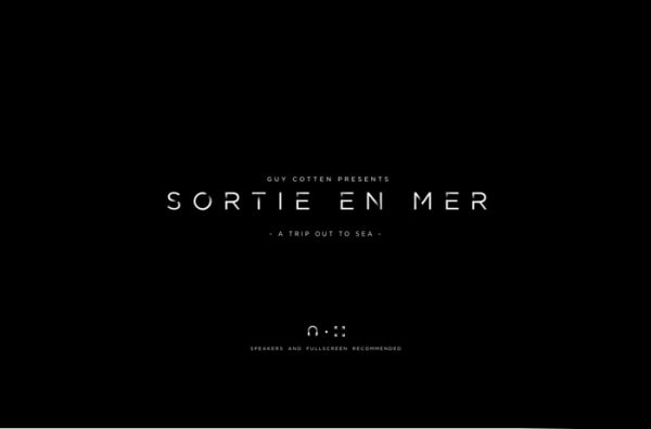
Video experiences were one of the biggest web design rends of 2014 and this site uses that well. The websites opens with a video – almost like you are in a movie – and then you can make choices with your mouse to impact how the film plays out. The site and effects are stunning and make for an experience that few other sites can claim.
A Spacecraft for All
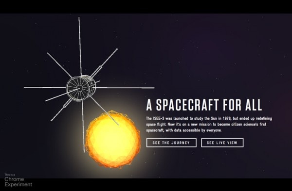
Built as a Chrome experiment, this website takes you through the course of the ISEE-3 spacecraft. You can view a live image of where it is currently or watch a video of the craft’s past flights and mission. It’s a site that has a simple and modern design and encourages interactivity.
Super Looper
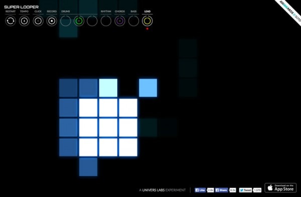
This fun game lets you create music and shows it visually. It usable, fun and addictive. Plus the bright color choices against a dark background make it even more visually engaging.
Jam3
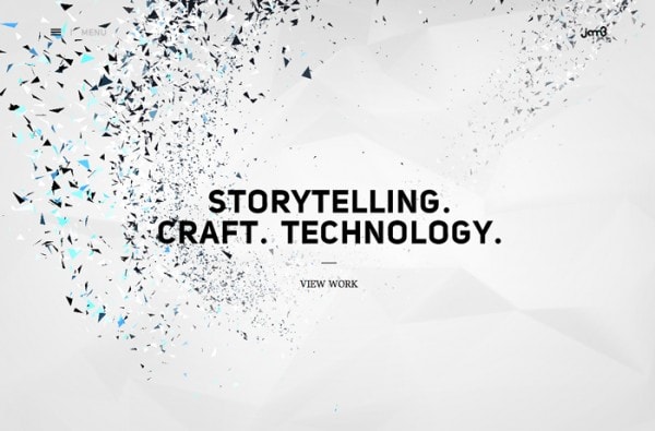
Another site packed with animated and video effects, Jam3 includes a simple homepage and nice effects for clickable elements throughout the site. Designed in a more minimal style, the site uses photos well against a white backdrop with hover effects for usability.
A Journey Through Middle-Earth
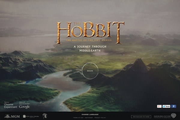
Website design for movies has become quite impressive in recent months (and in particular the last two years), and the site for the recent “The Hobbit” film is no exception. With nice typography overlays on still and moving images, the experience is game-like and interactive.
MashVP
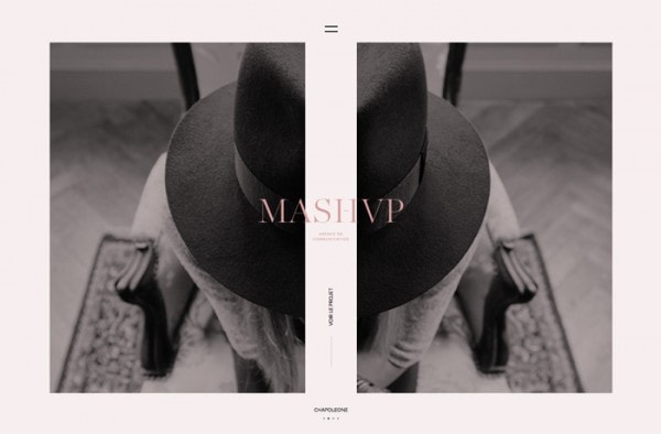
This site screams simplicity. But it has a twist with photos that are paired to make a single image and scrolling effects to see other images. Click into the navigation for a full-screen video that shows you more about the agency.
Over the Hills
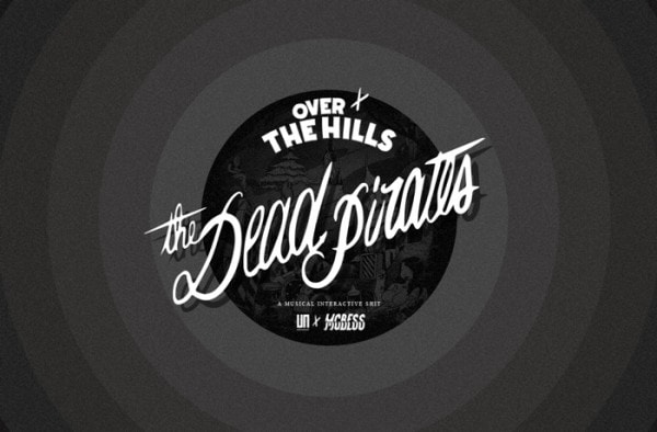
There are so many features on this site that you could spend a day with it. From animation and video to a full musical experience, you will want to play on this site. The design is equally nice with stark features in all black and white.
Twofold
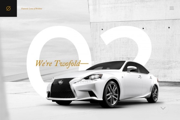
The agency site embodies the idea of minimal, but adds touches of sophistication. Gold coloring and the blinking lights on the homepage, for example, give the stark nature of the site something extra. Nice animation effects for images on scroll add to this feel. A site like this works best with little touches of the unexpected.
Leodis
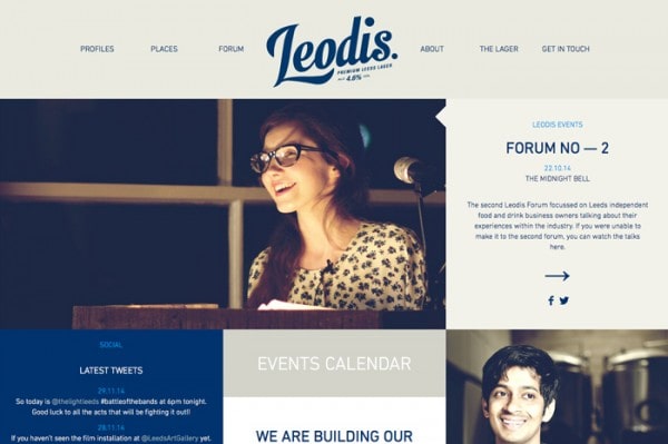
This site really takes concepts of flat design and then takes it to another level. Beautiful simple photography in flat blocks with simple typography is simple and engaging. What makes it so different is the color palette, which completely breaks the idea of “flat colors.” The site also plays of up social media style and showcasing with image shapes and toning that resemble the popular social sharing platform, Instagram.
Valerie Martinez Agency
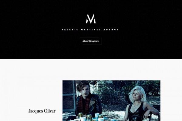
While this site may appear simple on its face, it is full of hidden gems. In the header, there’s a ghost button (super trendy) and each of the image animates to help you click through. The opening animation on the load screen is equally impressive – it almost went away too quickly.
Volkswagen
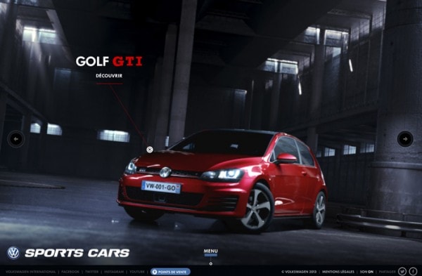
Set up in a movie-trailer or video-game style format, this website lets you play with a sports car as a sales tool. What really makes this site work is the meshing of textured backgrounds and super-sharp photography. The design team also used super simple typefaces to make the smaller words easy to read and follow.
Your Local Studio
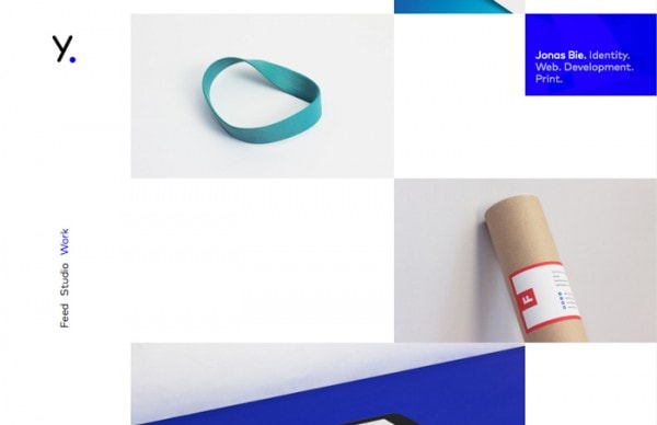
The fun mix of minimal style, simple photos and little user elements make for an engaging site. The blue, flat-style pop-up menus over each photo create a fun juxtaposition between flat design and the realism in each photo.
Ba Ba Dum
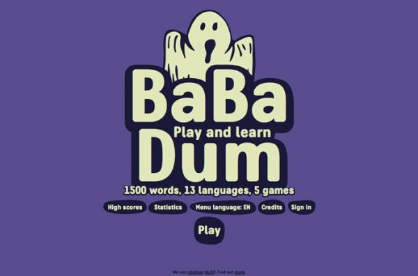
Website gamification is still going strong and this site proves that games can look fun and teach you something. The game style uses illustrations and bright color to guide you through learning simple words in a variety of languages.
Conclusion
There are too many new websites each year to even list them all here.
Is there a site you love that missed this list? Share it with us in the comments and make sure to include why you like it so much.


