Get a bit closer Showcase of Big Faces in Website Design
Every day we stumble upon marvelous websites that overwhelm us by creative truly unique designs, wonderfully incorporated animations and high-level technical side. However, generally the majority of them remain impersonal and we don’t have a clue who is responsible for these sophisticated realizations.
Certainly, not every site requires mandatory personalization but if we are talking about personal blogs, online portfolios, different types of agencies that are aimed to direct interaction with the simple users or customers on the other side of a screen such sections as “about me” or “team” are compulsory. In most cases these pages do their job of brief familiarization well, but if you want to make your online presence more open and site more friendly it will be better to introduce yourself visually, providing your users with photo or illustrated portrait of yourself.
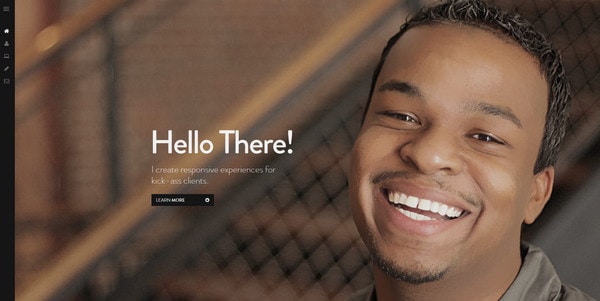
Furthermore, properly chosen image also helps to incorporate emotions into your site, evoking positive reactions. For example, if you take a look at our first sample you won’t keep from smiling. Such buoyant and optimistic face definitely adds to a website prepossessing appearance.
Today we have collected examples of big faces in website designs that are used to introduce staff, win over people, or just simply add a human touch that is really welcome in a world of the endless net of scripts and digital designs.
Examples of Big Faces in Web Design
Nathaniel Deal radiates warmth and hospitality that is achieved by means of only one big smile and small regular greeting.
With Postcards Email Builder you can create and edit email templates online without any coding skills! Includes more than 100 components to help you create custom emails templates faster than ever before.
Free Email BuilderFree Email TemplatesEdita’s Casting uses an extraordinary approach of presenting team members through a play, giving an opportunity to create different funny facial combinations.
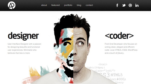
Adham Dannaway graphically and distinctly shows his main lines of activity, dividing its face into 2 parts and making one of them fully illustrated in order to reveal creative nature.
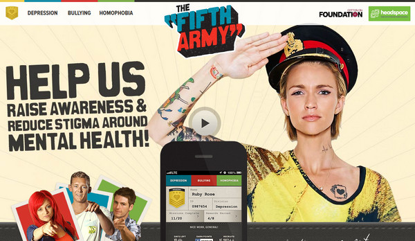
The Fifth Army has an unconventional retro atmosphere, in which human photo is harmoniously supplemented by typography and light-textured background.
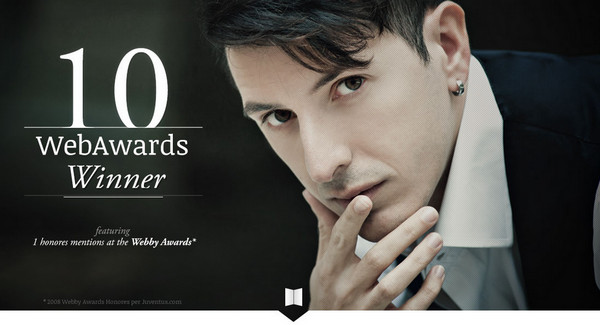
Simone Favarin features traditional horizontal stripe layout, where first, rather wide, line is reserved for a welcome section with an image of a man who creates award-winning sites.
Perspectif leverages face image as a tool for communicating couple of aspects, such as main specialty – creation of realistic 3-dimensional projects, and, of course, an awe-effect from a final result.
With Pulsetic you’ll be instantly notified the moment your website, API, or server becomes unavailable. Monitor uptime from multiple global locations and respond to incidents before your users are affected.
Create beautiful status pages in minutes to keep customers informed during outages and build trust with transparent communication.
Start Monitoring for Free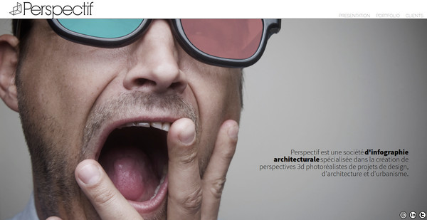
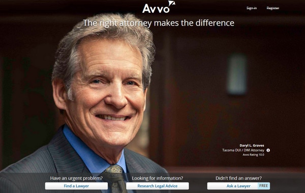
Avvo has a rather simple homepage that contains only several necessary components: photo background, which exudes an image of trust and proficiency, and essential search form with a good tagline.
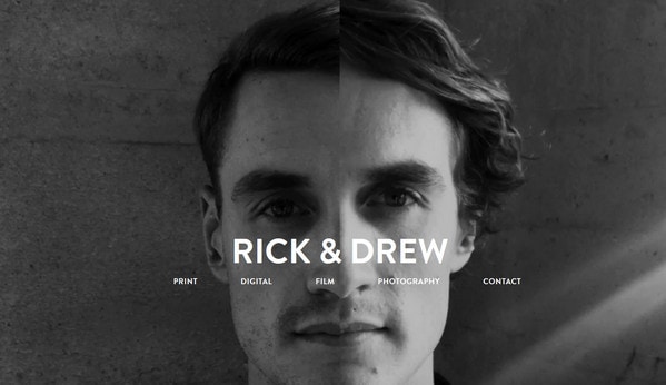
Rick and Drew beautifully merges 2 faces into one in order to show 2 separate but major staff members simultaneously, and make it clear that they are working as a unit.
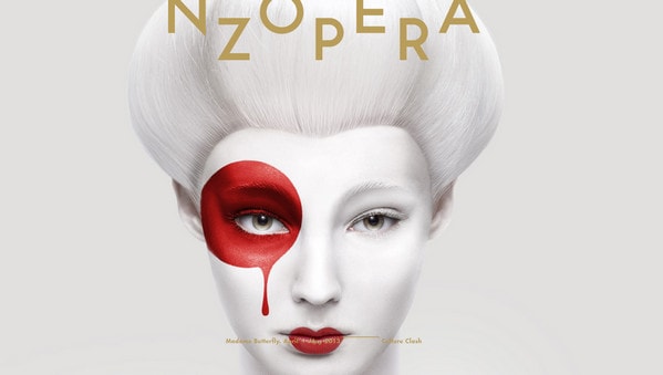
Opera Returns exudes an image of purity and beauty, featuring ingenious picture of a woman with spellbinding bicolor makeup and light clean background.
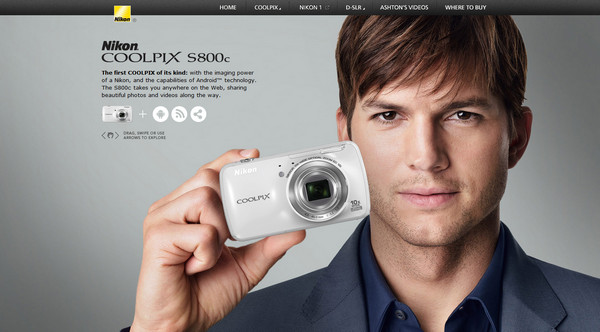
Nikon USA utilizes good time-tasted method of leveraging faces of famous people in order to inspire confidence in regular customers.
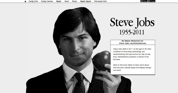
Rememberum is an amazing online memorial for Steve Jobs, featuring master himself. Website is made in grayscale mode with a bunch of user interface elements that are inherent to old computers.
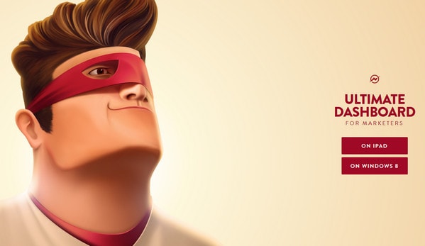
Mobile Dashboard for Marketers is a cartoon driven landing page with cheerful superhero illustration which looks simply wonderful.
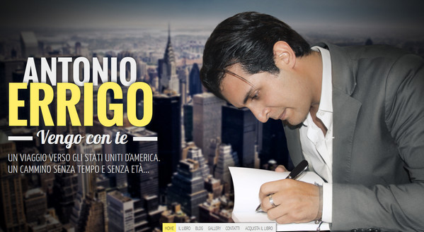
Antonio Errigo has an urban vibe with a slightly blurred cosmopolitan photo background, bold distinct typography and an image of serious man behind a work on a foreground.
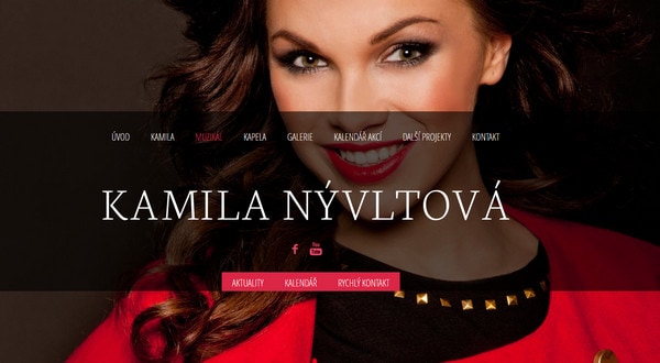
Kamila Nyvltova showcases her photo portfolio by dint of full screen slider that reveals true emotions of models.
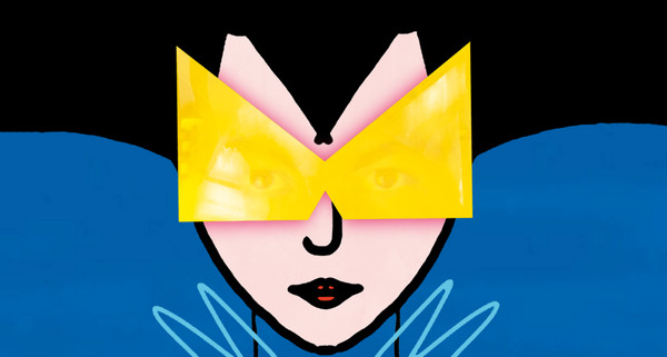
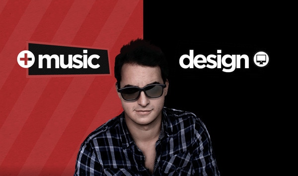
Labo M Music is another good example in our collection of applying illustrated huge face, which fascinates users by its harmonious combination of simple shapes, bright colors and thick lines.
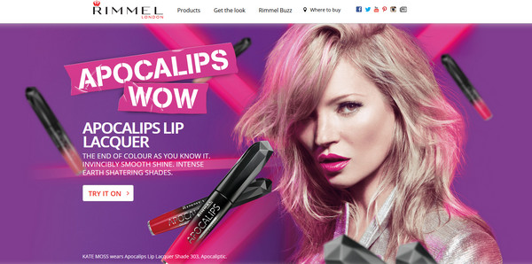
Rimmel London UK recreates a feeling of depth perception and perspective due to clear human image on a background and several slightly blurred pictured mascaras that are scattered throughout the design.
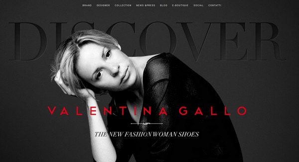
Valentina Gallo has dark but truly sophisticated website design; her black-and-white portrait goes perfectly well with composition.
L’Experience beaute urbaine features amazing female face image that is split into 2 parts. First one has washed-out colors, and second one is vice versa saturated with natural colors. In this way designer wants to promote cosmetic products that help every women to stand out from a “grey mass”.
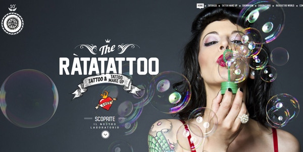
Ratatattoo recreates necessary atmosphere of online tattoo salon by means of specific type, grunge decorations and vivid image of frisky and blithesome person.
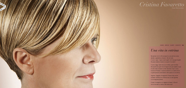
Cristina Favaretto skillfully utilizes space of single-page website, tightly packing essential information and her image.
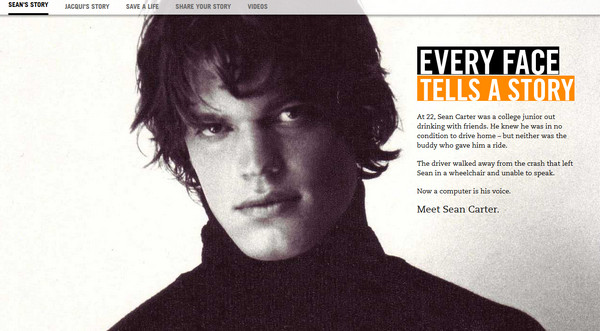
Faces of Drunk Driving is a really serious website that is aimed to raise awareness of drunk people on the roads and its horrendous outcomes by showcasing people who has been already affected by this problem.
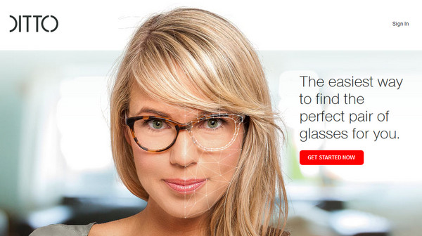
Ditto has a traditional business-like layout that uses facial image in a header in order to easily draw attention to merchandise and its basic utilization.
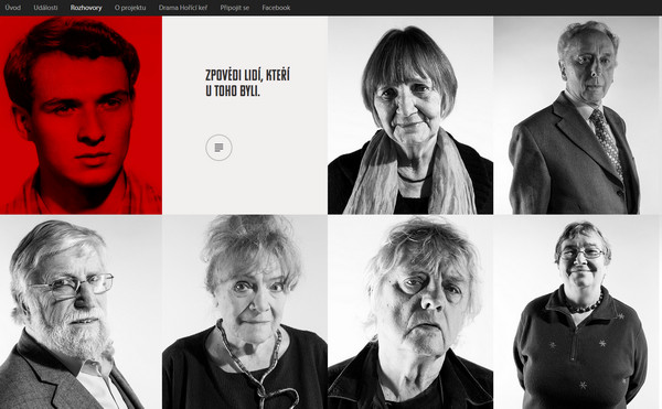
Rozhovory is a standard grid-based website with cells filled with achromatic facial images of different people. Each picture leads to corresponding biography.
Das Pinke Zimmer is truly unconventional online store with vertical parallax effect and a great deal of zingy retro-styled images.
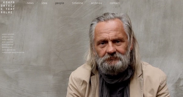
Konfrontacje incorporates magnificent video background that features an aged person who stares at you and it seems like he is going to talk to you.
Juan Mora is another nonstandard take on graphically showcasing versatile nature of creative people. In this instance, designer decided to divide background into 2 parts, supplying each one with specific color, icon and title.
Reflection
One of the main reasons of using big faces as well as other people images is to add a feeling of authenticity. Such websites are considered to more likeable inspire confidence in potential clients. Obvious allusion to the individuality is definitely set your site apart from your faceless competitors.
What do you think about adding a human touch? Is it really necessary for certain group of sites? Or emotional component, which is often hidden in people photos – is not so important in establishing good relationships?


