How Changing the UX 180 Degrees Made Grew Sales By 180%
Were you ever asked to fully change the experience and UI of a product that is used by more than 3 million people? Well, it happened to me.
Let me tell you my story and the journey of the 180-degree change of Bannersnack.
Have you heard about Bannersnack?
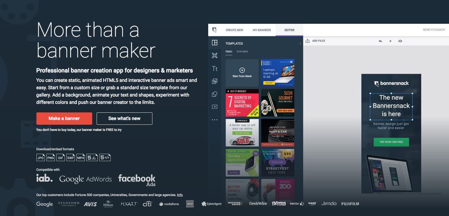
If you are one of our users, skip to the next section. If you don’t know what Bannersnack is, take a minute and check it out. Bannersnack is the leading banner making tool for creating static and animated HTML5 banners, Flash and various social media banners, all from one place. Find out more here, or keep reading to find out the whole story about the redesign.
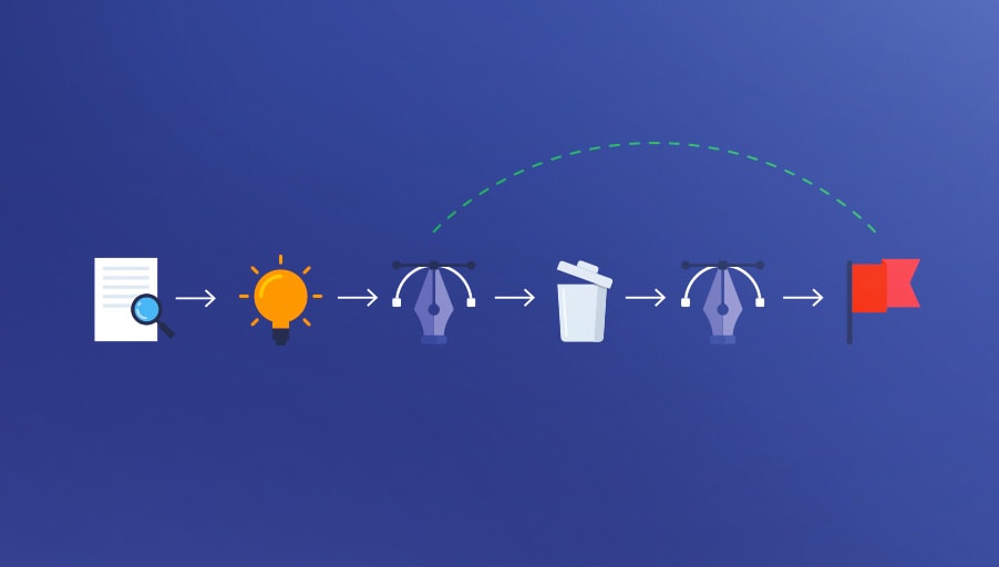
Evolving Vision: Make the Design Process as Simple and Short as Possible
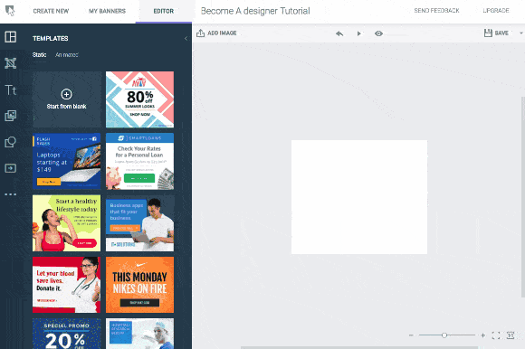
(The Evolving Vision – Banner creation process with the new Bannersnack)
With Postcards Email Builder you can create and edit email templates online without any coding skills! Includes more than 100 components to help you create custom emails templates faster than ever before.
Free Email BuilderFree Email TemplatesToday’s world is changing fast, but the digital world is changing even faster.
More and more often, we see well-established brands, apps and services changing and adapting their look and communication frequently. Technology evolves at an astonishing speed. People want to do more things faster and they need tools that can make their lives easier.
Bannersnack began its journey in 2008, the culminating era of Flash banners. It was launched as the banner making app that helps you build flash banners within a couple of minutes. It was an extraordinary achievement and a revolutionary product, compared to other similar software.
Now, as flash is dying, our attention shifts from Flash to HTML5 banners; more and more static banners are created daily and the appearance of social media has blown away everything we learned about banner design.
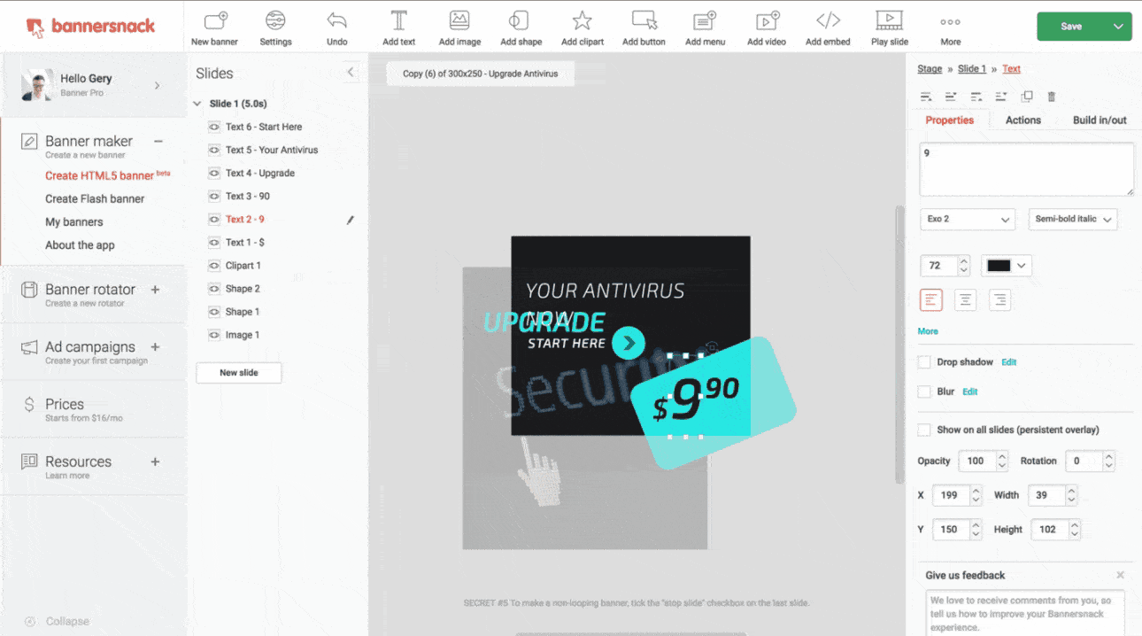
(Old Bannersnack vs New Bannersnack – Snapshots)
With all of this happening, Bannersnack in 2015 still looked and felt almost the same as it did in 2008. Of course, along the way we’ve worked on over 50 major features and changed our website three times, but our buttons suffered from web 2.0 and other crazy design trends.
Constant improvements were made to the app, but our user interface, navigation and user flow, and the whole creation process was the same. It was amazingly well designed for 2008, but too complicated for 2016.
With Startup App and Slides App you can build unlimited websites using the online website editor which includes ready-made designed and coded elements, templates and themes.
Try Startup App Try Slides AppOther ProductsOne day I was asked “Hey Gery, how much time would you need to design our new UI? Four weeks is enough, right?” Oh! believe me, no designer wants to hear a question asked this way. Anyway, I had no time to waste and finally it was time for the big change.
Research. Rethink. Redesign. Simplify. Deliver. Satisfy.
Satisfy who? First of all, myself. Do you know how hard is to find designers fully satisfied with their own work? On the other hand, I had to come up with an improved user experience for all 3 million customers, including power users, the executive board and the rest of the company.
Quite a challenge, but luckily I’m a huge fan of challenges, so let me walk you through my design journey.
1. Research: The Root of Your Design Should Be User Personas
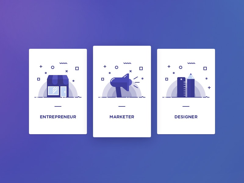
(Three main user types of Bannersnack)
We’re talking user experience here, so we must start with the user. Our team of marketers, designers, strategists, and project managers mapped out three main personas who use Bannersnack.
Surveys, emails, phone calls, coffees, heatmaps, screen recordings and brainstorming sessions uncovered an insane number of key insights, revealing the various needs and habits of our customers.
In just a few days (and nights) we learned a lot about our target audiences: the marketer, the entrepreneur, the designer. We discovered their daily habits, they expectations from our banner design app, their opinion about Bannersnack, their skills, their daily problems, their frustrations, etc. This helped us discover where we should shift our attention.
I have to mention that Hotjar was a great help for us, watching all the screen recordings and heatmaps helped us identify numerous patterns regarding how our users interact with our product.
2. Rethink the Whole Experience (Problem Solving)
When I think about UX design, I think about how an experience can be manipulated or influenced by me to increase the quality of that experience and the satisfaction of the user, in a way that he really sees the value and the advantage in our app. Changing everything overnight isn’t recommended and can get risky, but in our case, we had major blocks in the further development of the app.
The old code wasn’t right, so this is why we put “all in” and reworked everything from the ground up. I’m going to describe four major user experience issues I’ve fixed along the way:
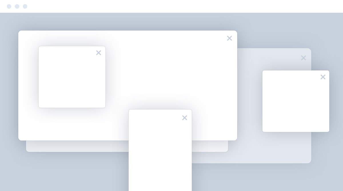
(Old UI – Pop-ins)
Problem #1 – Pop-ins, pop-ins everywhere
Given the fact that the app was old and created to old standards it was full of intrusive and focus breaking pop-ins and popups. If you wanted to choose an image, a pop-up came in, but for the settings of the image, came another pop-in over the old one and so on. This pop-in galaxy was all over the place, from the colors to clipart, from the background to banner settings.
In order to make the creation process more focused and less messy, I got rid of almost all the pop-ins and integrated everything in a huge gallery and toolbar section, where you can search and add your favorite images, shapes, backgrounds and other elements, with a drag and drop action.
Now you can find everything on one side of the screen, in a logical, easy and intuitive way.
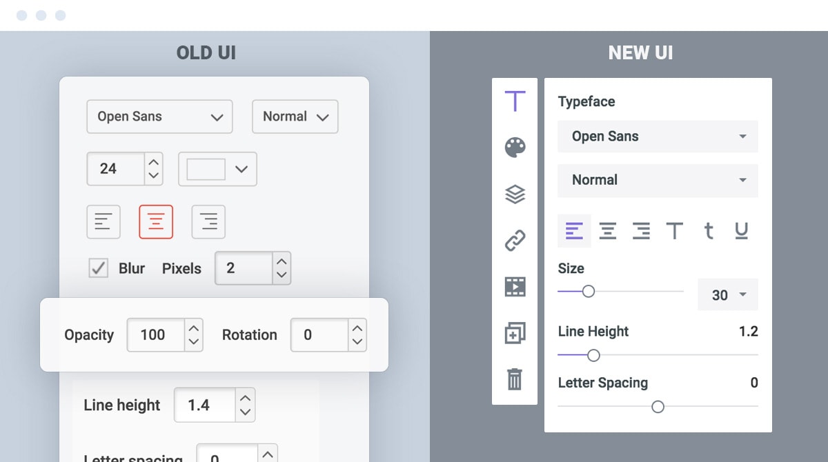
Problem #2 – Interaction, controls and input
The first time I used the old Bannersnack I was shocked that all the values I wanted to control had incremental input fields. So if I wanted to increase the font size by 10, I had to click 10 times on the up arrow or enter the number manually. I also had to do the same if I wanted to play with the settings and just experiment to get something creative, and obviously, it was frustrating. The workflow was mathematical and exact, but utterly non-creative. This isn’t Photoshop, it has to work when you first enter in our app, even if you haven’t seen anything like it before. It has to be easy to use, fast and focused.
The incremental input field was precise but slow for editing the most of the values like blur, opacity, drop shadow, and effects of the different layers. The solution was replacing most of them by custom made, native sliders which you can simply drag and go. We also added an editable field for all those cases when you want to enter the values manually, perfect for both worlds.
Problem #3 – Lack of content
Content is everything. Unfortunately, our old banner maker was lacking content and creative elements.
Creating a content friendly space was a must, but this was only the smaller task. I had to make sure the app will get more content, more presets, more templates and more photos than it ever had, to able to provide a rich, fast and creative experience.
For the new banner maker, we’ve worked to add more than 70,000 professional photos, provided by Unsplash, more than 200 new shapes and clipart, plus we have worked on almost 1,000 new templates to play with. And this is only the beginning; I really believe in the solutions and content we offer is the key to an application like ours.
Problem #4 – Non-flexible UI system
The biggest benefit of the redesigned UI is in the way we can develop and add future features to our app. In the past, every time we wanted to add a new button, link window, etc., we struggled to find a good placement that often resulted in odd button placements because we didn’t have more space in the old layout.
Designing the new interface I had in mind a simple, but modular, flexible, and future-proof interface, spaced out evenly across the stage and where all the similar functions are grouped in the place, leaving space for further changes.
3. Redesign: Make it sharp and beautiful
Bannersnack really needed a fresh new look, which not only pleases your retinas but gives you a sense of space and arrangement, too.
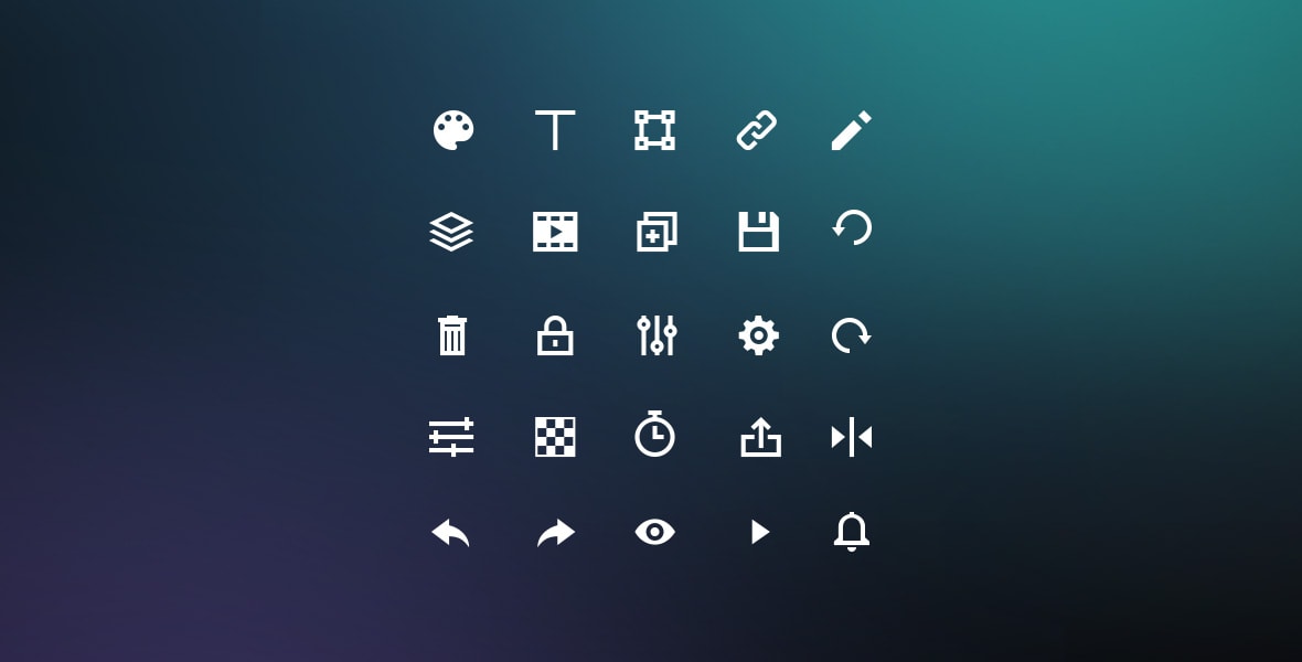
Make your own icons, isn’t that hard and it’s well worth the effort.
(Bannersnack – Custom Icon Set)
I like sharp edges, especially when combined with perfect circles. In the initial sketches, I used rounded edges all over but then realized it gave the app a whole different look than I initially wanted. I wanted to give an easy to use feeling to the banner maker, but I didn’t want a childish, “too easy” looking UI.
I found the sharp edges provide a more professional look, so I used only a pixel or two of rounded edges in places like cards, windows, popups and buttons. All the icons have been created on 18×18 / 24×24 pixel-perfect grids as SVG. The final effect is stunning on any screen, no matter if it’s retina or not.
Drop that shadow!
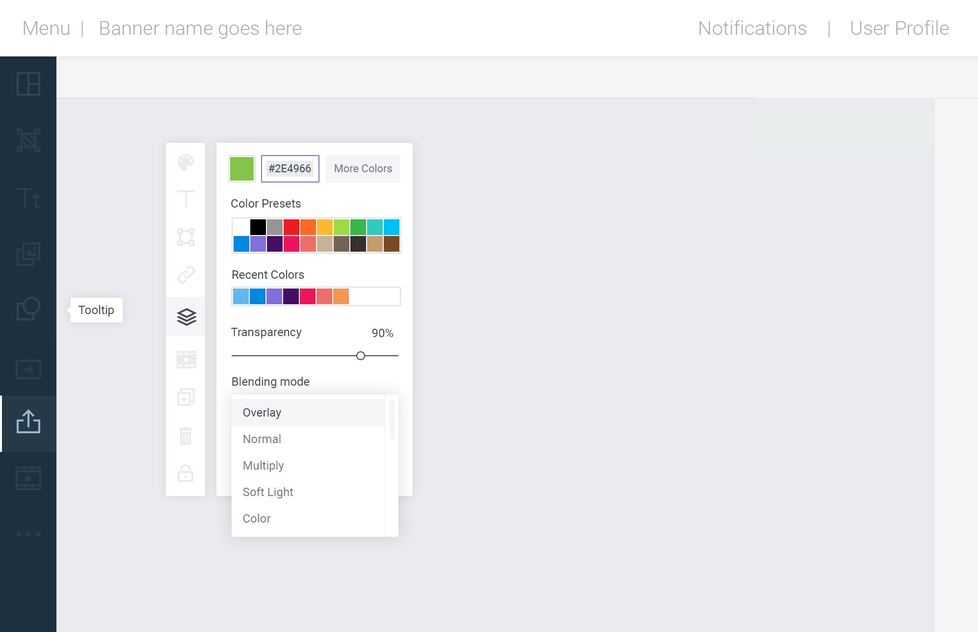
(Use of drop shadow on the overlapping UI elements)
When Google introduced Material Design, I thought..”oh sh#t, not drop shadows, not again…” I like the idea of layer separation and visually separating overlapping elements but I didn’t like the extensive use of drop shadow over buttons and over every little circle, rectangle, and itsy bitsy details.
Things didn’t change that much in my personal design philosophy, so I designed an adapted Material Design looking (but not really) custom-made visual interface.
Clean and high contrast elements, combined with blue toned grays and a hint of shadowing over layers, so you can see what’s on top and what’s not. With all the respect given to the designers at Google, I still think that Material Design is too heavy on shadows.
Create an initial style guide, but be prepared to change it.
I’m not really a sketch guy. Of course, before I started working on the new UI, I had to sketch a few days, then wireframed the basic layout, but I usually like to work and adapt. I design stuff, by trying out different scenarios, colors, and layouts by creating different artboards and compare them on the fly.
Sketching can be really time-consuming and not accurate at all.
On the other hand, starting to design without some sketches is like going to an unknown destination without a roadmap. I usually sketch to a point where I can have a basic idea of what I want, but without having all the details mapped out. You won’t be able to discover the real problems in your design ideas until you dig deep into the design process.
The same thing happened with the initial style guide I made after I finished the sketches. I said, “wait, I need a style guide to get everything to a standard, to use the exact same colors, button sizes etc, I want to make it pro, man!”
Well, I made an initial style guide, but it wasn’t really a style guide, it was more like a glossary of colors and settings which I had to update every single day, because, along the design process, colors were adjusted almost on daily basis, font sizes were refined, button sizes and styles were changed at least four times until I got to the final version.
Of course, in the end, I had a really accurate style guide, but along the way it was really exhausting to keep it up to date. I’m pretty sure next time I’ll make a style guide only when I’m almost done with the design process.
Design + Dev Team, collaboration = success
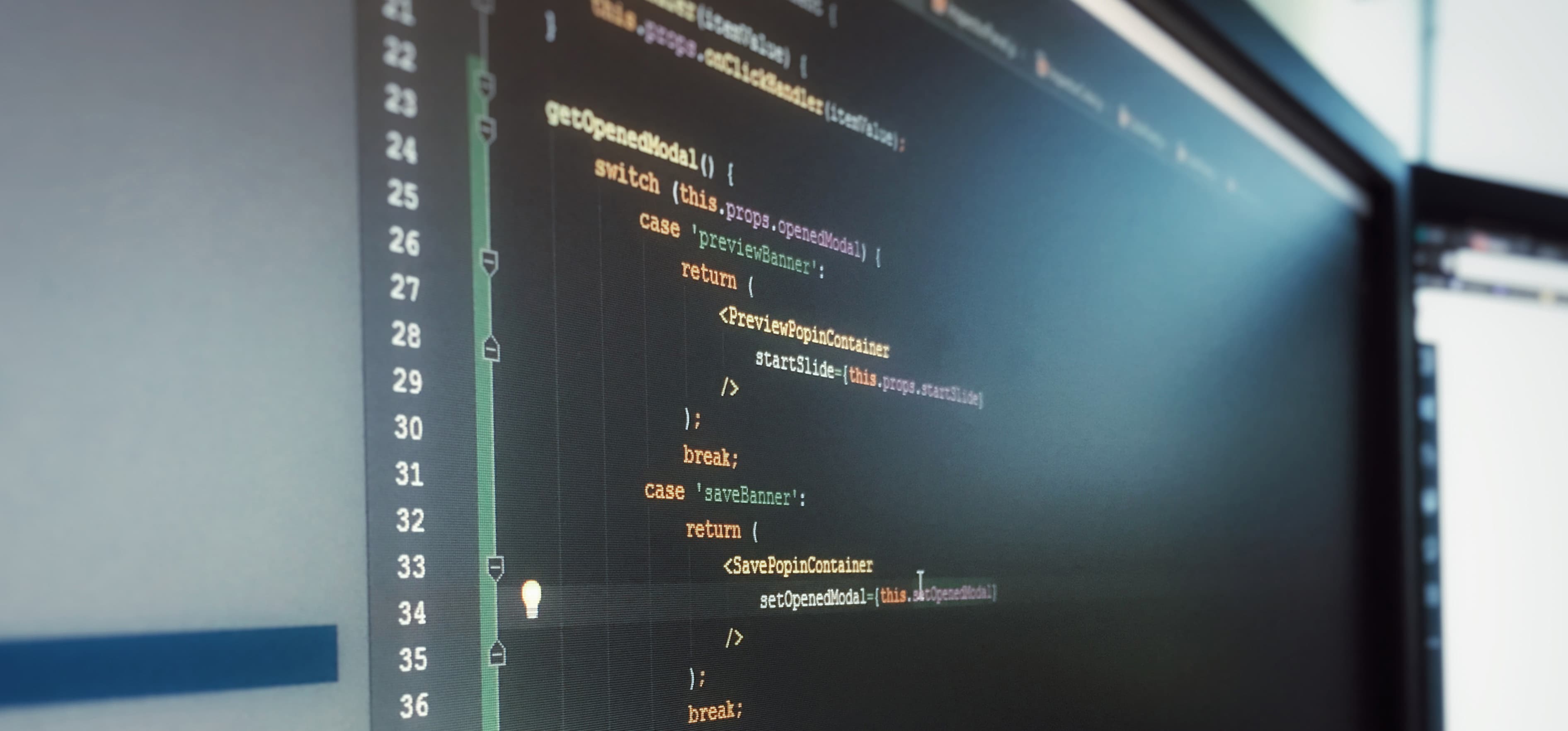
(Some fresh code – snapshot made during the dev session)
After working more than three weeks only on the design, which included the initial sketches, user flows, style guide, mockups, icons and all the details, finally it was time to start the developing process and make the whole thing work.
The development part of our new UI was super tough! The dev team was overwhelmed by all the new details, features, crazy ideas, animations, transitions, loaders and icons I dreamed up. We worked hard, overtime, Saturdays, in the morning and in the night. And this was the most fascinating about it!
I learned a lot from them and I was stunned by the amazing power and knowledge my team has! I insisted on working and collaborating closely with the whole dev team to ensure every detail is in place, every animation has the right timing and I tried answering every question they had, no matter if it was about UI, UX or other product related queries.
We rebuilt our whole banner maker app in just 4 weeks, with all the features and bug fixes. Amazing!!! If you asked me before we began, I would have said that it’s impossible.
I think the success came from the epic teamwork and great no matter what style collaboration we had.
“Both the new code and the design has to be clean, no matter what!” Putting the designer near developers is essential from my perspective and in the end, we all learned a lot and made the team even stronger.
4. Simplify aka SSS: Skip the Skippable Stuff!
I’m a huge believer in minimal design no matter that we are talking about watches or software, logo or business cards.
I think the greatest designs are the simplest ones, but sometimes you make some mistakes in the wave of challenging yourself to change something old in something fresh and clean, without realizing that you don’t even need to redesign, just throw it away or keep it as it is.
It happened as we worked for two days on a sidebar, when I realized that the whole thing was pretty useless, the sidebar wasn’t used that much and was full of unimportant links, which can be hidden elsewhere. You need to be able to think completely out of the box and realize that some elements or features you don’t need anymore.
Migrating old mistakes to a new design is easy if you don’t dive deep enough into the details and the core structure of your product.
5. Deliver
Three weeks on the design, four weeks on the development and our brand new banner maker was ready to be pushed live. We had a few focus groups and tested the app internally, within the company, too. Launching a massive update like this required effort from our marketing team. We prepared everything, from landing pages to AdWords and retargeting campaigns, from press releases to emails, all in a well-timed manner, ready for the show-off.
Our team was happy with the results, but often during the development process, you end up in a mood that’s both exciting and doubtful. We were super curious about the feedback from our users.
6. Satisfy: Improve Your UX and Sales Will Improve, Too
Customer feedback arrived pretty quickly and in high quantity. In the first days after launch, we did nothing other than read feedback, talking about user moments of frustration and joy.
Our user base can be divided regarding their feedback.
The smaller group, our power users (which were the most affected and disoriented) and the larger group our free and new users. The first wave of feedback came from the power users and they weren’t that happy. I knew they wouldn’t be because we just changed everything in a tool they use on daily basis. It’s like if Apple would change iOS over the night and you have to live with it and try to adapt. Frustrating … even if you know deep down that they made it better. But we assumed this from the beginning.
The main reason behind the redesign was to help new users to get on board, and we excelled. Most of our customers aren’t technical so they easily got lost with the old UI and workflow. The new UI is easy to understand and a much better experience to work with. Also in order to compensate the power users who had to adapt to the new UI and new workflow, were introduced major feature updates and content to keep them on track, enjoying Bannersnack to the fullest.
After the first month, the numbers were shocking.
The conversion rate of free users to PRO users more than doubled. Our users found the value in our app much easier because they found the app more pleasing to use and easier to work with, not to mention the whole lotta content they found in it. The number of banners created increased and the time spent making a banner dropped by ~20 percent.
We are now back on track with our banner maker and will introduce more awesome stuff over the next few months and keep the trends going upward.
 siter.io
 pulsetic.com
 static.app
 mailpost.io