How to Use Color Filters for Fantastic Website Designs
Who would have thought that such simple instruments as color and gradient can catalyze creativity and enormously enhance the website’s aesthetics in the modern world of advanced effects and intricate styles? Modern web designers prove that working a color filter effect can naturally emphasize refined illustrations, sophisticated graphics and spectacular photo manipulations. The website simply starts to shine with new fresh vibe. Indeed, it really helps to sort out some issues.
First of all, color filters can give a website a refreshing look without overloading it. Second, it nicely enriches the design with matching coloring that conveys various emotions. Third, as an overlay screen that has a low opacity, it doesn’t hide the charm of main background that is quite beneficial for those who want to slightly mute its slider section or section with videos but still draw attention to it. And finally, it helps establish a solid foundation for foreground content, taking care of readability.
Such solution harmoniously works with basic white coloring that offers strong contrast, and highly popular flat-style elements and contour-style graphics that add delicacy and subtlety to projects.
Here are some exceptional website designs that show how to employ this technique properly.
Zimya
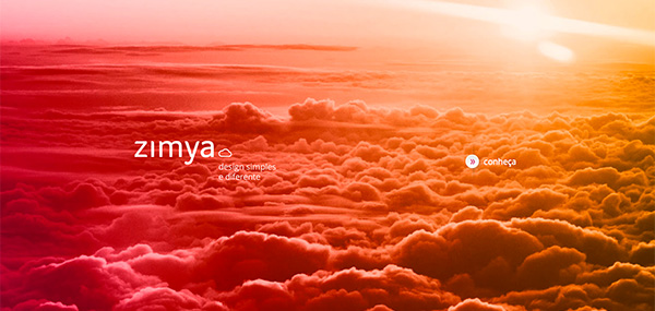
The landing page bears a fantastic warm semi-transparent gradient that immediately evokes positive and cozy feelings. From purplish red to yellowish orange, the overlay screen simply fascinates with magnificent coloring.
With Postcards Email Builder you can create and edit email templates online without any coding skills! Includes more than 100 components to help you create custom emails templates faster than ever before.
Free Email BuilderFree Email TemplatesRed Collar
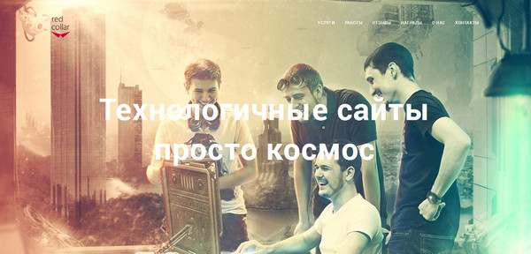
The smooth, almost translucent, gradient enormously enriches the image background that serves as the agency’s visual representation. It adds its note of peculiarity that not only complements the whole scene but also sets a highly energized atmosphere.
Ingram Cole and Land
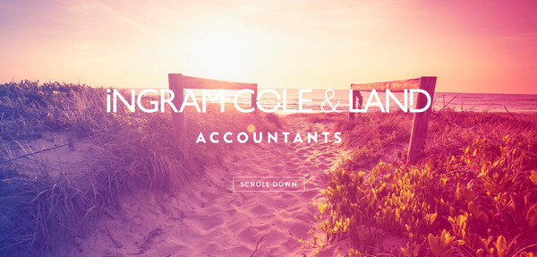
The website is based on some excellent and eye-pleasing effects, which are not only animations but also photo manipulations that have been successfully run through the whole website design. Warm subtle gradients from violet to pink make the welcome screen look absolutely fantastic and lavish.
Adopt Wales
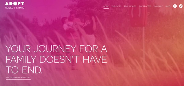
The designer covers a video background with a charming pinkish gradient that establishes amiable atmosphere. The choice of colors and level of transparency are able to nicely highlight foreground elements.
Snippet App

The combination of blue and white has something to offer for those who prefer to recreate calm and convenient general feelings. The designer has actually used a three-tone scheme, but these two shades still dominate.
With Pulsetic you’ll be instantly notified the moment your website, API, or server becomes unavailable. Monitor uptime from multiple global locations and respond to incidents before your users are affected.
Create beautiful status pages in minutes to keep customers informed during outages and build trust with transparent communication.
Start Monitoring for FreeJoyce Van Herck
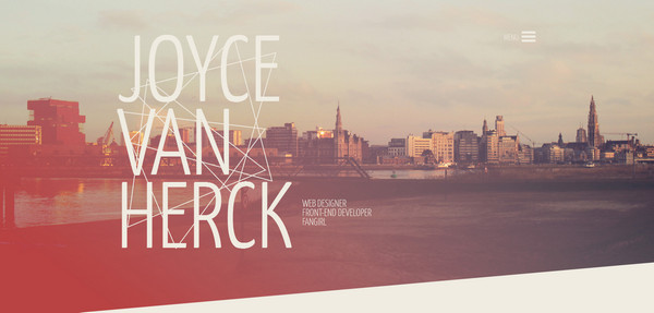
Joyce Van Herck is a high-end artist whose online portfolio is penetrated by a lovely geometry vibe. Diagonal-style widgets and sections are nicely enlivened by some sweet translucent gradients that effectively reinforce a pleasant atmosphere.
Electric Mainline
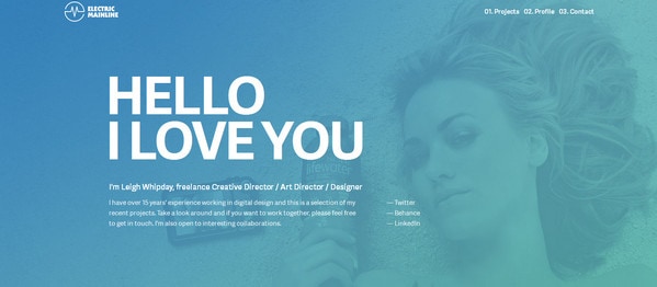
Much like Snippet App above, this designer leverages mix of blue and white. However, the low opacity of overlaid screen lets users admire the magnificent image that plays the role of backdrop.
Solid Giant
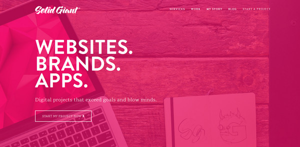
The use of pink coloring is managed to sort out several issues. First, it helps effectively highlight a tagline, logo, navigation and subtle ghost button made in white; second, it establishes a relaxed atmosphere; and finally, it characterizes brand identity.
Invelab
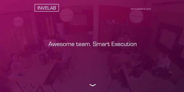
Again, the designer tries to achieve a perfect contrast between background and foreground, while drawing attention to the image of the workspace. The bright violet effectively complements the white tone.
M2B
The cheerful semi-transparent gradient reinforces the website’s appearance. Thanks to such solution, the image background is tuned up with completely new colors. White is used as a complementary tone that makes content look prominent.
Lovedays
The designer employs a flat style for the welcome page. The minimal design includes only several outline-style elements, simple typography, plain button and urban image background. The latter is paired with blue solid that is almost transparent in order to intensify readability.
Numero Neuf
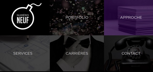
The main page features a massive image-based navigation, where each item is covered with a black translucent screen. This is a widely-used solution: If you want to provide a perfect contrast for text, and mute menu items by naturally focusing attention on a selected element.
Evoluzione Telematica
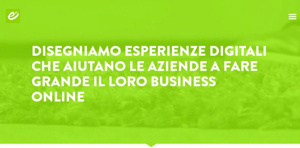
Green is associated with positive energy, and here it is used namely because of this. The bright hue in conjunction with white builds a positive impression.
The Place

The designer recreates elegance simply with a help of minimalism. The color choice reflects the personality of the website and unifies videos.
Obbaki Foundation
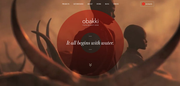
Color is able to heighten a sense of harmony. It enriches the theme of the website and at the same time, easily adds a dramatic effect that contributes to the overall mood.
Studio Up
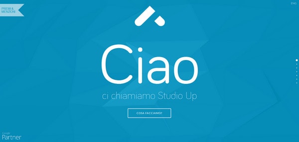
The agency does enough to demonstrate to regular users that they are perfectly aware of web trends by presenting a small parallax-based self-presentation that is driven by lovely effects. Each slide has its own color that covers a dynamic background in order to avoid vagueness of the content.
Hype Agency
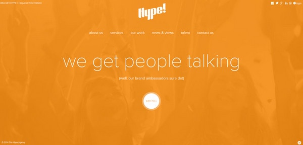
The designer splashes orange throughout the hero area in order to set the proper positive mood in the website. As befits, the secondary color is white and simply shines and nicely blends in.
Louis Currie

Louis Currie doesn’t stop with one color; he has chosen a whole variety of pastel hues that laconically replace each other. The keen sense of rhythm and harmony are definitely presented on the website.
Grey Group
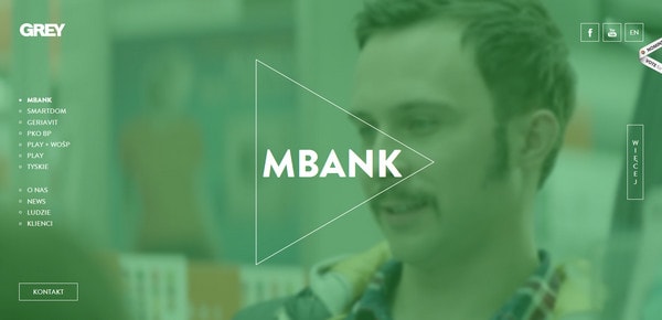
Magnificent turquoise overlays the home page like a weightless veil that intensifies the strong businesslike appearance of the website. The contour-style graphics and ghost buttons nicely protrude and actively collaborate with main tone.
Papertelevision
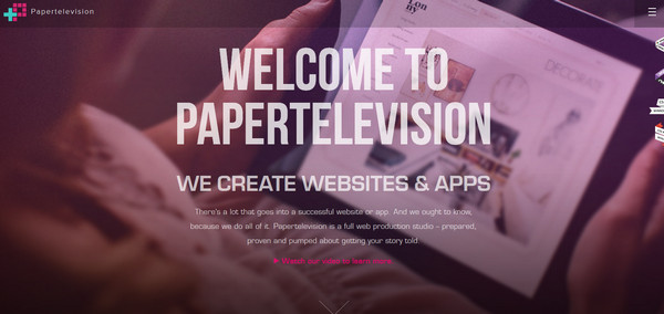
The patina of various bright and eye-pleasing colors accompanies every main section. The home page has a hint of rich violet coloring that is barely noticeable, yet it is still able to jazz up the front page design.
Conclusion
The basic technique of using color filters in the old good days in graphic design has been reborn in website design. Though color slightly dilutes the design, it also brings a note of sophistication and extra charm while contributing to functionality.


