How to Create CSS3 Pricing Tables
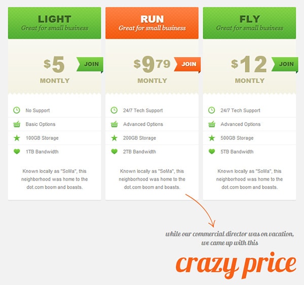
In this tutorial, we’ll learn how to code and style CSS3 pricing tables from the Impressionist UI. This step-by-step guide will help you create elegant and responsive pricing tables with ease. Whether you’re a beginner or an experienced developer, you’ll find valuable tips and tricks to enhance your web design skills. So, let’s start coding and bring your web projects to life with beautifully designed pricing tables!
Difficulty: Intermediate
Estimated Completion Time: 45 min
Step 1 – HTML of CSS3 Pricing Tables
We will create a table with the class “pricing-table”, this class will be the base to add our styling. Then we will divide our pricing tables in three parts: the first one, <thead>, will have the title of the plan and the respective price; the second one, <tbody>, will have the features of the plan (for example: bandwidth, disk space, etc.); and finally the third one, <tfoot>, will be the footer with a text description.
<table class="pricing-table">
    <thead>
        <tr class="plan">
            <td class="green">
                <h2>Light</h2>
                <em>Great for small business</em>
            </td>
            <td class="orange">
                <h2>Run</h2>
                <em>Great for small business</em>
            </td>
            <td class="green">
                <h2>Fly</h2>
                <em>Great for small business</em>
            </td>
        </tr>
        <tr class="price">
            <td class="green">
                <p><span>$</span>5</p>
                <span>monthly</span>
                <a href="#">Join</a>
            </td>
            <td class="orange">
                <p><span>$</span>9<span>79</span></p>
                <span>monthly</span>
                <a href="#">Join</a>
            </td>
            <td class="green">
                <p><span>$</span>12</p>
                <span>monthly</span>
                <a href="#">Join</a>
            </td>
        </tr>
    </thead>
    <tbody>
        <tr class="clock-icon">
            <td>No Support</td>
            <td>24/7 Tech Support</td>
            <td>24/7 Tech Support</td>
        </tr>
        <tr class="basket-icon">
            <td>Basic Options</td>
            <td>Advanced Options</td>
            <td>Advanced Options</td>
        </tr>
        <tr class="star-icon">
            <td>100GB Storage</td>
            <td>200GB Storage</td>
            <td>500GB Storage</td>
        </tr>
        <tr class="heart-icon">
            <td>1TB Bandwidth</td>
            <td>2TB Bandwidth</td>
            <td>5TB Bandwidth</td>
        </tr>
    </tbody>
    <tfoot>
        <tr>
            <td>Known locally as "SoMa", this neighborhood was home to the dot.com boom and boasts.</td>
            <td>
                Known locally as "SoMa", this neighborhood was home to the dot.com boom and boasts.
                <div class="table-float">
                    <span class="arrow"></span>
                    <p>while our commercial director was on vacation, we came up with this</p>
                    <p class="big">crazy price</p>
                </div>
            </td>
            <td>Known locally as "SoMa", this neighborhood was home to the dot.com boom and boasts.</td>
        </tr>
    </tfoot>
</table>
Step 2 – Basic CSS
Before starting styling the pricing table, we will add a CSS reset file to reduce browser inconsistencies in things like default line heights, margins and font sizes of headings, etc. The CSS reset file that we will be using is this one, made by Eric Meyer.
Then we will set the width for the pricing tables. As we will use three columns, the width will be 670px, but if you will use more or less than three columns you will need to increase or decrease the width value. We’ll also set some basic styles for the table columns. To add the margin between the tables we have to set the <td> to “display: inline-block;”, by setting this property some bugs may appear depending on the content of your table, so if you don’t want the columns spacing you can remove the display property.
.pricing-table { min-width: 670px; }

.pricing-table td {
	position: relative;
	display: inline-block;
	margin: 0 5px;
	vertical-align: text-top;
}
Step 3 – Plan Section
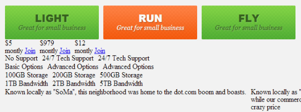
For the plan section we will set the width (this width value will be also used in the next sections), the height, add some padding and rounded corners using the “border-radius” property. Then we will add the typography styles (font family, size, line height, etc.) for the plan title and small description.
With Postcards Email Builder you can create and edit email templates online without any coding skills! Includes more than 100 components to help you create custom emails templates faster than ever before.
Free Email BuilderFree Email Templates
.pricing-table thead .plan td {
	width: 210px;
	height: 42px;
	padding: 15px 0;
	text-align: center;

	-webkit-border-radius: 2px;
	-moz-border-radius: 2px;
	border-radius: 2px;
}

.pricing-table thead .plan h2 {
	font-family: 'Arial Black', Arial, Helvetica, sans-serif;
	font-weight: bold;
	font-size: 22px;
	text-transform: uppercase;
	line-height: 24px;
}

.pricing-table thead .plan em {
	font-family: Georgia, Arial, Helvetica, sans-serif;
	font-style: italic;
	font-size: 14px;
	line-height: 16px;
}
We also have two different color schemes, green and orange. For each color scheme we will set a different color, text-shadow and background image.
.pricing-table thead .plan .green {
	color: #36611e;
	text-shadow: 1px 1px 0px rgba(255,255,255, .2);
	background: url(../img/green_pattern.png) repeat-x 0 0;
}

.pricing-table thead .plan .orange {
	color: #fafafa;
	text-shadow: 1px 1px 2px rgba(0,0,0, .4);
	background: url(../img/orange_pattern.png) repeat-x 0 0;
}
Step 4 – Price Section
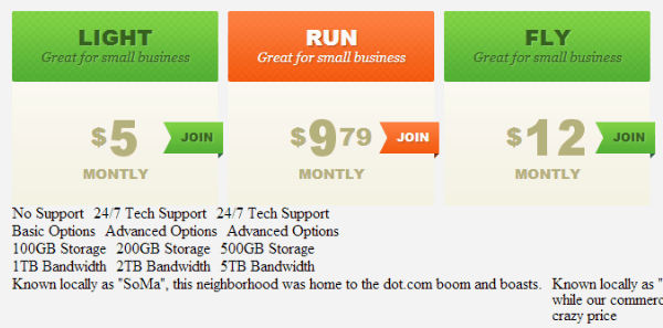
The price section is the most difficult one because we have a lot of details here. To start we will set the same width value as the plan section, add a light CSS3 gradient, some typography styles, etc.
.pricing-table thead .price td {
	position: relative;
	width: 210px;
	padding: 25px 0;

	font-family: 'Arial Black', Arial, Helvetica, sans-serif;
	font-weight: bold;
	text-transform: uppercase;
	text-align: center;
	color: #b6b07c;

	background: #f9f8f1;
	background: -moz-linear-gradient(top,  #f9f8f1 0%, #f4f2e2 100%);
	background: -webkit-gradient(linear, left top, left bottom, color-stop(0%,#f9f8f1), color-stop(100%,#f4f2e2));
	background: -webkit-linear-gradient(top,  #f9f8f1 0%,#f4f2e2 100%);
	background: -o-linear-gradient(top,  #f9f8f1 0%,#f4f2e2 100%);
	background: -ms-linear-gradient(top,  #f9f8f1 0%,#f4f2e2 100%);
	background: linear-gradient(to bottom,  #f9f8f1 0%,#f4f2e2 100%);
}

.pricing-table thead .price p {
	display: table;
	margin: 0 auto;
	font-size: 50px;
	line-height: 60px;
}

.pricing-table thead .price p span {
	font-size: 0.5em;
	display: table-cell;
	vertical-align: middle;
}

.pricing-table thead .price span { font-size: 14px; }
For the “Join” button we will position it 41px from the top and -5px from the right, add the paddings, font size, etc. As we did on the plan section we also need to set different colors and gradients for the green and orange color schemes.
.pricing-table thead .price a {
	display: block;
	position: absolute;
	top: 41px;
	right: -5px;
	height: 32px;
	padding: 0 10px;
	line-height: 32px;
	font-size: 12px;
	text-decoration: none;
}

.pricing-table thead .price .green a {
	color: #37621f;
	text-shadow: 1px 1px 0px rgba(255,255,255, .2);

	background: #82d344;
	background: -moz-linear-gradient(top,  #82d344 0%, #51af34 100%);
	background: -webkit-gradient(linear, left top, left bottom, color-stop(0%,#82d344), color-stop(100%,#51af34));
	background: -webkit-linear-gradient(top,  #82d344 0%,#51af34 100%);
	background: -o-linear-gradient(top,  #82d344 0%,#51af34 100%);
	background: -ms-linear-gradient(top,  #82d344 0%,#51af34 100%);
	background: linear-gradient(to bottom,  #82d344 0%,#51af34 100%);
}

.pricing-table thead .price .orange a {
	color: #fafafa;
	text-shadow: 1px 1px 2px rgba(0,0,0, .3);

	background: #ff8042;
	background: -moz-linear-gradient(top,  #ff8042 0%, #f55a0e 100%);
	background: -webkit-gradient(linear, left top, left bottom, color-stop(0%,#ff8042), color-stop(100%,#f55a0e));
	background: -webkit-linear-gradient(top,  #ff8042 0%,#f55a0e 100%);
	background: -o-linear-gradient(top,  #ff8042 0%,#f55a0e 100%);
	background: -ms-linear-gradient(top,  #ff8042 0%,#f55a0e 100%);
	background: linear-gradient(to bottom,  #ff8042 0%,#f55a0e 100%);
}
To add the “two triangles” and the “small arrow” to make the button look like a “flag” we will use the :before and :after pseudo-selectors. This two selectors allows us to insert content before and after the element, this way we don’t need to add two extra tags in the html. The small arrow at the right of the button will be added using a smart border technique. By combining all the borders with different colors for each one, we can create custom shapes, like triangles, for more info about this technique you can take a look at this website.
.pricing-table thead .price .green a:before,
.pricing-table thead .price .orange a:before,
.pricing-table thead .price .green a:after,
.pricing-table thead .price .orange a:after {
	display: block;
	position: absolute;
	content: '';
}

.pricing-table thead .price .green a:before,
.pricing-table thead .price .orange a:before {
	width: 8px;
	height: 32px;
	top: 0;
	left: -8px;
	background: url(../img/badge.png) no-repeat;
}

.pricing-table thead .price .green a:after,
.pricing-table thead .price .orange a:after {
	width: 0;
	height: 0;
	bottom: -5px;
	right: 0;
	border-bottom: 5px solid transparent;
}

.pricing-table thead .price .green a:before { background-position: 0 0; }
.pricing-table thead .price .orange a:before { background-position: 0 -32px; }
.pricing-table thead .price .green a:after { border-left: 5px solid #1c5d40; }
.pricing-table thead .price .orange a:after { border-left: 5px solid #88330a; }
Step 5 – Features Section
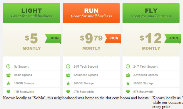
We will start with the “stripe” at the top of this section, we will add it using the :before selector. Then we will set the width (notice that here the width is not 210px because we have some left padding), the top border and some typography styles.
.pricing-table tbody tr:first-child td:before {
	position: absolute;
	display: block;
	content: '';
	width: 100%;
	height: 5px;
	top: -25px;
	left: 0;
	background: url(../img/stripe.png) repeat-x 0 0;
}

.pricing-table tbody td {
	width: 170px;
	padding-left: 40px;
	line-height: 30px;
	border-top: 1px solid #f2f2f2;

	font-family: Helvetica, Arial, sans-serif;
	font-size: 11px;
	color: #828282;
}

.pricing-table tbody tr:first-child td { border-top: 20px solid #ffffff; }
For the icons we have a custom class for each one and we only need to position the background image for each class.
With Startup App and Slides App you can build unlimited websites using the online website editor which includes ready-made designed and coded elements, templates and themes.
Try Startup App Try Slides AppOther Products
.pricing-table .clock-icon td,
.pricing-table .basket-icon td,
.pricing-table .star-icon td,
.pricing-table .heart-icon td { background: #ffffff url(../img/icons.png) no-repeat 0 0; }

.pricing-table .clock-icon td { background-position: 0 0; }
.pricing-table .basket-icon td { background-position: 0 -30px; }
.pricing-table .star-icon td { background-position: 0 -60px; }
.pricing-table .heart-icon td { background-position: 0 -90px; }
Step 6 – Description Section
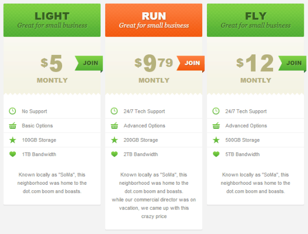
The description section is the simplest, only text. As usual we will set the width, paddings, background color, align the text to the center, etc. This is the end of our table column and we will add a shadow and rounded corners using CSS3.
.pricing-table tfoot td {
	width: 190px;
	padding: 20px 10px;
	text-align: center;
	line-height: 18px;
	background: #ffffff;

	font-family: Helvetica, Arial, sans-serif;
	font-size: 11px;
	color: #828282;

	-webkit-border-radius: 0 0 2px 2px;
	-moz-border-radius: 0 0 2px 2px;
	border-radius: 0 0 2px 2px;

	-webkit-box-shadow: 0px 2px 0px #e4e4e4;
	-moz-box-shadow: 0px 2px 0px #e4e4e4;
	box-shadow: 0px 2px 0px #e4e4e4;
}
Step 7 – “Float” Text
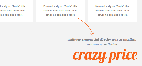
For the last section of our table, the “floating” text (where you can add a custom description to make a column stand out), we will add a custom font, you can find this font on fontsquirrel and we will add it using @font-face.
@font-face {
	font-family: 'Lobster13Regular';
	src: url('font/Lobster_1.3-webfont.eot');
	src: url('font/Lobster_1.3-webfont.eot?#iefix') format('embedded-opentype'),
		 url('font/Lobster_1.3-webfont.woff') format('woff'),
		 url('font/Lobster_1.3-webfont.ttf') format('truetype'),
		 url('font/Lobster_1.3-webfont.svg#Lobster13Regular') format('svg');
	font-weight: normal;
	font-style: normal;
}
Then we will position this section, add the text styling and the orange arrow at the top.
.table-float {
	display: block;
	position: absolute;
	width: 300px;
	padding: 80px 0 0 0;
	top: 85%;
	left: 130px;
}

.table-float p {
	font-family: Lobster13Regular, sans-serif;
	font-size: 16px;
	color: #858585;
	line-height: 20px;
}

.table-float p.big {
	font-size: 65px;
	color: #f76117;
	text-align: right;
	line-height: 65px;
}

.table-float .arrow {
	display: block;
	position: absolute;
	top: 0;
	left: 50px;
	width: 68px;
	height: 77px;
	background: url(../img/arrow.png) no-repeat 0 0;
}
Step 8 – Internet Explorer
As usual internet explorer has some small differences on the CSS rendering, to fix them I’ve created a new file that will be loaded only in IE9, IE8 and IE7. To load this file only in this browsers we will use conditional comments.
Here is the CSS that will only run in this three browsers:
.pricing-table thead .price a { right: 0; }

.pricing-table thead .price .green a:before,
.pricing-table thead .price .orange a:before,
.pricing-table thead .price .green a:after,
.pricing-table thead .price .orange a:after { display: none; }

.pricing-table tbody tr:first-child td:before {	top: -15px; }
Conclusion
This is the end of this tutorial. I hope you find it useful and have learned something new from it. Feel free to use these pricing tables on your next project or personal website. Don’t forget to follow us for more articles, tutorials and quality resources.


