The Ultimate UX Design of the Perfect CTA Button
Buttons are one of the most important elements to create, especially if you use them for calls to action. If you wait to the last minute, you may be risking your conversions.
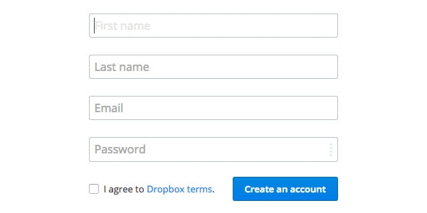
Image source: Dropbox
In this post, we’ll go over button size, style, placement and color — everything you need to know to create an effective call to action that improves the user experience.
A button placed in the wrong area of a page, which uses the wrong color, can stop a user in their tracks. The button is meant to direct users into taking the action you want them to take.
If they don’t take it, then the button has failed for one of the following reasons:
With Postcards Email Builder you can create and edit email templates online without any coding skills! Includes more than 100 components to help you create custom emails templates faster than ever before.
Free Email BuilderFree Email Templates- The button is placed in an area that’s unfamiliar to the user;
- The color turns the user off or doesn’t stand out enough;
- It’s not immediately obvious that the button exists.
According to UX Movement, we can categorize all CTA buttons as:
- Positive – changes, sends or adds information. For example, a button accompanying a newsletter signup box would send information;
- Neutral – no changes are made, or the button takes the user back to a screen (e.g. cancel);
- Negative – deletes or resets information.
Consider Color and Contrast
UX Movement points out that you want to have clear color contrast because it helps users figure out what action to take. If your main CTA button blends in too much with the background or looks like any other button, then users will feel uncertain. At best, this will slow them down. At worse, they won’t click.
This is especially important for your users who may suffer from colorblindness. Colors can appear very similar to the colorblind user even when they appear completely contrasting to sighted users.
The red versus green button argument is a good illustration of why you should consider users with color blindness.

Image source: UX Movement
Let’s review the red/green debate briefly. Red typically implies “stop” or “delete” in most people’s minds. But there are those that hold fast that users are more inclined to click a red button over a green one. So the question becomes — which one to choose?
Take a look at the image above. On the left is how someone who can see colors would see the difference between red and green. On the right, look at how a colorblind user views the two colors — both of which appear as very similar shades.
With Startup App and Slides App you can build unlimited websites using the online website editor which includes ready-made designed and coded elements, templates and themes.
Try Startup App Try Slides AppOther ProductsAs we described in Web UI Design for the Human Eye, the discrepancy is because red and green appear opposite each other on the color wheel (they complement rather than contrast each other). Faced with this, a colorblind user processing and interpreting the colors probably won’t take the action.
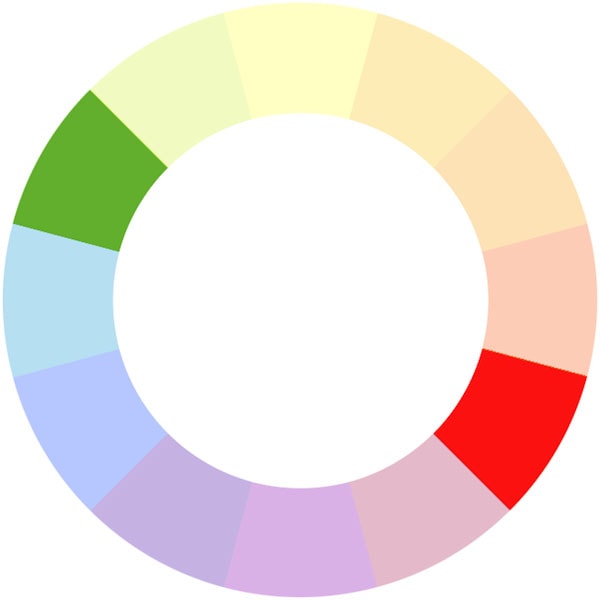
Red and green appear opposite each other on the subtractive color wheel
Image source: Wikipedia
Using red and green next to each other would certainly be a mistake. You’ll also want to consider the background color behind the button. For example, a green button on a blue background will just disappear because the colors are too similar. This effectively cancels out any action the user might take and causes analysis paralysis.
See the image below for a quick color psychology guide to inform your choices. It will depend on the type of site you’re designing and its brand personality. You should also think about the user and who is likely to be using the site and clicking on the buttons to inform your choices.
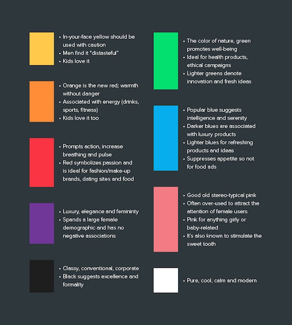
Image source: Web UI Design for the Human Eye
So it’s not only necessary to be careful about what colors you choose for your buttons, but it’s important to also ensure that you choose contrasting colors to the rest of the page and for accompanying buttons.
Where on the page you place the button is just as important as its color and the text on it or accompanying it.
Buttons should definitely appear prominently on the page.
However, consider the user’s path through the page. As Jeremy Smith points out in this excellent Crazy Egg blog post, buttons need logical placement as to where the user is going to next. You’ll want to consider how people actually read the page.
Let’s take a look briefly at F-patterns and Z-patterns.
The F-Pattern
The F-pattern is the standard for sites with a lot of text, such as news site or blogs. The user’s eyes will scan across the page, left to right, then go left before dropping down and scanning across the page again. In the example below, you’ll want to have your call to action where the eye ends as it scans left to right.
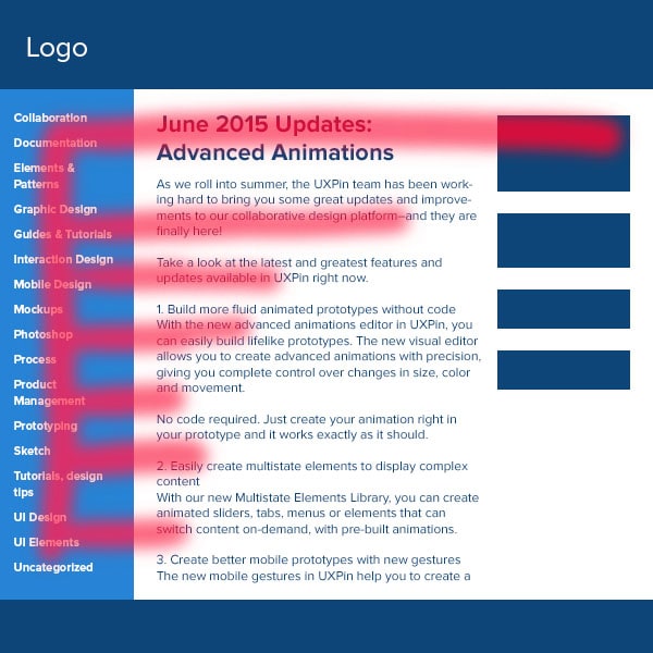
Photo credit: Web Design for the Human Eye
The Z-Pattern
You’ll find this pattern when content is more spacious and the user’s eye will scan the page like Zorro carving a Z. In the example below, you’ll want to place your call to action along the Z line, preferably near the end of it.
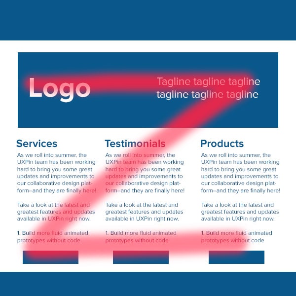
Photo credit: Web Design for the Human Eye
These patterns allow you to put the button within the user’s path. After all, you wouldn’t want to bury the button in the footer where no one will ever see or click it. Finally, don’t be afraid to use web conventions — there’s good reason why things are commonly placed where they are, because they work.
There’s a few ways to make buttons appear nice and clickable.
Let’s go through some considerations that Gabrielle Gosha outlines in her excellent Sitepoint article:
- As we said above, color is an important part of making a button stand out. It’s also useful in making a button clickable. If the button blends too much into the background, a user won’t realize that it’s something you can press.
- Buttons should also contain text that provide the user with further visual clues to direct action. Text can be used to clearly direct the user, such as “sign up”, “join now”, or “get started.”
- Give the button some room to breathe. When placing a button below a chunk of text, we’d recommend adding a margin that’s roughly ⅔ the height of the button.
- Sorry, Yoda, but size matters when it comes to buttons. You want to consider how big the button is in relation to the other elements on the page. Too small and it’ll go unnoticed. Too big and it may overwhelm users. And there’s mobile to consider.
Photo credit: UXPin
As you can see in the above illustration, three different calls to action have different impacts. The left CTA is small yet hard to miss; the center is unobtrusive; the right is so large that it distracts from the content above it. Color and size make all the difference.
Avoid getting too artistic when it comes to creating buttons and keep them simple and rectangular in shape. Replacing a perfectly crafted button with clever text or a GIF rarely results in a good experience for the user – it just confuses them as they are faced with something that’s unfamiliar.
As Kamil Zieba stated in Web Design for the Human Eye: “Clarity comes before cleverness.” Don’t use a button label like “Cool, let’s rock it!” if “Submit” communicates the action better.
Buttons should be rectangular because again, that’s what we’re used to. We understand how such buttons function.

Photo credit: UXPin
According to Paul Olyslager, these rectangular buttons should also have rounded corners as studies have shown that these perform the best. This is because rounded corners draw attention to the inside of the button as they point inwards. It’s also because we’ve evolved to avoid anything with sharp corners as human beings, as they represent a threat of injury.
We suggest that you read Paul’s four-part article for more information on all aspects of button design, including size.
Before we move onto button placement, a quick word about floating action buttons (FABs) which have become more popular in recent years.
FABs are generally circular buttons which ‘float’ above the user interface and are “used for a promoted action”. We’re seeing more sites use them “to represent the single action users perform the most on that particular screen,” says graphic designer Teo Yu Siang.

Image source: Flipboard
A FAB ‘floats’ on top of the regular content and can encroach on other elements, as well as distract the user from the rest of the content.
Siang goes on to point out that while they seem to be a great idea, and provide good UX in ideal scenarios, in reality, widespread adoption of FABs might actually harm the overall UX.
This is because they reduce the immersive experience as they are overlaid on top of every single UI element on the screen. This distracts the user from the overall experience and as such, you should take care when adding FABs to any page as it could be counterproductive.
Not only this, but as Siang says,
“By taking up real estate on the screen, the FAB effectively blocks content.”
This isn’t to suggest that you shouldn’t use FABs at all, but you should certainly take care with their use and placement as they can reduce the number of users taking the desired action.
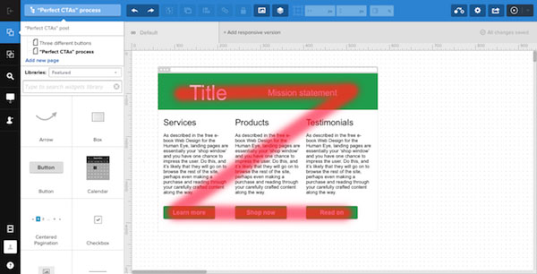
Creating an effective call to action depends on several factors, including relative size, color, and text. We’ll create a quick example with UXPin to illustrate some best practices we just described.
1. People see the hero first
The largest, topmost elements get the most attention.
2. Their eyes wander downward
Subtitles come next: bits of text that, being less prominent, create a hierarchy of attention.
3. Content moves them along
There’s a chance that people will skip from the subheads straight to the buttons, but often they need to know where each button will take them. The “sales pitch” text explains in detail why users should click each call to action. This content is a promise: What will tapping a button get you?
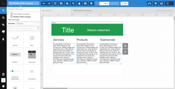
4. Calls to action
The calls to action themselves occupy the third tier. Why?
- Contrast: Button backgrounds that stand out against the body’s background.
- Text: Clean and legible, usually in a sans-serif typeface.
- Placement: In a nice, even row.
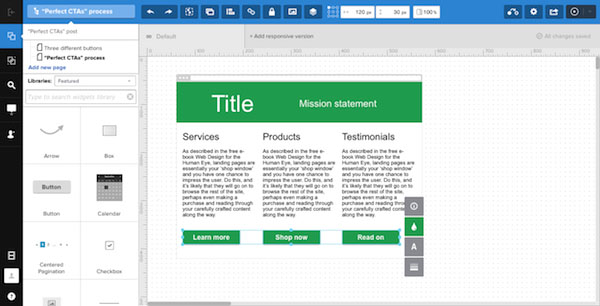
How it works
This pattern takes advantage of Western languages’ left-to-right flow: Because people are already accustomed to reading from the top left to the bottom right, arranging elements that follows conventional thinking feels natural — even if readers aren’t aware of it.
Further Resources
So that wraps up our discussion and tutorial. If you’d like to learn more about creating effective CTAs for good UX design, check out some of our favorite resources below.
- UXPin– Web Design for the Human Eye (free e-book explaining how to keep users on a site longer with smart visual design. 30+ deconstructed examples from top companies included.)
- Hubspot – Call-to-action best practices
- Hong Kiat – 38 CTA templates that stand out
- Wordstream – CTA button best practices
- Impact Branding – 4 creative tweaks for high-value button


 siter.io
 pulsetic.com
 static.app
 mailpost.io