Best Website Examples that Use Startup App
This article is a case study in websites built using Startup app. We have compiled an assorted collection of outstanding examples in order to show its range of possibilities and scope of use.
No one can argue that the number of websites created using unique online software is increasing every day. The rise of website builders is evident. Numerous developer teams all over the world offer universal solutions for those who longing for “online property.” Whether you want to share your thoughts through a blog or sell cookies, you can find an ideal option that will totally meet your requirements. No need to look far afield, Startup App is an excellent tool.
Unlike the majority of generators, it lets you compose the layout block by block, not element by element in the traditional way. Let’s be honest, not everyone can call himself a designer and can easily create a website that will look modern and refined. What’s more, add to this the bootstrap boilerplate and you can forget about problems of adding the responsiveness to the layout. All this and much more is hidden in the Generator created by Designmodo.
Examples of Websites Based on Startup App
Pixelsum
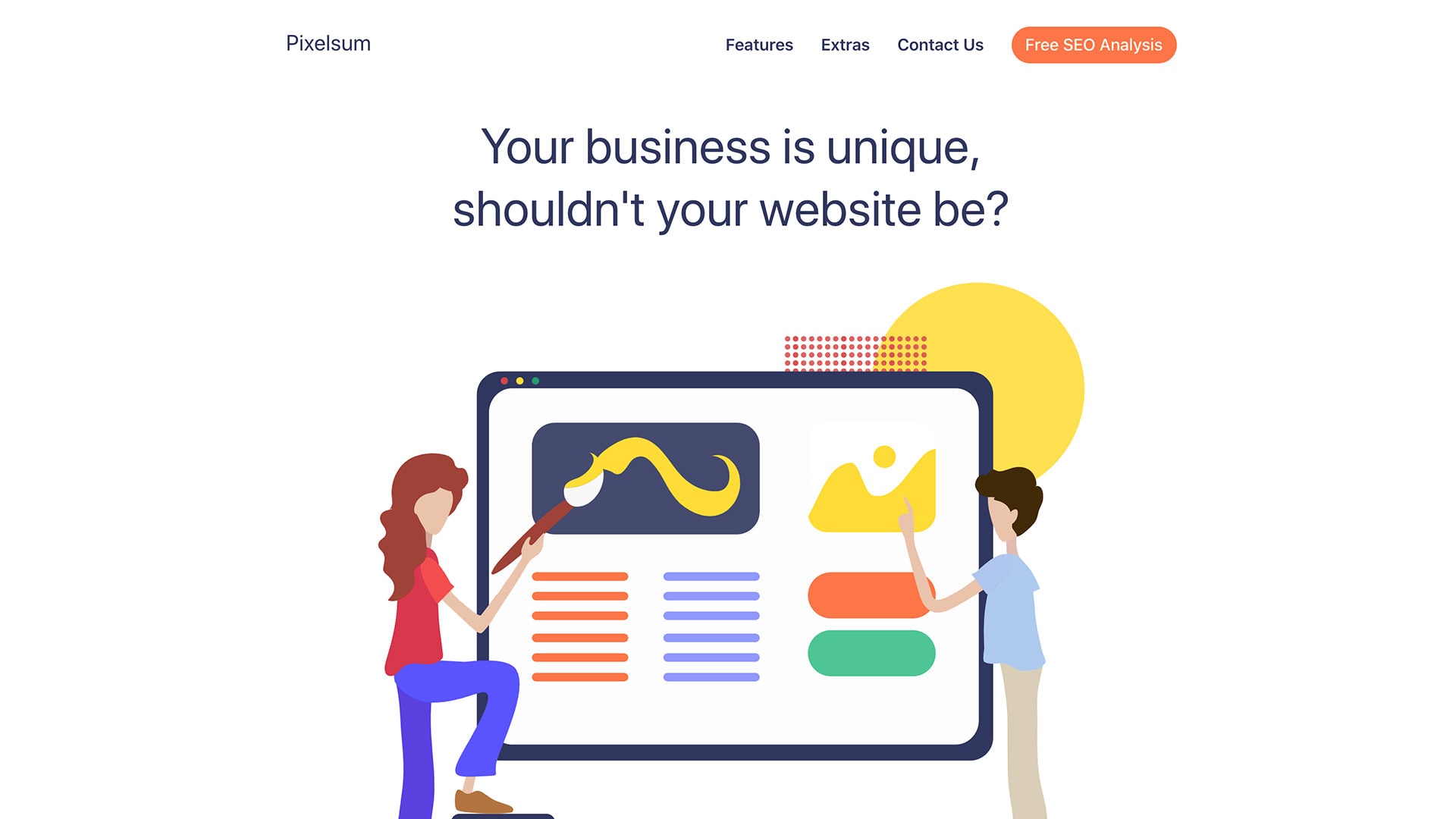
Clean, neat, and artistic are the first things that come to your mind when you open the Pixelsum. Generous amount of whitespace, simple yet effective coloring, robust structure, and of course, lots of straight-to-the-point illustrations let the team not only convey a personality behind the brand but also ensure a great user experience across all devices and browsers.
Pixelsum is the second project created by the team. Using both Startup and Slides, they were managed to transform an idea into the working project three times faster than usual without using any help from the developer’s side. Eliminating all the hustle of the development and post-production stages allowed the team to get down to business right away, offer new services to the crowd, and start earning money.
Forming our 2nd company in the last 3 years, this newest venture wouldn’t have been possible without Startup and Slides. End of story. We are able to go from wireframe to finished product 3x faster. The last one was finished completely on mobile: Startup export > Working Copy > Textastic. It’s really mind blowing. 5 stars really isn’t enough for all you do. – Bryan
No-Code Email Template BuilderWith Postcards Email Builder you can create and edit email templates online without any coding skills! Includes more than 100 components to help you create custom emails templates faster than ever before.
Free Email BuilderFree Email Templates
Pops
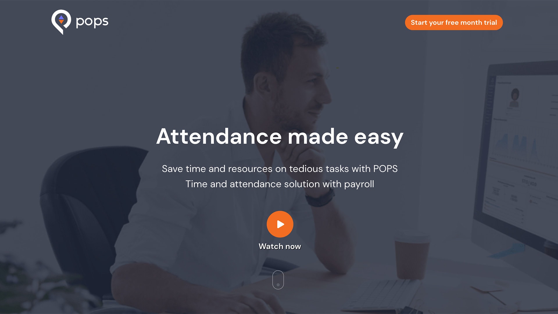
Unlike Pixelsum, Pops exudes an image of seriousness and modest. At first glance, it becomes evident that they mean business. However, it does not mean that the website is boring or insipid. On the contrary, the website exploits another side of the web design. It looks incredible, meeting the expectations of the targeted audience.
The UI has a traditional quality of mobile-promo landing pages. You can see an impressive video-based hero area, well-set CTAs, and of course, lots of striking images. The neat two-column layout perfectly balances visual and textual content creating a comfortable reading flow for the readers. Note, the page is packed with useful information; however, it does not overwhelm nor scare away.
The website brings value and delivers the message with a unique brand voice. It could not have happened without the Startup App that gave the team behind Pops a handy drag-and-drop platform with a ton of field-tested highly customizable user interface elements. There they were able to bring their idea to life without coding everything from scratch and conducting numerous tedious cross-browser tests, saving lots of time and money.
Designmodo provides easy drag and drop website templates that are trendy. It is a good tool if you do not want to spend a lot of time coding your own website from scratch. – Abdo Mallah
Rezi
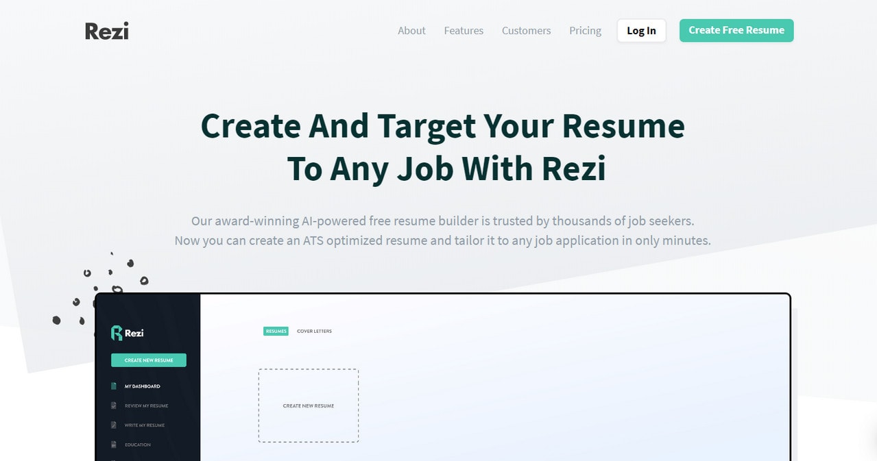
Rezi is a young, small yet quite successful startup whose first steps in online expanses could not be possible without Slides App. Jacob Jaquet, the man behind this venture, has used the website generator to translate his idea into a fully working project within minutes. Without coding skills, he was managed to pull off an exceptional website with a large inner structure, beautiful design, businesslike atmosphere, optimal readability, and finally, yet importantly responsive behavior.
He has put many elements into play: elegant pricing tables, neatly organized feature blocks, customized range sliders, well-built testimonials, handy video players, and much more. As a result, we can enjoy a delightful web interface where the value of a product was revealed in an alluring manner.
Using Startup Framework was one of the key decisions that contributed to Rezi’s early success. The value is unmatched for young startups. – Jacob Jacquet
Crunch Commerce
With Startup App and Slides App you can build unlimited websites using the online website editor which includes ready-made designed and coded elements, templates and themes.
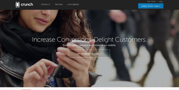
Try Startup App Try Slides AppOther ProductsCrunch Commerce has a visually stimulating design that leverages a horizontal stripe layout in the best possible way. The content is lined up perfectly, and due to a responsive behavior of the foundation, the project harmoniously communicates the message across different devices.
Recollective
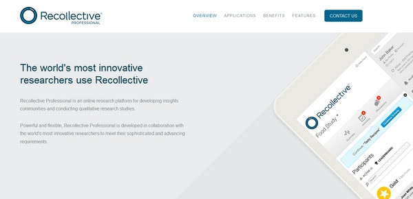
Much like the previous example, the website is built upon a splendid combination where flat style wonderfully underlines the importance of the content as well as saves the page from a messy appearance. Light color scheme, vector mockups, well-spaced content blocks, color differentiation between sections, all reinforce the design.
Bannersnack
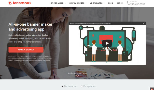
Bannersnack has an excellent businesslike appeal supported by some trendy features. Flat style with clean structure puts the content above everything, giving it a more dominant position. Illustrations play a secondary role, but not the last one thanks to their impressive appearance.
Zirtual
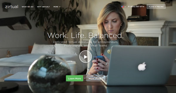
This site harmoniously balances multimedia and text providing visitors with a properly organized layout. The content is neatly arranged and carefully formatted; the visuals occupy a special place, drumming up users’ interest and the general atmosphere is amiable and affable.
Timeneye
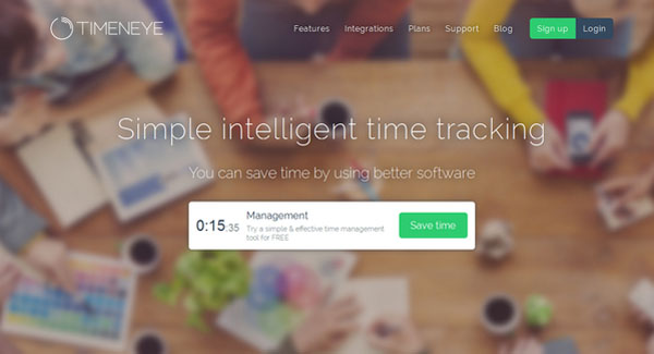
This site easily maintains the users’ focus on the tagline and CTA thanks to startling contrast between background and foreground, and the layout that shapes the rest of the design. It quickly captures the idea, shows the attitude and supplies the proposed product with a favorable environment.
SHN
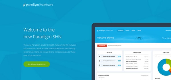
This site has a plain and straightforward layout that wonderfully treats data, making vital points clear and bringing key features into the spotlight. The website demonstrates a harmonious symbiosis of a powerful, responsive foundation and smooth and eye-pleasing design where the content takes up the lead position.
Jipio
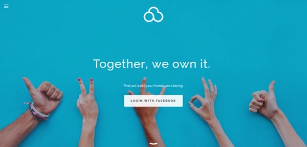
Here, Startup Framework enables the website to avoid looking broken on smaller screens such as tablets and cell phones, thereby expanding the targeted audience. The content is wisely broken into digestible portions that can be quickly scanned and absorbed. The website has friendly esthetics that lures in users.
Yisual
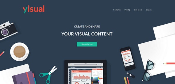
With a clean and intelligible structure and flawlessly executed flat design, this site dishes up data in an understated manner that saves regular visitors from being lost and naturally encourages them to collaborate. It is exactly what you want from a website that offers online services.
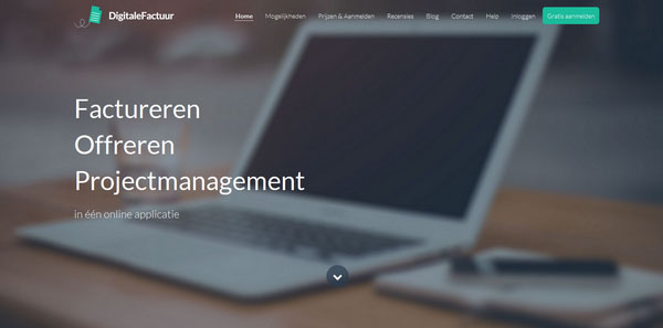
Digitale Factuur
The website has lots to tell and without the robust foundation provided by Startup Framework would not be capable of supporting such projects. Here, the content is perfectly served, and the layout is succinct and well-organized.
Winterrain
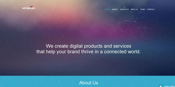
Winterrain succeeded in getting the most out of the powerful Startup Framework, providing online visitors with a pleasant user experience. Not only does the landing page have a tidy layout and naturally displays content, but it also has some fancy effects that brighten the header section and instantly seizes attention.
PeachDish
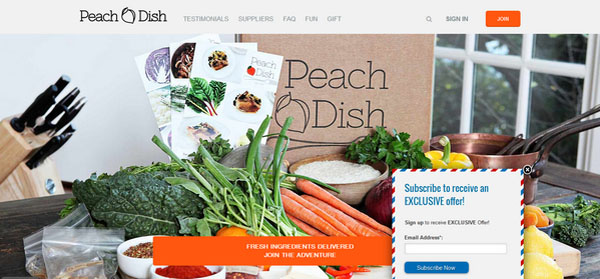
With a combination of lush images, rich text blocks supported by monochrome backdrops and vector graphics add visual interest to the website design. The densely packed together data does not cause confusion and provides users with an excellent readability.
het eenzame westen
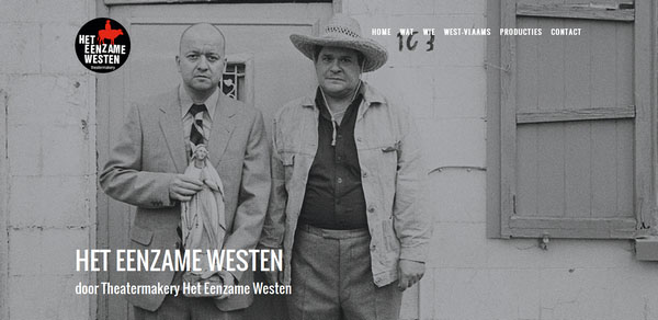
Startup Framework brings an order to the website, making ever section to look neat, tidy and succinct. Although the front page is filled more with text rather than with images, yet each picture gets its proper place thanks to basic and well thought out layout.
Calltacular
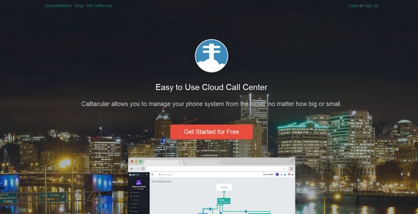
Here, Startup Framework helps to delineate the content naturally and creates some kind of a visual path from the header to the footer that smoothly guides users through all sections. As usual the website owes its magnificent appearance to the flat style, minimal coloring and plenty of extra space.
PickEvent
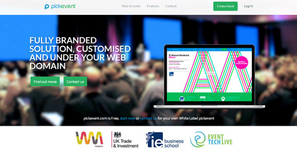
Here the designer deliberately shifts the primary focus to the content, turning it into the center of attention and slightly diminishing importance of visuals. The one-page website with a perfectly executed scrolling mechanism and a sticky navbar lets users quickly skip around and easily navigate.
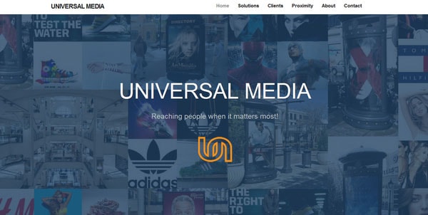
Universal Media
Videos, images, maps, forms, and regular text – everything included in the website of Universal Media. Despite of such a variety, the page does not overwhelm nor confuse users, mainly thanks to a balanced and coherent structure that sorts out the chaos.
FortyAU
Thanks to Startup Framework, the team was able to pay more attention to design. In the issue, you’ll find a truly engaging and impressive website where the front page has an innovative vibe.
GiftOff
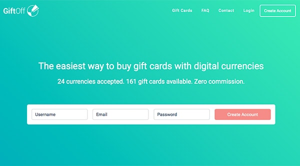
GiftOff conveys a strong favorable first impression that will certainly leave an indelible imprint in your memory. With gorgeous subtle gradients, modern nifty details such as ghost buttons, and enough room for breathing enormously contribute to the entire design; in addition, Startup Framework supports the overall structure.
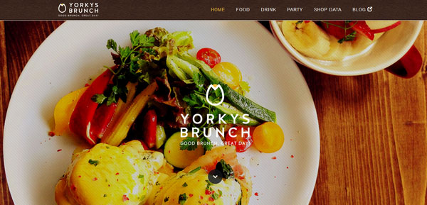
Yorkys Brunch
Startup Framework is a multipurpose and pretty universal system that has something to offer everyone, even for restaurant owners. Set your eyes on the official website of Yorkys Brunch that gives an edge to an appetite right away and urges users to delve into the project. It is a showcase of spectacular photos, featuring delicious dishes, while not to losing sight of the content without overwhelming users thanks to an elaborate and stable foundation.
Bard Spring Fling
This site needs to display various types of data, from a basic block of text to complex table, so Startup Framework is the best option. It handles all the mess, presents data in a straightforward manner and gives the center stage to the copy, to say nothing about its innate ability of perfectly adapting to different browser screen dimensions.
Vyte
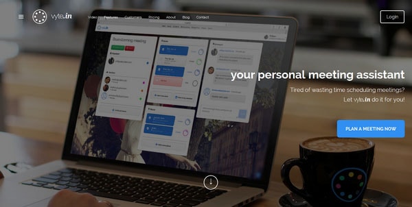
A superb example of how to take full advantage of Startup Framework and not waste the precious time building an app landing page and begin to advertising a product in a flash. The website is neat and refined, the features of the app are nicely presented, and the message is ideally conveyed.
Visage Payroll
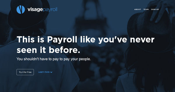
The payroll vendor site unobtrusively guides users from a starting point to the end thanks to well-executed line stripe layout that is particularly strong here. Each section includes a piece of data that is wonderfully presented. The interesting feature is that the designer goes for a huge, almost colossal typography, and icons in order to vividly convey the message.
Foodliner
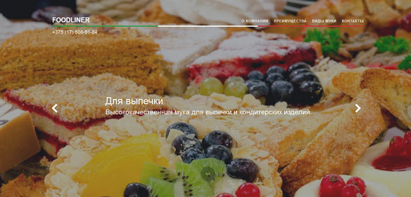
The team brings a gamut of positive emotions to the website through a range of close-up images of mouth-watering pastries that instantly develop an appetite. The designer mixed photos and a simple canvases naturally without overpowering users as well as give prominence to the content.
Jezierski
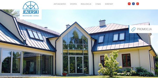
Thanks to Startup Framework, access to the content on a front page of Jezierski is quick and easy. The designer joins copy and visuals in a beneficial way that helps to spread the idea, and at the same time, intrigue users with illustrative photos.
Buel
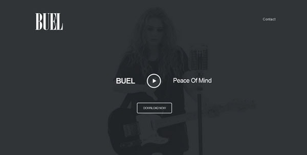
The homepage bursts with energy with its impressive and dynamic video backdrop that greets online visitors. Here, the designer tries to strike an optimal balance between graphics and content through coloring and minimalistic layout. As a result, the front page cogently expresses the sparkling personality of the singer.
Octoly
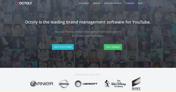
The designer opts for a minimalistic approach when it comes to creating the home page for the Octoly, a website that deals with online videos. As a consequence, the user gets an opportunity to navigate through the project easily as well as instantly get all the necessary information.
Orbitfy
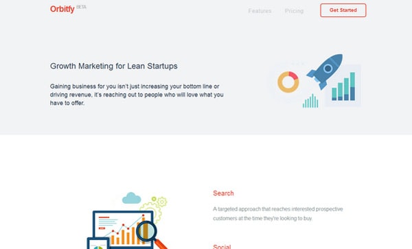
With several tiny but vibrant and lovely flat illustrations, this site instantly captures the attention and directs it to chunks of text which they accompany. The front page comprises two-column content area and extra pricing table, which both looks consistent on every device whether small or large.
Hubstaff
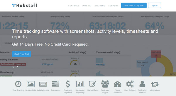
This site breaks away from the regular grid and lays out the majority of the content on a two-column structure that looks natural and straightforward. The coloring is visually appealing, flat style graphics are modern and refined and the roomy design provides users with a comfortable user experience.
Mail Squad
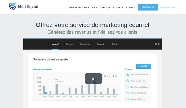
This site depicts a nicely crafted flat style that enables images to naturally accompany the content blocks and not outshine them. Properly arranged page stresses out the main characteristics, draws the attention to the most important ones and entertains users with beautiful illustrations.
Apartable
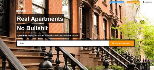
The real estate agency site needs to display lots of data, both textual and multimedia. So the properly balanced grid layout built with the help of Startup Framework is what the doctor ordered. It allows sorting out data, showing them in a clear manner and not overpowering users.
OneQube
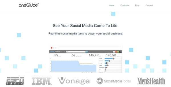
Built on three pillars: flat style, distinctive typography and clear and mighty structure where the latter gathers everything together like a puzzle for the OneQube site. Smooth two-tone coloring in pair with lots of white spaces, present even on a tablet version, significantly strengthens the fantastic general feeling.
Dezain Werks
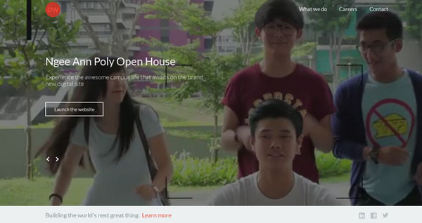
The site has an element of playfulness that separates the website from others without delay. Startup Framework is used as a supporting foundation that builds the whole layout and as an accompanying material.
Pablo Ruiz
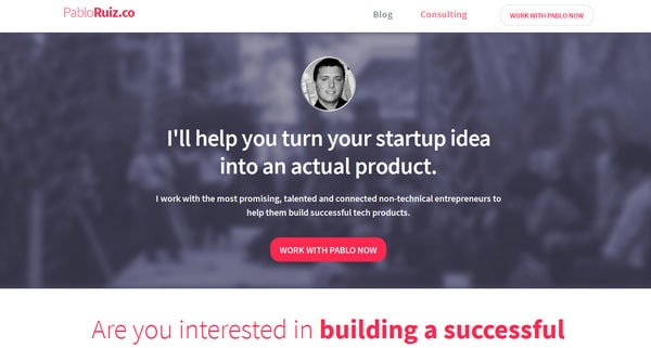
With a top-notch personal portfolio, Pablo Ruiz is going to win over as many potential clients as possible. The landing page includes primary sections such as a sphere of expertise displayed via grid, testimonial area, contact form, list of services and much more that are compactly arranged and look just wonderful.
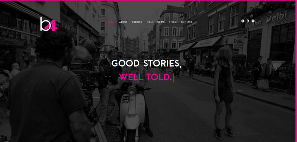
B4Films
The designer team behind the B4 Films is perfectly aware of how to bring into life the ideology of “Less is More” with its video-centric homepage that offers users a great and unique experience. Looking good on both tablets and phablets, the website keeps pace with the rest of modern projects in numerous aspects.
LaunchPage
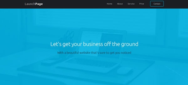
LaunchPage is a mobile-friendly website with a clean and well-structured appearance. The point is immediately apparent and important features such as pricing or services do not look clumsy or blurry.
Eagle

Startup Framework works perfectly here, effectively reflecting the concept. While the modular approach enables the content to be quickly digestible and easily perceived, the powerful open feeling makes users to feel comfortable and not overwhelmed.
450 GSM
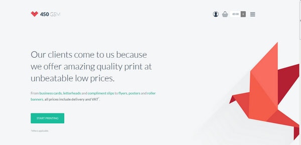
The designer wisely uses space, concisely familiarizing users with the concept. Harmonious combination of flat graphics, polygonal illustrations, modest yet gorgeous coloring and plenty of white space gives the landing page a cutting edge aesthetics that wonderfully fit the content.
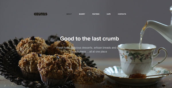
Crumbs
Unlike the previous example, here visuals play the first fiddle, setting up the tone of the project and establishing an excellent and engaging atmosphere. Nevertheless, even, in this case, the content is managed to carve its niche and occupy its particular place.
Giacomo Golinelli
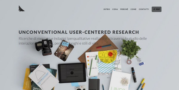
A bare use of colors in collaboration with straight-line layout enables the personal website of Giacomo Golinelli to call attention to the content in non-intrusive manner. The artist leverages two-, three- and four-column structures as well as solid color backdrops to maintain a harmonious and inviting look.
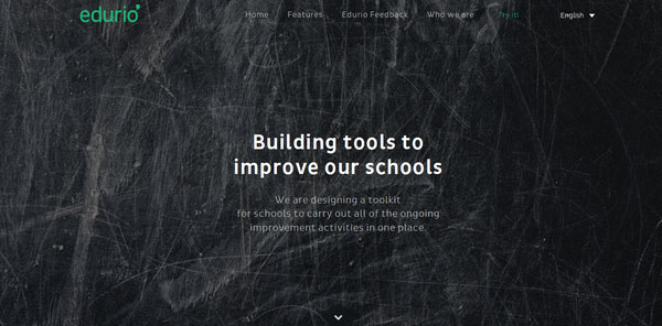
Edurio
Edurio is based on a pretty conventional layout that line by line reveals information about the project and supplies each section with clean and un-ostentatious borders. In this way, the designer succeeded in creating consistency that is easily understood by regular visitors and remains the same on every device.
Sobber
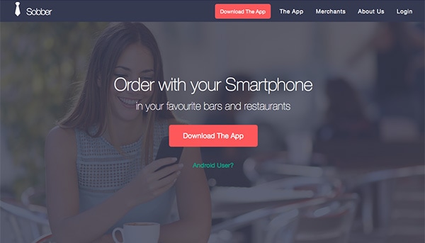
Here the user instantly gets the idea of the product. The backdrop beautifully highlights the copy and draws the attention to CTAs. Flat style in tandem with modest coloring unifies all elements together, delivering a perfect user experience.
Hipsta Food
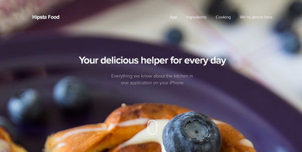
This site exemplifies the “every detail counts” ideology that certainly has its perks, though demands a great deal of effort. With Startup Framework, this task does not seem to be so challenging and time-consuming, and the website is a representative example.
Gum
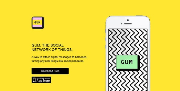
The website creates the right feel for the app with its playful and juice appearance that laconically moves visitor’s eyes from the top to bottom. In fact, there is nothing extraordinary or unusual, just a clever solution realized on the basis of Startup Framework.
Conclusion
It’s really pleasing that with the help of just one small but powerful instrument any tech-savvy person (even without in-depth knowledge and skills in web development) can realize its concepts and quickly brought to life almost any website. A website that will look:
- fabulous thanks to well-crafted style;
- consistent thanks to responsive boilerplate;
- unique thanks to numerous customization options.
Want to see it for yourself? Just check out Startup Bootstrap Builder.
