Flat Design and Fonts
Flat is in.
We’ve discussed the trend in depth here at Designmodo. And you have responded with lots of questions. We will try to answer one of those popular queries today.
“What are the best fonts to use with flat design?”
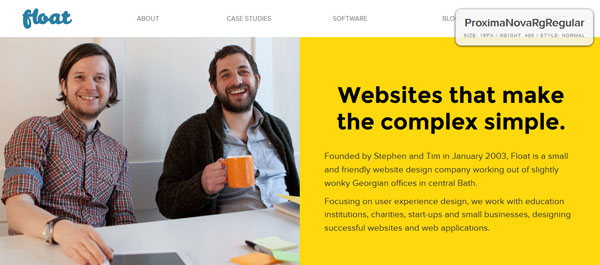
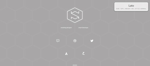
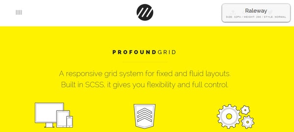
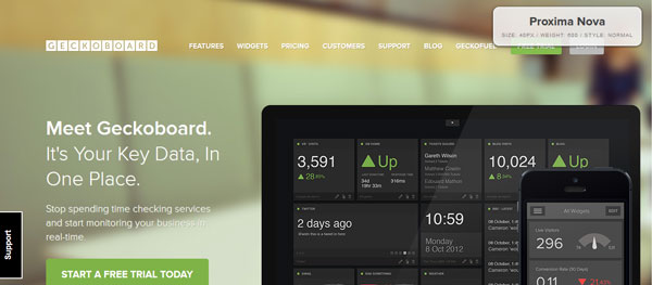
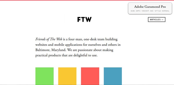
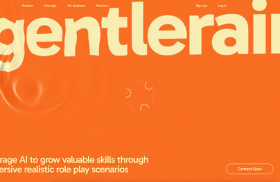
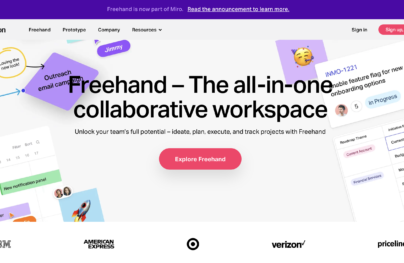
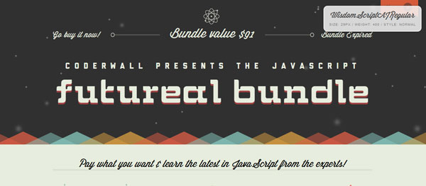
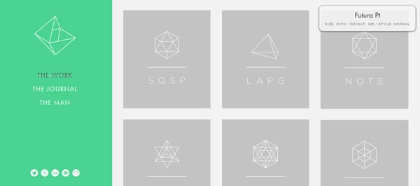
Throughout this post you will see websites using flat design techniques paired with information about fonts used on the site in the top right corner. Font information was gathered using the Fount bookmarklet.
Flat Design and Typography
With Postcards Email Builder you can create and edit email templates online without any coding skills! Includes more than 100 components to help you create custom emails templates faster than ever before.
Free Email BuilderFree Email Templates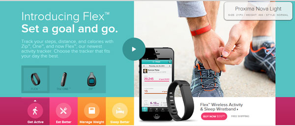
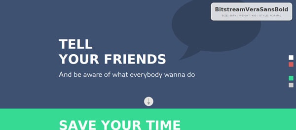
One of the key parts of the flat design trend is a focus on typography. This makes looking at, selecting and using type an essential part of getting in on this design trend.
Good typography is interesting to look at and easy to read. The look and feel of type should match the overall tone of the design and message.
Flat design, because it is inherently simple, works well with simple font pairings. Most flat design schemes use a maximum of two type families, and many only use one (staying in line with the idea of simple).
Because flat design often employs bright color schemes, weights and clean lines are important when it comes to lettering. Look for typefaces that have even strokes, work well and contrast against your color palette, include a touch of flair and are big and bold enough to read.
In the end, you want to use sharp, crisp typefaces that fit the minimal feel of flat design while adding visual interest.
Choosing a Typeface
With Pulsetic you’ll be instantly notified the moment your website, API, or server becomes unavailable. Monitor uptime from multiple global locations and respond to incidents before your users are affected.
Create beautiful status pages in minutes to keep customers informed during outages and build trust with transparent communication.
Start Monitoring for Free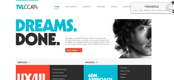
Primarily you will see designers opting to go with sans serif typefaces when it comes to flat design. But that’s not the only option; some novelty typefaces can be nice as well.
Sans serif typefaces with uniform stroke widths are by far the most popular option in flat design schemes. Non-varying stroke widths are simple and often easy to read. They work well against a variety of backgrounds – especially those which are flat. Typefaces with thicker stroke weights also create a great deal of contrast against colored backgrounds.
Serif typefaces can be used as well, but are much less common because they tend to have a more formal feel and often include more embellishment.
It is common in flat design projects to see designers use just one type family for an entire project. (Often designers use two to four typefaces for project palettes.) Look for a type style that has multiple weight options – such as bold, black or light – to give you plenty of variety and help create a distinct sense of hierarchy with the single typeface.
The use of novelty typefaces is another option for flat design schemes. Think of selecting a novelty typeface with many of the same attributes as a sans serif – clean lines and uniform strokes. Avoid too much embellishment or decoration. While one typeface is often recommended in flat design schemes, it is a good idea to select two typefaces if one is from the novelty category. Use the novelty typeface in places where the text is simple and larger and use a secondary typeface for smaller-sized and weightier blocks of text.
Forget using some of the same old typefaces. While common typefaces such as Arial do work well in flat design schemes, opt for something more unique and with a little more pizzazz. This is vitally important when it comes to making your design stand out from the pack, since many designers are using similar colors and techniques in flat design projects. A custom or unexpected typeface can help create an identity for your project. (Keep reading for a few free suggestions.)
Focus on the Words
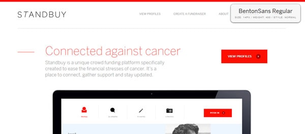
The words themselves are just as important as the typeface.
Flat design focuses on simplicity. Your text should as well.
Ensure that you edit well and use text well. Be direct with language and show users how your site works. Calls to action should be easy to understand and complete. Don’t say “Click this button to pay” when you could say “Pay now.”
Color and Font Pairing
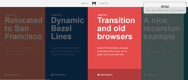
Both the weights and colors used in your typography are important.
Black and white are the most commonly used colors for type in flat design right now. And that makes perfect sense because type is often placed on top of a block of color.
It is important to create contrast between color and type so that words are clear and readable. Without using some of the effects that are characteristic of skeuomorphism – drop shadows, gradients, etc. – designers must rely on color contrast to separate items and make them pop.
Space and Size
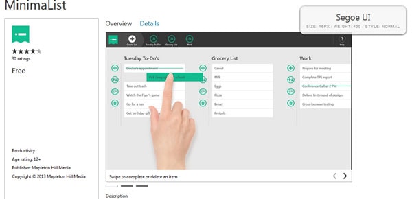

Designers can (and should) take advantage of space and size when working in flat design schemes.
Give type plenty of room to breathe. Flat design encourages usability. From clicks to taps, you want users to do something. By give type a little extra space, you can bring attention to the words, and subsequently, instructions for use.
Consider making type a little bigger as well. Take this into special consideration if you select a thinner sans serif or novelty typeface because these will need some size to be read with ease.
These techniques tend to g hand-in-hand. Giving text more room to breathe with white space can encourage designers to go bigger with fonts. Play with different variations of each. Think about space and size as key usability tools – are buttons large enough to click or tap. Is each button its own item? Does type properly direct or instruct users as to how a site works or what they should do next?
Font Suggestions
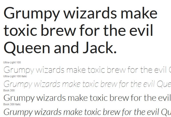
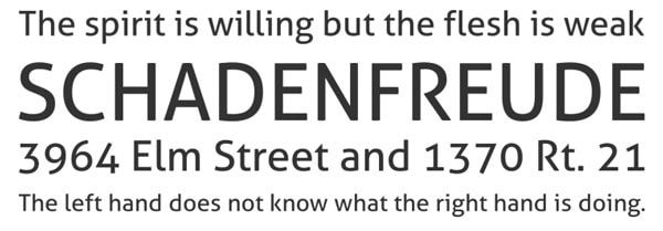
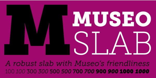
There are a plethora of great font options out there to choose from. Here are a few free typefaces for inspiration.
Lato (Google Fonts)
Junction (League of Moveable Type)
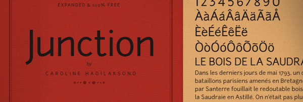
Aller (Font Squirrel)
Museo Slab (FontSpring)
Telegrafico (Ficodfont)
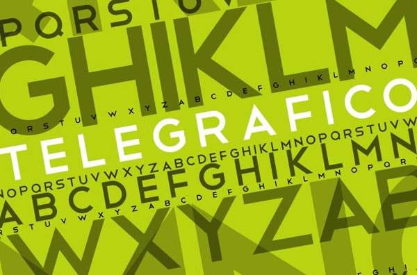
Gnuolane (FontSpring)
ChunkFive (Font Squirrel)
Lovelo (Font Fabric)
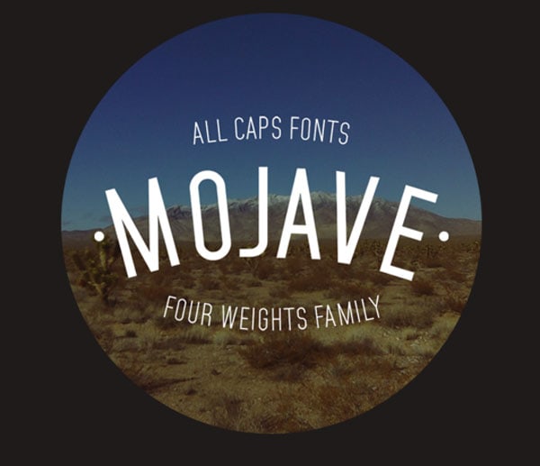
Mojave (Behance)
Join the Conversation
The flat design trend is evolving daily. What would you like to learn more about? What are you interested in? Have you seen a site that just blew you away? Comment below or on Twitter.
