20 Small, Yet Viable Solutions Based on Flexbox
Flexbox layout is perhaps one of the most long-awaited features in CSS. It is the “talk of the town.” It is suitable for tablet and mobile applications and small-scale layouts, however, its enormous potential allows it to deal with all sorts of projects, including large-scale ones.
Its primary task is to efficiently use all the available space by manipulating aspects of container items, such as width, height and order. It shrinks or expands its child items to prevent overflow and keep the structure clean and tidy. It is also direction-agnostic so that it feels comfortable on touch screen devices that as a rule, constantly change orientation.
The only thing that clouds its glory is browser incompatibility. Of course, the majority of the latest versions support it, even Blackberry browser 10+ and IE 10 nicely respond to the technology. However, it is not enough and to enjoy the whole benefits, you should mix and match old and new syntax as well as prepare a fallback.
We have gathered 20 viable solutions that are created with Flexbox. Some are frameworks, while others are just tiny code snippets. You can use them at your discretion.
Flexbox Resources and Snippets
Flex Box Editor
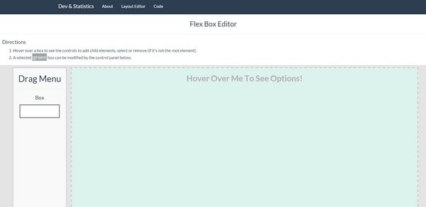
Flex Box Editor is a small playground that lets you experiment with Flexbox mode layout. You can add, remove and select child elements and manipulate with their alignment, direction, content justification and wrap. Below you will find CSS and HTML code snippets.
With Postcards Email Builder you can create and edit email templates online without any coding skills! Includes more than 100 components to help you create custom emails templates faster than ever before.
Free Email BuilderFree Email TemplatescssPlus
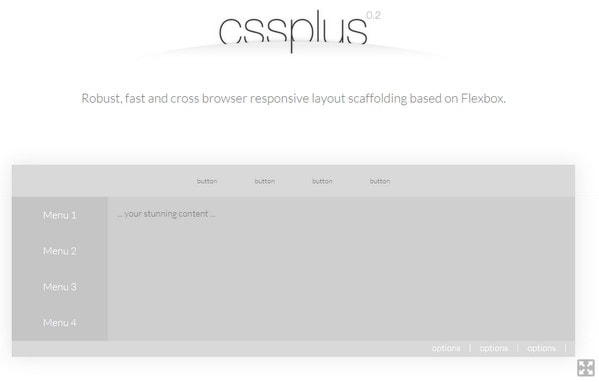
cssPlus is a standard scaffolding tool that generates responsive layouts that are robust, lightweight and fully compatible with modern browsers within minutes. It is equipped with a handy interface suitable even for newbies.
Bulma
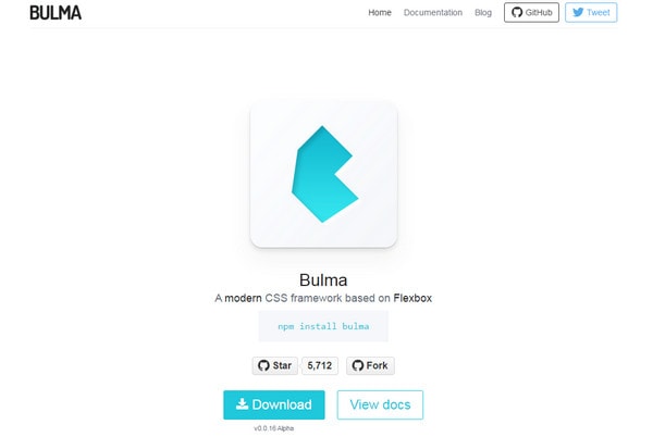
Bulma improves any project with the help of a safe and flexible foundation. It is easy to use: Just add columns and they will automatically adapt to the browser screen.
It comes with a flexible navbar, versatile media objects, vertical centering for any content, various modifier classes and all the core elements (buttons, tabs, notifications, etc.).
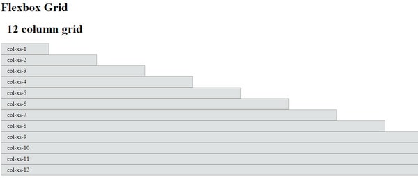
Flexbox Grid
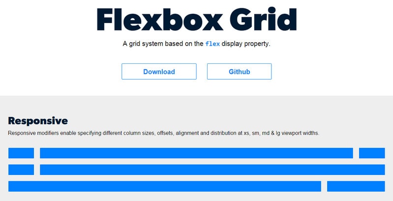
Flexbox Grid is a lightweight and robust grid system that treats content carefuly. It implies use of nested grids and has responsive modifiers for specifying such vital aspects as column sizes, offsets, viewport widths, alignment and some others.
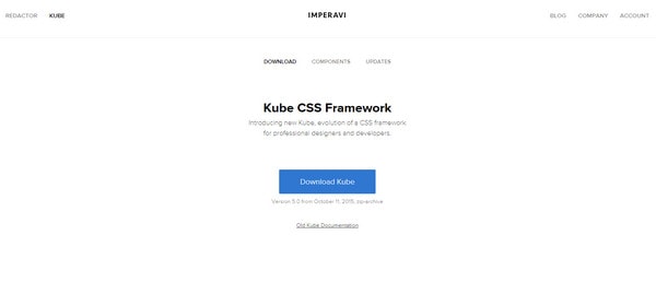
Kube
With Pulsetic you’ll be instantly notified the moment your website, API, or server becomes unavailable. Monitor uptime from multiple global locations and respond to incidents before your users are affected.
Create beautiful status pages in minutes to keep customers informed during outages and build trust with transparent communication.
Start Monitoring for FreeKube is a CSS-powered framework for building modern, fast and lightweight interfaces. It is delivered with crisp and precisely crafted typography, 8px baseline horizontal rhythm, extremely adaptive grid system and support for all popular desktop and mobile browsers.
Flexbox Responsive Grid Playground
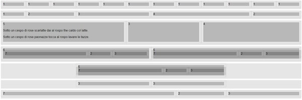
Marco Lago has conducted some experiments with Flexbox to produce a responsive base. Maybe the result does not look presentable. However, you can use it as a reliable starting point. There are nested grids, fluid columns with fluid gutters, centered columns and other elements.
CSS Flexbox Grid
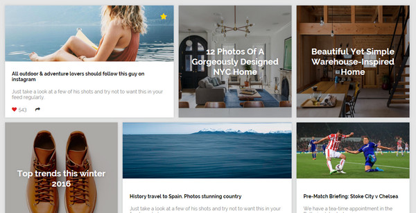
CSS Flexbox Grid is inspired by a trendy cards layout. The template consists of a gallery section, sidebar navigation and a top navbar that look tidy and stylish. The author creates a harmonious structure that is applicable for numerous projects. Flexbox enhances the foundation, and the solution naturally accommodates all devices.
Flexbox Equal Height Columns
The idea is well-suited for galleries, portfolios and even blogs. Each block is supplied with an image, content area and even extra graphics for indicating the status of the article.
The grid is flexible and remains cohesive across various screen sizes.
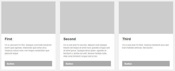
Flexbox Cards
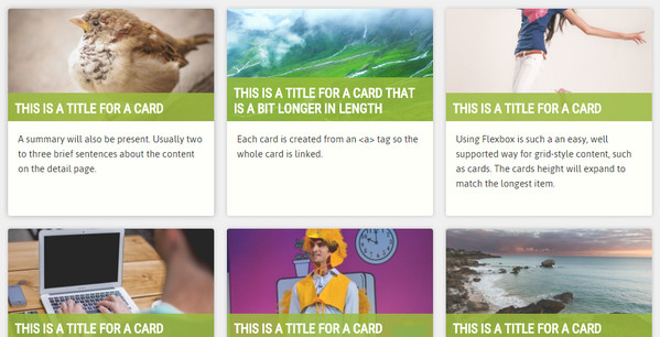
This is another solution that is created on the basis of Flexbox and cards. It looks clean and well-balanced. The information is aligned and gently dished up, even if it is a bit oversimplified. Nevertheless, it is still efficient, practical and may come in handy for numerous concepts.
Feather Flex
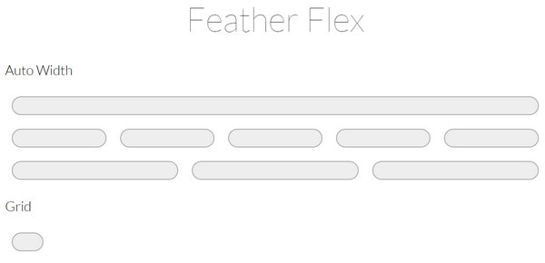
Feather Flex is a simplistic, minimal and ultra light boilerplate that achieves the greatest output from the Flexbox. It has clear boundaries, well-thought-out spacing, and gutters. The structure is standard and boring, yet it is universal and multi-purposeful.
Flexbox Cards Layout + Fallback
Not only does Luca Rosaldi represent its take on cards, deriving benefits from the latest CSS feature but he also takes care of a graceful degradation, when it comes to browser incompatibility issues by using Modernizr. He also leverages BEM syntax for the classes.
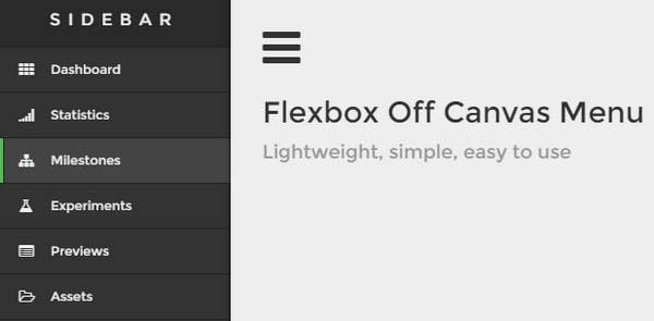
Flexbox Off Canvas Menu by Oliver Knoblich is made with touch screen devices in mind. The slide out sidebar that houses all the options smoothly appears when the user hits the hamburger menu button.
Designed to look like traditional navigation in apps, it boasts a compact and well-structured look, quick adaptation to various screens and mobile-friendliness.
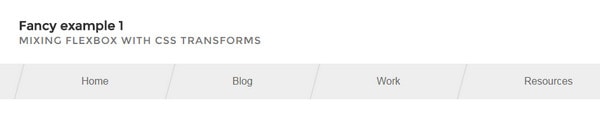
This is another project that is dedicated to navigation. There are a couple of alternatives that have a pleasant appearance, typical linear structure, and optimal functionality.
On top of that everything is reinforced by Sassy CSS.
Lindsey shares with the audience a one-page template with a general organization and modest design. It consists of a header, streamlined navigation bar, area for demonstrating featured image, content block, and footer. It is highly adaptive.
Flexbox Grid
Flexbox Grid is built with the assistance of Flex property. The author was guided by Bootstrap principles so that the boilerplate is enhanced by an excellent responsive behavior. It works great as a standalone module or in collaboration with a Topcoat.
A Better Responsive Image Gallery With Flexbox

At first sight, the gallery looks like any other, yet it has an interesting twist. If you browse it via a huge desktop monitor, you won’t see much difference.
All the magic happens when you begin to surf via tablet. While the structure adheres to general principles (all the items are arranged as a grid), the last picture when left alone in a line occupies the whole width of the screen and fills all the blank space thereby creating a smooth and consistent experience.
Angular Resizable
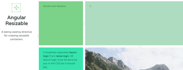
Angular Resizable is a small solution to create resizable containers. Here, the CSS does all the heavy lifting using this high-end feature.
Flexibility
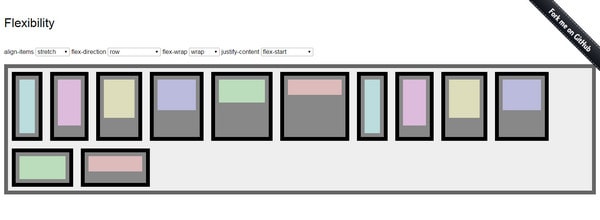
Flexibility is some kind of an enhancement for projects realized on the basis of Flexible Box Layout Module. It is aimed to provide users with an excellent experience even in old and problematic IE.
It restyles all the flex-affected elements achieving a harmonious and fully adaptive environment.
Cyanotype
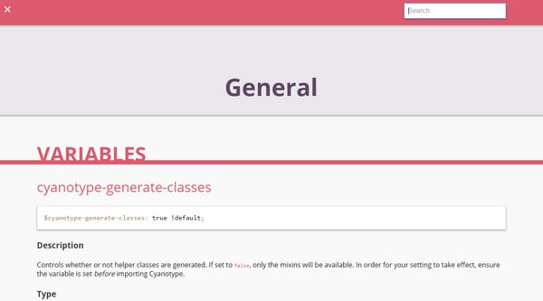
Cyanotype is a layout framework that is suitable for SASS-driven interfaces. It is lightweight, fast and productive. It includes mixins and general variables.
Ginger

Ginger is a responsive 12-column grid system for crafting websites that contains only the necessary stuff. It is minimal and viable. It attaches helper classes, and allows overriding other classes. It is easy to use thanks to a simple structure and intuitive names.
Conclusion
Flexbox seems to be a quite promising technique with vast potential. It elegantly solves issues that usually require lots of manipulations and tricks. Use the above solutions to your advantage.


