Fresh Trend in Navigation: Full-Screen Menus
As with any integral detail of a user interface, menu design is changing with current trends. Some metamorphoses bring about positive results that refine user experience, but others can destroy favorable impressions. Following trends, especially when it comes to navigation, can be tricky.
For example, hidden menus and minimal navbars recently began to run the show. However, they do not work well with all websites in contrast with full-screen menus, that in the most cases are ideally suited for almost any project. The latter trend, thanks to its versatility and its ability to enhance rather than ruin the UX is gaining more popularity. It unobtrusively dishes up lots of data, neatly displaying text and multimedia. Of course, it is one click away from the homepage, yet sometimes such a sacrifice should be made for the sake of better UX.
Today we are going to brainstorming 20 fresh and excellent examples of full-screen navigation in website design.
Maecia
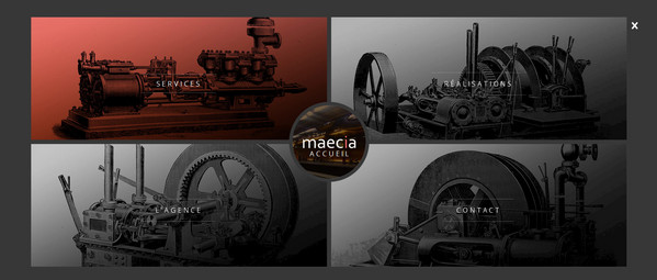
Maecia goes for a lovely steampunk appeal that adds a note of unique refinement and distinctive mechanic feeling. The image-based navigation that takes up the whole screen perfectly echoes with the dynamic front page and the overall theme.
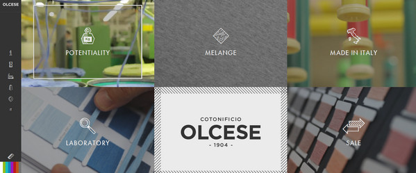
Olcese
With Postcards Email Builder you can create and edit email templates online without any coding skills! Includes more than 100 components to help you create custom emails templates faster than ever before.
Free Email BuilderFree Email TemplatesOlcese has several menus that enable users to explore the website more thoroughly as well as reinforce brand identity. The full-screen, image-based, grid-styled navigation is populated with interesting photos, smart graphics and pleasant accompanying effects. These elements combine to play a vital role.
Moeko ABE
What else could you expect from the online portfolio of a photographer? A brilliant photo-centered home page and multimedia-based navigation that loudly speaks on behalf of the artist. The menu smoothly overshadows everything on the page in order to provide picturesque photo links with a solid foundation.
Conference Awwwards
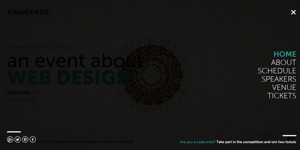
With such a pioneering home page that instantly captures attention with a series of mind-blowing, first-rate animations driven by HTML/CSS/JS, the simple navigation occupies the entire screen and throws the spotlight on the nav links is a reasonable solution.
Drygital
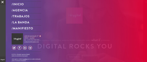
The main menu of Drygital radiates joy and positive emotions. A gorgeous, vibrant, gradient backdrop serves as an ideal base for displaying navigation made in a radiant white color. As usual, the menu overlaps the home page entirely. However, thanks to a semi-transparent canvas, users have an ability to view a video on the landing page.
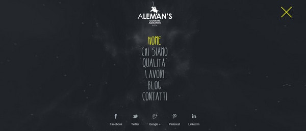
Aleman’s Design
With Startup App and Slides App you can build unlimited websites using the online website editor which includes ready-made designed and coded elements, templates and themes.
Try Startup App Try Slides AppOther ProductsAleman’s Design has a seamless navigation that goes well with the whole scene, making significant contribution to the aesthetics. The team takes an uncommon solution of leveraging an animated backdrop for stressing menu items.
Mas Industries
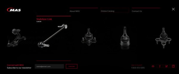
Mas Industries features an image-based, full-screen navigation menu that elegantly appears from a tiny “hamburger” button. Excellent renderings of metal parts establish the air of brutality and seriousness. Though the contrast between background and foreground is pretty weak, yet such solution, on the contrary, reinforces the design line.
Danne Olsson
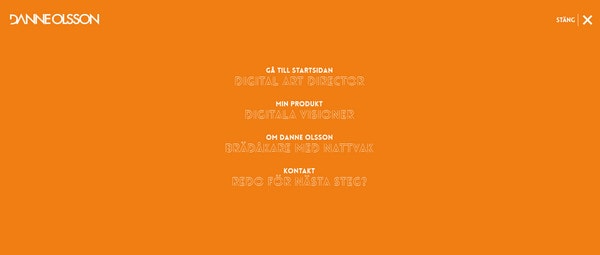
Danne Olsson greets users with a spectacular photo background saturated with natural motifs. In order to move away emphasis from such an eye-catching centerpiece to more mundane and simple navigation, he opts for a more robust solution of incorporating a full-screen menu with a solid color backdrop.
Impossible Bureau
Here the main navigation breaks the front page into four columns, leaving no chance to miss primary sections of the website. In order to brighten the appearance and make the front page not look so gloomy, each link has a beautiful gradient canvas, splendid typography and matching image.
Voisins
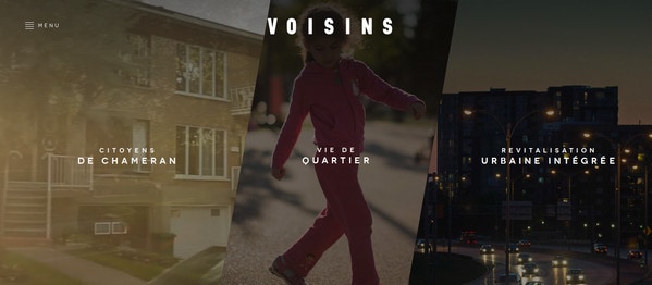
The first page of Voisins is a massive navigation system that consists of two menus. The first, as expected in line with current web design trends, is activated through a “hamburger” icon, and the second takes up the whole screen in order to handle video links more efficiently.
Fornace Studio
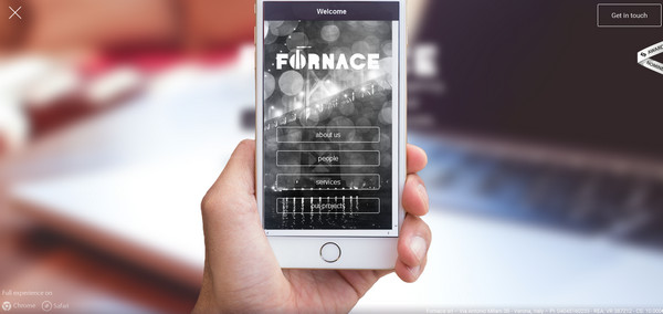
Fornace Studio has adopted an unusual solution of revealing the main menu that is originally triggered by a tiny navicon. It slides from a different angle, blurs and overlays the homepage, grabbing the users’ attention instantly.
Webgriffe
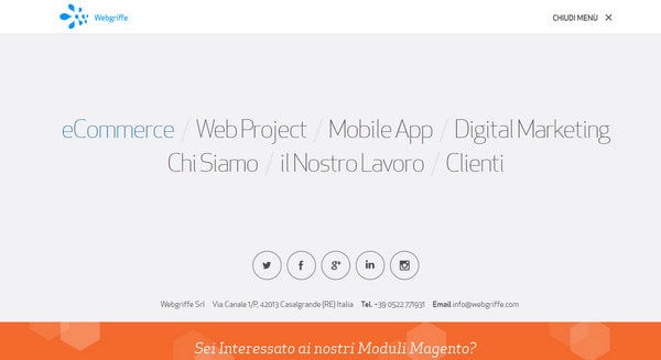
Webgriffe has a subtle design with a major focus on the copy, ultra-thin, delicate typography, ghost buttons, sharp, stylish graphics and intriguing canvases. The main menu totally works with the theme.
Moma
Full-screen navigation enables users to shift naturally from images on the first page to others featured in the primary menu. The solution looks elegant and sleek, and totally appropriate.
Giaco Morelli
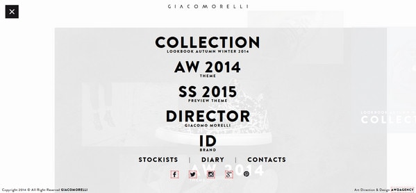
Much like the previous example, here a full-screen menu with a slightly transparent backdrop and bold, smooth type helps visitors to switch their attention from an interactive, enticing front page to a more important part of the site.
Gianluca Bocchi
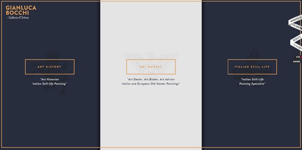
The official website of the gallery exudes an image of refinement, delicacy and artistry, despite a minimal design and a lack of lavish decor. Here, the first impression, produced by a stately menu that subtly and implicitly splits the landing page into three parts, does count.
Elliot Lepers
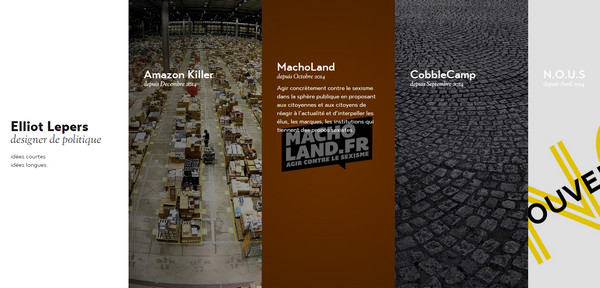
Elliot Lepers has a full-screen horizontal slider that depicts data column by column. Although it is not a classic variant of a menu, it is a sterling navigation that lets users get the most out of the project.
Fahrenheit

As befits majority of small online portfolios, Fahrenheit has a tiny menu that consists of four basic links. However, this does not stop the team from paying particular attention to it, giving the navigation list the whole page and identifying its high priority.
N3RD
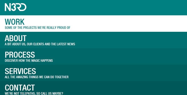
Here the first page is a navigation page. The great thing is that the team should not bother about tablet/mobile variation, since the solution goes perfectly well with all the platforms. It is simple and elegant, though quite primitive.
ivxvixviii
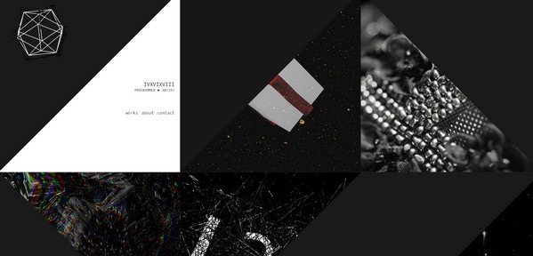
ivxvixviii has a sophisticated geometric nature enriched with spectacular images and subtle effects. The unique and elaborate navigation is able to excite interest and force users to delve deeper inside.
The Colors of Motion
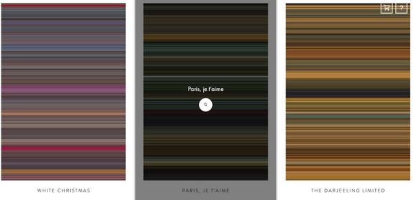
The website features an exceptional text-free navigation that, at first sight, bewilders. The designer has adopted a solution that stays off the beaten track. In such manner, the menu complies with the nameplate, supporting the theme.
Conclusion
Being subject to trends, navigation can take different forms. The full-screen menu option is one of the win-win realizations that can solve many of your website design problems.
 siter.io
 pulsetic.com
 static.app
 mailpost.io