Modern Take on Minimalist Landing Page only Type and Photo
Typography and photo backgrounds are fundamentals that every modern website has in common. Those two ideas, first and foremost, greet users on the website, familiarizing them with the slogan, a brief description, and navigation as well as establishing due ambiance through properly chosen photo or illustration. They are responsible both for visual and contextual aspects; and their cooperation is so potent and comprehensive that they alone can create a truly attractive and unique landing page. Skillfully combining and supplementing each other, type and background together are deprived of limitations, simply capable of bringing to life almost every idea in your head.
Today I want to consider a more minimalist approach that involves nothing more than these two basic elements. I have picked an in-depth collection of examples that showcases websites whose main pages include only a photo background and ably injected typography.
Minimalist Landing Pages: Type and Photo
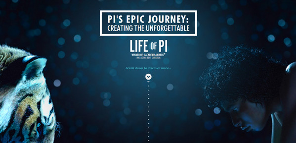
PI’s Epic Journey has an oozing adventurous vibe. The welcome section fascinates users by spectacular photo manipulation with bokeh touch and white plain tagline enclosed in bold frame.
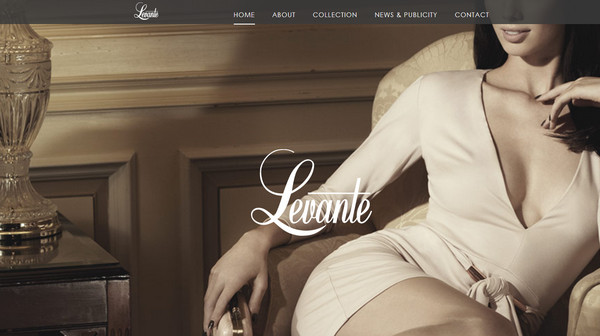
Levante uses elegant feminine type that adorns huge image slider. Small dark navigation panel with light regular type in a header beautifully complements the main page.
With Postcards Email Builder you can create and edit email templates online without any coding skills! Includes more than 100 components to help you create custom emails templates faster than ever before.
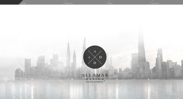
Free Email BuilderFree Email TemplatesAllamar Design features urban scenery that is covered with a white imponderable veil, making website look clean and neat. Graceful combination of dark circular logo and title momentarily grab onlookers’ attention even despite of relatively small size.
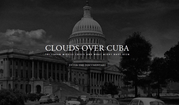
Clouds over Cuba is a complete contrast from the previous example. The website includes dark background that also highlights town scenery, and white narrow tagline that has a truly distinctive look.
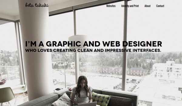
Beta Takaki instantly familiarizes users with activity, featuring a bright snapshot of a working place, which in turn easily makes elements on the foreground lift off the screen.
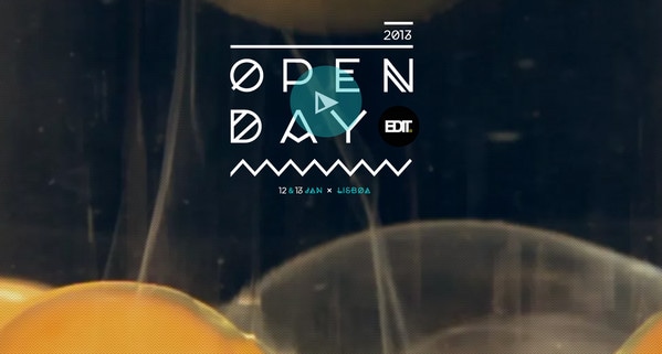
EDIT OpenDay 2013 uses exceptionally sharp typography with geometry touches that attract users by its peculiar primitive state.
With Startup App and Slides App you can build unlimited websites using the online website editor which includes ready-made designed and coded elements, templates and themes.
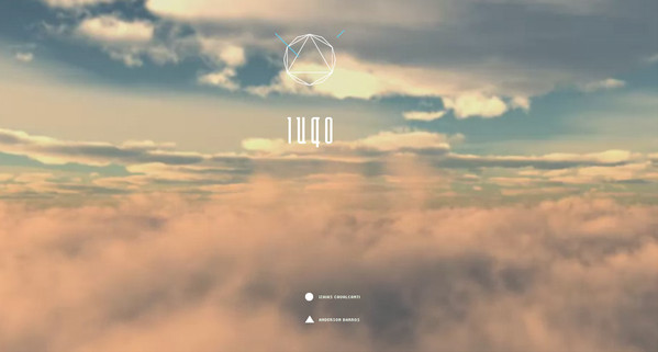
Try Startup App Try Slides AppOther ProductsIuqo includes not just simple photo background, but truly captivating video that allows users to soar into the clouds. The home page looks absolutely airy due to the compactly arranged narrow tagline, outline logo, and couple of menu items at the bottom of the page.
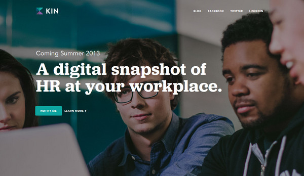
KIN HR portrays a collaborative working process that is supported by relatively large caption, which works with the help of fat regular font.
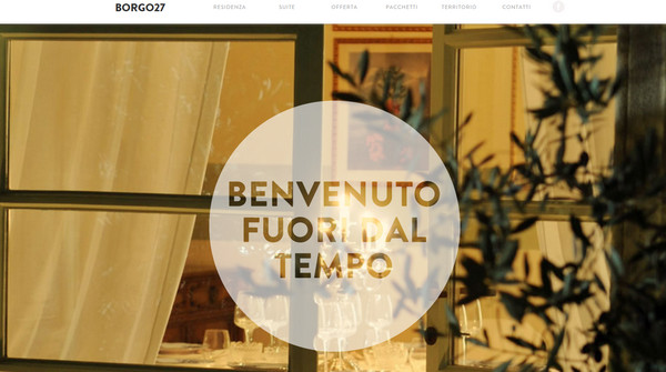
Borgo 27 recreates warm atmosphere thanks to soft, full of light photo background and the semi-transparent vibrant circular basis for tagline.
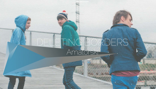
Deleting Borders is marked by exceedingly narrow slogan, which occupies the central part of the design. The muted, slightly noised background goes perfectly well with slightly transparent high-pitched font.
House has a bright summer look with a note of glamour. The white frugal type-inspired logo wonderfully complements full-screen photo background with a Lomography feel.
Basader is another great example that skillfully uses a wide-screen video background. Huge, dark inclined lettering perfectly supplement the powerful image of a raging sea.

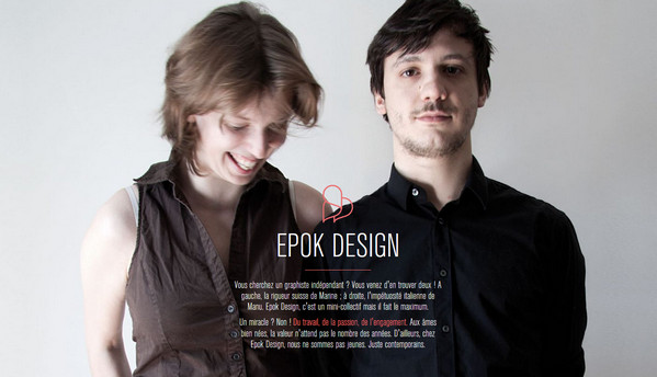
Epok Design is based upon various parallax effects and nicely represents agency staff on the landing page, and a complementing photo with a witty introduction.
Le Rockwood is defined by a conventional black-and-white color palette, heavily relying on an intentionally-darkened emotional photo and bold, almost radiant, type.
Sebanado exudes an image of style and sophistication. The fashion-themed shot and extremely small caption add to the website a note of inscrutability.
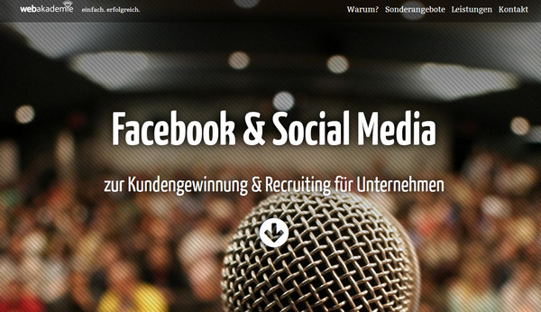
Web Akademie uses heavily blurred photo background and distinguished smooth typeface to give the website a sophisticated and stylish look.
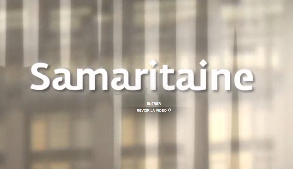
Samaritaine leverages appealing video intro, which ends with a charming screensaver. The latter bet on a pastel color scheme and huge bold type with smooth lineament for added impact.
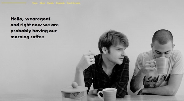
Wearegoat divides the screen into two parts and focuses users’ attention on major aspects. The first one is aimed at self-representation (that is realized by means of a small descriptive text block) and the second visually showcases habitual workflow.
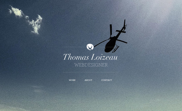
Thomas Loizeau welcomes potential customers with a thrilling empyrean shot and light elegant modest title.
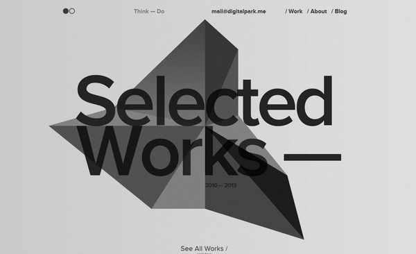
Digital Park features extraordinary three-dimensional polygonal graphics that definitely add a bit of depth to the central part of the design. In addition, black huge casual lettering looks good with the grey monotonous background.
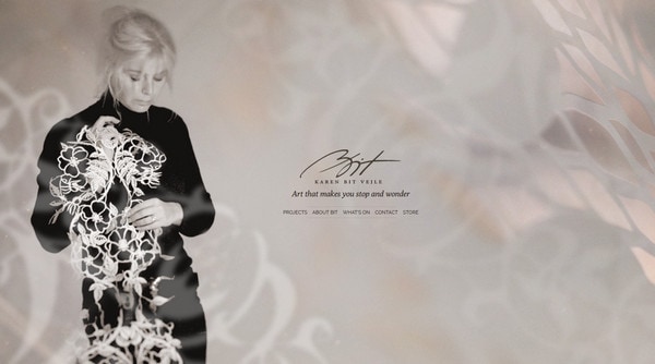
Papercutart. Grey colors, black-and-white photography, a lot of space and a tiny text block that includes lively hand-written typography all give the website refined look.
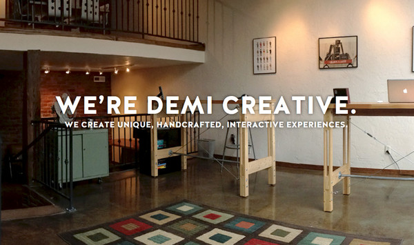
Demi Creative beautifully combines a warm picture of the workplace and serious prominent tagline, filling the website with symbolism.
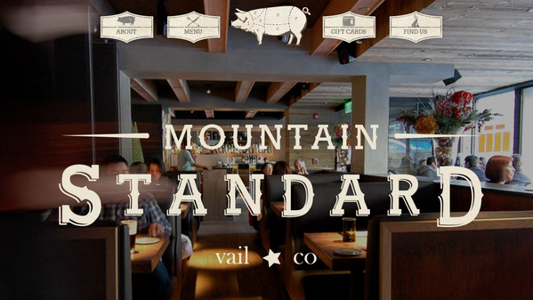
Mountain Standard Vail exhibits absolutely stunning type that is capably supported by a vintage-style navigation system and creative logo.
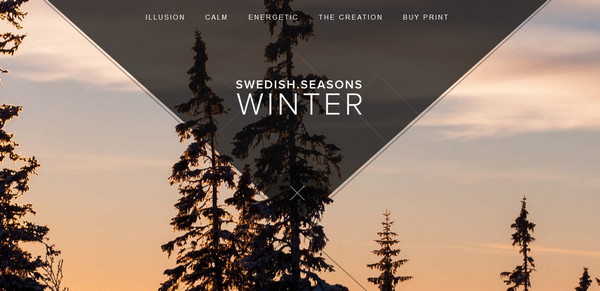
Swedish Seasons depicts spectacular landscape image that is nicely covered by triangle dark semi-transparent block with menu and site title. On the whole, this website has an accurate and refined appearance.
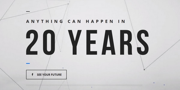
My life in 20 years is really unusual site with a great concept. The first page, which includes abstract line-inspired background and huge plain font, instantly puts the owner’s idea into prominence.
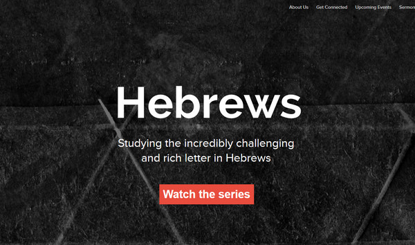
Loft City Church includes full-screen photo slideshow that familiarizes users with church activity. A set of relatively huge taglines, which are perfectly set, clearly state the philosophy of a website.
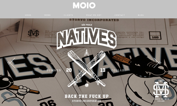
Moio injects notes of sporty style by using an amazing vector one-colored logo and rough font.
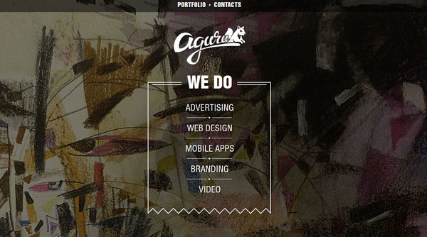
Aguru Digital Agency gives an impression of artistry. A dark paint-themed background and delicate accurately-executed menu with elegant but slightly jolly type-inspired logo deliver great sense of balance.
Reflection
Generally, designers prefer to use breathtaking photo backgrounds that are slightly blacked out in order to avoid creating artificial contrast. Light, almost white, type gorgeously stands out on any such background, so you get an opportunity to kill two birds with one stone. First, you don’t have to waste your time on creating an extraordinary font – regular type will be just fine, all you have to do is to choose the right weight and size; and second, you can as well enthrall users with a picturesque background without losing proper readability.
It’s your turn. What do you think about such minimal landing pages? Do they look sophisticated? Are they comprehensive? Share your opinions in the comments.


