23 Websites That Are Stepping Away from Traditional Layouts
For one reason or another most websites follow the same rules when it comes to layout. You see it everywhere, from Facebook and Apple to startups of all kinds and even random teen blogs. Most websites follow a grid and attach content to it. This approach breeds familiarity, ease of comprehension and ease of design, too.
There is nothing wrong with it, I just want to point out what it’s like when we stay away from a traditional layout. I’ve gathered website examples from personal portfolios to movie sites that skip the traditional route and do their own thing to make for an amazing design.
It’s an easy way to make a statement and give personality to a design.
Yatzer
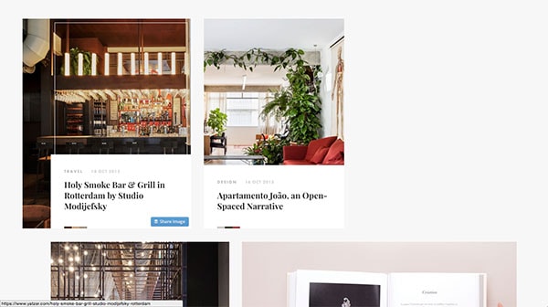
Yatzer’s main focus is to inspire visitors. It’s no wonder they opted in for an elegant web design that features posts off a typical grid. As you scroll, notice posts are not aligned to the same vertical space and that they are different widths. It is definitely interesting.
Sylvian Reucherand
With Postcards Email Builder you can create and edit email templates online without any coding skills! Includes more than 100 components to help you create custom emails templates faster than ever before.
Free Email BuilderFree Email TemplatesWhen you first land on Sylvian’s portfolio the text is overlapping and it’s pretty minimal. When you hover over the “read more,” link the page shifts to give you a preview of a portfolio piece for a mobile app. The background is uneven – at an angle – and so is the phone; it’s facing something off to the far left. It certainly makes a statement.
Lane & Associates
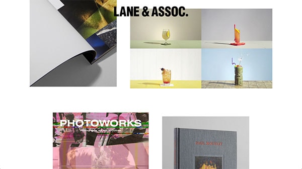
As you start scrolling through this pretty simplistic, yet elegant portfolio of Lane and Associates you’ll quickly notice that colorful photos just floating around the page. They don’t feel anchored to anything the way they would if they were organized in a typical two column grid.
Jimmy Says Yes
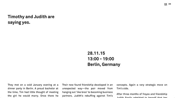
This is a wedding page for Timothy and Judith. It’s a minimal design, not what you’d expect from most wedding pages. I hope you’ve noticed that they don’t align headings that well like they do paragraph, columns of text or photos. It gives the minimal design some eccentricity.
Quechua
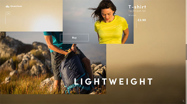
While scrolling through the lookbook for the spring/summer collection, it is easy to notice that many of the elements overlap. It seems to be an up and coming trend for design recently to have a couple of photos, a button or a headline to overlap one another and it’s working just fine for Quechua.
Readymag
With Pulsetic you’ll be instantly notified the moment your website, API, or server becomes unavailable. Monitor uptime from multiple global locations and respond to incidents before your users are affected.
Create beautiful status pages in minutes to keep customers informed during outages and build trust with transparent communication.
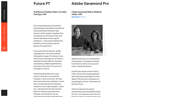
Start Monitoring for FreeReadymag has created a free online guide for typography – a component of a four-part guide series. It’s a pretty easy to follow layout actually until you hit a section with a longer paragraph about Futura and Garamond. Notice thin, but long text is aligned off center.
VN Star
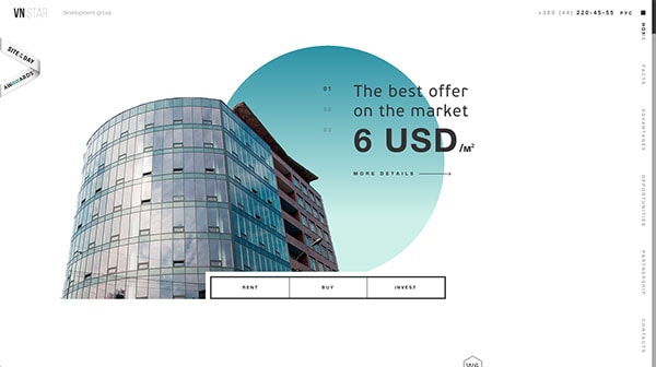
VN Star is a development group (buildings, not web) that has a lot going on in the intro/hero section. It’s using circular elements, slight overlapping and cutouts in order to create something interesting. It works for them very well.
88 and 90 Lex
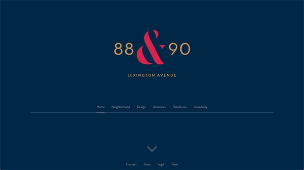
The thing that really interested me about 88 and 90 Lex is the way they handled navigation. It’s a big part of the introduction and they did not shrug it off to the top or bottom of the hero section; they embraced the center.
Christopher Ireland
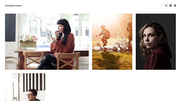
As you scroll through Christopher’s portfolio, notice that although the photographs are neatly organized they are not truly aligned to any specific grid. It’s lovely to see that you can be organized and have a sense of originality at the same time.
Brian Hoff

The thing I love about Brian’s intro screen is that amount of color in the background. The weird overlapping shapes are awesome! They make for a very fun background. The other thing I love is the unusually shaped button and that it changes shape on hover! It’s great.
Frames by Franke
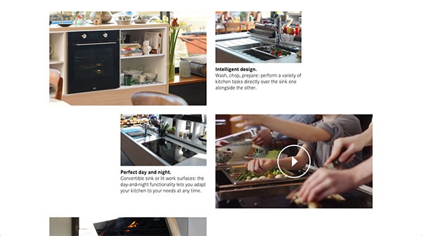
This is a lovely landing page for kitchen appliances and accessories. Once again, we have a distorted display of photographs of the products, as well as short bursts of text. It’s nothing too complicated nor fancy, but it’s a nice touch.
Nlee
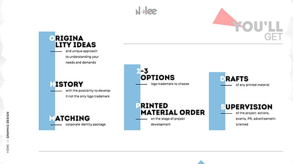
Nlee shows us that it’s easy to take a standard list of features and make it look extraordinary. It doesn’t take much to go from a dull three or four column feature list with a center aligned icon atop each column. Instead, play around with typography and decorative shapes.
Signesduquotidien
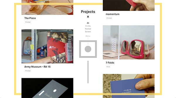
Everyday Signs is quirky, fun and interactive website. I love the way they display projects. As you scroll, the yellow square overlaps images, some above and some below. It’s an interesting transition as they flow off the page in the opposite z-index.
Livo UI Kit
Frankly, Live UI Kit has a lot going on. The transitions, in addition to angled backgrounds and various layered images, are a lot to handle. But I think it works because this is not a cookie-cutter landing page which gives interest to the product.
Ginventory
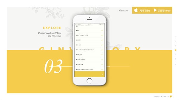
If you are into gin and tonic, this apps helps you find the perfect mix. The app’s landing page is filled with weird off layout elements. There is text overlapping text, overlapping background of the same color as the text and therefore disappearing. It’s a lovely looking website, it’s style is remarkable and the decision to keep things overlapping and cut off was a nice touch to give this page personality.
Sweet Punk
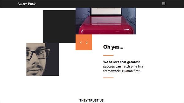
I liked this example because it shows you that throwing things off balance just a bit, a few photos can go a long way. This is not an elaborate page but it gets more interesting with things are off balance.
The Nero
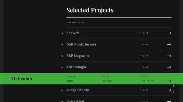
Margo Grimaldi’s portfolio is beautiful. I fell in love with the hover state of the project directory. The directory is off-centered to the right, which is contradicting compared to the left-centered introduction. On top of that the hover state is a full-width color change of the row. It’s awesome.
62 Models
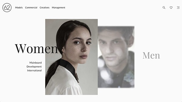
When you first enter this agency’s website, you’re greeted with a choice of whether you’d like to peruse their female or male talent selection. As soon as you hover over either choice, things start moving. The item you are selecting becomes bigger while text moves forward, too.
Amy Movie
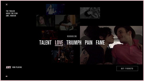
I love the menu state of this movie’s website. Not only does the menu cover the whole previous page, it has its own background that’s a bunch of moving – and not – scattered photos. They are most certainly not aligned to anything. Further, the menu is front and centered and big, too. It’s unusual and it looks so good!
Pierre Georges
<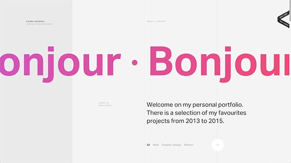
Pierre’s recent portfolio release is all the rage; he’s done a great job in making something creative. My favorite part is the small sliver of darker gray to the left; it looks like a page margin and is kind of awkward and out of place. But it works well alongside his rule breaking layout.
Sztafeta Pokolen
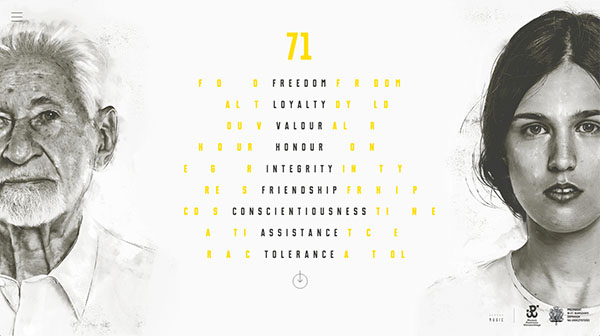
The navigation/menu for this project is interesting because it combines a traditional approach with wild decoration. Typography is used in interesting ways and this design uses yellow lettering to accent the main navigation. It’s definitely an interesting take on an otherwise plain navigation.
Haute Horlogerie
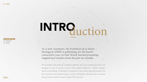
This watchmaker’s landing page is beautiful. My favorite part is the intro/hero section with overlapping typography. Again, typography can be powerful when you overlap it; give it good coloring and make sure the arrangement works. It can become a statement all by itself.
Webydo
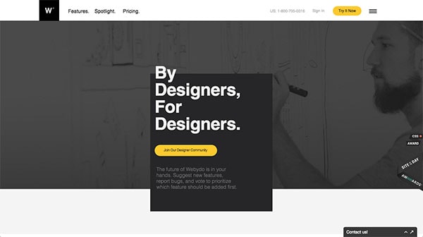
Once again we have overlapping content; the text is peeking out of a corner side, the content box from another. It’s nothing drastic but compared to the rest of this site it looks good. Same goes for the photo sections that are misaligned.
Conclusion
I’m noticing designers experimenting with traditional layouts but they are no longer that interesting. It’s unfortunate but true. To give a typical layout some interest, the first thing you should try is misaligning your grid, maybe go as far a creating a wacky grid and sticking to that instead. Don’t limit yourself to aligning everything perfectly to the 960 grid!


