How Phablets Are Changing Mobile UX
Remember the days when smaller mobile phones were fancy?
That time is gone.
Large screen smartphones have been around for quite a while and the trend suggests that they are not going anywhere. It’s high time to review the way we design for mobile considering the changes in user interaction with the new generation mobile devices and particularly phablets.
What Is a Phablet?
The word speaks for itself: phone + tablet = phablet.
So these are mobile phones that are way bigger than we are used to, but still not big enough to be called a tablet. More specifically, the screen size of these devices typically ranges between 5 inches and to 6.9 inches (127 to 180 mm). For a comparison, consider that the iPhone 5s has a screen diagonal of only 4 inches.
So the thing that distinguishes a phablet from a smartphone is screen size. The stuffing is pretty much the same as of a smartphone or a tablet.
With Postcards Email Builder you can create and edit email templates online without any coding skills! Includes more than 100 components to help you create custom emails templates faster than ever before.
Free Email BuilderFree Email TemplatesPhablets are not new, though some people pretended they didn’t exist until the recent announcement of iPhone 6 Plus. But the truth is that Samsung “created” the phablet market back in 2011 with its 5.3-inch Galaxy Note, which immediately sparked consumer interest.
Why?
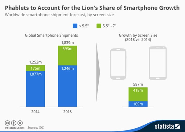
Research shows that people are consuming more visual content on mobile devices than ever before, while the primary function of a phone, which is making voice calls, falls behind. So with this in mind it is not surprising that the phablet segment is expected to grow at an average rate of 36 percent until 2018, when the rest of the smartphone market will grow at only 4 percent per year, according to Statista.
User Interaction with the Phablet
Phablets are cool and most consumers are expected to ditch their old smartphones for these devices. But even those consumers are not entirely sure about the comfort of using phablets over regular smartphones. The thing is that screens are getting bigger, while our hands and fingers stay the same. So we have to adjust the way we interact with phablets.
You are probably familiar with the thumb zone heat map that outlines how people hold their smartphones and visualizes the hard-to-reach areas of the screen.
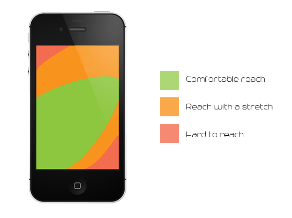
Steven Hoober first used the term “thumb zone” in his 2011 book “Designing Mobile Interfaces” referring to it as “the most comfortable area for touch with one-handed use.” This statement is based on the analysis of 1,333 observations of smartphones in use, which showed that 49 percent of users hold their smartphones in one hand and by doing so rely on their thumb to get things done. According to the same research;
With Startup App and Slides App you can build unlimited websites using the online website editor which includes ready-made designed and coded elements, templates and themes.
Try Startup App Try Slides AppOther Products- 36 percent of users hold their phones cradled, with either the thumb or finger on the screen
- 15 percent of users hold their smartphones with two hands, out of which 90 percent hold the device vertically and only 10 percent horizontally
But how does the picture change with phablets? Do users try to stretch and reach across the screen or do they switch the grip?
According to recent research conducted by Steven Hoober, “people use their non-dominant hand, and they frequently switch hands, as well as the way they’re gripping the phone.” This refers to different smartphones, including phablets.
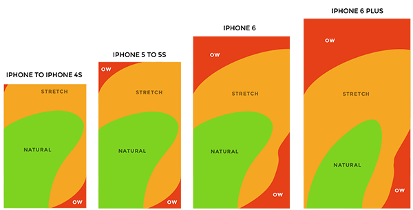
But when we look at how the natural thumb zone changes on different screen sizes, it becomes obvious that users are not going to torture themselves with a one-hand grip trying to reach all areas of the screen. The assumption is that they’ll simply change the grip and adjust. With this in mind we can expect that users won’t bother about the big screen size and will just keep changing their grip to hold and interact with the phablet comfortably.
This may seem like a huge relief, but considering that many users multitask while using their phablets, one-handed grip is still going to be a necessity. So ideally it would be smart to design the mobile interface the way that main interaction points stay within natural thumb zone. This way users won’t even need to switch the grip.
But in reality this doesn’t always work.
How to Design for a Phablet
So Samsung Galaxy Note was more or less the first phablet in the market, but the only thing it could offer to make the interaction easier was a stylus. It does somewhat help, but a stylus is just a complementary tool that not all of us like.
Apple seemed to be concerned with the comfort of its users a bit more in that sense. With the announcement of iPhone 6 Plus, they also announced the OS level “Reachability” feature: by double-tapping the home button, iOS will push the top of the screen down within users natural thumb zone. This feature is certainly not natural, it increases the time on task and the number of steps required to perform a task, but still it’s an option that other phablet users do not have.
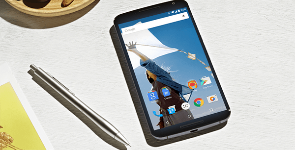
Another solution offered by Luke Wroblewski is to reposition the most important interaction points at the bottom of the screen and change the order of all controls from bottom to the top according to their importance level. I think this may be a really good option for iOS developers, but won’t be applicable for a number of Android phablets like Google Nexus 6 that has a bottom control bar, which may conflict with the application level controls.
Closing Thoughts
Phablets are definitely shaping the way we consume digital content, impacting the way we design for mobile. We need more actual usage data and research to ground UX design decisions and make the interaction with bigger screens as comfortable as with smaller smartphone screens. The real challenge for UX professionals is to enhance all the greatness of the phablet with the most natural and least painful way of interaction.


 siter.io
 pulsetic.com
 static.app
 mailpost.io